
By Catherine Austin Fitts
My “go to” website for technical analysis of precious metals, the US dollar & the US stock market is Rambus Chartology, where Rambus (that’s his handle – he’s the founding technical analyst) leads a discussion with extensive charts of what the markets are saying.
In January 2016, Rambus launched his quarterly Solari Report with a Blockbuster Chartology. You can find links to the entire series of quarterly and annual Blockbuster Chartologies at the end this latest piece.
One of the reasons that Rambus is so good at his craft is that he focuses on “staying on the right side of the major trend.” The challenge of doing so at this time is that it is tempting to look for bottoms or to assume that the trend upwards in the US dollar or stock market may be over. However, Rambus consistently brings us back to the discipline of the Chartology. What does price tell us? As he describes so aptly, we are dealing with psychological warfare.
Sitting back once each quarter to get this perspective offers invaluable insight. So, here we go for the 2nd Quarter 2018 Blockbuster Chartology!
Blockbuster Chartology Quarterly Report
By Rambus
~ 2nd Quarter 2018 Wrap Up ~
- Weekend Report…
- GLD Update…
- PM Combo Chart Update…
- Measured Moves…
- World Stock Markets…
- Different Sectors Within the Markets…
Weekend Report…
Over the next week I’ll be showing you many long term charts for all the different areas in the markets as part of the Quarterly Report I do for Catherine Austin Fitts who is the founder of the Solari Report. It’s a lot of work but it forces me to look at the big picture for signs that our bull market, which has been in place since the 2009 low, is still intact and viable. When we just look at the short term charts it’s easy to miss the big picture and what it means for the long term. All bull markets will come to an end and our current one will be no different.
There will be signs along the way that will tell when things are starting to deteriorate in a meaningful way in which we will have to act accordingly. For the time being I believe we are still building out a consolidation pattern in the ongoing 2009 bull market. We are in a trading environment as long as the consolidation phase keeps developing. There will be sectors that were very strong and begin to correct while some of the weaker sectors may find some hidden strength that wasn’t seen before. We will most likely see capital rotate from one sector to the next until the correction is compete and then we can experience the next important impulse leg up in the secular bull market.
The job of a consolidation pattern is to confuse both the bulls and bears alike until they can’t see straight. The old adage, the trend is your friend, speaks volumes about the markets. So until we see a major shift in the secular bull market the trend is our friend. There will be times during this correction that it will feel like the end of the world as we know it has arrived. The bull will do everything in its power to buck us off before the eight seconds is up. As I mentioned many times previously, if it was easy everyone would be millionaires.
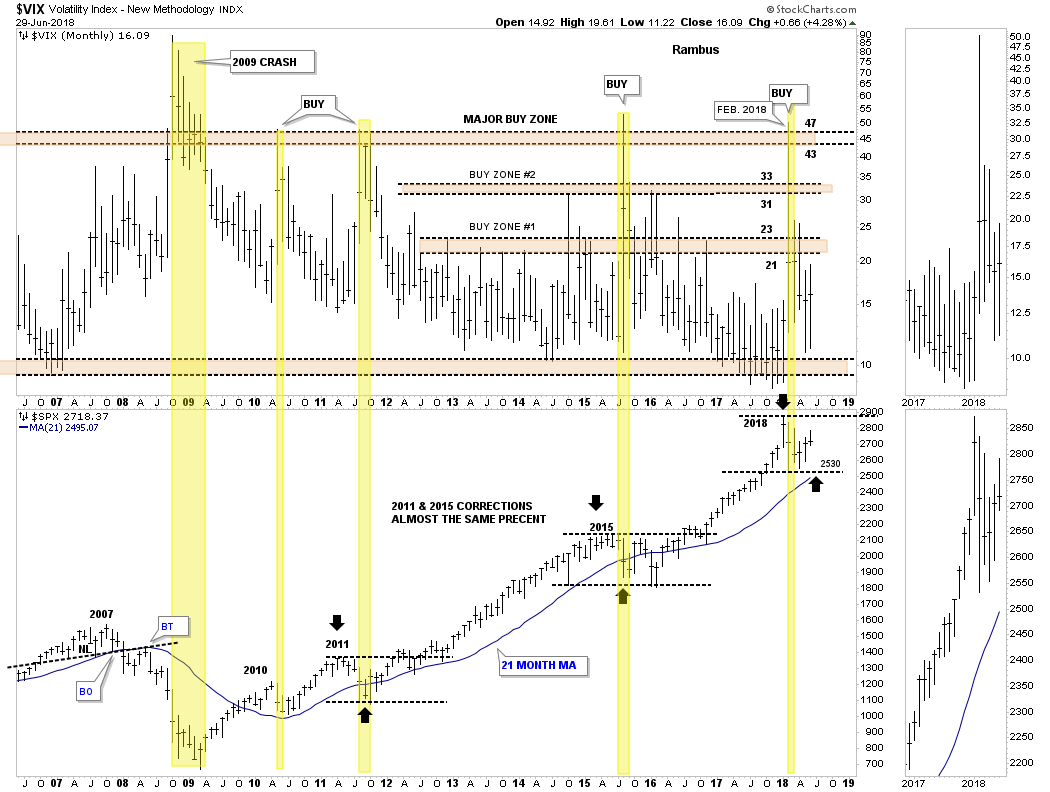
Lets start with a 12 year monthly combo chart which has the VIX on top and the SPX on the bottom. Investors like to use the VIX in many ways, but the only good way I like to use the VIX is for long term buy signals. Normally when the VIX spikes up to the 43 to 47 area a worthwhile buy signal is generated. It usually will mark an important low on the SPX that if tested again will hold support. That low on the SPX could be tested several times, months apart like the 2014 – 2015 correction, which built out two small double bottoms that created a much bigger double bottom. A weekly chart will show the two smaller double bottoms.
Back in February of this year the VIX spiked up to 50 which marked the initial low on the SPX at 2530. If our theory holds true then the 2530 area should represent pretty good support give or take 25 points or so. Note the 2011 correction took about a year and a half to compete and had two VIX spikes to 47 while the 2014 – 2015 correction took close to two years to complete with one spike to 47. We just completed six months of our current correction. I can almost guarantee you that you will most likely go mad before this correction is complete which will feel similar to what the PM stock investors have been going through since the top in August of 2016. Each rally feels like the beginning of a new bull market while each decline feels like the start of the next bear market, rinse and repeat.
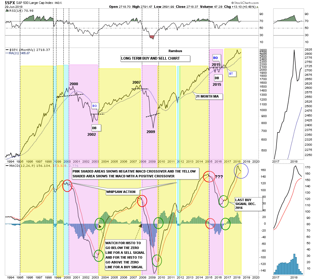
These next two long term monthly chart for the SPX I use for long term buy and sell signals and are easy to follow. This first chart uses the MACD and histogram for long term buy and sell signals. The sell signal becomes effective when the faster black line moves below the slower red line while the MACD, blue bars, trades below the zero line and just the opposite for buy signals. The buy or sell signal is only generated on a monthly close. Note how close the red and black lines are to each other while the MACD is currently at 2.776. A sell signal won’t be in place until we see how these indictors close at the end of July. The blue shaded areas shows where there were a few short term whipsaws.
In regards to the SPX chart on top note how smooth the monthly price action has been since the bottom in February of 2016 to our most recent high in January of 2018. Now compare the parabolic blowoff phase that began in 1995 and how choppy it was on a monthly closing basis. Even the 2007 bull market was much more choppy than our recent bull market out of the 2016 low. For the most part those previous bull market rallies into the 2000, 2007 tops and the 2015 correction produced higher highs and higher lows. The same can be said for the rally phase that began in 2009 to the correction in 2015. After the backtest to the double bottom trendline in February of 2016 we are experiencing the first sustained monthly dip in over two years which is pretty incredible when you think about it.
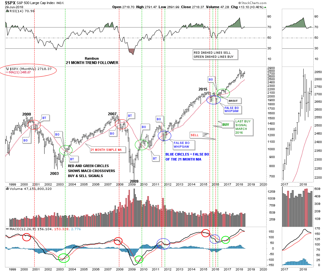
This second long term monthly buy and sell signals chart uses the simple 21 month moving average for its buy and sell signals. We’ve gone over this chart many times in the past, but I’ll give a quick summary for our new subscribers. Think of the 21 month simple moving average as a moving trendline, above is bullish and below is bearish. Just follow the price action and the 21 month sma beginning at the 2000 bull market top. Note how the 21 month sma reversed its role from support to resistance during the topping process in 2000, as shown by the red circle.
There was a one month whipsaw in 2011 which was quickly reversed when the price action closed back above the 21 month sma the next month. That buy signal stayed enforced until the correction in 2014 – 2015 where we saw two whipsaws before the correction was finished, blue circles. The current buy signal has been in play since March of 2016 well over two years now. Currently the SPX will have to close the month of July below 2495, which is still rising, to give a sell signal. Note the spike below the 21 month sma during the month of the BREXIT vote. A sell signal wasn’t generated because the SPX reversed direction and closed that month above the 21 month sma.
The bottom line is that we could get a sell signal at the end of July and that would strongly suggest the bull market may be over. We’ll be looking at individual sectors and markets for clues to help guide us through these choppy waters. Emotions are our toughest enemy when it comes to trading the markets. Hopefully these charts above will help ease the emotional stress that the markets can bestow upon us. If we get the sell signals I will have no problem at going short, but for the time being I’m looking at short term opportunities both on the long and short side. Happy Canada Day for all our Canadian friends. All the best…Rambus
GLD Update…
Just a quick update on a couple of GLD charts we’ve been following. This first chart is the 2 year daily chart which shows the bearish rising wedge. If you recall GLD was doing a ping pong move between the bottom rail of the bearish rising wedge and the S&R line at the 124 area. There was a big breakout gap without a backtest so far. We discussed how similar the 2016 top was to the 2018 top. After the initial drop in 2016 there was a rally that backtested the S&R line which produced the right shoulder of a H&S top and then the real decline began. I can’t rule out a backtest to the underside of the bottom rail of the bearish rising wedge at some point. The importance of this chart was to show the potential bearishness for GLD.

And then there was that much bigger 2 1/2 year triangle consolidation pattern that broke out to the downside three weeks ago already. Again, it’s still possible we could get a backtest to the bottom rail of the 2 1/2 year triangle which would come in around the 124 area.
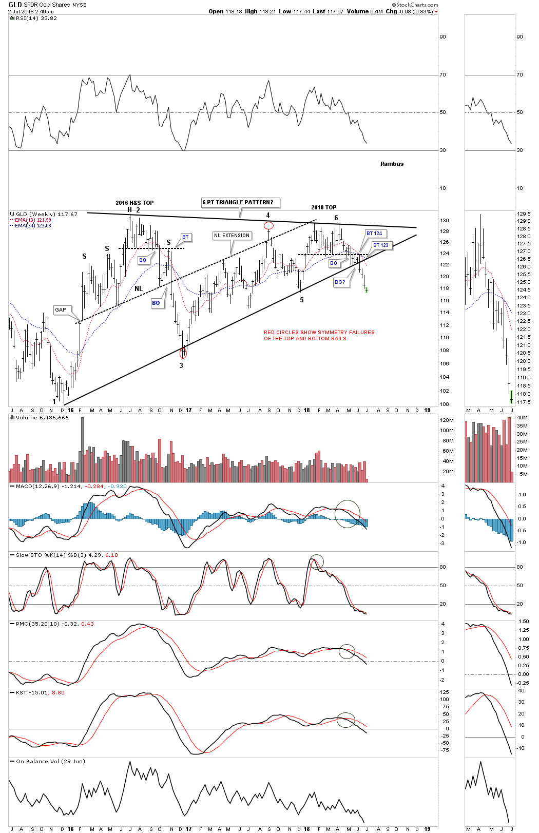
This long term monthly chart puts the 2 1/2 year triangle in perspective. As you can see there are six reversal points which makes this triangle a consolidation pattern to the downside.

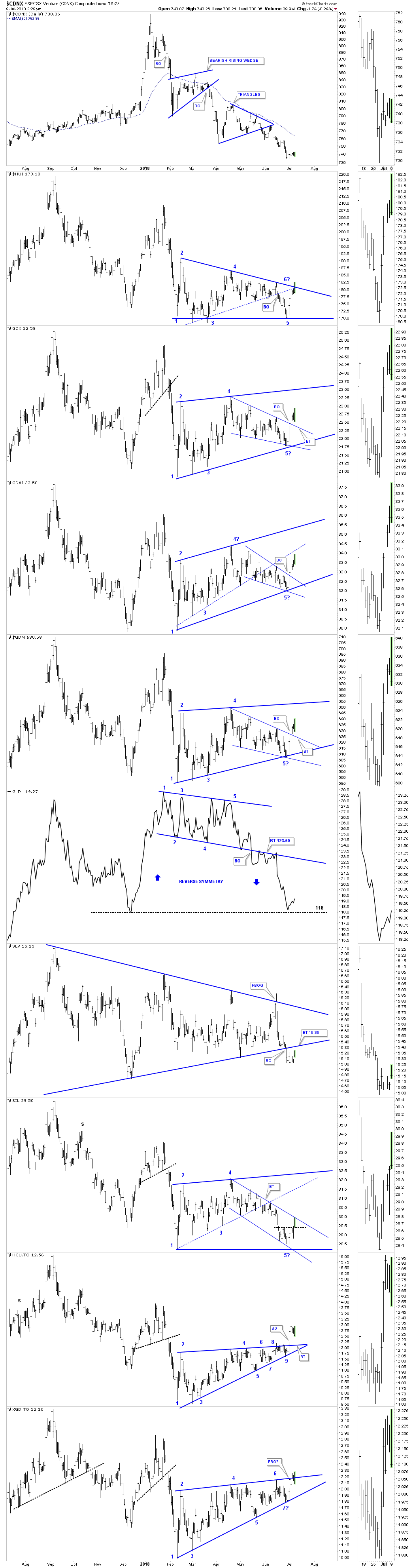
PM Combo Chart Update…
Last week several of the PM stock indexes GDX, GDM and GDXJ broke out from a falling wedge inside of their bigger February trading range. It now looks like a possible backtest maybe underway to the top rail. GLD is still bouncing off it previous lows while SLV is still in the process of backtesting the bottom rail of its triangle formation. Note the false breakout above the top rail about three weeks ago. The HGU.TO is probably showing the most strength right now. The XGD.TO broke out above the top rail of its 7 pt rising wedge last week but that breakout has been negated for the time being as the price action has slipped back into the rising wedge.
Measured Moves…
There are only three things a stock can do. It can build out a reversal pattern, consolidation pattern or be in an impulse move. It sounds simple and easy enough, but reversal and consolidation patterns can be tough to figure out until they eventually have to show their hand. These three types of patterns can buildout on short term minute charts all the way up to the Long term monthly charts.
It’s all relative. If you find a reversal pattern on a minute or hourly chart then you can expect the impulse move to be somewhat relative to the reversal pattern. When you find a reversal pattern on a monthly chart then you can expect the impulse move to be much bigger. It’s the relative size of these patterns that determines if one is a day to short term trader, intermediate term trader or a long term trader. It’s important to understand what type of trader you are so you can focus on the appropriate charts.
Since we are looking at long term charts lets look at some measured moves in some of the US stock markets. Please understand that a measured move isn’t a perfect science as is the case with anything related to the markets. A measured move will generally get you close to the price objective while other times the measured move can be a little short or to high, but it gives you something to watch for, understanding that the stock you’re following is in an impulse move.
Many Chartists have their own way of measuring a measured move, but I have three ways I like to measure for a price objective. I have what I call the breakout to breakout measured move, an impulse measured move and on occasions one can use the width of the mouth of a triangle or the width of a rectangle.
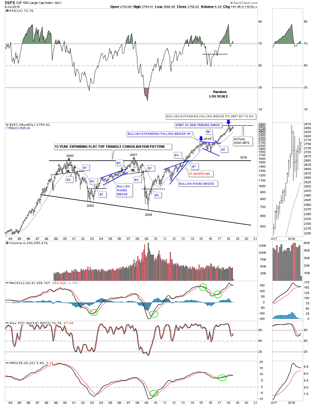
Lets start with a 25 year monthly chart for the SPX which shows a perfect example of a breakout to breakout measured move price objective. A breakout to breakout method starts with the breakout from the previous pattern, in this case the 13 year flat top expanding triangle consolidation pattern. We start the breakout to breakout method when the SPX broke out above the top rail of the flat top expanding triangle in 2013. That is where you begin your first measurement from. Once that impulse move is finished and you begin to see a consolidation pattern start building you take the distance from the breakout point on the flat top triangle to the first reversal point in the new consolidation pattern, the bullish expanding falling wedge, lower blue arrow.
After the consolidation pattern is finished building out you then add the distance of the previous impulse move to the breakout from the bullish expanding falling wedge to get your price objective. As you can see the price objective for the complete measured move starting with the breakout from the 13 year flat top expanding triangle was up to 2857. The actual high was 2872. That told us we should expect to see the next consolidation phase take hold and because this is a long term monthly chart the consolidation pattern will most likely take at least a year or longer of consolidating that last impulse leg up. Big patterns lead to big moves.
It took the blue bullish expanding falling wedge to correct the first leg up out of the 13 year flat top expanding triangle which is why I call these patterns halfway patterns as they tend to form between two impulse moves. We are currently only in month number six of our current consolidation phase which is correcting the impulse leg out of the blue expanding falling wedge. This secular bull market that began at the 2009 crash low has completed two consolidation patterns so far with the possible third one under construction.

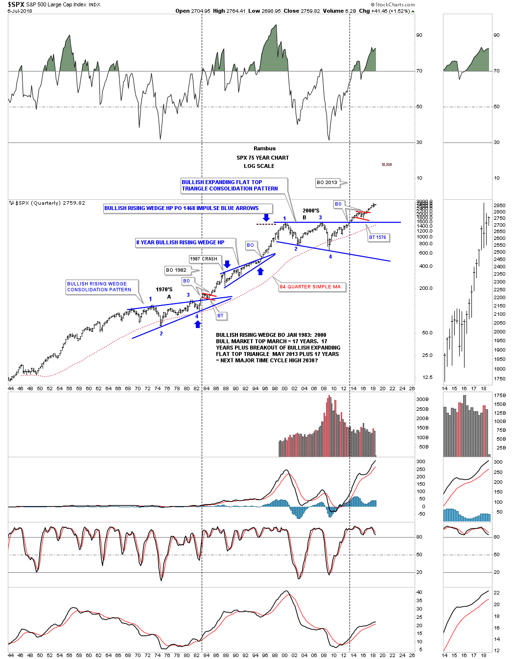
This next long term 75 year quarterly chart for the SPX shows you a good example of the impulse measuring technique. Instead of starting the measurement from the breakout point on a consolidation pattern the impulse move measurement starts at the last reversal point in the previous consolidation pattern which is where the actual impulse move begins, usually the 4th or 6th reversal point. You start the measured move from the last reversal point in the blue bullish rising wedge at reversal point #4 in 1982, to the first reversal point in the eight year bullish rising wedge that ended at the beginning of the 1987 crash. When the SPX finally completed that eight year bullish rising wedge we can then take the original impulse leg from 1982 to the 1987 high and add that distance to the last reversal point in the eight year bullish rising wedge which gave us a price objective up to 1468 which began the 13 year flat top expanding triangle consolidation pattern.

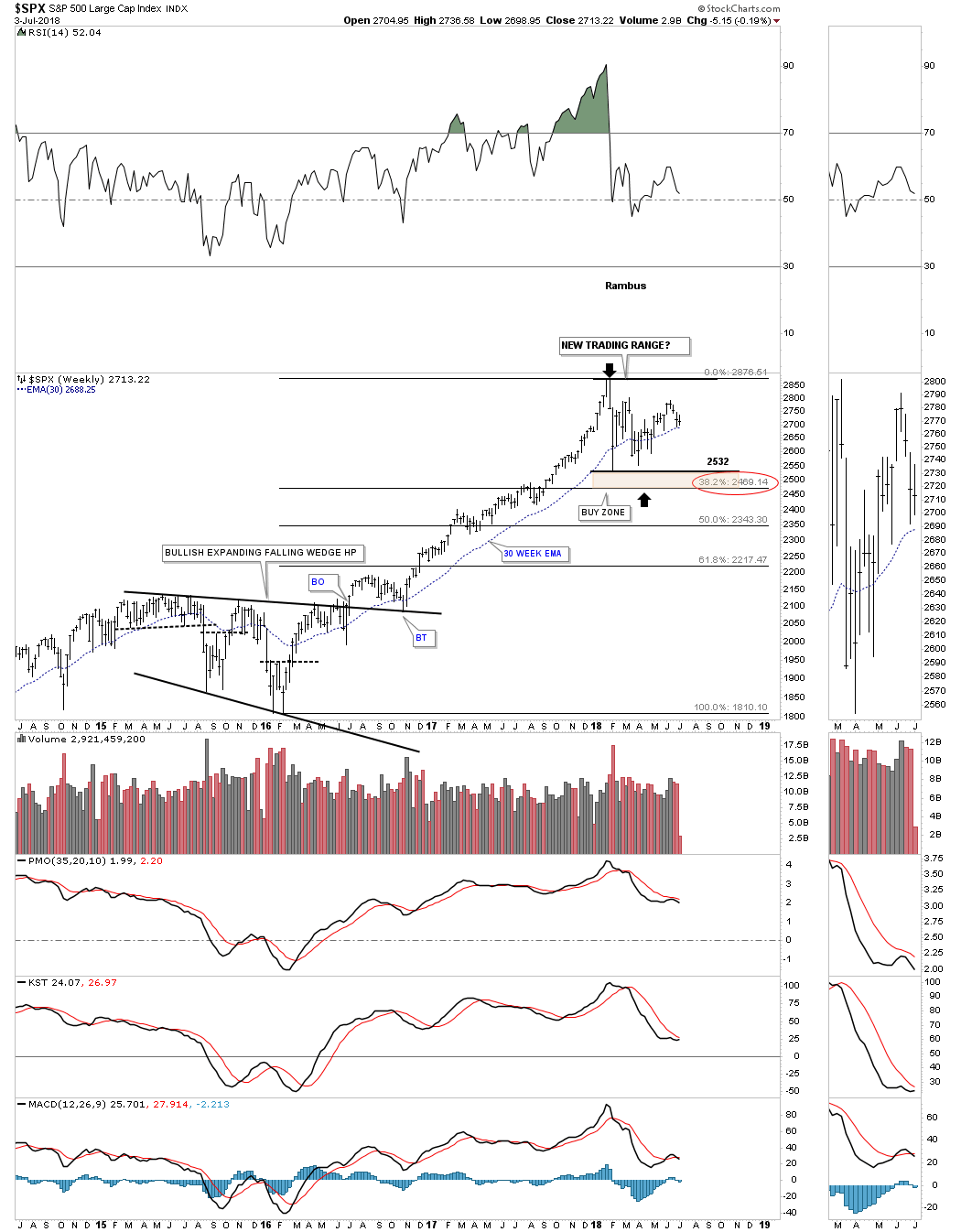
It’s hard to see the current trading range on these very long term charts above so below is a four year weekly chart for the SPX which starts with the expanding falling wedge to the recent high. When we got that significant bounce off the 2532 low I was then able to suggest that we could start building out the next consolidation pattern in the on going secular bull market. It’s still way to early to know yet what type of consolidation pattern may build as we only have one confirmed reversal point off of the all time high.
Put yourself into the 2016 bullish expanding falling wedge halfway consolation pattern and you can begin to see how difficult it’s to predict each and every turn. What we can do though is recognize the potential top and bottom boundaries that should hold support and resistance, give or take a few points. Since we know the SPX completed a two year impulse leg up there are only two possible outcomes. First, and what I expect, is for some type consolidation pattern to build out correcting the last two year bull market leg. The second thing that could happen is a top of some kind develops which will end the secular bull market that began at the 2009 crash low. Since we are in a secular bull market the odds favor an upside breakout until proven otherwise. The trend is our friend. If the SPX can trade down to the brown shaded support zone I would consider that area to be a low risk entry point in the ongoing bull market. The market won’t make it easy for us, but that is the nature of the game we choose to play.
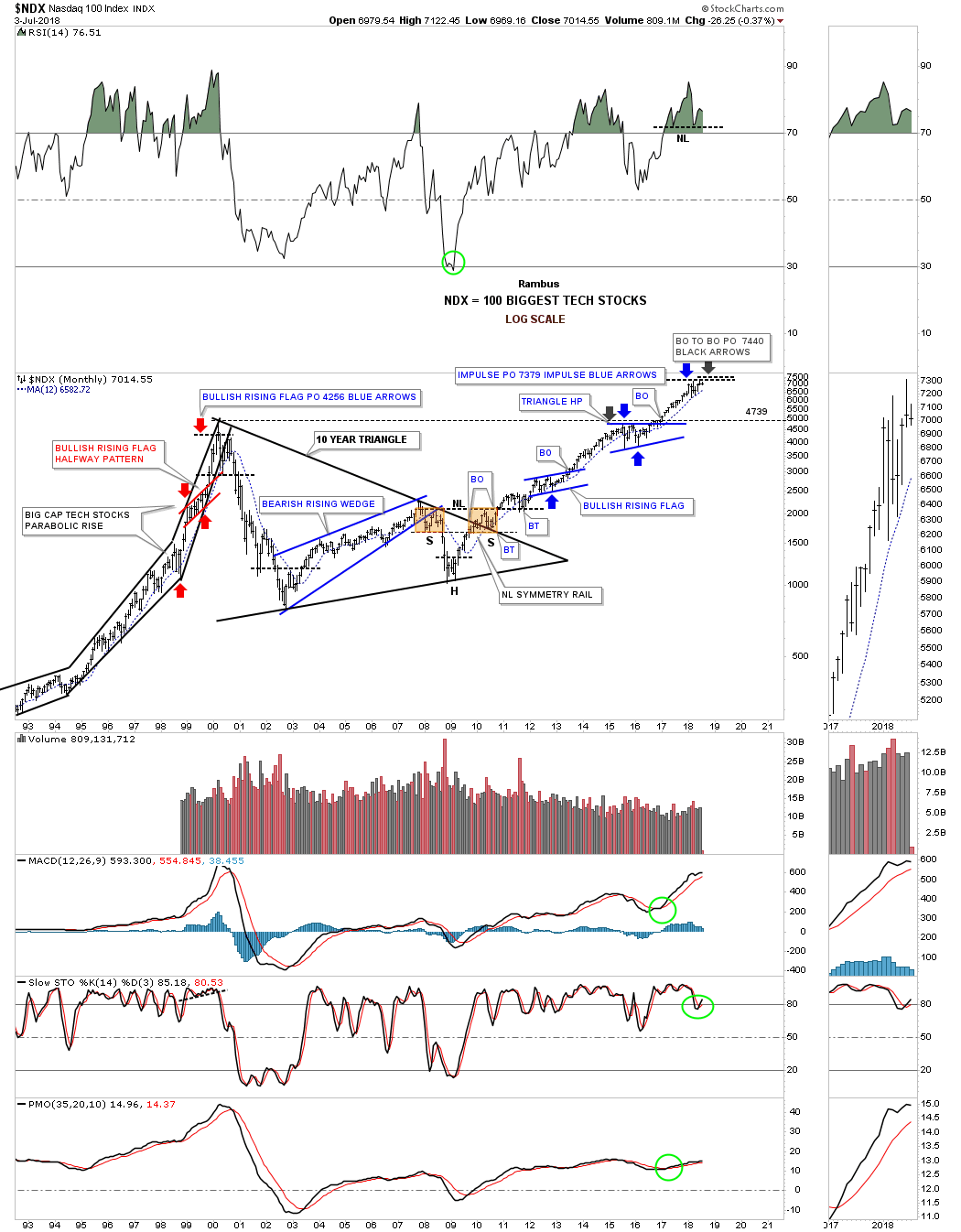
Next lets look at the 25 year monthly chart for the NDX 100 which uses both measuring techniques to reach our current top. Starting with the breakout to breakout method we can measure from the breakout point on the blue bullish rising flag in 2013 to the first reversal point in the triangle halfway pattern that formed just below the all time highs at that time. When we add that measurement to the to the breakout point from the blue triangle halfway pattern we get a price objective up to 7470, black arrow.
The impulse method starts its measurement from the last reversal point in the blue bullish rising flag to the first reversal point in the blue triangle halfway pattern. You then take that measurement and add it to the last reversal point in the blue triangle which gave us a price objective up to 7379 as shown by the blue arrows.
Note the impulse measured move that started in1998 to the secular bull market top in 2000 as shown by the red arrows. When that price objective was met in 2000 at 4256 there was no way to know at that time if the SPX would begin the next consolidation phase or begin building out or a reversal pattern. As it turned out the 2000 high was the major top that wasn’t broken until January of 2017. It took that 10 year triangle consolidation pattern to correct that pervious secular bull market. That very symmetrical H&S bottom at the fourth reversal point in the 10 year triangle strongly suggested the bear market was over and a bull market of some duration was upon us.
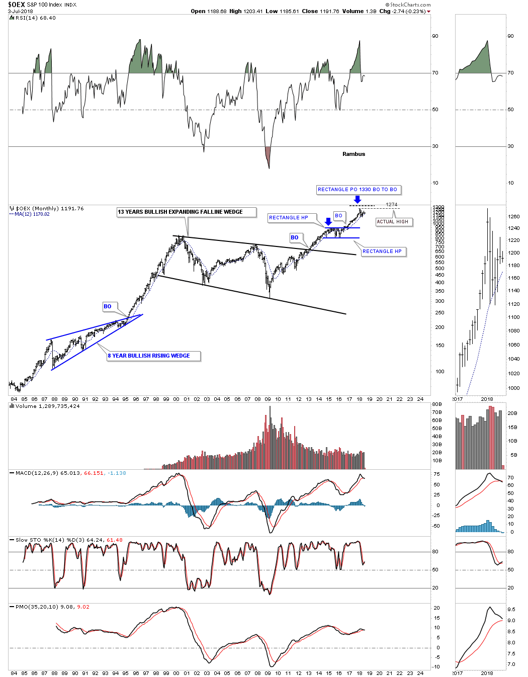
Next we have a 35 year monthly chart for the $OEX 100 which shows its breakout to breakout price objective up to our current high at 1330 based on the blue rectangle consolidation pattern halfway pattern. The actual high was 1274. Again 2013 marked an important breakout for many of the very large consolidation patterns that consolidated the previous secular bull market.
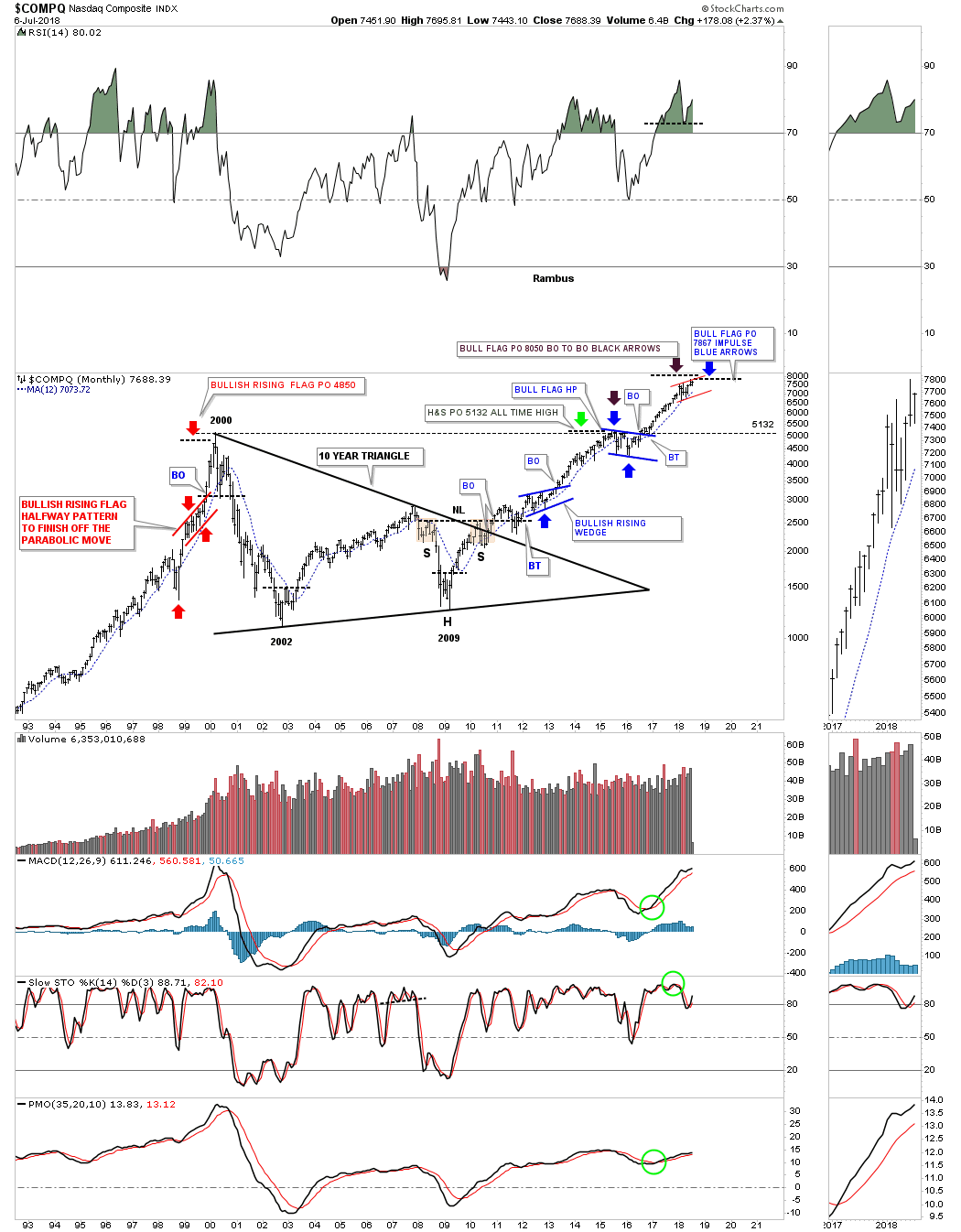
Lets look at one last long term chart for the $COMPQ which has a lot of nice Chartology on it. Starting on the left hand side of the chart you can see the red bullish rising flag halfway pattern that showed a price objective up to the 4850 area which was just shy of its all time high back then at 5132, as shown by the red arrows. That price objective didn’t tell us the bull market would be over, but it did tells us to expect a correction at a minimum or a possible top of some kind.
Next lets look at the 2009 H&S bottom which eneded up being the fourth reversal point in that 10 year triangle consolidation pattern. A H&S pattern is measured from the bottom of the head if it is an inverted H&S bottom, straight up to the neckline. You then take that measurement and add it to the breakout point on the neckline to get a minimum price objective. In this case the H&S bottom had a price objective up to the previous all time high which was 5132 as shown by the green arrow.
Using the blue flag that formed just below the all time high at 5132 as a halfway pattern we got an impulse price objective up to 7867 as shown by the blue arrows. The breakout to breakout method gave us a price objective up to 8050 as shown by the black arrows. By putting those two different measured moves together it gave us a place to look for that two year rally, beginning in February of 2016 to January of 2018, to finally start showing some exhaustion. So far that has been the case.

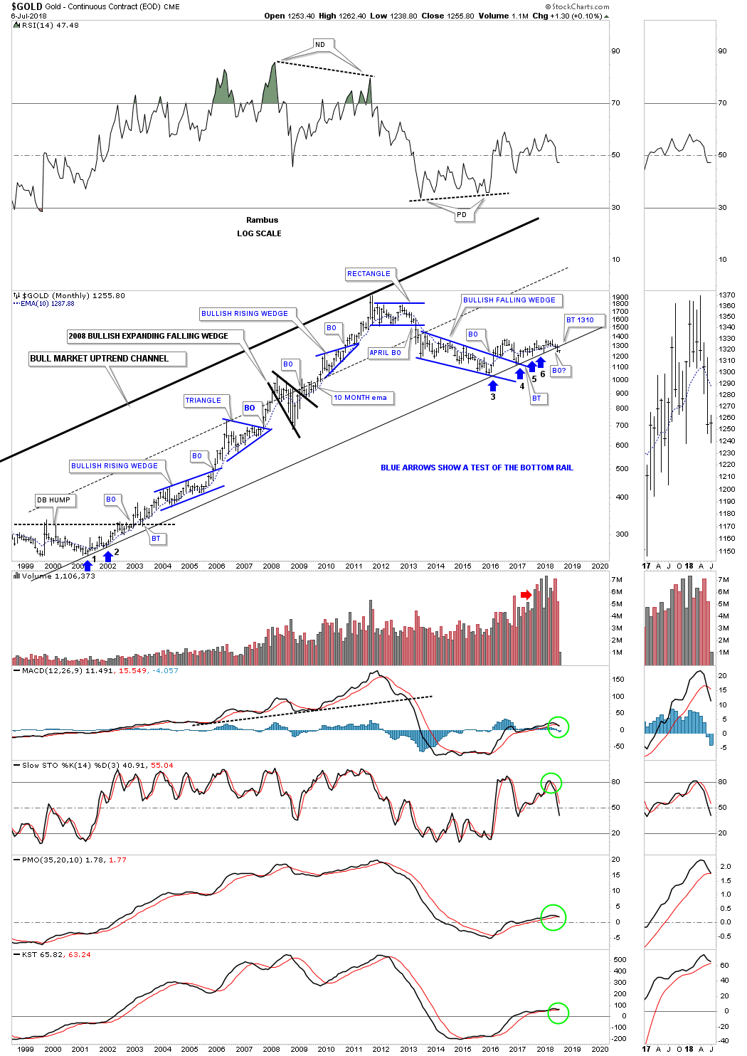
Below is a long term monthly chart for gold which shows all the big consolidation patterns that formed during its 10 year bull market. It shows you a good example of a consolidation phase followed by an impulse leg, rinse and repeat.
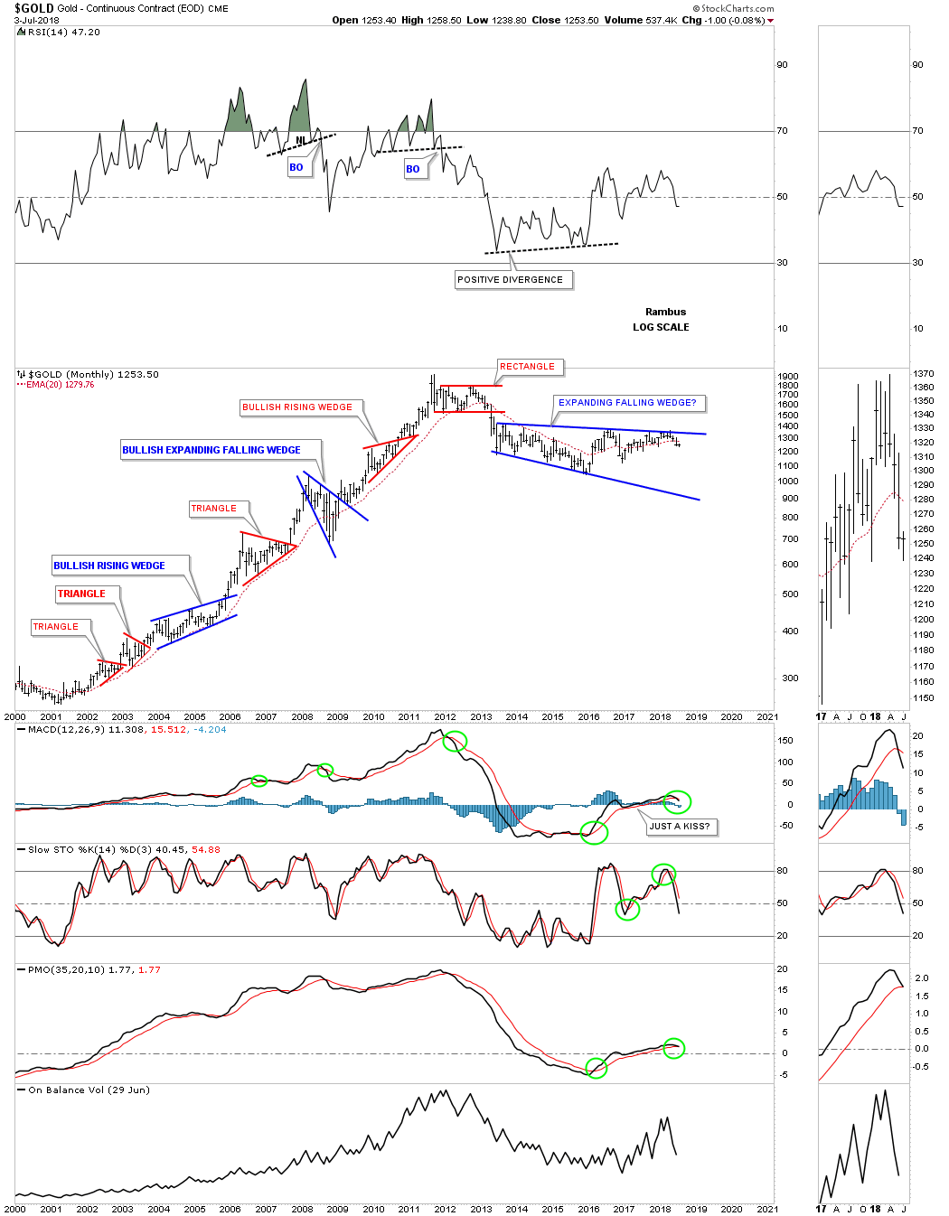
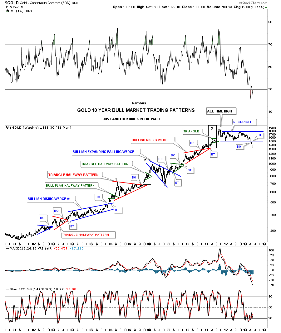
Its been a long time since I last posted this long term chart for gold which I used to call, Just Another Brick in the Wall. This chart has every chart pattern that gold made during its 10 year bull market. Many of the impulse moves out of the bigger consolidation patterns formed a small green triangle halfway pattern. The thin black rectangles labeled 1,2, and 3 are all exactly the same height and measured their respective measured moves. This chart is a good study in Chartology.
This last chart for measured moves shows some classic Chartology on the long term weekly chart for silver. On the left hand side of the chart you can see a H&S consolidation pattern that formed during the 2008 crash low which is very similar to the one gold built out during that time. There were three separate measured moves which gave us some good clues on how high the parabolic blowoff phase into the April 2011 top might go.
The H&S bottom had a price objective up to 45.50. The green arrows measures the impulse leg beginning at the fourth reversal point in the blue bullish rising wedge right shoulder using the red bullish rising flag as the halfway pattern. The red arrows measures the breakout to breakout price objective of the red bullish rising flag halfway pattern starting at the breakout point of the blue bullish rising wedge right shoulder. The brown area at the top shows where all three price objectives came into play. On the way down the blue arrows measured the blue rectangle as a halfway pattern with a price objective down to 18.39.
There is nothing magical about Chartology, it’s just learning to look in the right place at the right time for something to happen. Having an idea that you are working in a consolidation or reversal zone may keep you from taking on to big of a position. On the other hand if you know you are in an impulse move then you can backup the truck and take advantage of a strong one way move. I can tell you that an impulse move is much easier to trade than when the price action is chopping around building out a reversal or consolidation pattern.
I hope everyone has a great 4th of July. All the best…Rambus

World Stock Markets…
In this part of the Quarterly Report I would like to show you some of the long term monthly charts for some of the world stock markets we’ve been following for a long time now. It’s hard to believe that another quarter has just finished up and it’s mid summer already here in the states. The end of this quarter also marks the six month point of our most recent correction which began in January. It will be interesting to see how some these markets are holding up as a lot of investors are starting to doubt the validity of this secular bull market that began in 2009.
Most of these charts to follow are pretty self explanatory. It’s important to understand that the size of the consolidation pattern has a direct impact on the size of the rally that follows the breakout. Big patterns lead to big moves.
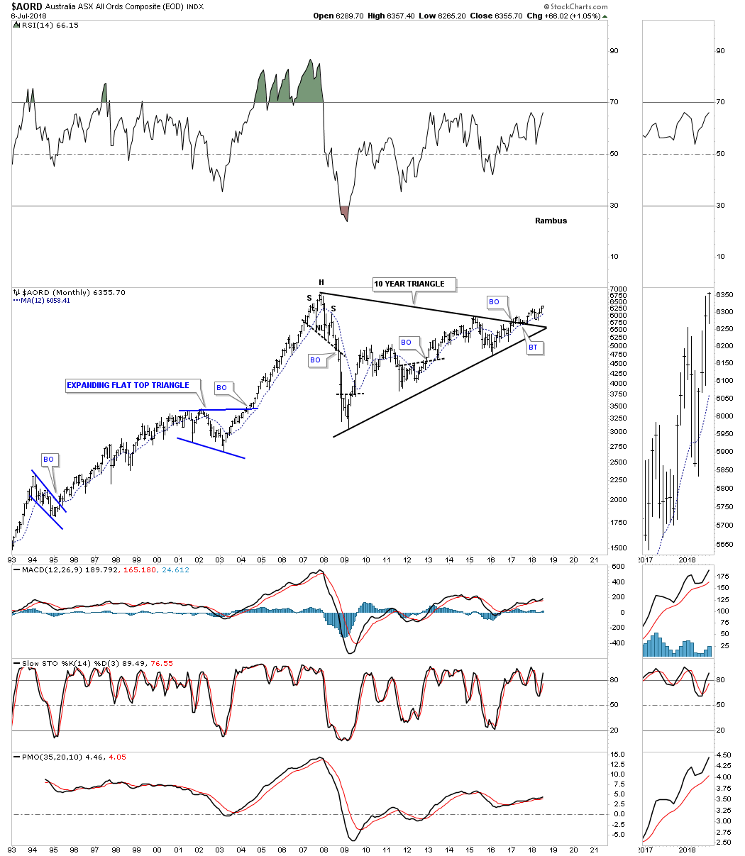
First up is the $AORD, Australian Stock market which broke out of its 10 year triangle consolidation pattern back in 2016, backtested the top rail and is now making a new high for its bull market. A move above its all time high made back in 2007 will be more confirmation that the secular bull market is still alive and well.
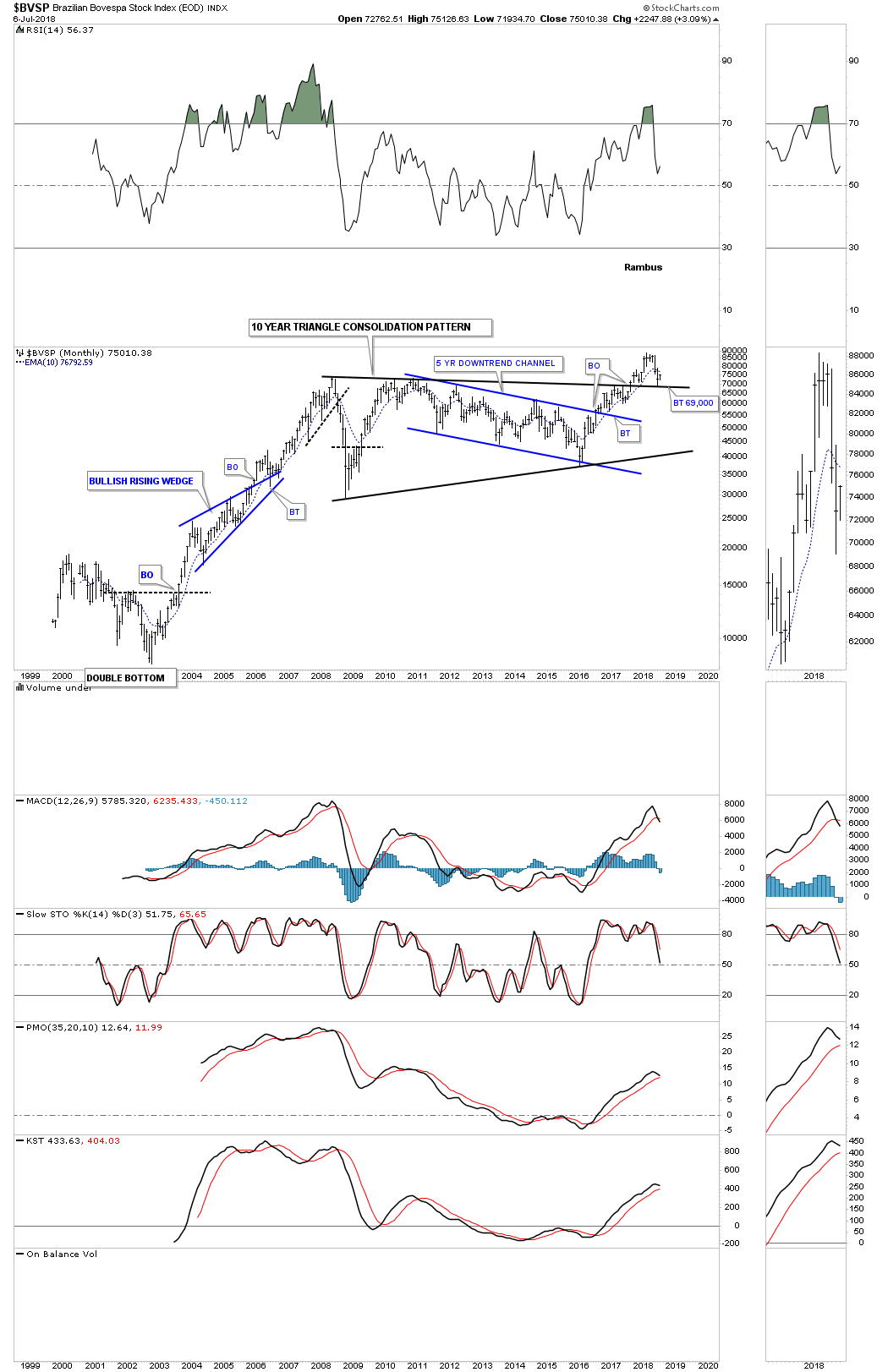
$BVSP broke out from its ten year triangle in 2017 and is currently backtesting the top rail.
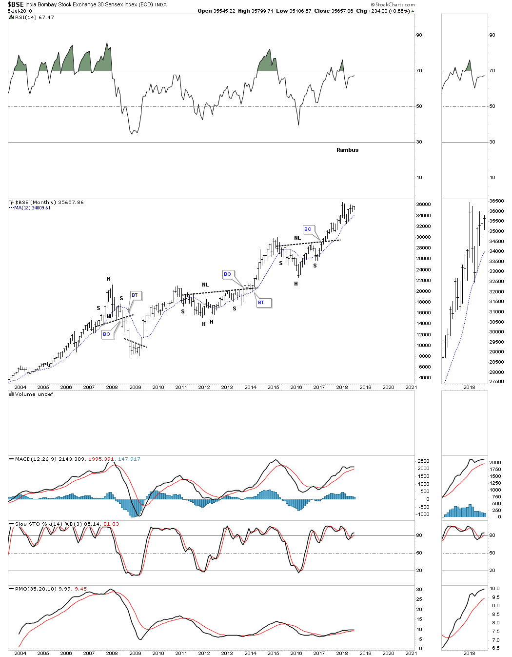
$BSE is one of the few world stock markets that doesn’t have a massive consolidation pattern. It just keeps forming one consolidation pattern on top of the previous one.
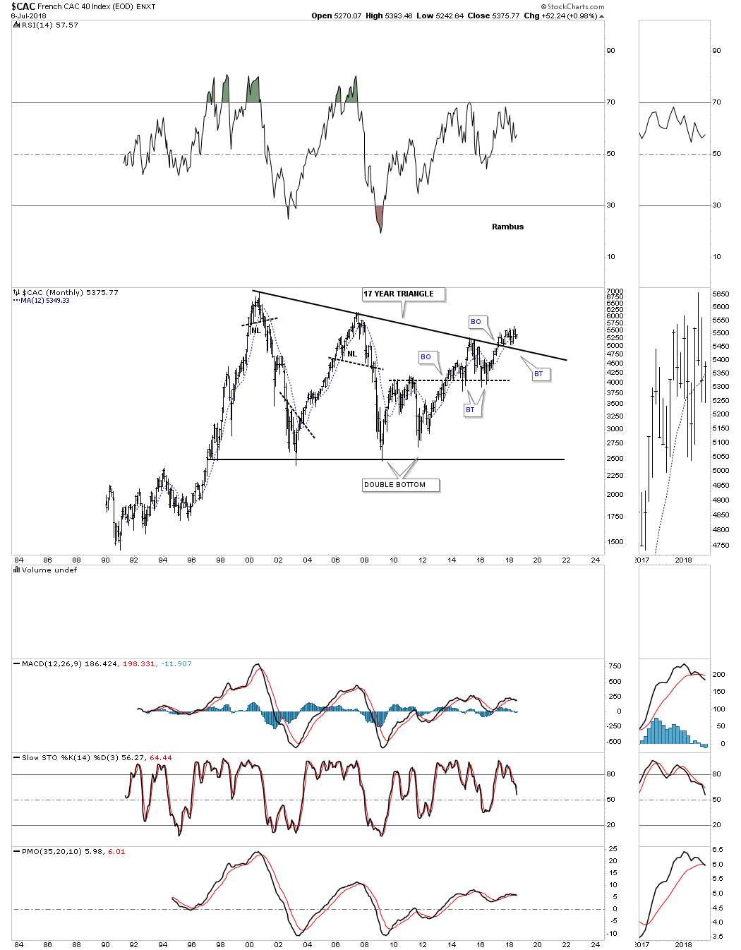
$CAC is still holding the breakout from its 17 year triangle consolidation pattern.
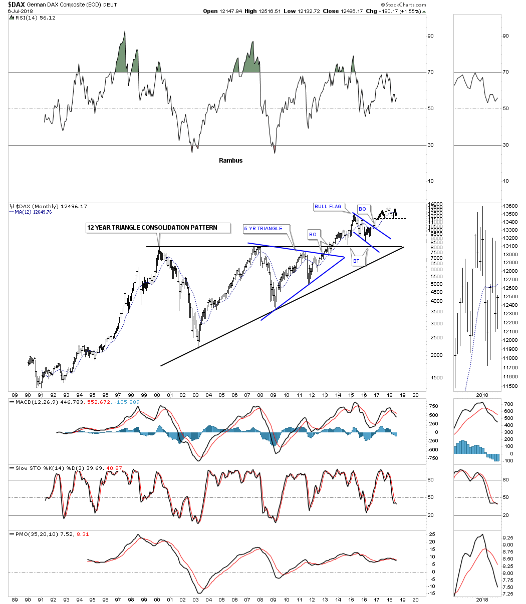
$DAX is an important stock market to keep a close eye on.
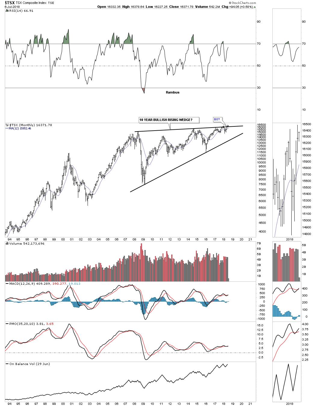
$TSX is still in the process of breaking out from its 10 year rising wedge formation.
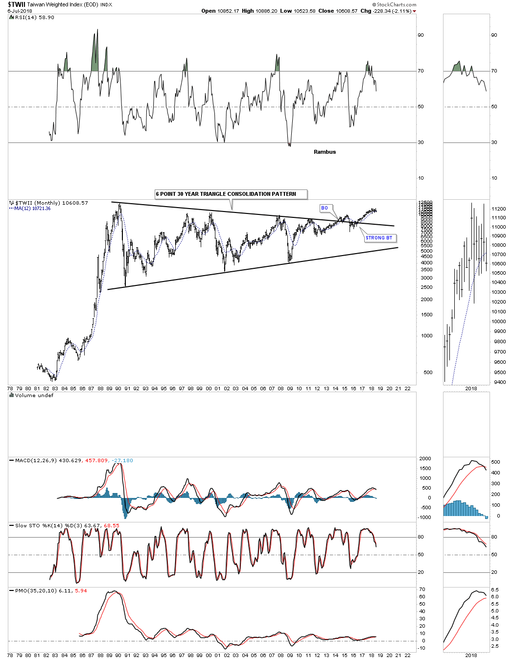
$TWII is still holding its breakout.
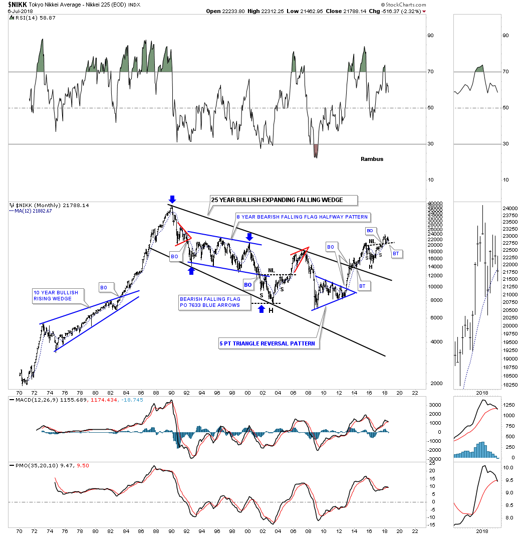
$NIKK still in backtest mode to its H&S neckline.
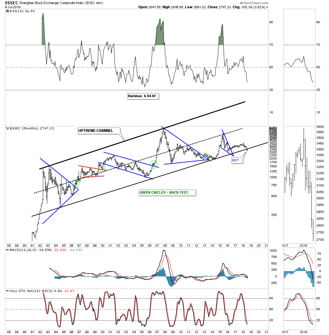
$SSEC is the problem child right now as it’s cracking the bottom rail of its 26 year uptrend channel.
Even the FXI, China large cap etf, has broken down below the top rail of its 10 year triangle.

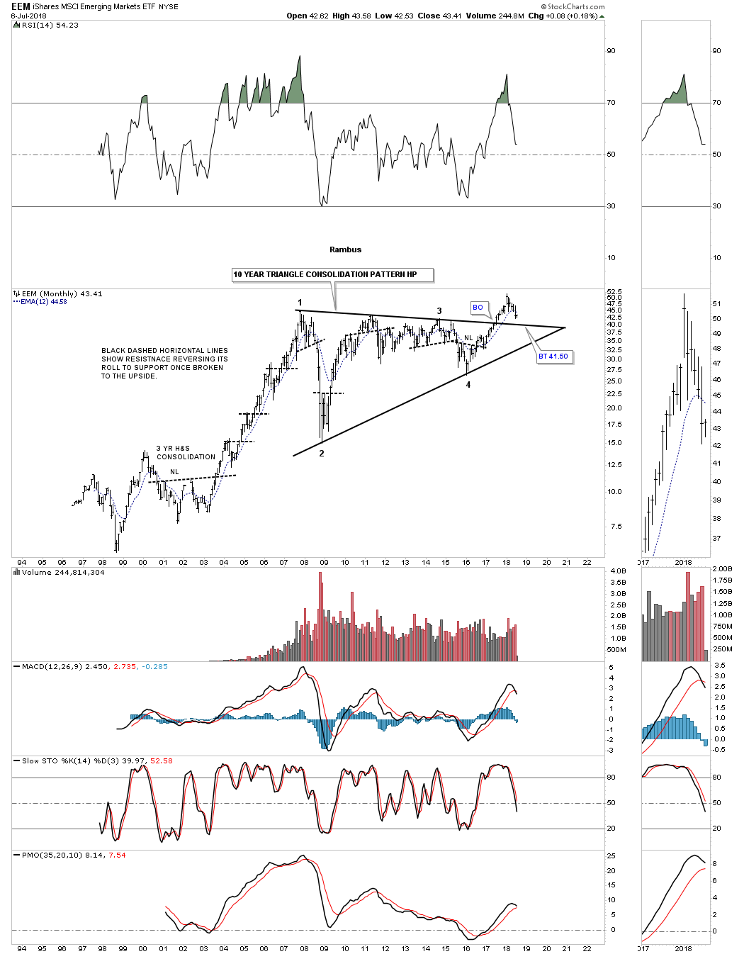
EEM looks like it’s in the process of backtesting the top rail of its 10 year triangle consolidation pattern.
VWO is another emerging markets etf which is backtesting the top rail of its trading range halfway pattern.

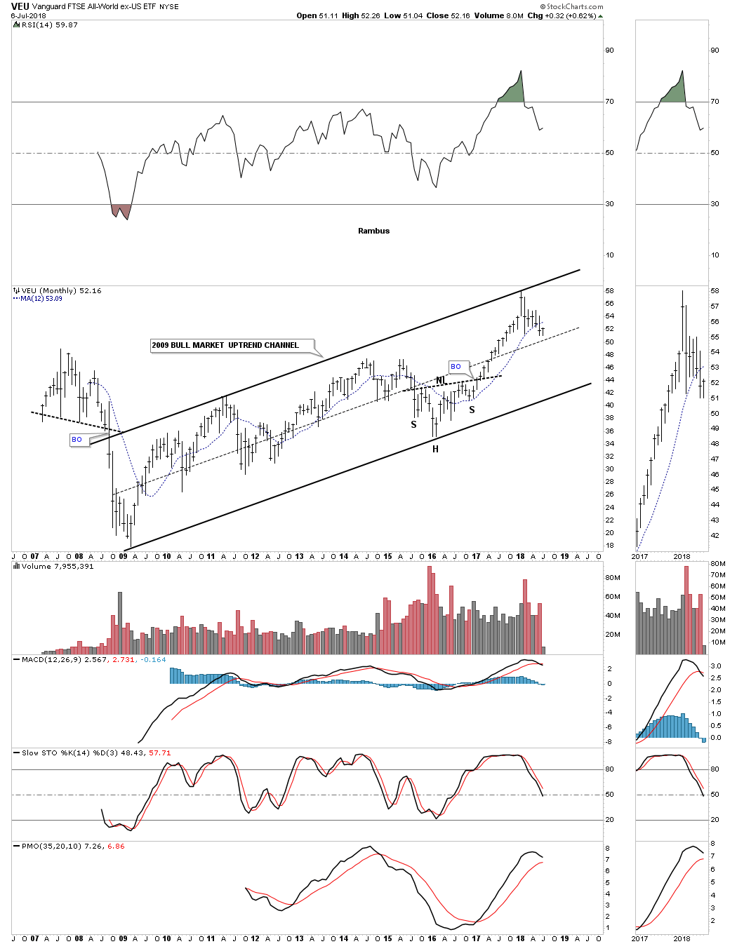
VEU is an all world stock market etf ex the US stock market and is trading in the middle of its 2009 bull market uptrend channel.
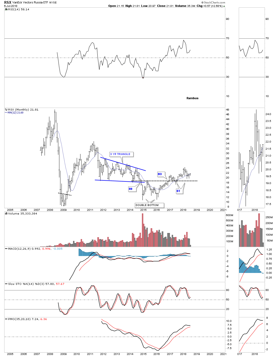
RSX is one of the weaker stock markets but it has been making higher highs and higher lows since the 2016 double bottom low.
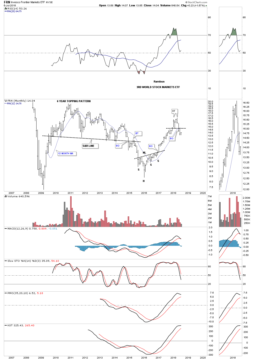
FRN third world stock market made a good run out of its 2016 low but may have put in a small double top formation.
Next I will post some of the US stock market indexes with some of them we’ve already discussed earlier in this report.
$COMPQ is trading close to its all time highs.
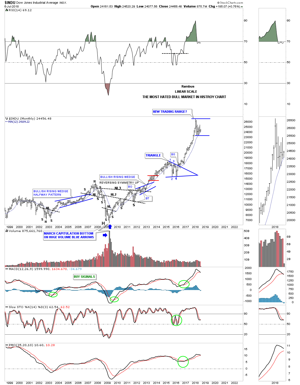
INDU most hated bull market in history chart.
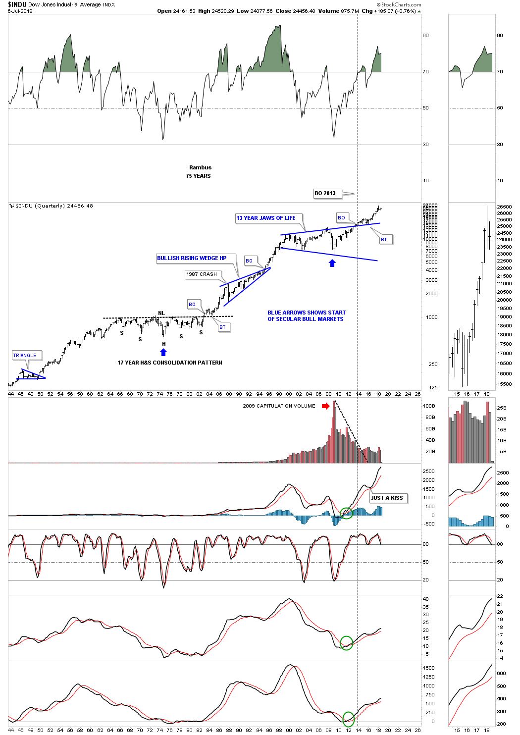
INDU 75 year quarterly chart.
$NYA 10 year rising wedge.
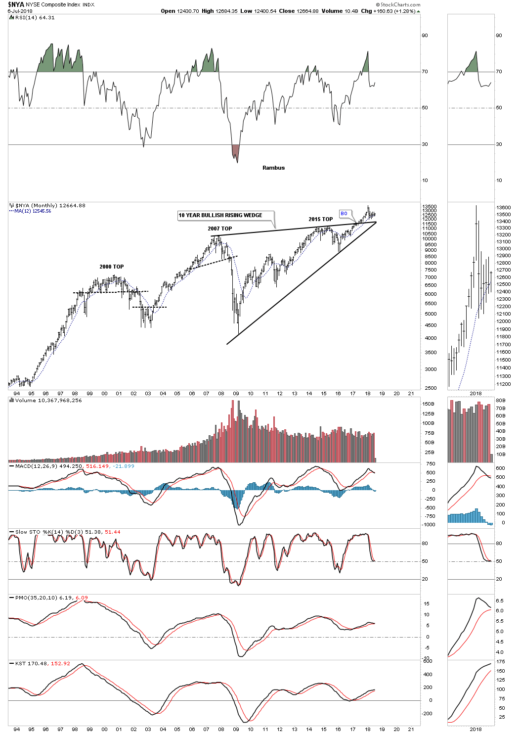
$NYA massive fractal H&S consolidation pattern.

$OEX 100.

$RUT is one of the hottest areas in the markets right now.
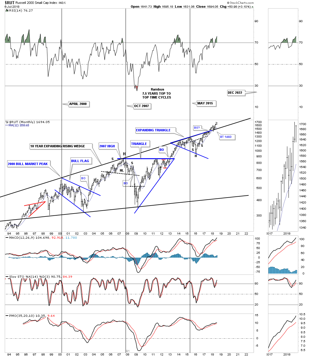
$RUT quarterly for a little clearer picture.

$XVG 2009 bull market uptrend channel.

$SPX 13 year flat top expanding triangle.
$SPX 75 year quarterly chart.
Transportation Average monthly.
![]()
Transportation Average 100 year quarterly.
![]()
Different Sectors Within the Markets…
This is where we find out which areas within the markets have been doing the best or the worst. During a correction money tends to rotate from one area to another until each sector works on completing their consolidation phase. Some sectors will have a mild correction which is where the stronger stocks will be, while other sectors will experience a deeper correction which will shake a lot investors out of their shares.
How long these consolidation phases can last is one of the hardest things to figure out on the front end. Normally the bigger the impulse move the bigger the correction will be to consolidate those gains before the next leg up can begin. As we know there has to be at a minimum of four reversal points during the formation of a consolidation pattern. What can be hard on our patience is when there are six, eight or even more reversal points before the consolidation pattern is finally finished doing its job of confusing both the bulls and bears alike.
Please keep in mind when you look at these charts to follow that they are very long term monthly charts where change comes slowly, but change they do. Also when you look at these charts, if you can just clear your mind for a few minutes of any preconceived notions of what you think these different sectors should be doing vs what the charts are suggesting currently, might help in understanding the big picture a little bit better. There are no guarantees when it comes to the markets, but as long as an important trendline or pattern is in charge we have to accept what it is telling us until something important changes.
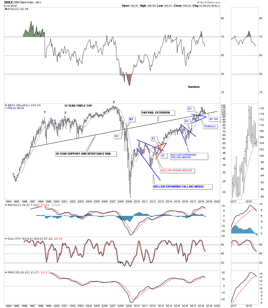
Lets start with the long term chart for the $BKX, bank index, which has been backtesting the 20 year support and resistance line for over a year now. The bullish setup on this chart is the small blue triangle that formed just below the S&R line in 2017. That S&R line is our line in the sand, above is bullish and below is bearish.
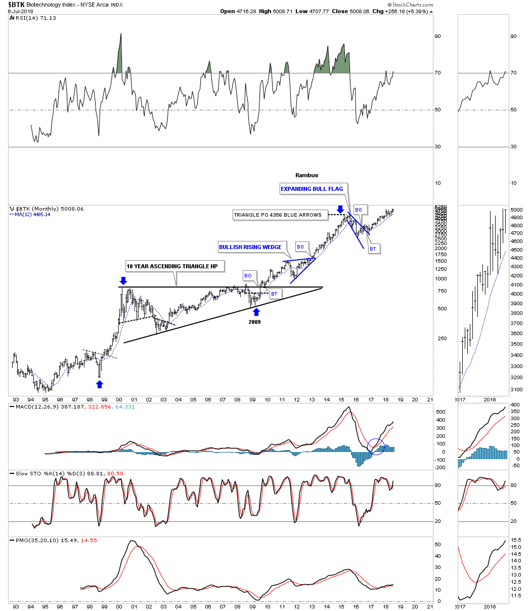
The $BTK, biotechnology sector is trading close to a new all time high.
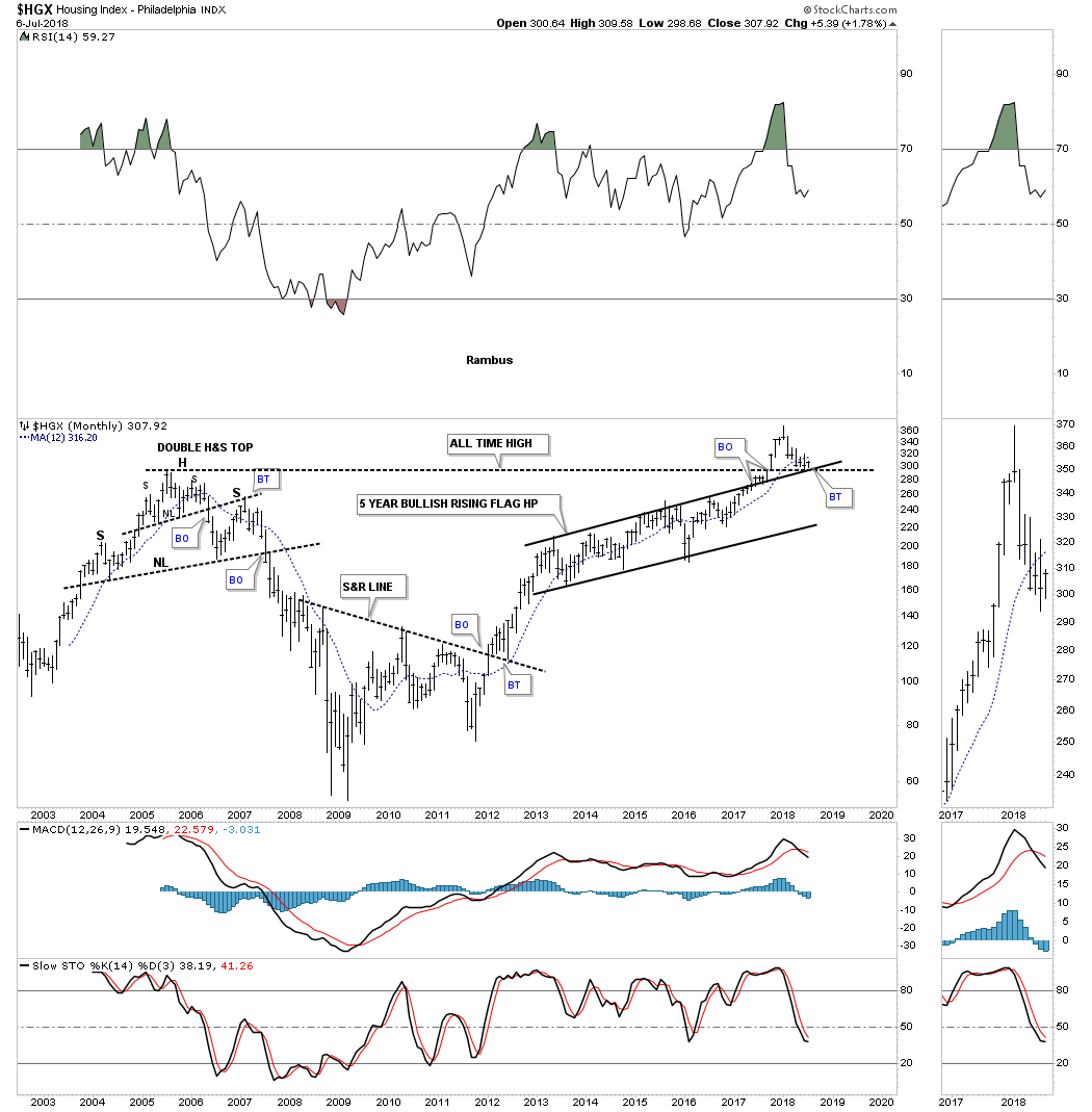
The $HGX, housing index, is an area where few believe has a chance to go higher. Important long term support is now being tested.
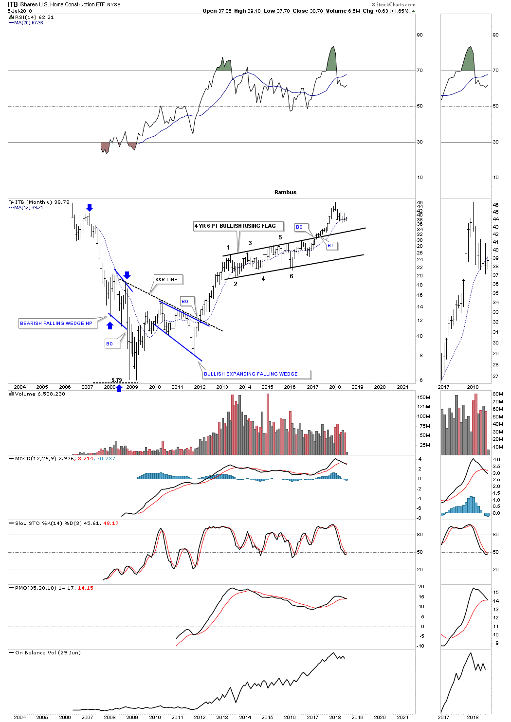
ITB home construction.
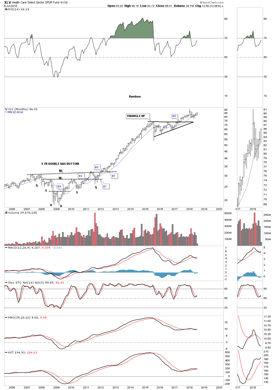
XLV healthcare.
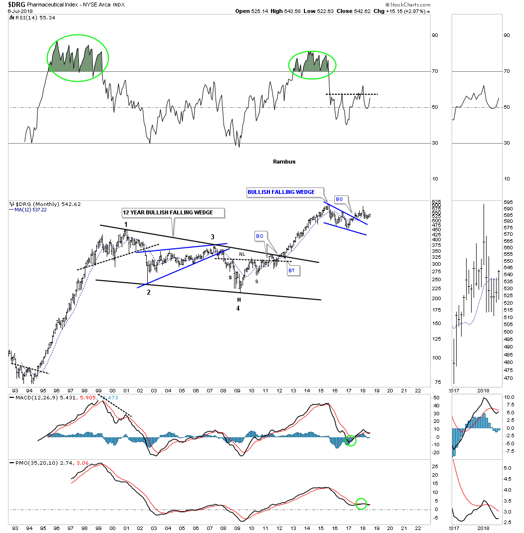
$DRG pharmaceuticals.
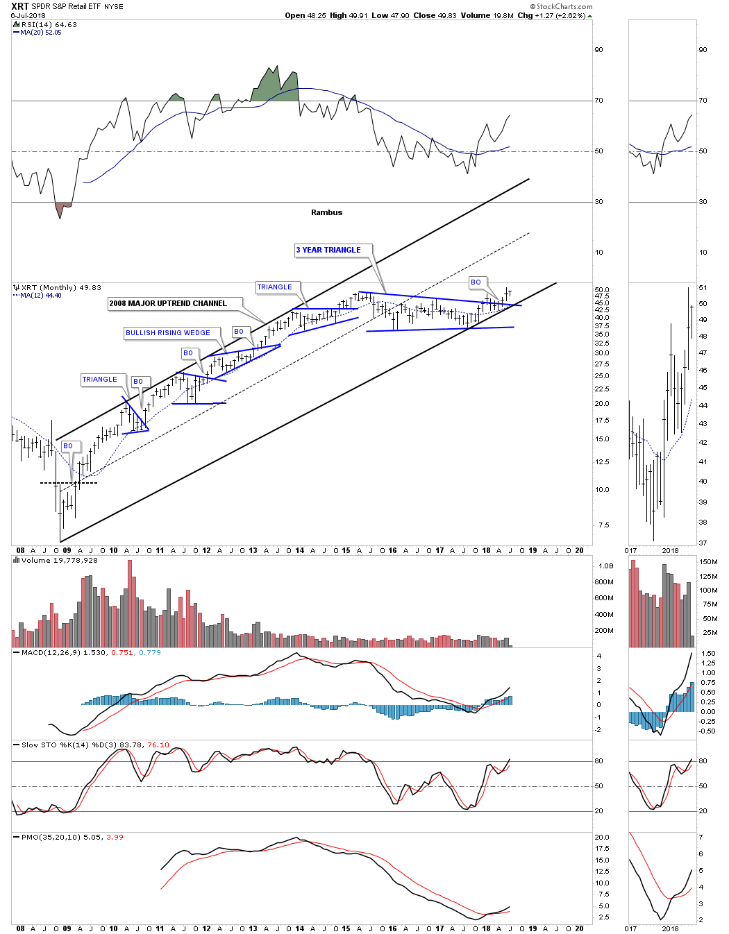
XRT, retail etf, is close to making a new all time high.
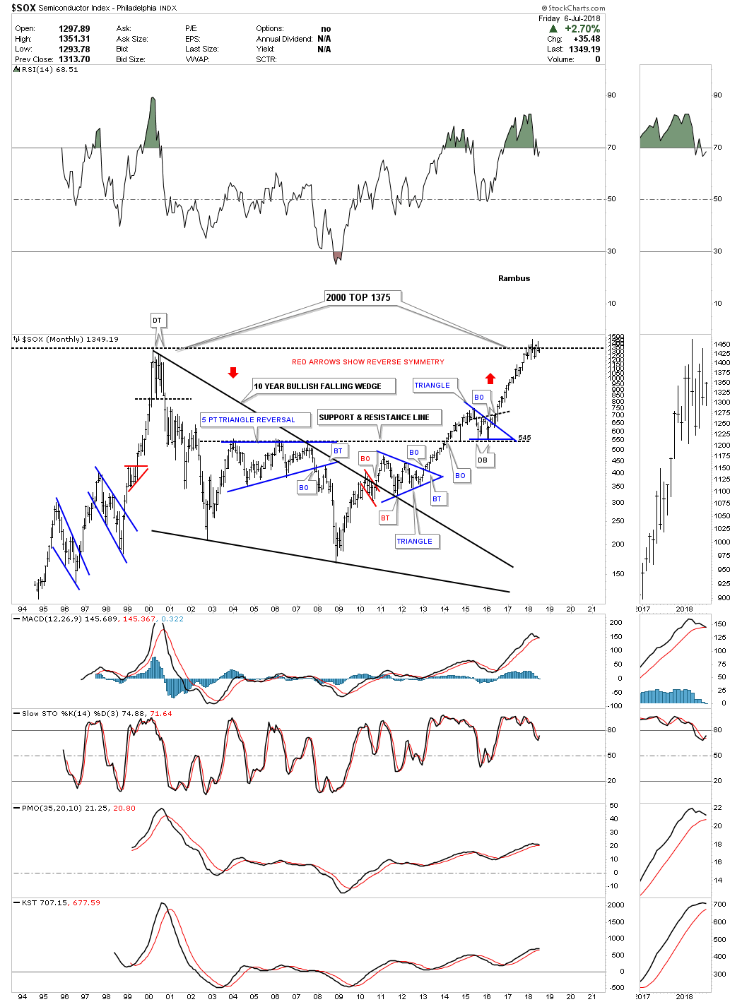
The $SOX, semiconductor index, has been building out a consolidation pattern right in the middle of its all time highs.
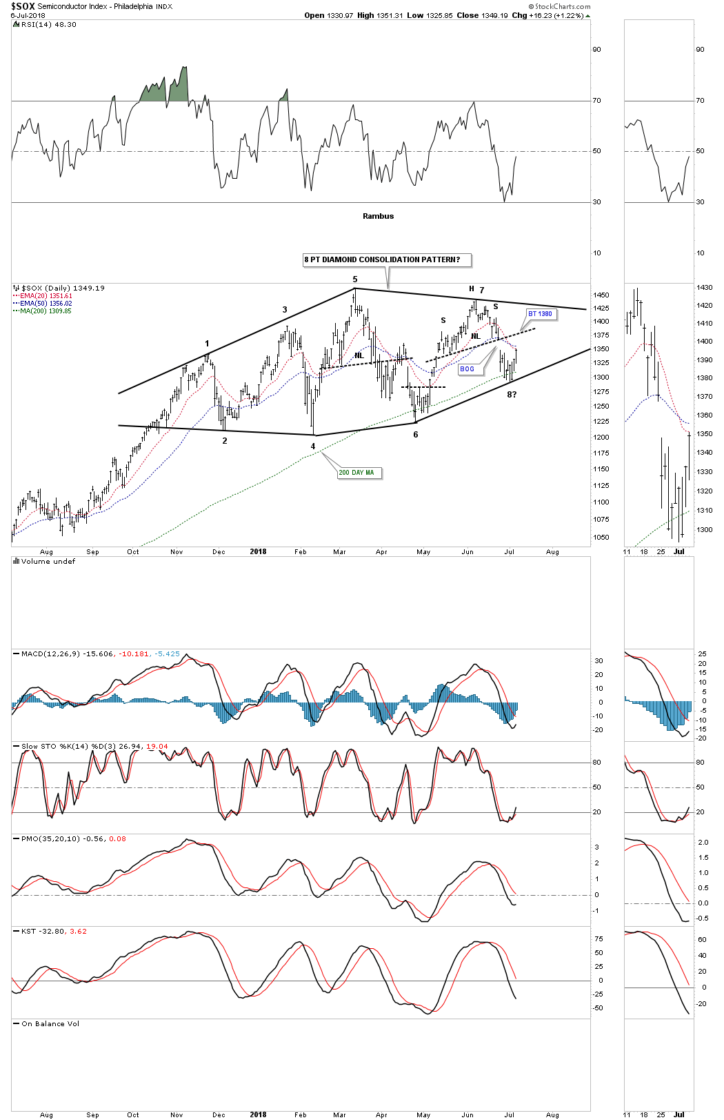
Below is a daily chart for the $SOX which shows what the potential trading range may be building out. This possible diamond pattern won’t be complete until the top rail is decisively broken to the upside. This chart also shows why it’s so hard to short in a bull market. I shorted the breakout from the small H&S top at the 7th reversal point only to cover it last Friday when the price action bounced off of possible reversal point #8. With the diamond still incomplete it still could be a 7 point diamond reversal pattern to the downside, so for the time being it’s better to be safe than sorry.
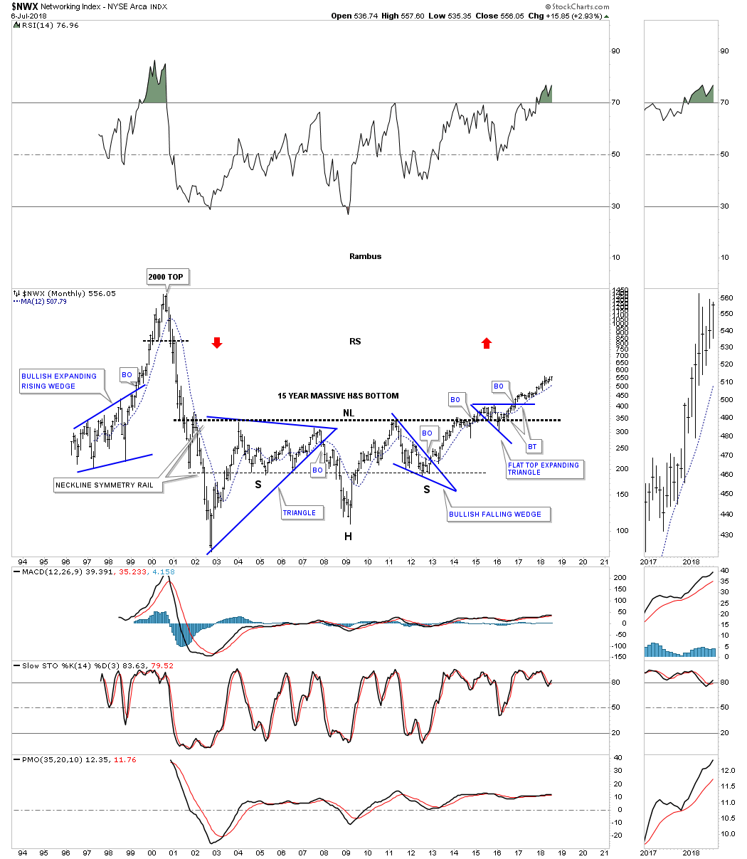
The $NWX, networking index, took almost three years of chopping around that massive neckline starting back in 2014 before all the work was finished and the bull market could begin. This was one of the hottest sectors toward the tail end of the tech bubble. It’s possible we could see some reverse symmetry to the upside. How the price action came down during the bear market is how the price action may reverse back up over that same area similar to what the $SOX did.
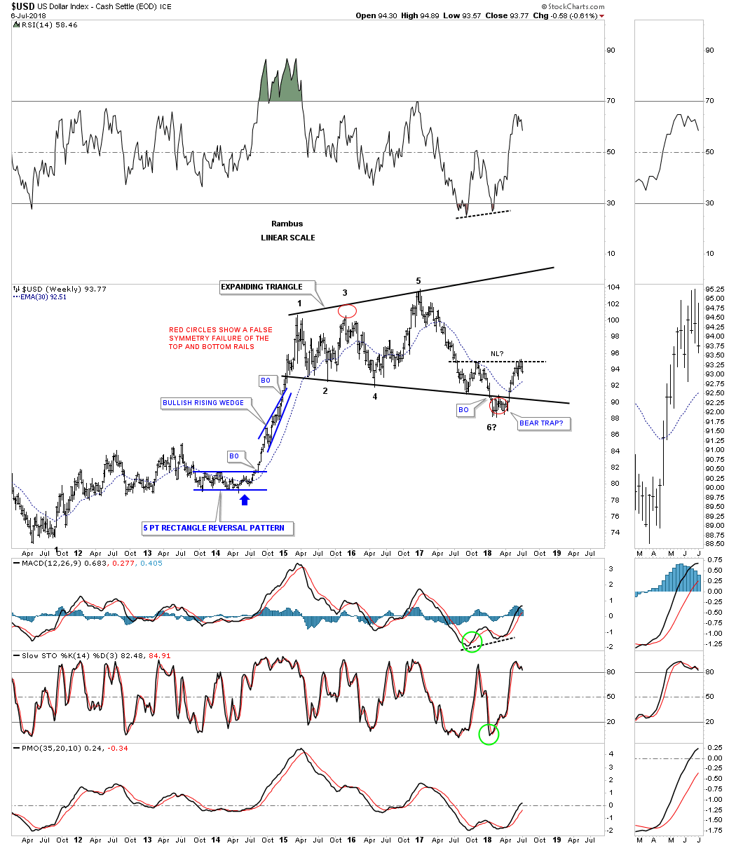
Next lets look at some currency charts starting with a long term monthly chart for the US Dollar. There are a lot of opposing opinions on the US dollar from crashing and burning to rallying very strongly based on what is happening around the world right now. At this point in time I’m still viewing the US dollar as being in a bull market until something significantly takes place. This monthly chart shows the two fractal bases which have been following each other closely.
The US dollar bottomed in 2011 and has been trending upwards since. The dollar began to correct that first impulse move in 2015 and has possibly finished its correction this year with a bear trap under the bottom rail of the expanding triangle. A break below the bottom rail of the uptrend channel will call into question the validity of the 2011 bull market, but for now the uptrend remains in place.

We’ve been following this quarterly chart for years now and had a good test of the top rail of the falling wedge during the last correction. It’s usually a bullish situation when you form a smaller consolidation pattern just above the top rail of an important trendline, in this case the 30 year falling wedge.

I’m going to throw in this weekly chart because this would be a good area for a H&S bottom to build out if indeed the US dollar is in a secular bull market. Symmetry would suggest the bottom for the right shoulder would come in around the 91 to 92 area.
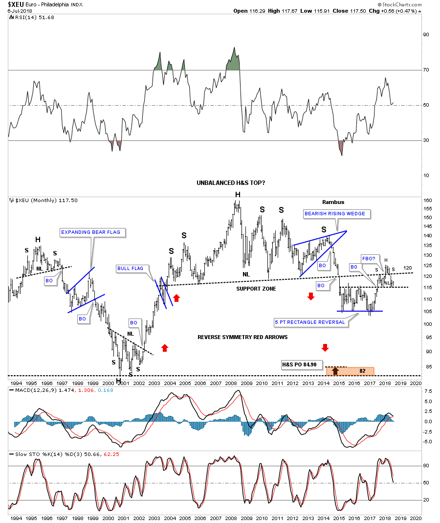
If the US dollar is going to be in a long term secular bull market then the $XEU would need to be in a secular bear market because the euro makes up the biggest part of the US dollar. The weekly chart above shows the potential H&S bottom building out on the US dollar so if that is the case then the $XEU will most likely be building out a H&S top. This long term monthly chart for the euro shows some nice Chartology starting with that massive H&S top. The neckline was breached in January of 2015. After a short decline the euro built out a 5 point rectangle reversal pattern which gave this currency the energy it needed to backtest the neckline. Just like the US dollar the euro produced a bull trap in this case, above the neckline which is currently the head portion of the H&S pattern. The euro is basically in no mans land right now between support above the top rail of the rectangle and the neckline of that massive H&S top.
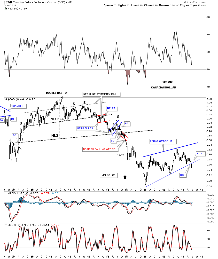
For a little more clarity I’m going to use a weekly chart for these next few currencies so you can see what is taking place at the bottom rail of their most recent consolidation pattern. The $CAD, Canadian dollar, is currently in backtest mode to the bottom rail of its 2 1/2 year rising wedge.
The same thing is happening with the $XAD, Australian dollar, as it has already backtested the bottom rail of its 2 1/2 year six point rising wedge formation.

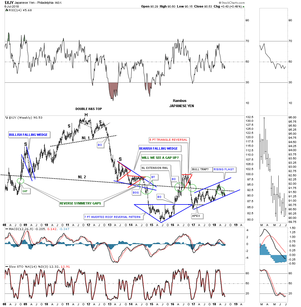
There is still one more important currency that I’m waiting to see if it will break below the bottom rail of its 1 1/2 year rising flag formation, the Japanese yen. It’s currently sitting right on the bottom rail. If it breaks below the bottom rail it will add more confirmation that the US dollar is still in its bull market that began in 2011 when these currencies were all topping out.
If the US dollar continues with its bull market then that will most likely have a negative impact on gold. They can both rally together, but generally for a short period of time. There are two large pattens I’ve been following for gold. The first one is the possible 5 1/2 year H&S consolidation pattern which everyone is aware of. Gold will need to breakout above the neckline which comes into play around the 1365 area.
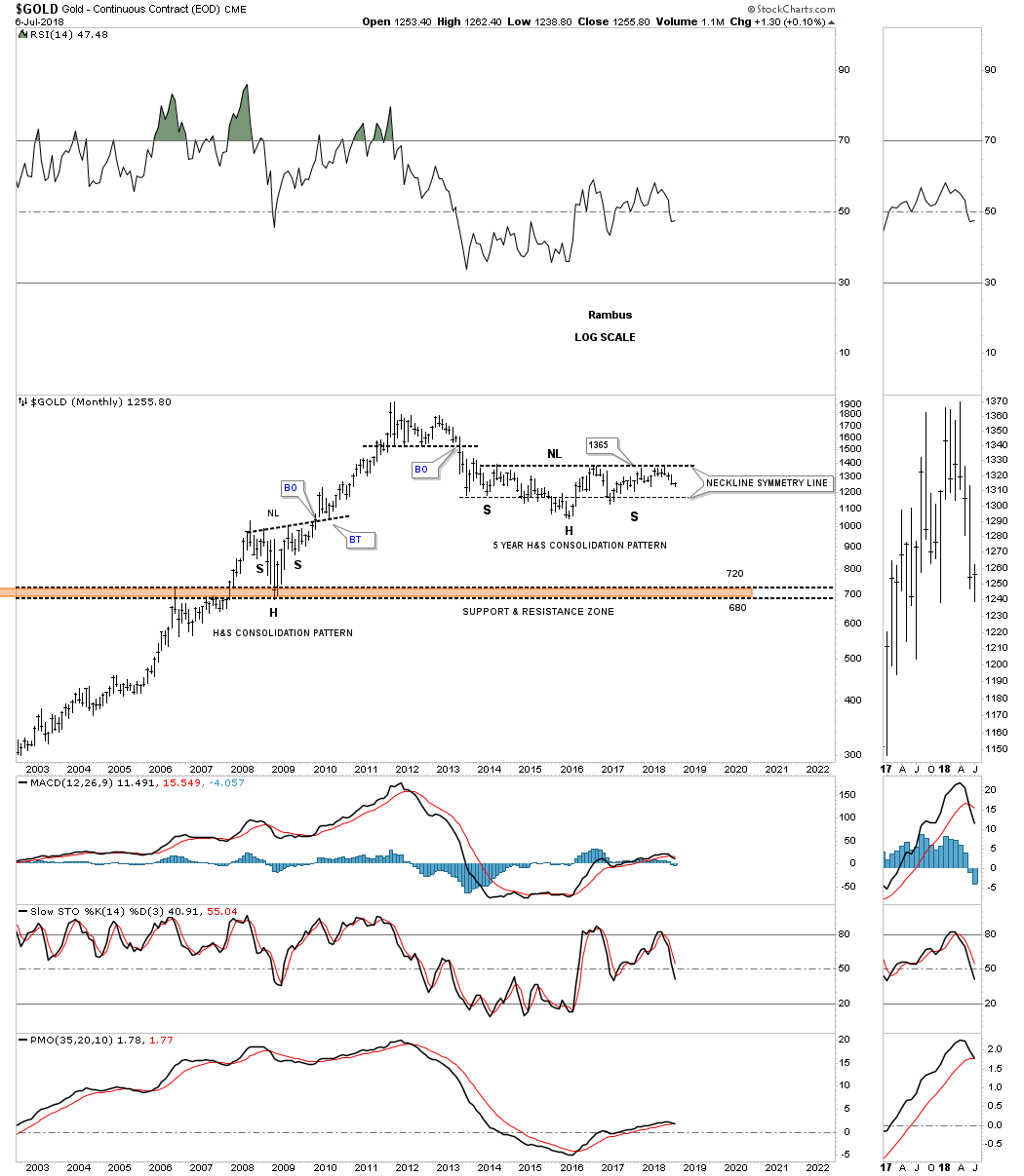
The second potential pattern is an expanding falling wedge where both the top and bottom trendlines slope down together but are expanding. If gold can breakout above the top rail then the H&S consolidation pattern will become very obvious, but until that happens gold remains in limbo.

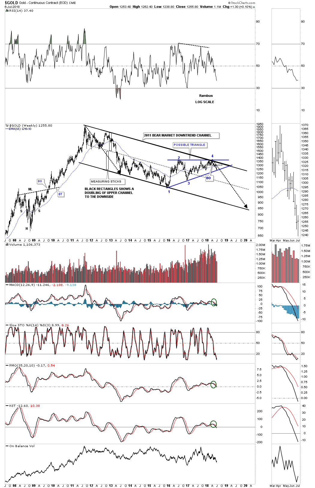
Below is the long term monthly chart we’ve been following which shows gold’s bull market to date. Note the last two bars on this chart. Trendlines are broken all the time and this could be a false breakout which would be negated when gold trades back above the bottom rail of its bull market. On the other hand if gold just backtests the bottom rail and can go no higher then the odds become more favorable for the bears. A trendline of this importance should be backtested at the very least. The best I can tell the backtest would come into play just above 1300 or so. I left the bottom rail of the major uptrend channel thin so you can see how the price action may interact with it.
This last chart for gold shows its 2011 bear market downtrend channel which is still playing out. The first thing we’ll need to see happen in order to change the bear market to a bull market is for the price action to trade above the top rail of the bear market downtrend channel and the top rail of the blue triangle around the 1365 area. I don’t think that is too much to ask of the bulls to show us they mean business.
I would like to finish up this Quarterly Report by looking at four FANG stocks. If our secular bull market is going to move higher it will have to have some strong legs under it to achieve much higher price objectives. As we’ve discussed previously I believe this secular bull market has to do with new technology that is going to drive this secular bull market a lot higher over time. Areas like biotechnology, artificial intelligence and robotics just to name a few.
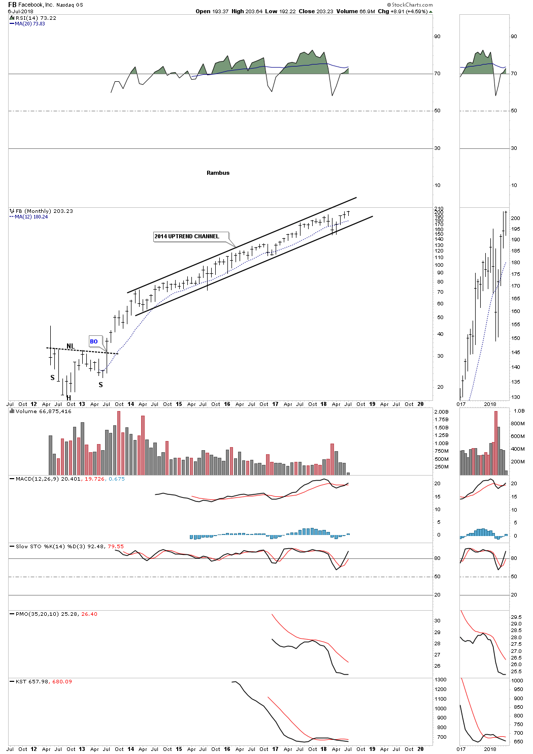
After putting in a nice H&S bottom in 2012 FB has never looked back. It has been in an uptrend channel since 2014 with no signs of breaking out one way or the other.
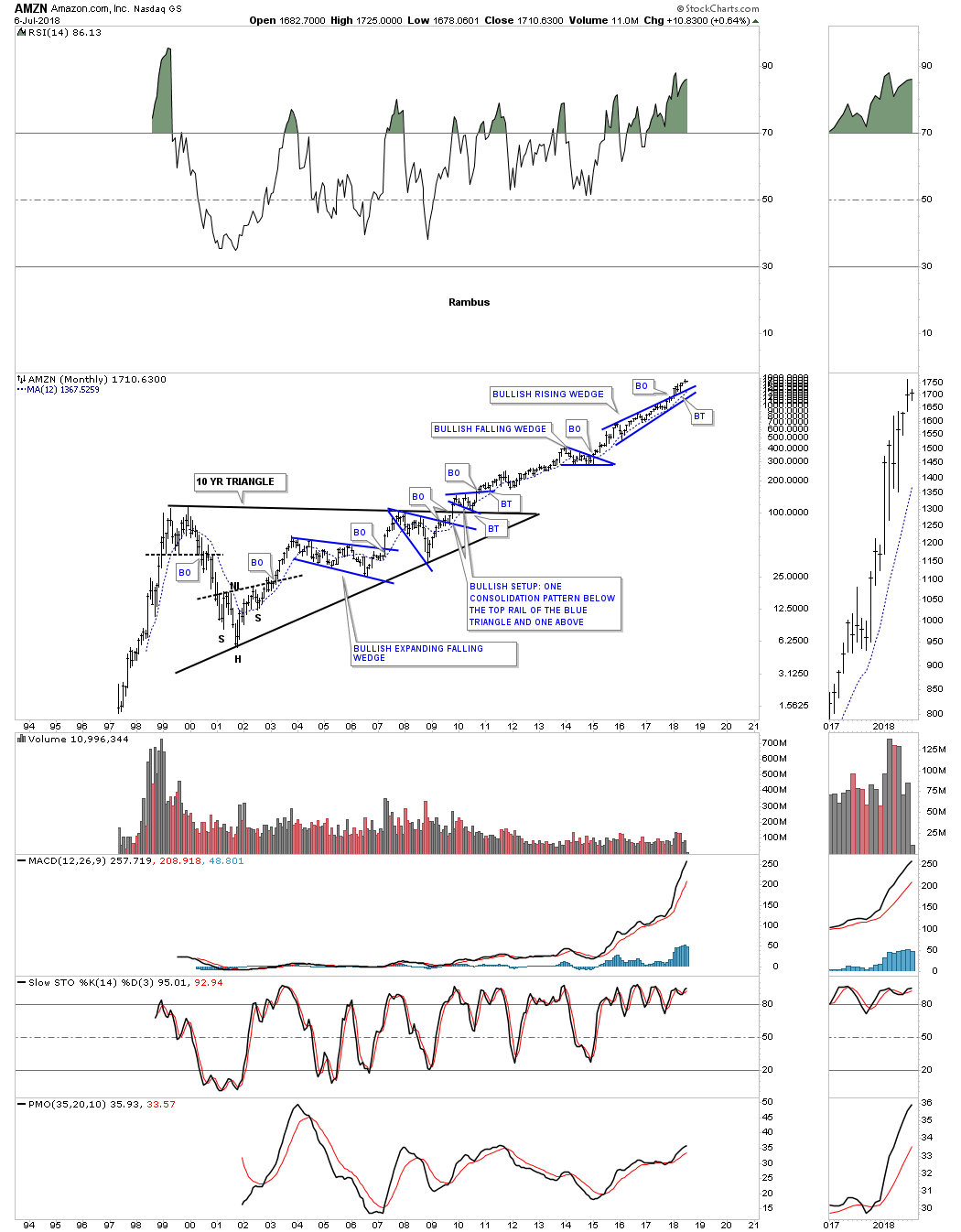
Back in the late 1990’s when AMZN was being born there was no way to know what the chart would look like 20 years later. Now with the benefit of hindsight we can now see what happened. We’ve looked at a lot of long term consolidation patterns, many that were ten years in the making. Note the ten year triangle consolidation pattern on AMZN which led to it’s unprecedented bull market. It broke out of a bullish rising wedge at the beginning of this year which is the only FANG stock to breakout of its rising pattern to date.
NFLX is another FANG stock that investors love to hate. I’m using the quarterly chart so you can better understand how the Chartology has been working. NFLX started to build out its latest consolidation pattern, the bullish rising wedge in July of 2015 with the breakout coming in January of this year 2018.

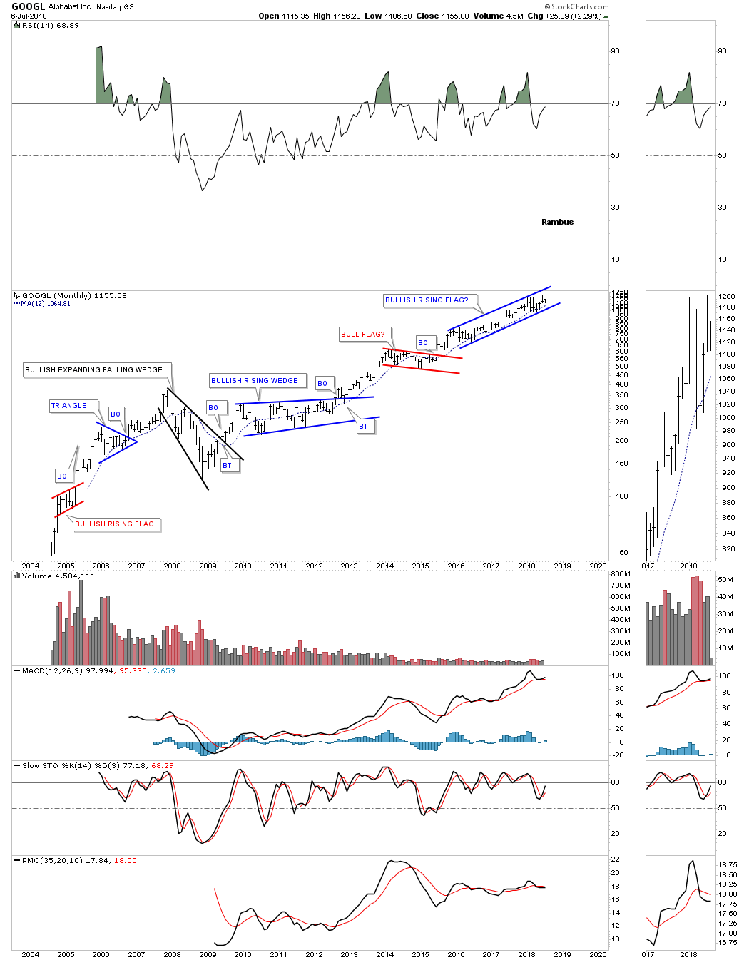
GOOGL started building out it most recent trading range, a rising flag formation, in December of 2015 over 2 1/2 years ago. It’s anyones guess how long this rising flag will continue to build out, but the “What If” part of the equation is, “What If” the rising flag breaks to the upside like every other consolidation pattern in GOOGL’s history.
I have many more tech stocks I could show you, but it’s time to wrap up this Quarterly Report. I hope I was able to present these charts in an unbiased manner that was easy for you to understand how I see the big picture unfolding through the eyes of Chartology. All the best…Rambus
PS: I’m working on a special report in which I think the bond market may be throwing us a curveball.
Related Reading:
- Rambus: Blockbuster Chartology – April, 2018
- 2017 Annual Wrap Up – Does Your Pension Fund Have A Deep State Drain? – January, 2018
- 1st Quarter Wrap Up 2018 Web Presentation
- Blockbuster Chartology with Rambus – October, 2017
- Blockbuster Chartology with Rambus – July, 2017
- Blockbuster Chartology with Rambus – May, 2017
- Blockbuster Chartology with Rambus – January, 2017
- Blockbuster Chartology with Rambus – October 20, 2016
- Blockbuster Chartology with Rambus – July 21, 2016
- Blockbuster Chartology with Rambus – April 21, 2016
- Rambus: Are We in a Deflationary Spiral? – January 28, 2016
- The Dollar, Gold & the S&P 500 with Rambus – October 15, 2015
Be the first to comment