
July 27, 2017
Rambus: Blockbuster Chartology - 2017 2nd Quarter Review
By Catherine Austin Fitts
My "go to" website for technical analysis of precious metals, the US dollar & the US stock market is Rambus Chartology, where Rambus (that's his handle - he's the founding technical analyst) leads a discussion with extensive charts of what the markets are saying.
Our series with Rambus began in October 2015 when the Solari Report did a written interview with Rambus including an introduction here and a discussion of Rambus, his background, technical analysis as well as the word "Chartology." You can find all this information at our first interview:
- Why "Rambus?"
- How Rambus Chartology Got Started
- What Rambus Chartology Does
- About Technical Analysis
- Tracking the Markets
- What does the word "Chartology" mean?
- Rambus: Blockbuster Chartology
In January 2016, Rambus launched his quarterly Solari Report with a Blockbuster Chartology across the four market sectors: Currencies, Commodities, Precious Metals and Stock Markets. You can find it here: Rambus: Are We in a Deflationary Spiral? Then, Rambus returned with his Blockbuster Chartology across the market sectors in April, July and October. With 2016 behind us, Rambus returned with his Blockbuster Chartology for our Annual Wrap Up and then in May to take an in depth look at currencies, US and world stock markets and precious metals.
One of the reasons that Rambus is so good at his craft is that he focuses on "staying on the right side of the major trend." The challenge of doing so at this time is that it is tempting to look for bottoms or to assume that the trend upwards in the US dollar or stock market may be over. However, Rambus consistently brings us back to the discipline of the Chartology. What does price tell us? As he describes so aptly, we are dealing with psychological warfare.
Sitting back once each quarter to get this perspective offers invaluable insight. So, here we go for the 2nd Quarter Rambus Blockbuster Chartology!
Blockbuster Chartology By Rambus
Basic Materials and Commodities Part 1
Prepared on July 19, 2017Since the Basic Materials sector is breaking out I would like to take an in-depth look at some of the stocks that make up the Basic Materials sector along with some commodities in general. Most commodities have had a tough go of it since they topped out in 2011, but there are some signs that they may be bottoming, which could lead to a substantial rally over the intermediate to the long term. As you will see some of the bottoming formations are very symmetrical while others are pretty ugly, but as long as they can make a higher high and higher low an uptrend is in place.
Lets start with the CRB index which built out a one year bearish rising wedge formation that broke to the downside in March of this year. The price action has been chopping to the downside and has gotten a bounce to the upside in late June. Normally the price objective of a rising wedge is down to the first reversal point where the pattern started to build out.
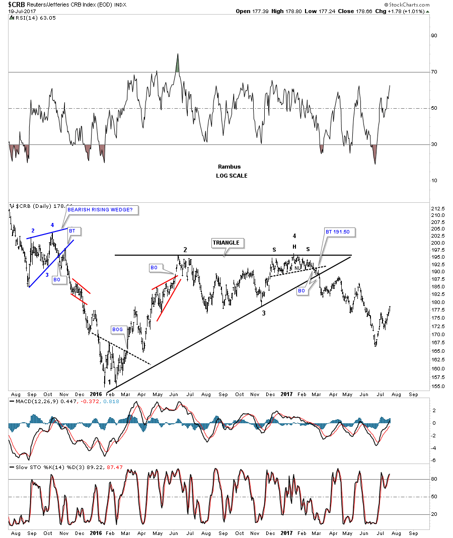
There is another pattern I’ve been keeping a close eye on which may have given us a good clue today that we may have a consolidation pattern building out which is forming above the January 2016 low. As you can see on this long term daily chart for the CRB index it has built out a sideways trading range which broke to the downside last month, which wasn’t a bullish development if one was bullish on this index.
Expanding patterns, whether they’re a triangle, flat top or flat bottom, expanding falling wedges or expanding rising wedges, are some of the more difficult formations to find in real time. The reason being is that with the pattern on this daily chart below shows a false breakout below the bottom rail, blue horizontal dashed line, which looks like a breakout to the downside. With today’s price action closing back above the blue dashed line we now have a potential flat top expanding triangle. If the price actions can close above the top horizontal trendline, the flat top triangle will be the first consolidation pattern in the CRB’s index’s new bull market.

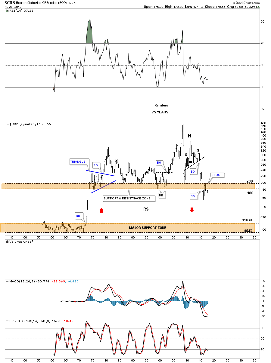
This 75 year quarterly chart for the CRB index shows you just just how bad the bear market has been. To really get this index bullish again I would love to see the price action trading back above the brown shaded S&R zone above 200 or so, which would create an unbalanced double bottom. By looking at the daily chart above you can see how the unbalanced double bottom would look like if the top rail of the expanding flat top triangle is broken to the upside. If the possible unbalanced double bottom plays out we are just in the first inning of a 9 inning game.
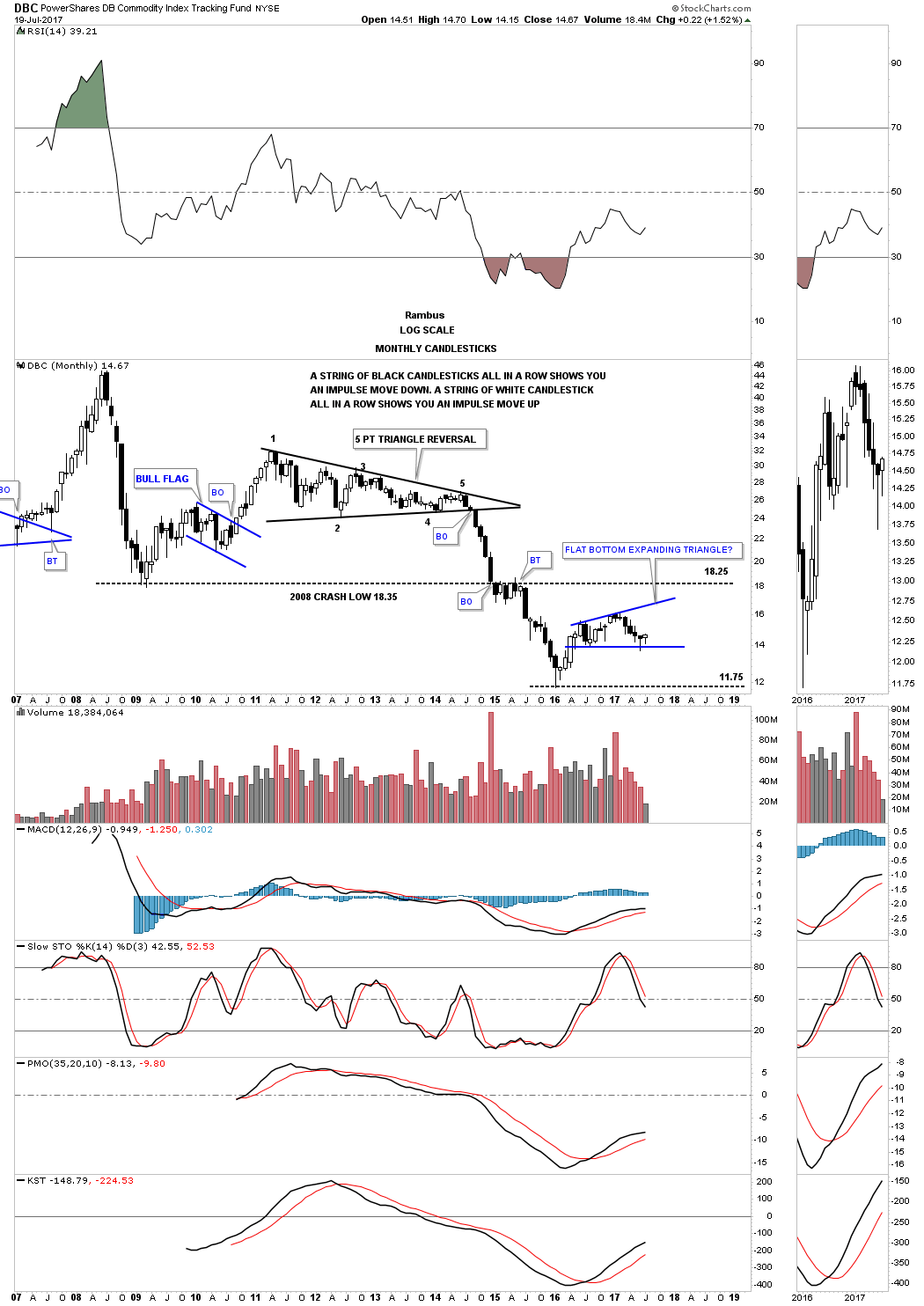
This next commodities chart is a long term monthly look at the DBC which is much more actively traded than the CRB index. Instead of an expanding flat top triangle the DBC is building out a possible flat bottom triangle. Again, this potential pattern has a chance to be a consolidation pattern to the upside if it can take out the top rail. No matter how you look at the current price action there is still a lot of work to do before we get any type of resolution to the trading range. A break below the bottom rail will ensure a move back down to the previous low and on the other hand, a breakout above the top rail will put the bull market thesis into play.
Next I would like to focus in on the XLB, basic materials index, which is made up of many large cap stocks. The last time I did an in depth report on the XLB, I suggested this index should do very well as long as its top 5 components were doing well.
Now lets take a look a daily chart for the XLB, basic materials index, which is showing it has just broken out of a 6 month blue expanding flat bottom triangle with a small H&S bottom that formed as the backtest. Today this basic materials index closed at a new all time high.
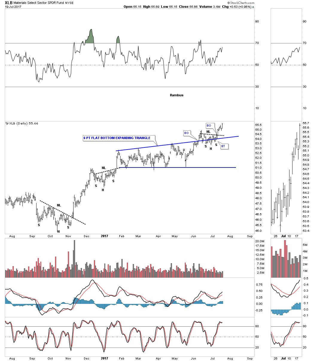
Below is a 4 year weekly bar chart that is showing the breakout from the 6 point flat bottom triangle consolidation pattern into new all time highs this week.
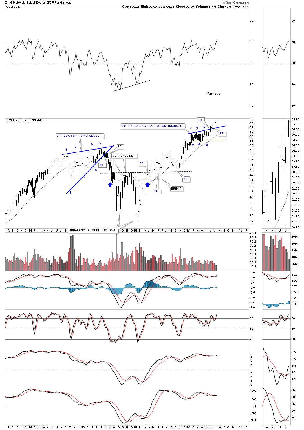
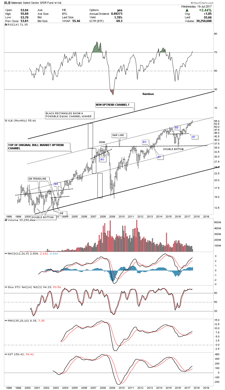
The long term monthly chart for the XLB shows its entire history and its bull market uptrend channel. If the 6 point expanding flat bottom triangle is breaking out topside then the original top rail of the major uptrend channel will be taken out. Generally when that happens you can see another equal channel higher giving the uptrend 3 equal channels instead of two. The black rectangles shows how this new uptrend may play out.
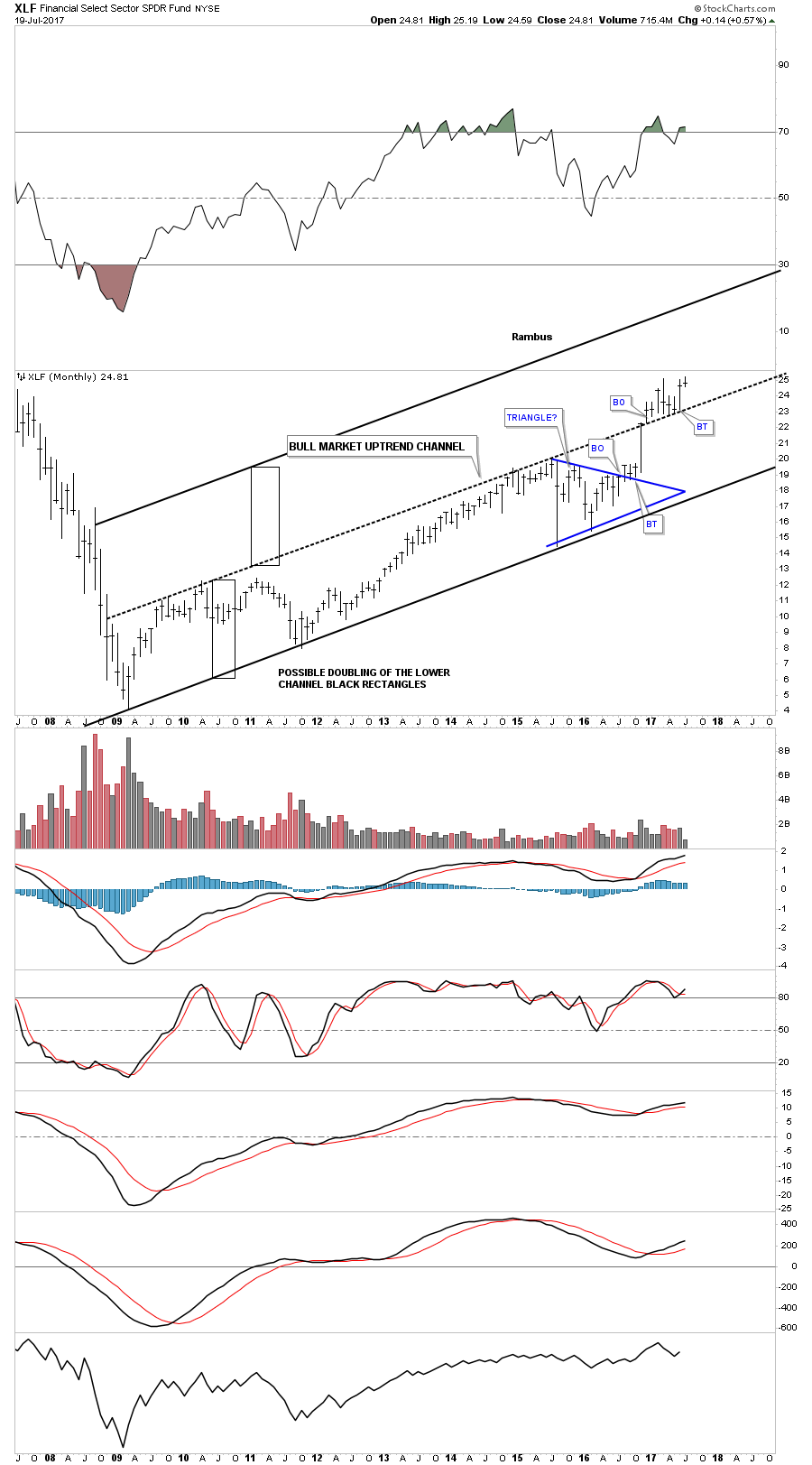
This next chart is a long term monthly chart for the XLF which I’ve been showing you how the lower channel may be morphing into a double uptrend channel with equal lower and upper channels. This is the same principle as the XLB chart above which is forming a possible third channel.
This last chart for the XLB is a monthly line chart going back 20 years. The reason the XLB looks so good is because it’s made up of many very big large cap stocks that we’ll look at in a moment.
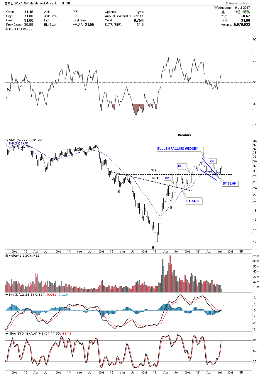
Next lets look at the XME, metals and mining etf, which broke out of a double H&S bottom last fall and has recently been backtesting the neckline forming the blue falling wedge as the backtest. Last week the price action finally closed above the 30 week ema.
The first 5 stocks that make up the XLB account for nearly 45% of this index. For 2 years the DOW, Dow Chemical, built out an expanding triangle that broke out to the upside about 8 months ago, and is currently trading at a new all time high. It has the highest weighting at 12.1%

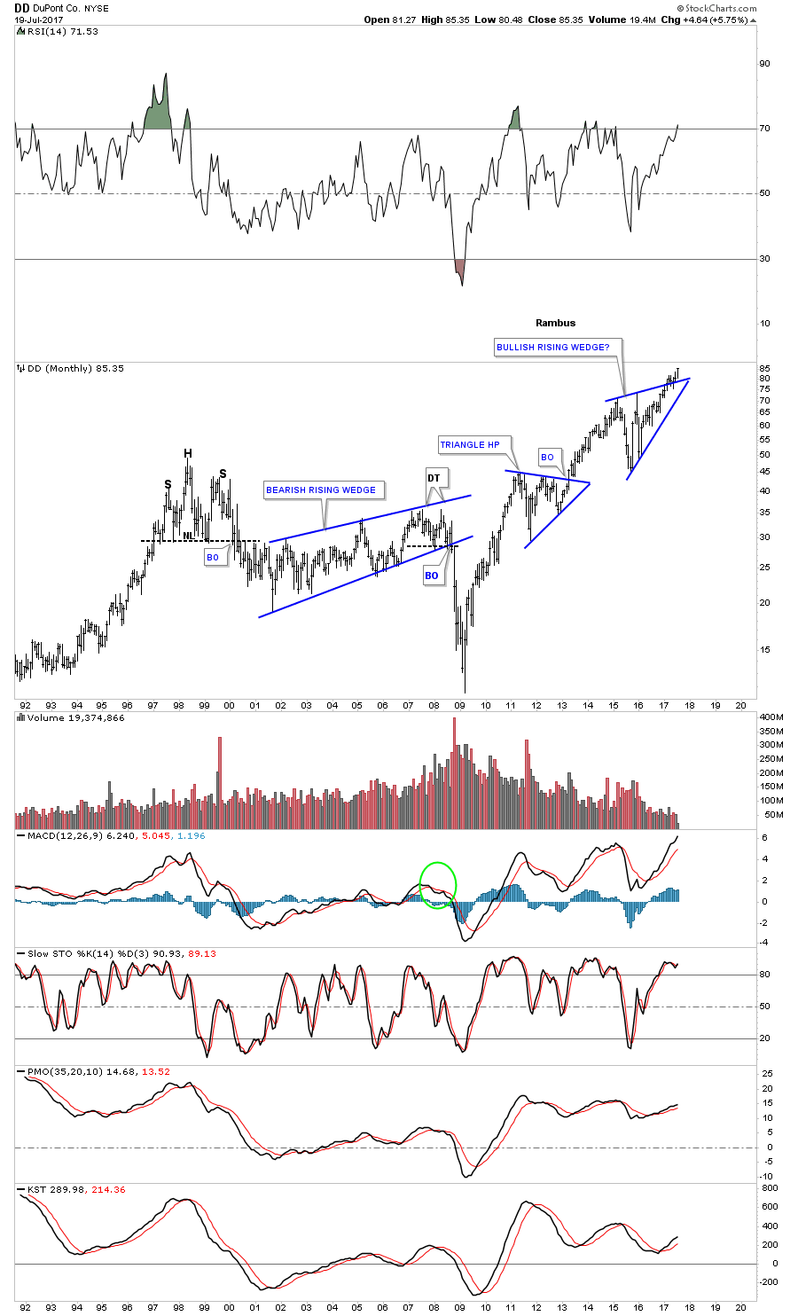
Next is DD, DuPont, which has broken out of a bullish rising wedge which makes up 11.9% of the XLB and is also trading at a new all time high.
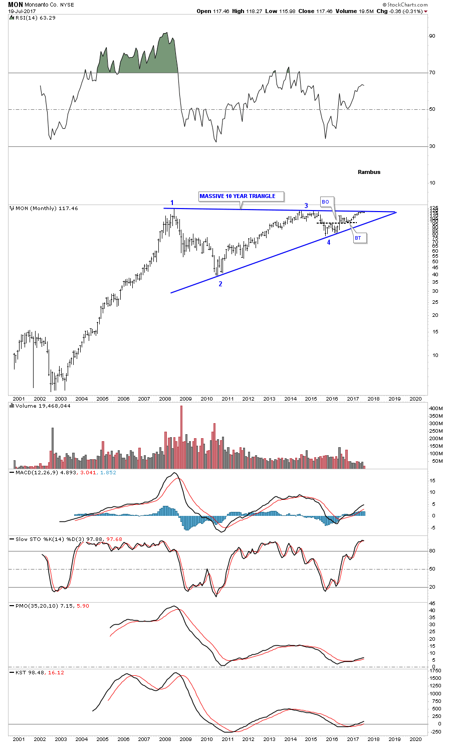
Below is a monthly chart for MON, Monsanto, which is just completing the 4th reversal point in a massive 10 year triangle trading range. It has a weighting of 9% in the XLB.
Number 4 on the list is PX, Praxair, which is still trading inside of its bull market uptrend channel that began to form way back at the 2000 low. It has a weighting of 5.9% and is trading close to new all time highs.

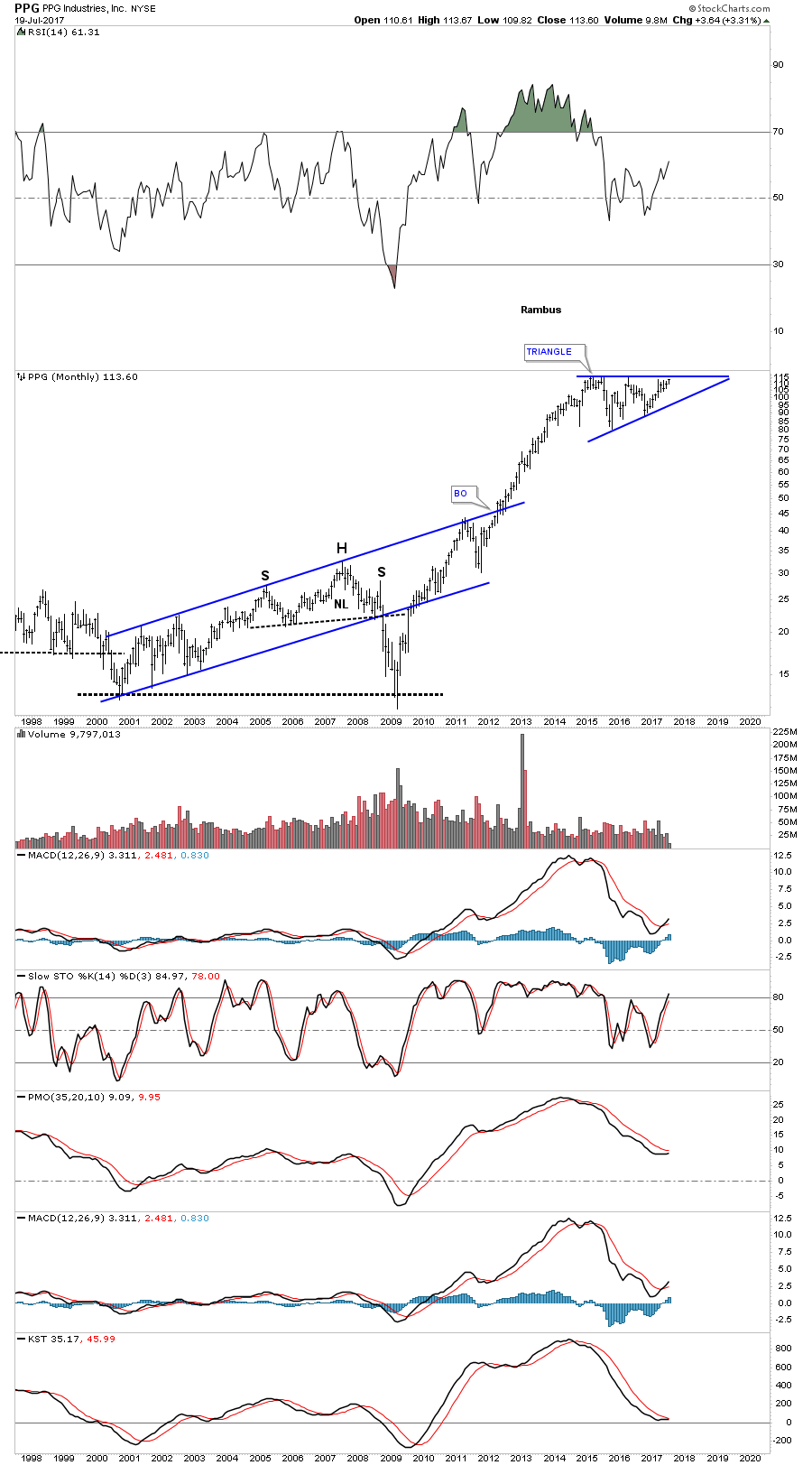
PPG. PPG industries, is 5th on the list and is trading close to new all time highs building out a very large triangle consolidation pattern. It has a weighting of 4.8%.
In part 2 of this report we’ll look at some of the different commodities and stocks within those commodities which are all over the place at the moment with some showing strength while other as still showing weakness. At some point if the bull market really takes off we should see the whole complex moving up together with all areas enjoying their own individual bull markets. One step at a time. All the best…Rambus
Basic Materials and Commodities Part 2
Prepared on July 21, 2017I would like to start part 2 of this report by looking at Copper which is building out a potential big reversal pattern. For most of 2016 Copper built out a 7 point triangle reversal pattern at its bear market low. Once the 7 point triangle was complete Copper wasted little time in its impulse move up to the 2.75 area where it has been consolidating that move, chopping out a sideways rectangle, which has just completed its 6th reversal point putting the rectangle in the consolidation pattern category for now. With the rectangle forming above the 7 point triangle, is another reason the odds favor it to be a consolidation pattern.
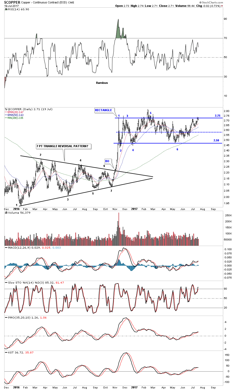
In 2011 Copper topped out with most of the other commodities and then went on to build out a 7 point triangle reversal top which was instrumental in its bear market decline into the 2016 low where the 7 point triangle reversal pattern began to build out for the upside. Is the rectangle we just looked at on the daily chart above going to be the right shoulder of a very large inverse H&S bottom?

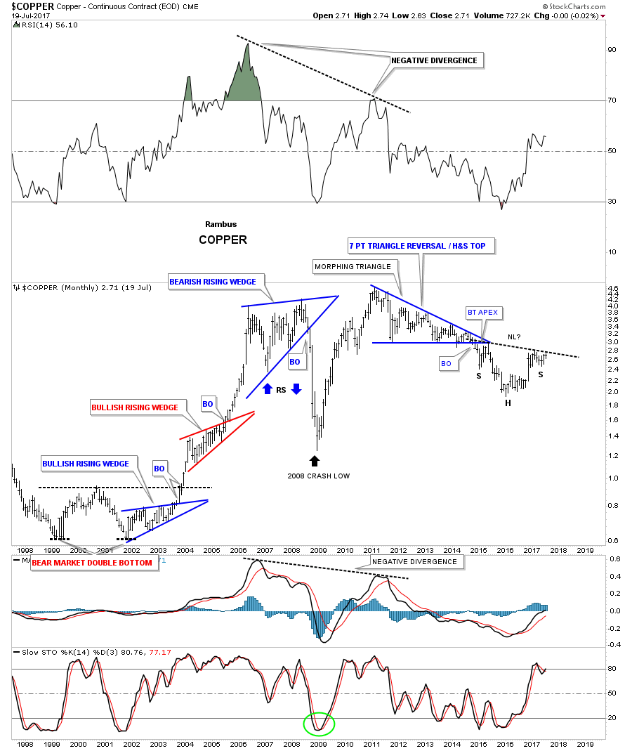
The monthly chart for Copper shows some interesting Chartology starting with its massive double bottom at its bear market low in 1999 and 2001. The bull market had 2 bullish rising wedges with a very large bearish rising wedge at its top in 2008 which led to the first crash. The 2011 topped formed the blue 7 point triangle reversal pattern and now there is a good chance that Copper is building out an inverse H&S which will reverse the 2011 bear market.
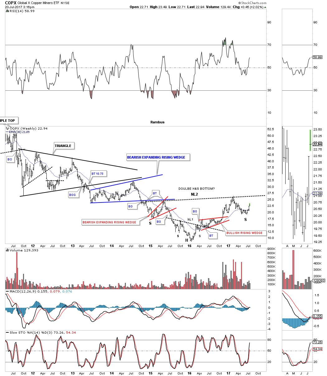
The COPX is a Copper etf which is attempting to build out a right shoulder currently. The chart is a little busy, but if you drag neckline #2 down to the bottom of the left shoulder you will see it also shows the bottom of the right shoulder as well. Big bases lead to big moves.
Next we have JJC which is a total return Copper etn which is also showing a big H&S pattern building out. It looks like the right shoulder is building out a smaller H&S pattern that is suggesting there will be a breakout above the neckline.

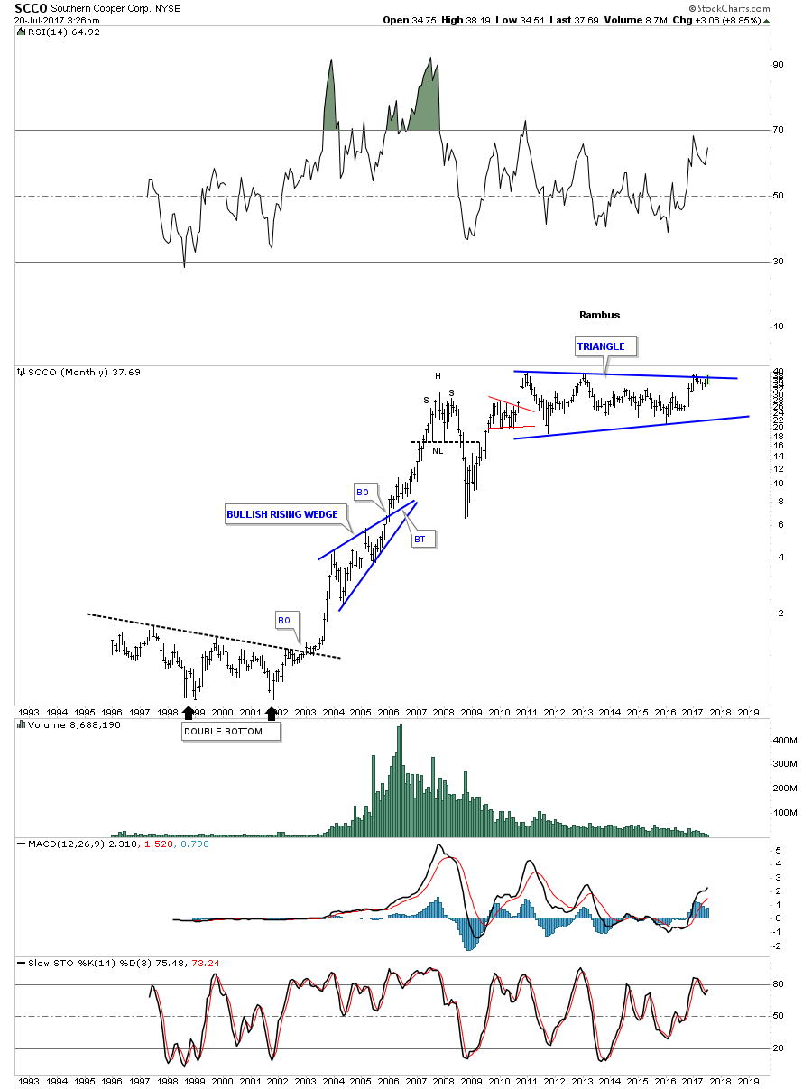
Since its 2011 high SCCO, Southern Copper, has built out a massive triangle and is currently testing the top rail completing the 4th reversal point. If Copper eventually breaks out of its large inverse H&S bottom this stock should do very well as shown by its relative strength.
Below is a weekly chart for SLX, steel etf, which has been holding up pretty well since its 2016 bear market low. It formed a H&S top at its 2011 bull market high which led to its 5 year bear market. During the middle of its bear market the SLX formed a very large rectangle consolidation pattern which showed up as a halfway pattern. That large rectangle consolidation on the left side of the chart is affecting our current price action on the right side of the chart as the price action is bouncing between the same 2 trendlines. Symmetry suggests that we could see a more chopping action on the right side of the chart equal to the left side of the chart. If that were the case and the SLX eventually breaks out above the top rail then there would be a massive inverse H&S bottom with the neckline coming in around the 45.80 area.

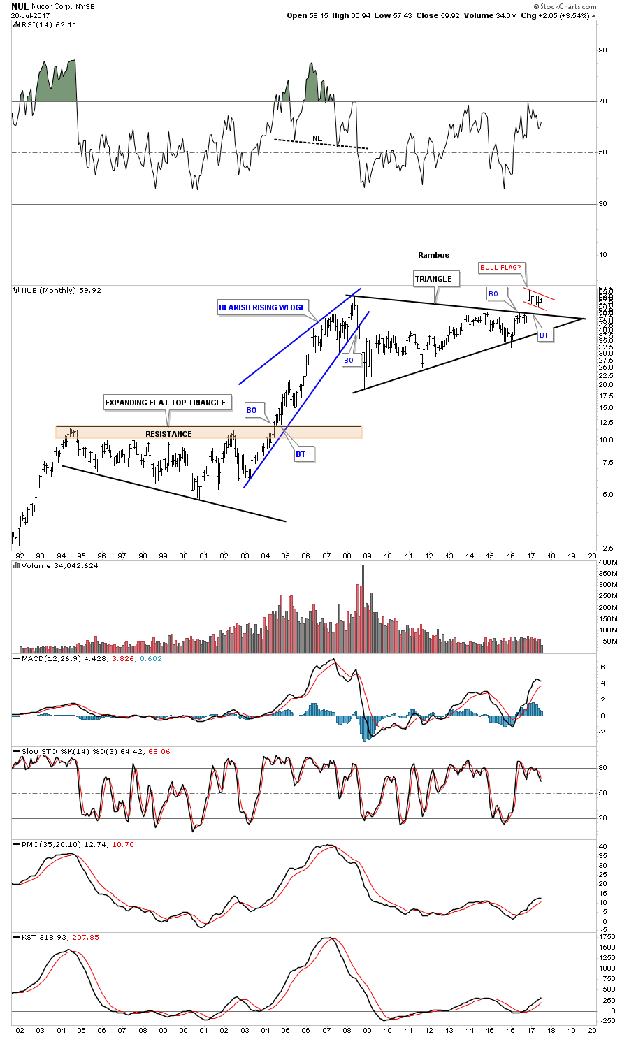
NUE, Nucor, has been building out a massive 9 year triangle consolidation pattern which shows a breakout above the top rail. There is also a small red flag that is forming the backtest. Note the massive 10 year bullish expanding flat top triangle at the bottom of the chart and the impulse move it produced.
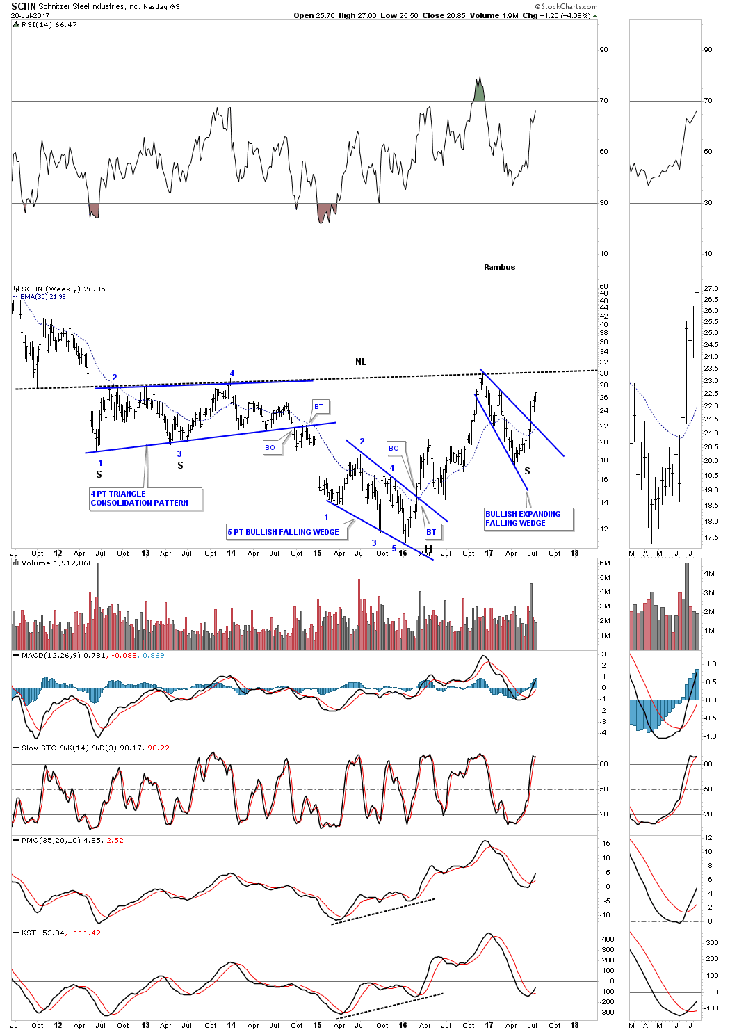
The weekly chart for SCHN, Schnitzer Steel, shows it could be building out a very large inverse H&S bottom. A month ago the price action broke out of a bullish expanding falling wedge which should get the price action back up to the neckline.
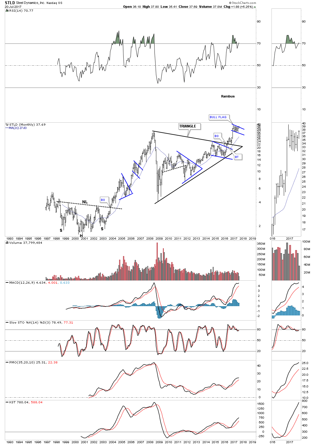
STLD, Steel Dynamics, maybe the strongest of the steel stocks as it has already broken out of its huge 8 year triangle consolidation pattern. It’s currently attempting to breakout above the top rail of its small bull flag and if successful this stock will be at new all time highs.
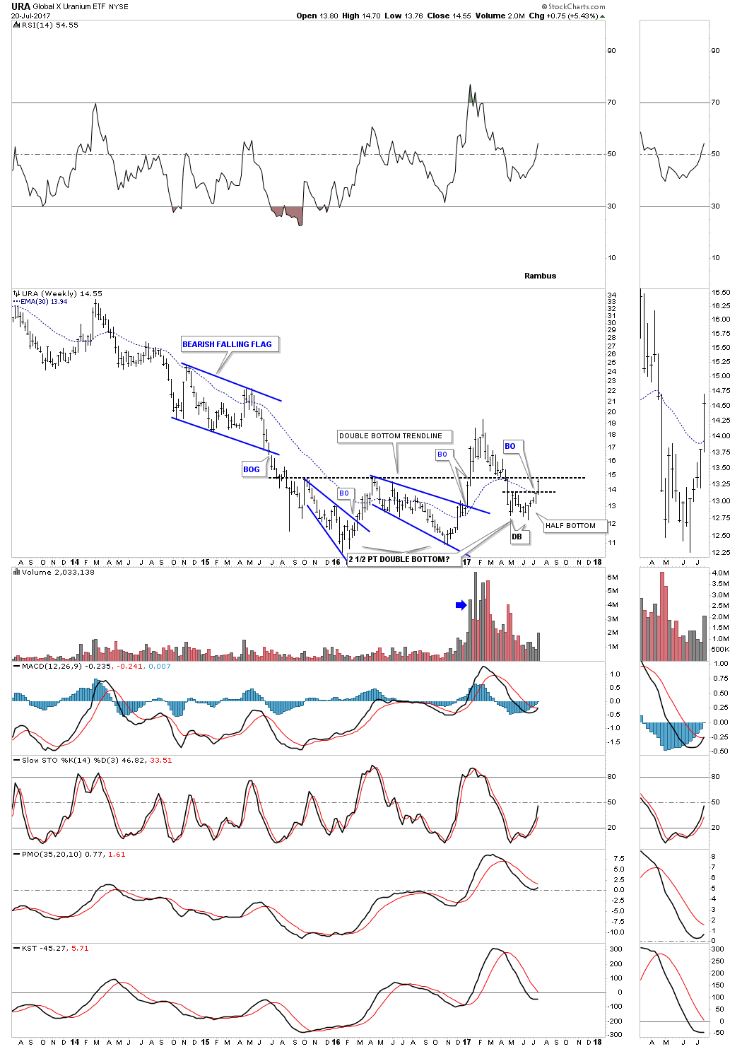
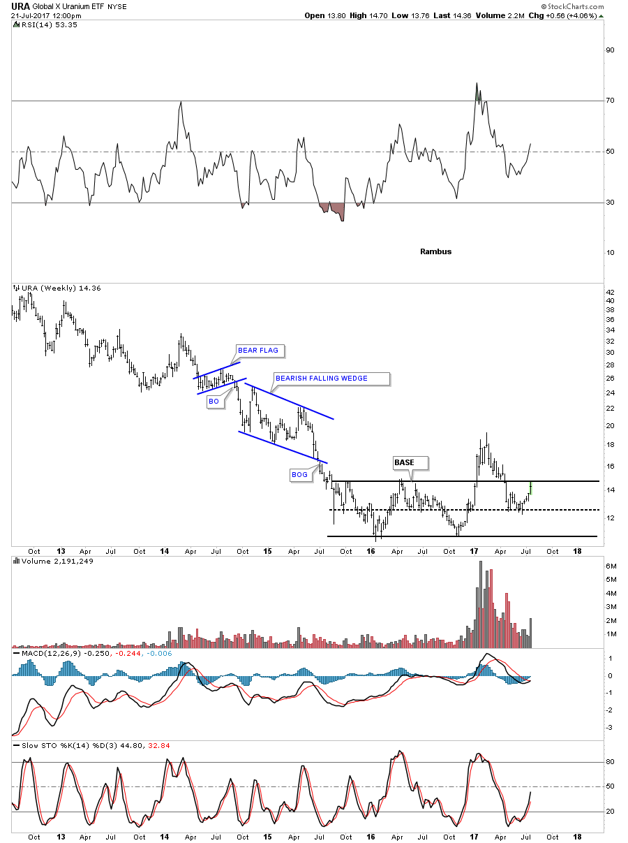
Next lets look at the URA, Global X Uranium etf, which is showing an ugly bottoming pattern. The last time I showed you this chart it had a nice double bottom in place with a breakout above the double bottom hump on strong volume. The backtest to the neckline looked normal at the time, but then URA threw me a curveball when it started trading back below the double bottom trendline.
Over the last couple of months URA has built out a small double bottom just below the major double bottom trendline. This week the price action has broken above the small double bottom trendline touching the much bigger double bottom trendline. I have seen these types of double bottom failures in the past which are still valid, but the reaction low below the big double bottom trendline is what I call a half bottom. In affect what we probably have is a 2 1/2 point double bottom in place as soon as the price action can trade back above the big double bottom trendline. It’s not the prettiest reversal pattern I’ve ever seen, but I think it’s valid when all is said and done.
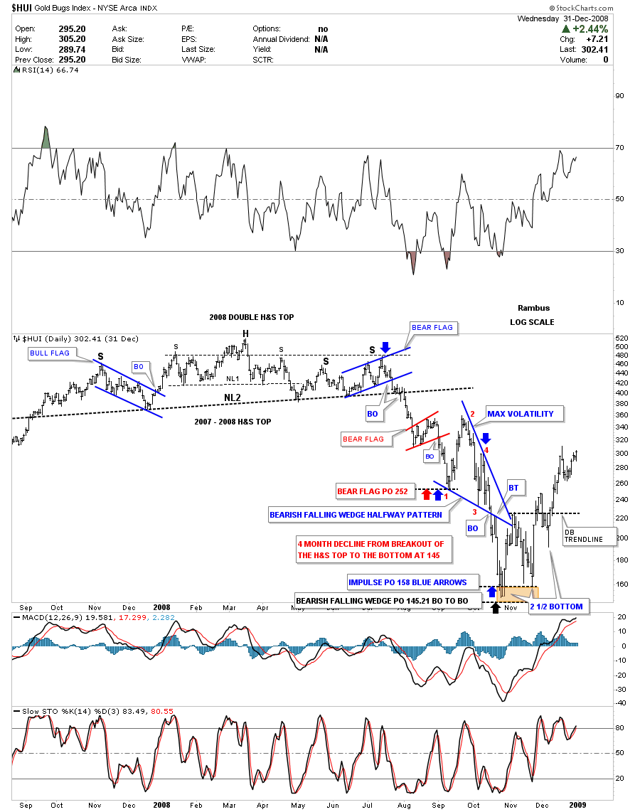
This next chart is an old static chart for the HUI which shows the 2008 H&S top and the impulse move down. At the bottom of that strong impulse move down the HUI originally built out a normal looking double bottom, but when the breakout failed above the double bottom trendline and the price action close back below the double bottom trendline, it was not looking to good for the HUI. Once the price action closed back above the double bottom trendline all was good again for the HUI which went on to rally for 3 more years into its 2011 bull market top.
Another way we can look at the last 2 years of price action for the URA is that it’s forming a big base. As I’ve said it’s not the prettiest base I’ve ever seen, but there is a certain symmetry to it. A weekly close back above the top rail will be a positive sign.
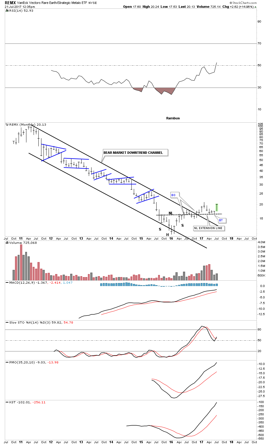
Another sector that has been in a long term bear market downtrend channel is the REMX, Rare Earth etf. It built out an inverse H&S bottom in early 2016. As you can see the breakout and backtest were a little sloppy as the price action closed below the neckline for several months before moving higher again. Many times I will extend the neckline out in time when there is a failure or a slow breakout move which can offer support once again at a later date as this chart shows. Since the early 2016 low the REMX has been building out a series of higher lows and higher highs and is getting close to making another higher high.
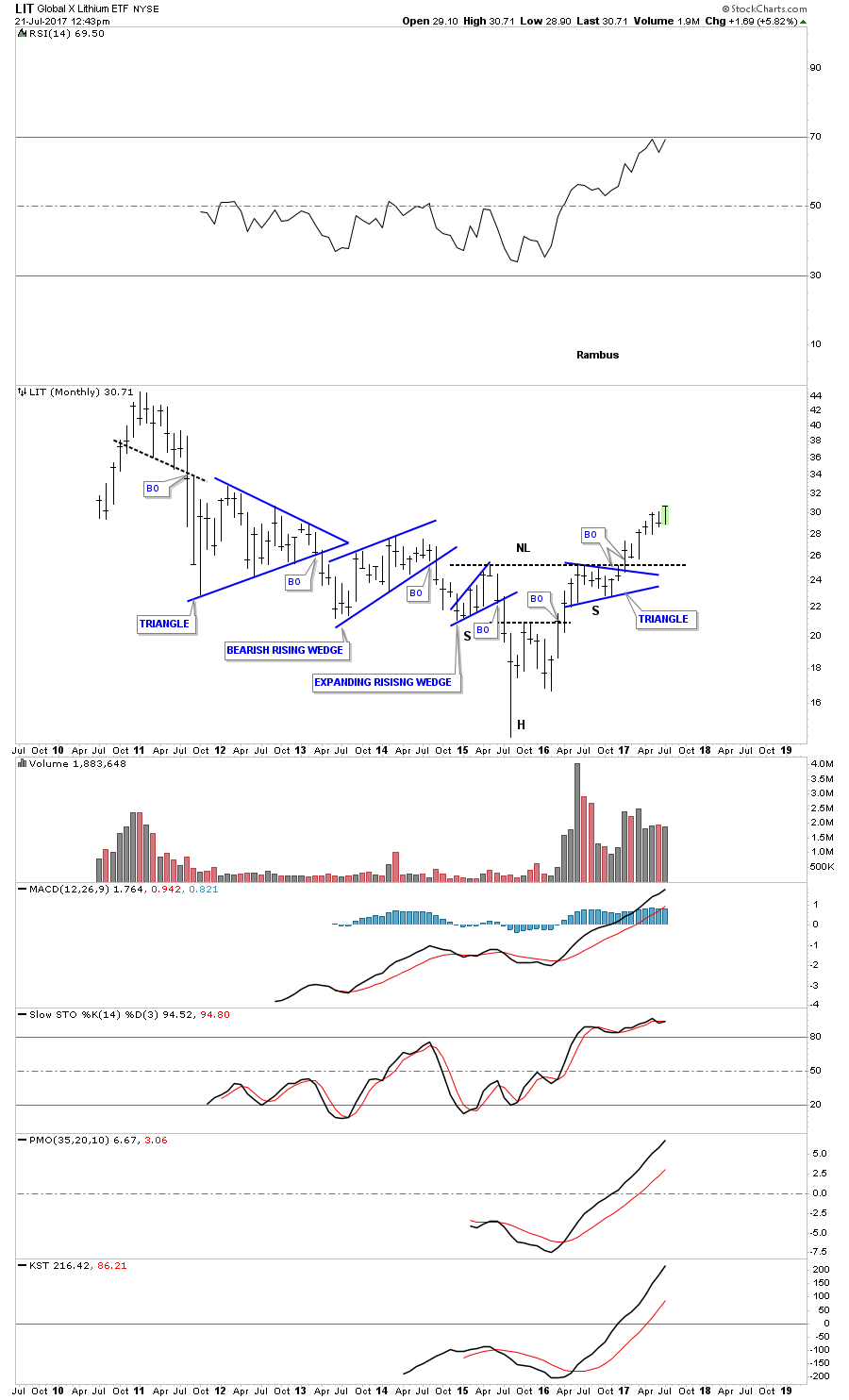
Below is a monthly chart for LIT, Lithium etf, which has been one of the stronger sectors within the commodities complex. Since forming an inverse H&S bottom, with the head forming 2 years ago at the 2015 low, this etf has a much more symmetrical look for its bottom than the previous 2 elf’s above.
Another area that has done pretty well over the last year and a half or so might surprise you which is KOL, Coal etf. Since the head formed at the early 2016 low this etf has almost tripled in price. Over the last 9 months KOL is building out its first consolidation pattern which is the blue triangle halfway pattern to the upside.

Next there is MOS, a fertilizer stock, that is in the Basic Materials sector which has been dead in the water for quite some time. The positive here is that it has been trading on the bottom rail of a very large triangle pattern which would offer a low risk entry point using the bottom rail as your line in the sand.

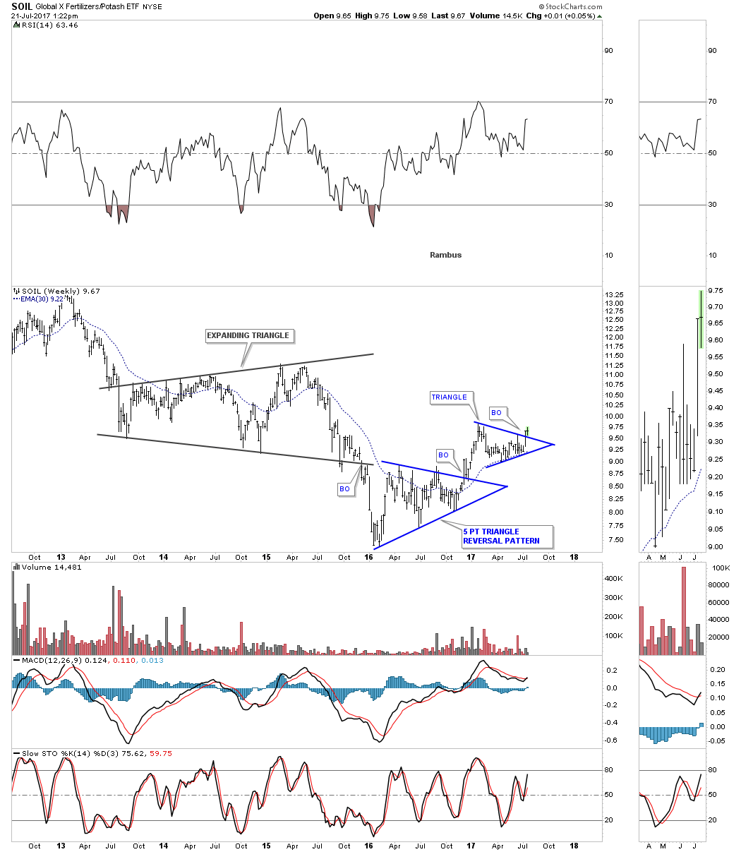
SOIL is another fertilizer stock which is doing a bit better than MOS. This stock completed a 5 point triangle reversal pattern at the bottom of its bear market and is now in the process of building out its first consolidation pattern. Note how the 30 week ema has offered support for the bottom rail of the blue triangle consolidation pattern.
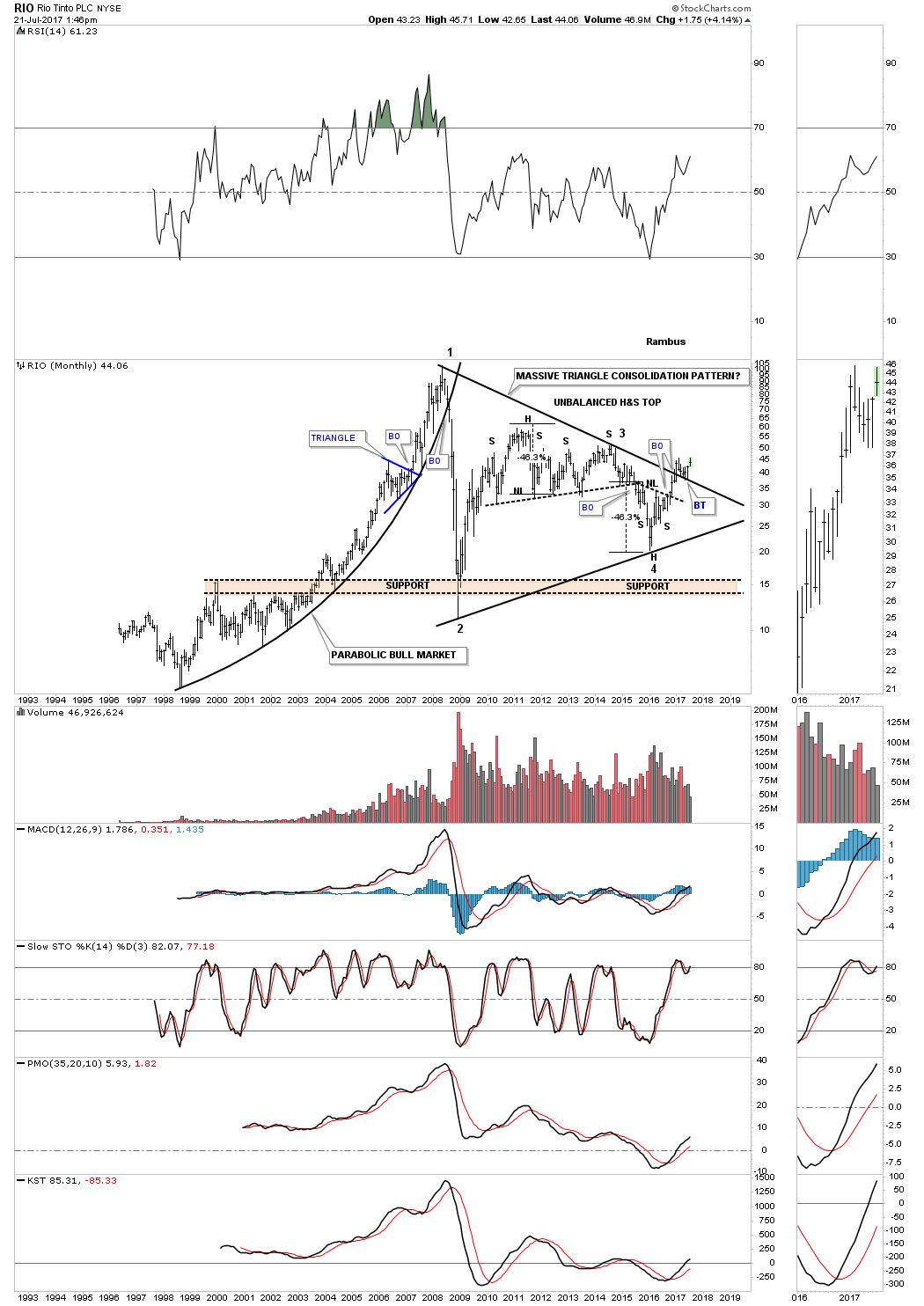
RIO, Rio Tino, is one of the biggest mining companies around. This stock shows you a good example of how a parabolic move ends which is never good. Once the parabolic arc was broken to the downside RIO wasted little time in crashing into its 2008 crash lows along with just above everything else. Since the parabolic top RIO has been building out a massive triangle consolidation pattern. Inside that big triangle you can see 2 H&S patterns, a top and a bottom. The top one I labeled as an unbalanced H&S as it has 2 right shoulder. The price objective was dead on the money which started the 4th reversal point with a H&S bottom. About 9 months ago the price action broke out above the top rail with a nice clean backtest so far.
Another very large mining company is BHP which is building out a very symmetrical double H&S bottom. You can see how this weeks price action touched the neckline and is now backing off telling us the neckline is hot and in the right place. A breakout above the neckline will complete a 2 1/2 year base which should propel this stock much higher during its bull market.

Next I would like to focus in on the energy sector by looking at Natural Gas first. I’m going to start with a daily chart which shows a possible one year H&S top building out. It will take a breakout below the neckline to complete the H&S which comes in around the 2.75 area.
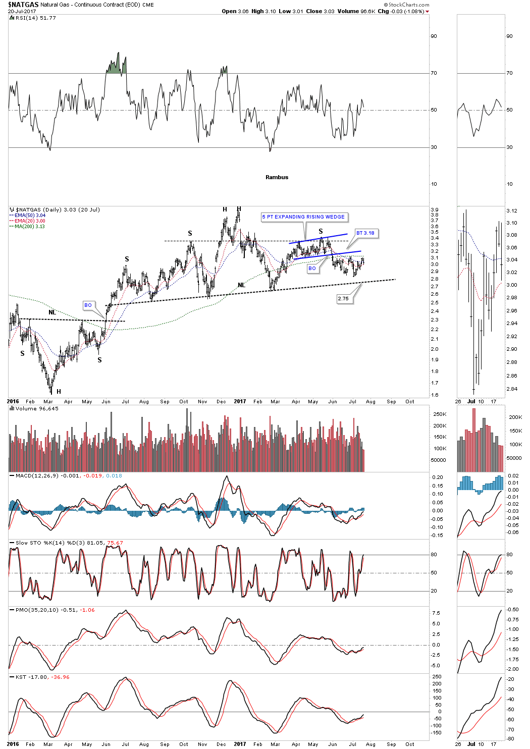
The weekly chart for Natural Gas shows us a classic H&S top. Many times when you have a rising wedge or flag the left shoulder and head will form inside the rising wedge or flag and the right shoulder will form on the backtest to the underside of the bottom rail. Symmetry suggests the right shoulder still needs a little more time to build out.

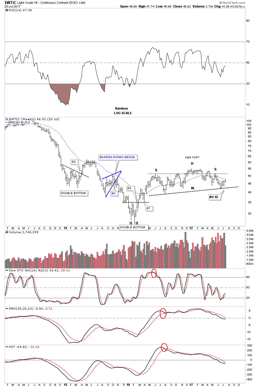
Similar to the Natural Gas chart, $WTIC oil, looks like it too is building out a H&S top. Below is a daily line chart showing we are in the process of backtesting the neckline at the 49.50 area. I’ve added a support and resistance line at the bottom of the possible top which if broken to the downside would isolate the top.
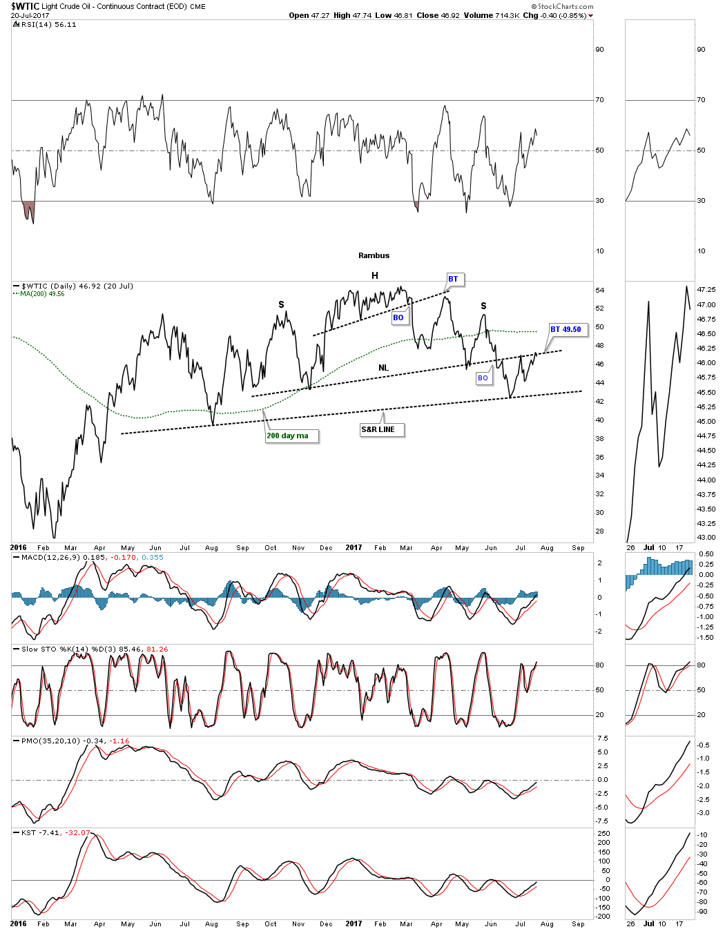
This last chart for this report is a weekly look at $WTIC which is showing a little bit bigger H&S top. Again, it’s not the prettiest H&S top I’ve ever seen, but there is a certain symmetry that suggests it may play out. The 30 week ema is now in a place to offer some resistance. What I don’t want to see is for oil to make a higher high which would negate the possible H&S top.
As you’ve seen by looking at all the different sectors in the commodities arena there are many that are building out inverse H&S bottoms with some in neutral and a few possible H&S tops. LIT, Lithium in particular looks strong and even lowly KOL, coal looks set to breakout of its triange consolidation pattern. Also a lot of the based are very large so that should ensure a strong bull market once everything is set to go. Each sector will take its own turn to run higher so keeping track of all different areas. Have a great weekend and all the best…Rambus
General Markets Part 1
Prepared on July 23, 2017Over the last week or so we’ve taken an in depth look at gold and silver along with basic materials and commodities charts. Today I would like to focus in on the stock markets and some different sectors within the stock markets and try to show you from a Chartology perspective where we are at in the big picture. Then I will update some charts for the foreign stock markets to see how they’re looking.
Lets get started by looking at the $INDU from the daily charts to the long term charts so I can attempt to show you why this strong impulse leg up out of the February 2016 low has remained so bullish, at least up until last Friday. I believe there are 2 very good reasons why the INDU and the rest of the US stock markets have remained strong. One reason, from a daily chart perspective the INDU has been building out small consolidation patterns after each small impulse leg up. By doing this the markets are self correcting which allows for another leg up once the small consolidation pattern finishes building out.
This daily chart below starts at the February 2016 low which is actually the second low in a double bottom reversal pattern. The smaller blue patterns are the consolidation phases which are allowing for a longer and stronger impulse leg up. There is also the 8 month black bullish rising wedge consolidation pattern which also offered corrective power to this move keeping any correction very shallow. Note the red bullish rising wedge which built out just below the top rail of the black bullish rising wedge, which gave the INDU the energy it needed to breakout above the top rail. From a Chartology perspective this is as beautiful of an uptrend you will find anywhere.

This next daily chart is a line chart that goes back further in time and shows you the big double bottom which helped launch this impulse leg up. I’ve numbered all the consolidation patterns so you can see how each one has at least 4 reversal points which makes them a consolidation pattern. Note the 5 point bearish falling flag at the double bottom hump which had 5 reversal points which made it a reversal pattern to the downside.
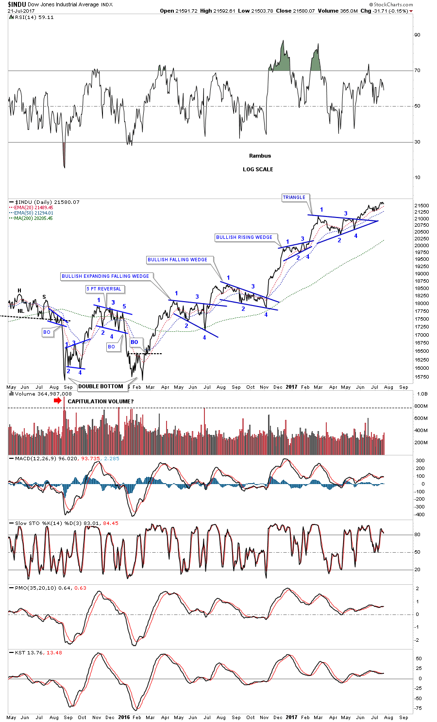
This last daily chart for the INDU shows what I call the 2016 uptrend channel that began to buildout with the 2015 & 2016 double bottom reversal pattern. Note how the double bottom hump held resistance in April, May and June of 2016 and once the price action broke out above the double bottom hump it reversed it role to support on the backtest in September and October of last year, which set the stage for our current bull market rally.
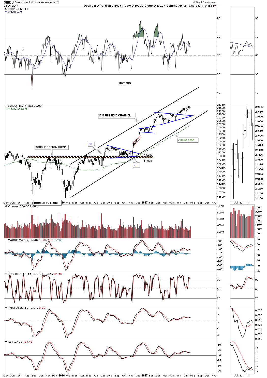
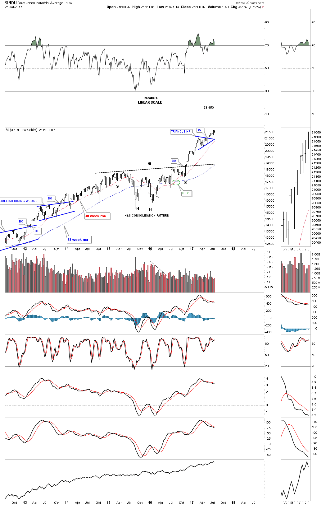
Going back further in time is a 5 year weekly chart for the INDU which I’m showing the 2 year correction/consolidation period, as a H&S consolidation pattern which is much bigger than any of the other consolidation patterns you see on this chart. If the blue triangle works out as a halfway pattern we should see the INDU move higher to the 23,450 area, using the breakout to breakout method before a meaningful correction begins. If the price action moves below the apex of the blue triangle or the INDU closes below the 30 week ema then I will have to go back to the drawing board.
Earlier I mentioned there were 2 reasons why I think the INDU is in such a strong impulse leg up. The first reason was that the price action was self correcting after each little impulse leg up which keeps the INDU from getting too overbought. The second reason I believe this rally out of the 2016 low is because we are in an impulse move up out of a massive consolidation pattern. How many times have you heard me say, “the bigger the consolidation pattern the bigger the impulse move to follow.” The clearest way to show you what I mean is to take a look at a 30 year monthly line chart for the INDU which shows the 14 year bullish expanding triangle or as I like to call it, “The Jaws of Life.”
The breakout above the top rail of the Jaws of Life actually took place back in late 2013. Note the initial backtest right after the breakout which looked like that completed the pattern with the impulse leg up ready to begin. After ralling for about a year we got a second backtest to the top rail of the expanding triangle which again looked like it was finally time for the expected impulse leg up to begin. The markets have a way to wear you down before what you were expecting finally comes to fruition. With the 3rd backtest to the top rail, which created the double bottom, the price action told us the top rail was hot and in the right spot. Finally after backing and filling above the top rail for a couple of years we finally got our expected impulse leg up, which we are currently in and have been in since February of 2016.
From purely a Chartology perspective this chart makes perfect sense, but if one is following the fundamentals then this chart makes absolutely no sense whatsoever. How can the INDU be in such a massive impulse move higher with all the negative things you read and hear in the news? Regardless of all the reasons the INDU shouldn’t be going up this chart doesn’t care what you or I think, it’s investors psychology that is building out his chart. IMHO the truth lies in what the charts are saying as all the bulls, bears and all the fundamentals are baked into the price action so to really understand what is happening the charts will give you the clearest picture.
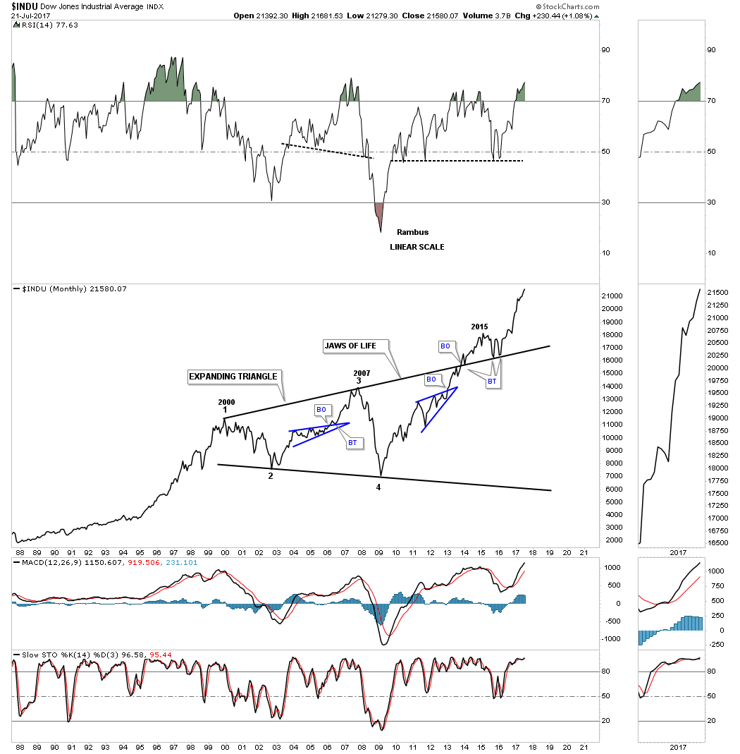
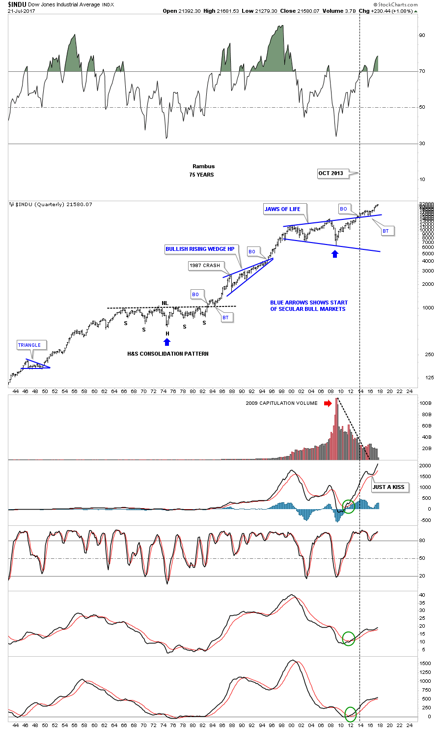
Before we move on I would like to take it one step further and look at the 75 year chart for the INDU we’ve been following which shows us why this impulse move has been so strong. Note the massive H&S consolidation pattern that formed back in the 1960’s and 1970’s which led to the greatest bull market of all time. Note the beautiful breakout and backtest to the neckline before the impulse move up began. Now compare that breakout and backtest to our current breakout and backtest. This is classic Chartology.
The impulse move out of the backtest to the neckline lasted 3 years before the INDU got a decent correction, that was a doozie which was the 1987 crash. Our current impulse leg up is just over a year and a half old which suggests there is more room to run for this current impulse leg. The blue arrows show the start of each secular bull market with the low in 2009 being the beginning of the second secular bull market for the INDU.
All the INDU charts above are a good outline for what I expect to take place with the other US stock markets so I won’t rehash the same charts again looking at the $SPX. These next 2 charts for the SPX show you long term buy and sell signals which we’ve been following for a long time now. This first method uses a 21 month simple moving average for buy and sell signals on a monthly closing basis. I won’t go into a lot of details as we’ve been over this chart many times in the past. Just think of the 21 month ma as a moving trendline, above is bullish and below is bearish. The red circles shows the sell signals, when the price action closed below the 21 month ma and the green circles shows the buy signals when the price action closed above the 21 month ma. Note how cleanly the breakouts and backtests to the 21 month ma’s are, just like a trendline.
The blue circles show a whipsaw or false breakout. The one in 2011 only lasted one month before the SPX rallied back above the 21 month ma which negated the sell signal. Another reason I think our current impulse move up is so strong is because of the 2 whipsaws that formed at the 2015 low shook alot of investors out of the bush. As you can see the buy and sell/signals don’t come around very often, but when they do it pays to follow them. Currently the SPX would have to drop all the way down below 2194 before a sell signal is generated. Note the BREXIT bar which traded below the 21 month ma during the month, but the price action closed out the month above the 21 month ma so no sell signal was given. Five months later the 21 month ma was tested again and it held firm. The last buy signal was given in March of 2016.
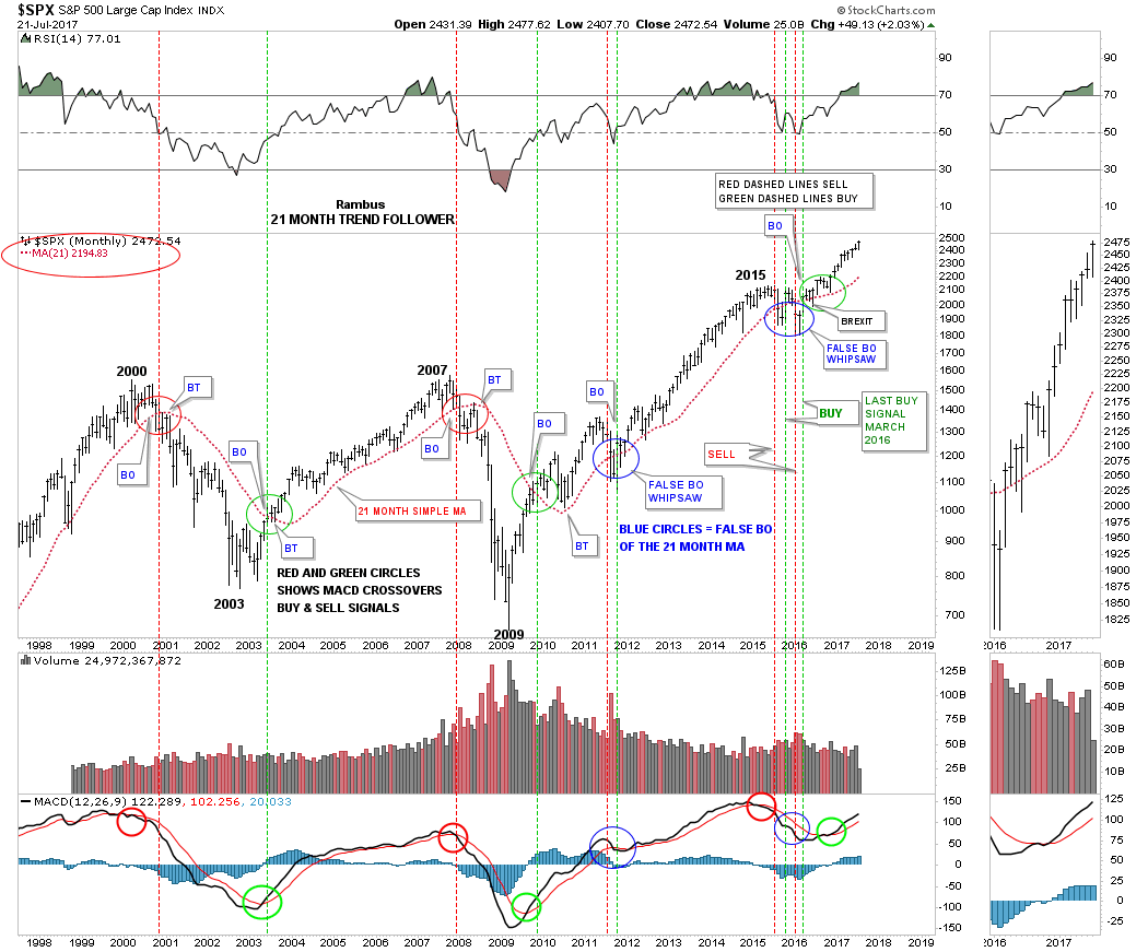
This next buy and sell signal chart for the SPX is a 20 year monthly line chart which uses just the MACD and Histogram. A sell signal is generated when the blue line on the MACD crosses below the red line with the Histo moving below the zero line. Just the opposite for a buy signal. When the last buy signal was generated in December of 2016 I suggested at the time that the move up could be strong and long lasting. The reason being was that the MACD was trading way below its previous high, but as you can see the SPX was trading at a new all time high. So as the MACD corrected the SPX didn’t, and formed a double bottom similar to the one in 2002 which led the SPX up to the infamous 2007 double top high, which led to the crash. Again, like the 21 month moving average trend following chart, there are not a lot of buy and sell signals generated, but when you do get one it pays to follow the signal.
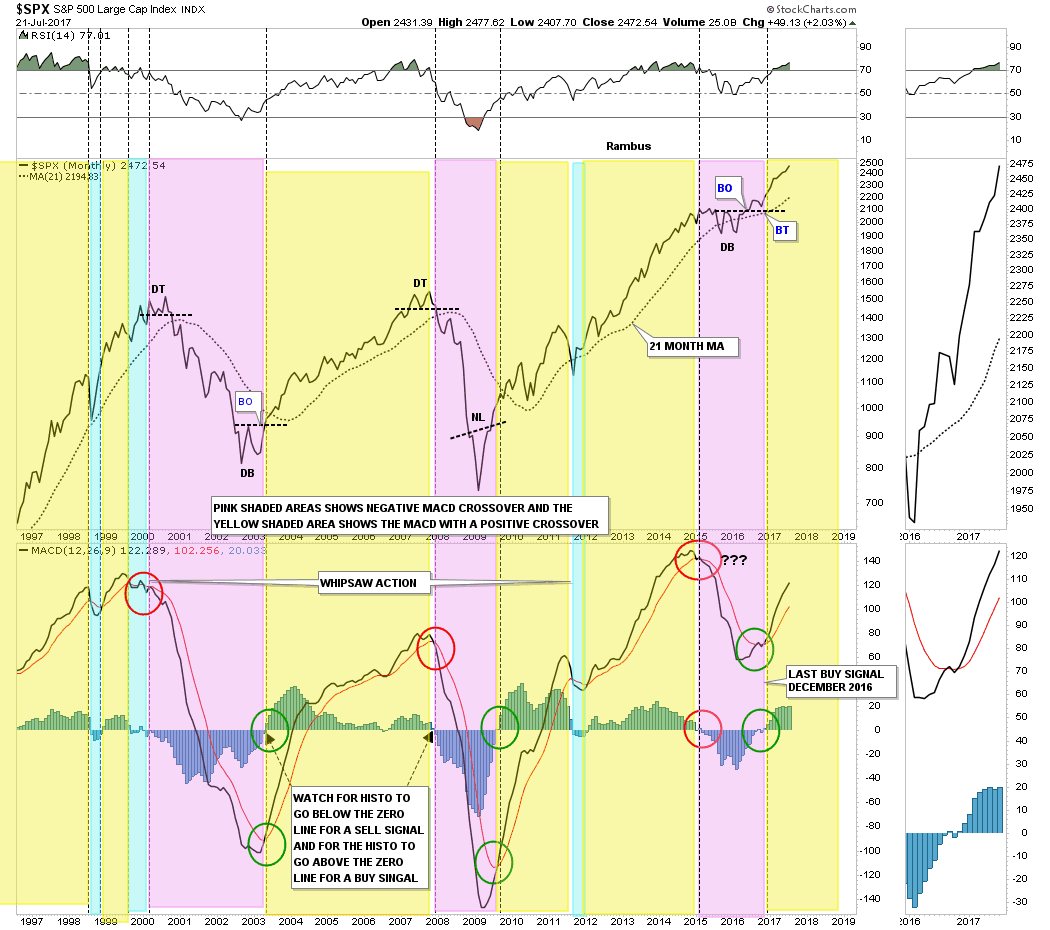
Lets finish up with the SPX by looking at a weekly chart which shows the consolidation pattern that formed in 2015 and 2016 as a H&S pattern. The H&S pattern has a price objective up to the 2556 area. If the blue triangle plays out as a halfway pattern the price objective would be just under 2600. Again, what would change my bullish outlook would be if the price action trades below the apex of the blue triangle or the 30 week ema.

Next up, lets look at the $RUT, Russel 2000 small cap index, which has been lagging the other US stock markets. The reason its been lagging is because it has been building out an expanding triangle since the middle of December of last year. Note the last bar on this daily chart which was last Friday’s price action which strongly tested the top rail again for the 6th time letting us know it’s still hot.
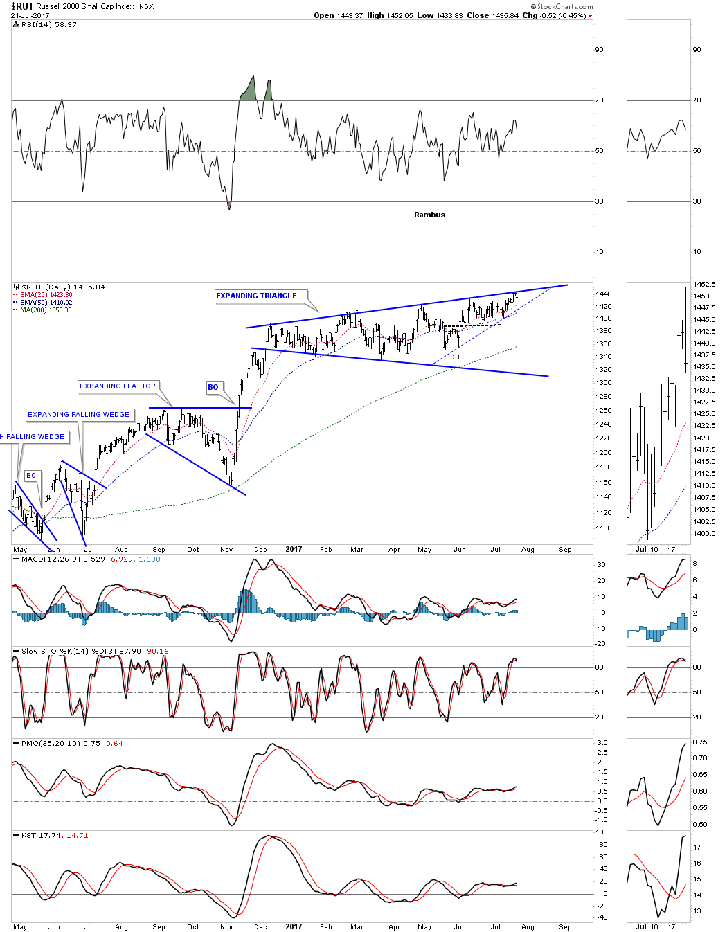
The 2 year daily chart below shows how the blue expanding triangle fits into the 2016 uptrend channel. Something is going to have to give pretty soon as the price action is squeezing into the top rail of the blue expanding triangle, and the bottom rail of the 2016 uptrend channel.

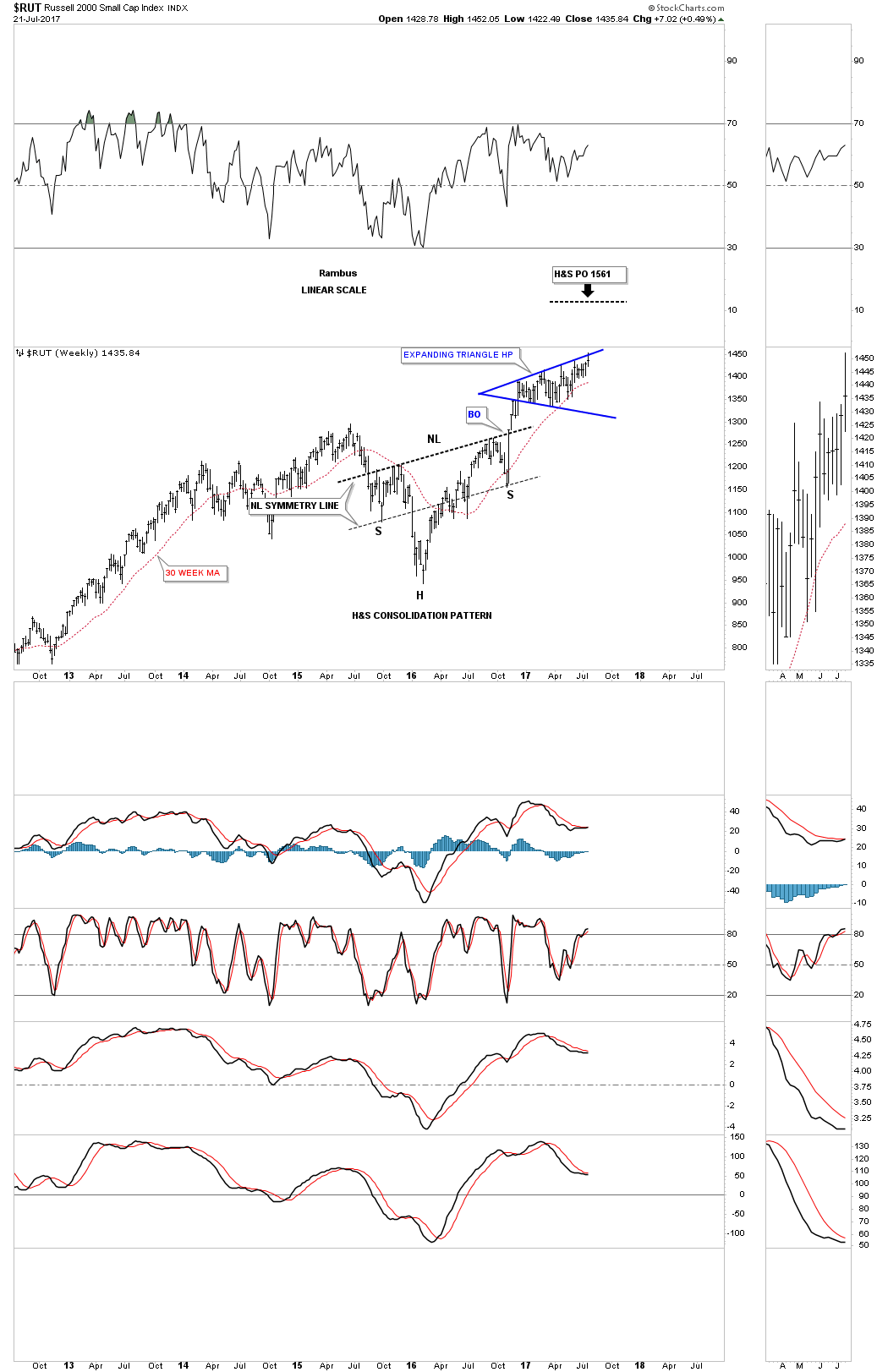
The blue expanding triangle hasn’t shown us its hand yet, but if the weekly chart below has anything to do with which way the price action is going to breakout, this chart with the H&S consolidation pattern should. The price objective for the H&S consolidation pattern is up to the 1561 area.
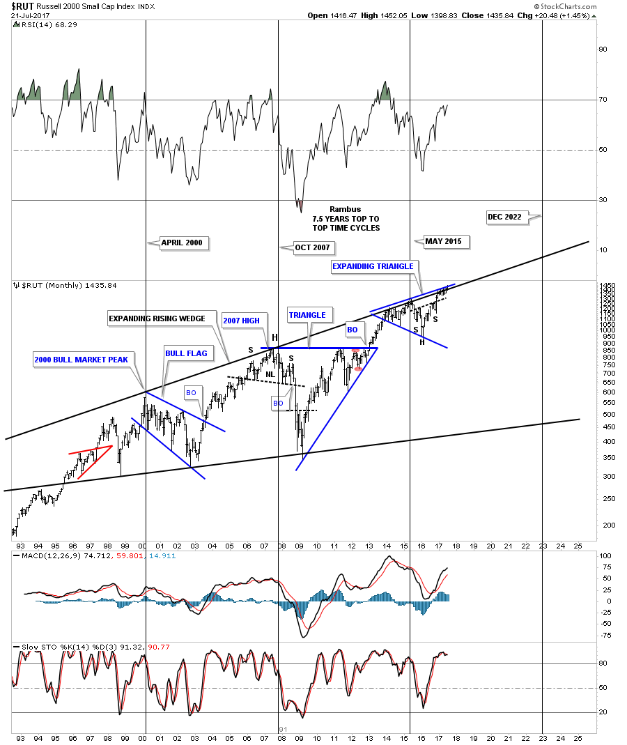
This last chart for the RUT is a long term 25 year monthly chart which shows you another reason the small caps have been the weakest sector over the last 8 months or so. There is a much bigger blue expanding triangle that began to buildout in 2013 just below the top rail of the 17 year expanding rising wedge. The expanding triangle we just looked at on the weekly chart above is hardly visible on this monthly chart. Again, if the H&S consolidation pattern plays out, it is strongly suggesting that the top rail of that massive expanding rising wedge will be broken to the upside, which I know sounds impossible at this time.
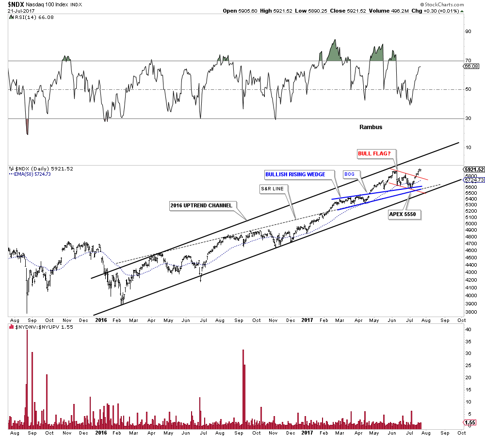
Lets finish up with the US stock markets by looking at the $NDX which gave most investors a scare 2 weeks ago when it started to correct its recent run up. The daily chart below shows its 2016 uptrend channel where multiple support lines came into play during the recent price action. There was the apex of the blue rising wedge which came into play around the 5550 area, the 50 day ema and the black dashed S&R line. The red pattern shows a possible bull flag, but I can’t rule out a backtest to the top rail in the coming days, but so far so good.
This next daily chart for the NDX I call, “Just Another Brick in the Wall,” because of all the small consolidation patterns that formed during the last major impulse leg up. The 4th reversal point in the black bullish rising flag in 2012 marks the start of that major leg up for the NDX. As you can see the NDX has built out another big consolidation pattern, the bullish rising wedge, which had a breakout in January of this year. It looks like the NDX is repeating the previous impulse leg up in time and price out of the bullish rising flag by building out its second small blue consolidation pattern since the breakout. When all is said and done the black bullish rising wedge should look like a halfway pattern between the two big impulse moves.
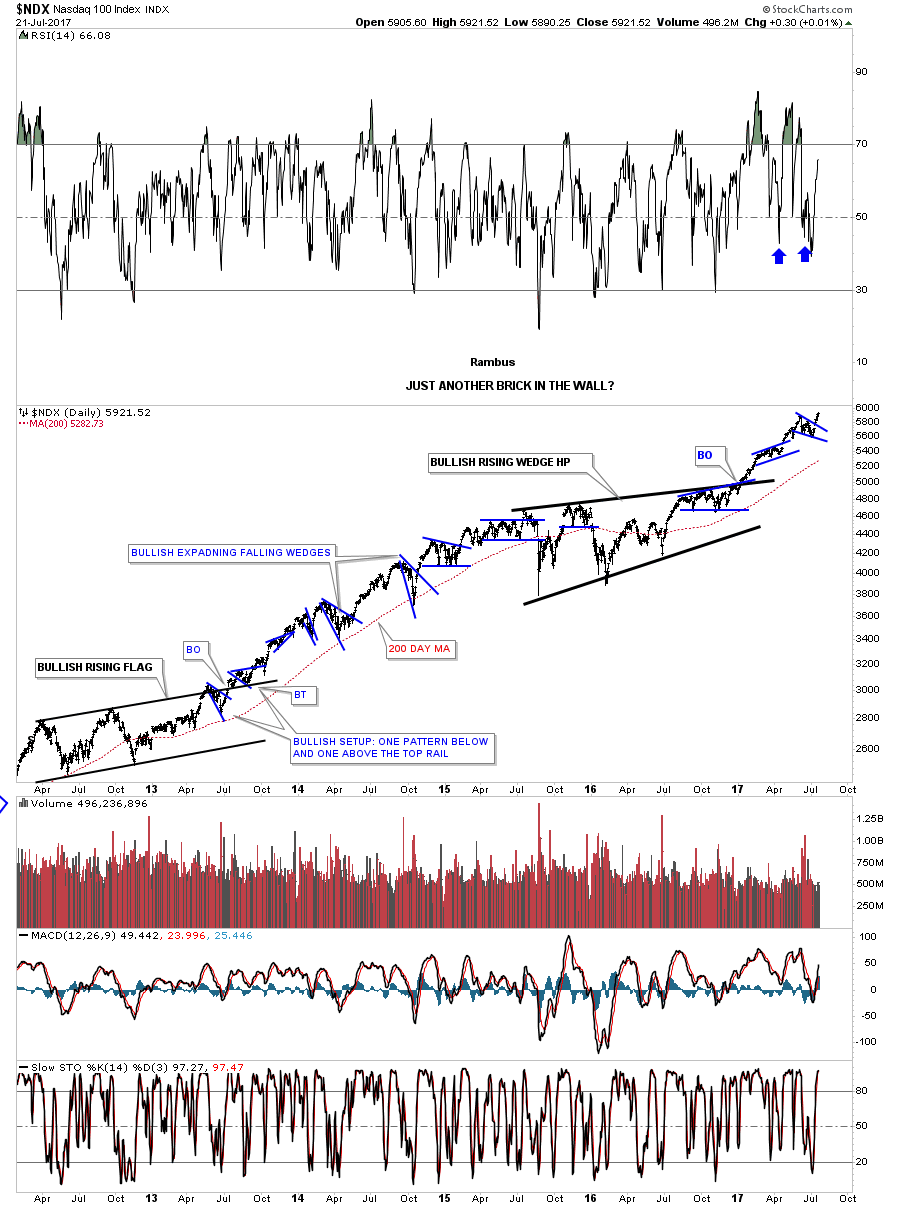
Below is a long term weekly chart for the NDX which shows its secular bull market that began with the large H&S bottom in 2009. In bull markets you will see one consolidation pattern forming above the last one with an impulse move between them. It’s hard to know how many consolidation patterns the NDX will build out during its secular bull market, but most bull markets form a number of consolidation patterns before they are finished.
This last chart for the NDX is a long term monthly look which gives us a couple big clues why the bull market is progressing like it has. First, note the parabolic rise into the 2000 bull market top which was the first reversal point in the massive 10 year triangle consolidation pattern. It took 10 years to consolidate the last secular bull market which ended in 2000. Then you have the classic H&S bottom with the left shoulder and head forming inside the 10 year triangle, with the right shoulder forming as the backtest to the top rail. Note the beautiful symmetry between the left and right shoulders, as shown by the brown shaded areas. I know how hard it is to comprehend, but that 10 year blue triangle I view as a halfway pattern to the upside. How’s that for going out on a limb? From a Chartology perspective the bull market that began at the 2009 low looks alive and well with no end in sight.
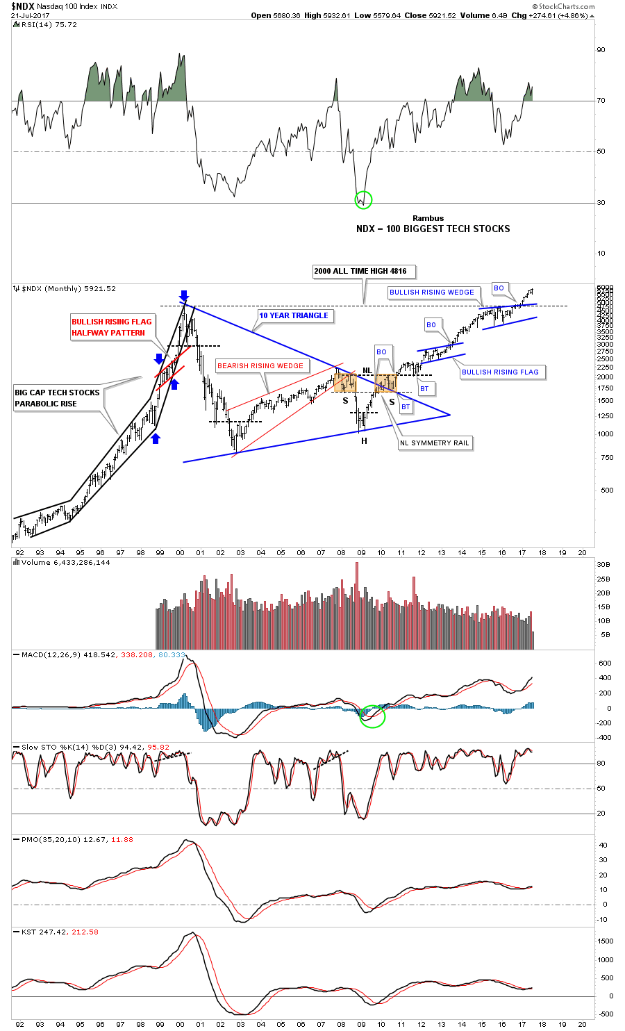
Below is an old long term monthly chart for gold which shows you what a beautiful bull market looks like. During its bull market gold created 4 big consolidation patterns before its bull market was over. Two of those consolidation patterns were of the bullish rising wedge type that tells you that you are in a strong bull market. which is similar to what we just looked at on the NDX charts above.
In part 2 of this report we’ll look at some of the different sectors that make up the stock markets, which should give us some insight on the durability of this bull market in stocks that has been going on since 2009. All the best…Rambus
General Markets Part 2
Prepared on July 24, 2017In part 2 of the Weekend Report we’ll look at a few more US stock markets and then some of the different areas that look like they could be ready to move again. As Sir Plunger has shown us there are areas that are taking a beating right now while other sectors are doing fine. So depending on your style of trading there is something for everyone.
I won’t go into a lot of detail as most of these charts are pretty self expanatory. I just want to paint a picture for you so you can see and understand how this bull market is unfolding before our very eyes from a Chartology perspective. If one is using Elliot Wave, cycles or whatever trading discipline you are using you will see the stock markets in a different light which can be just as right as Chartology, but from a different angle.
I got into trouble years ago at the Tent when I said, “There is more than one way to skin a cat.” A poster let me know real quick not to use that term again. Anyway, that holds true for trading the stock markets as well. Whatever you think may work for you, study it for all its worth, until you understand all the little idiosysyncrosies that come with that discipline. Through the years I’ve dabbled in just about every trading method out there, but for me personally, I always came back to Chartology.
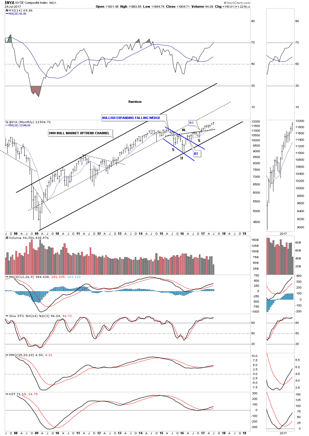
Lets start with the weekly chart for $NYA which is a good proxy for the stock markets in general. The H&S consolidation pattern is the dominate chart pattern.
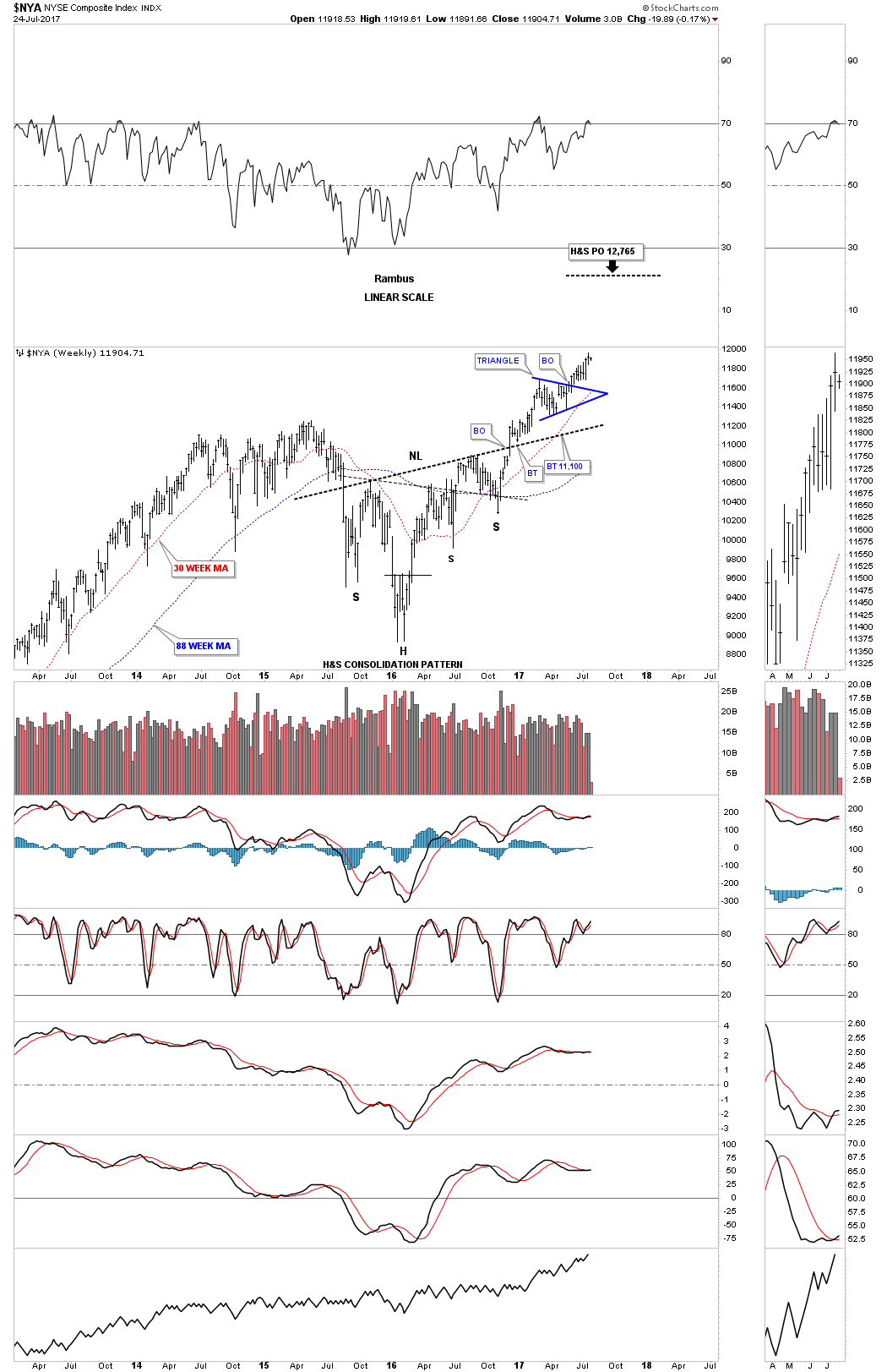
This long term monthly chart shows its 2009 bull market uptrend channel with the combo blue bullish expanding falling wedge/H&S consolidation pattern. It’s hard to argue with the price action since the breakout above the neckline, steady as she goes.
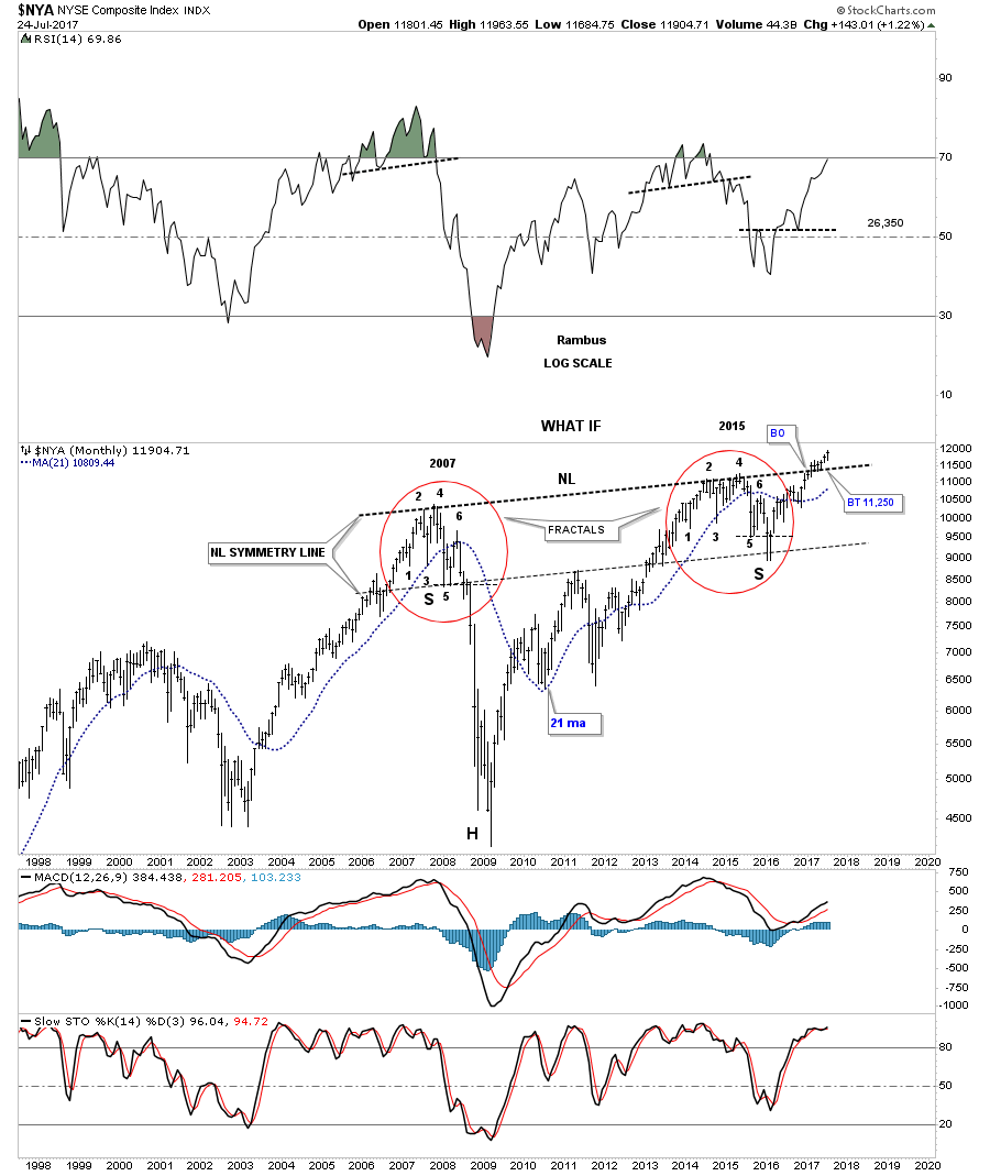
This last chart for the NYA is one I’ve only posted once so far and that was when the price action broke out above the neckline. I was showing you how fractals can work out very well sometimes, but can fail at the very last minute. As you can see the left and right shoulders are virtually clones of each other right down to the last reversal point which was just below #5. Up until that point the fractals were identical. This chart also shows you a good example what can happen when a fractal or even a H&S pattern for that matter fails. What generally happens is you will see a big move in the opposite direction which has been the case. A failure for a H&S pattern is when you see the price action trading above the top of the right shoulder on a H&S top. Generally that will lead to a big move up.
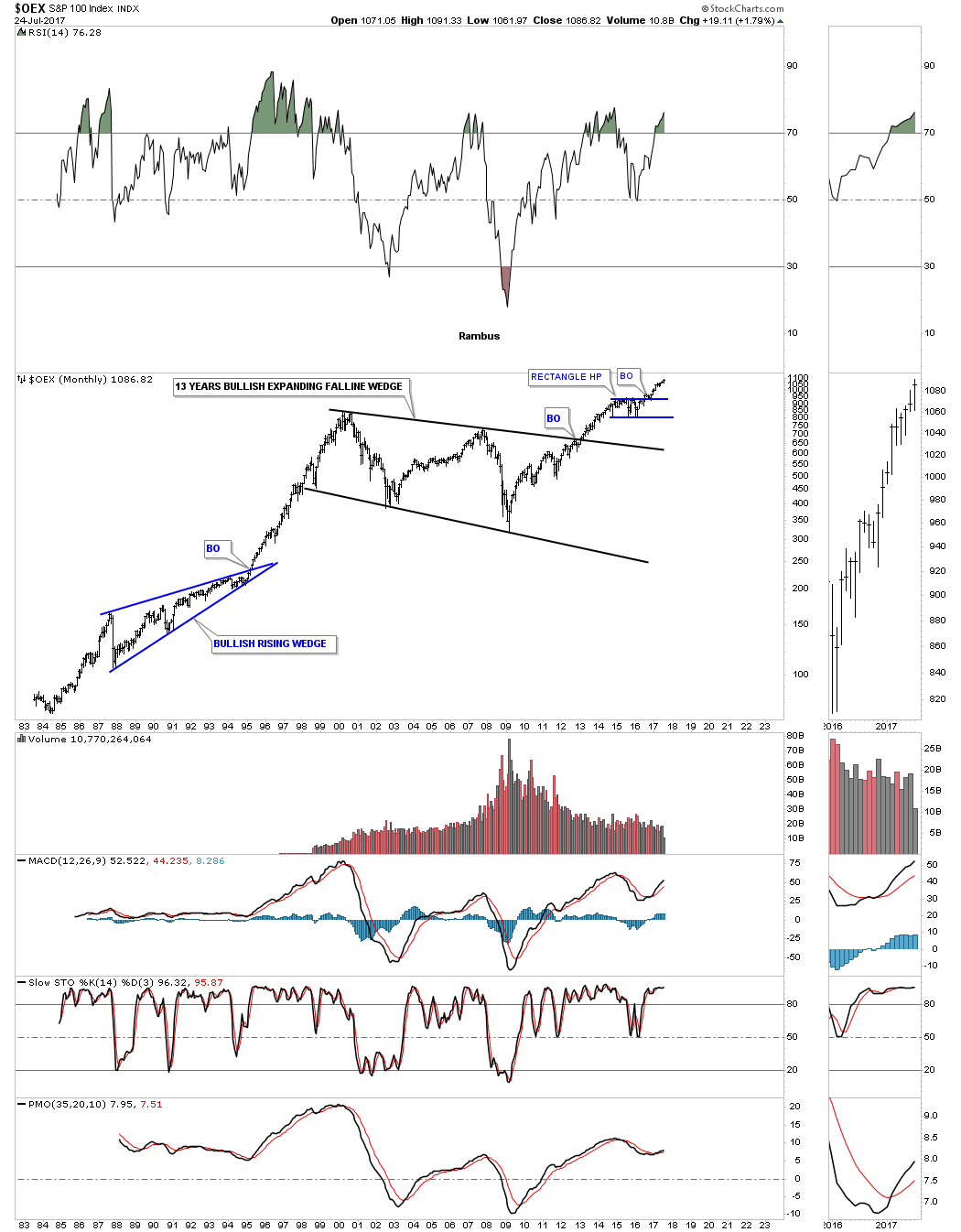
Below is a monthly chart for the OEX 100 which shows its bull market uptrend channel with its 2015 – 2016 correction being the blue rectangle consolidation pattern.
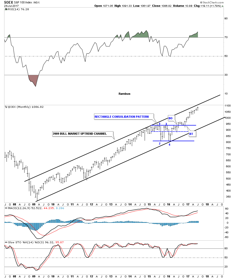
This 35 year chart for the OEX 100 shows how the blue rectangle fits into the big picture. For those that think the Jaws of Life pattern we’ve been following in the INDU is a fluke you can see how the OEX 100 was one of the first major stock market index to breakout of its massive 13 year bullish expanding falling wedge back in 2013.
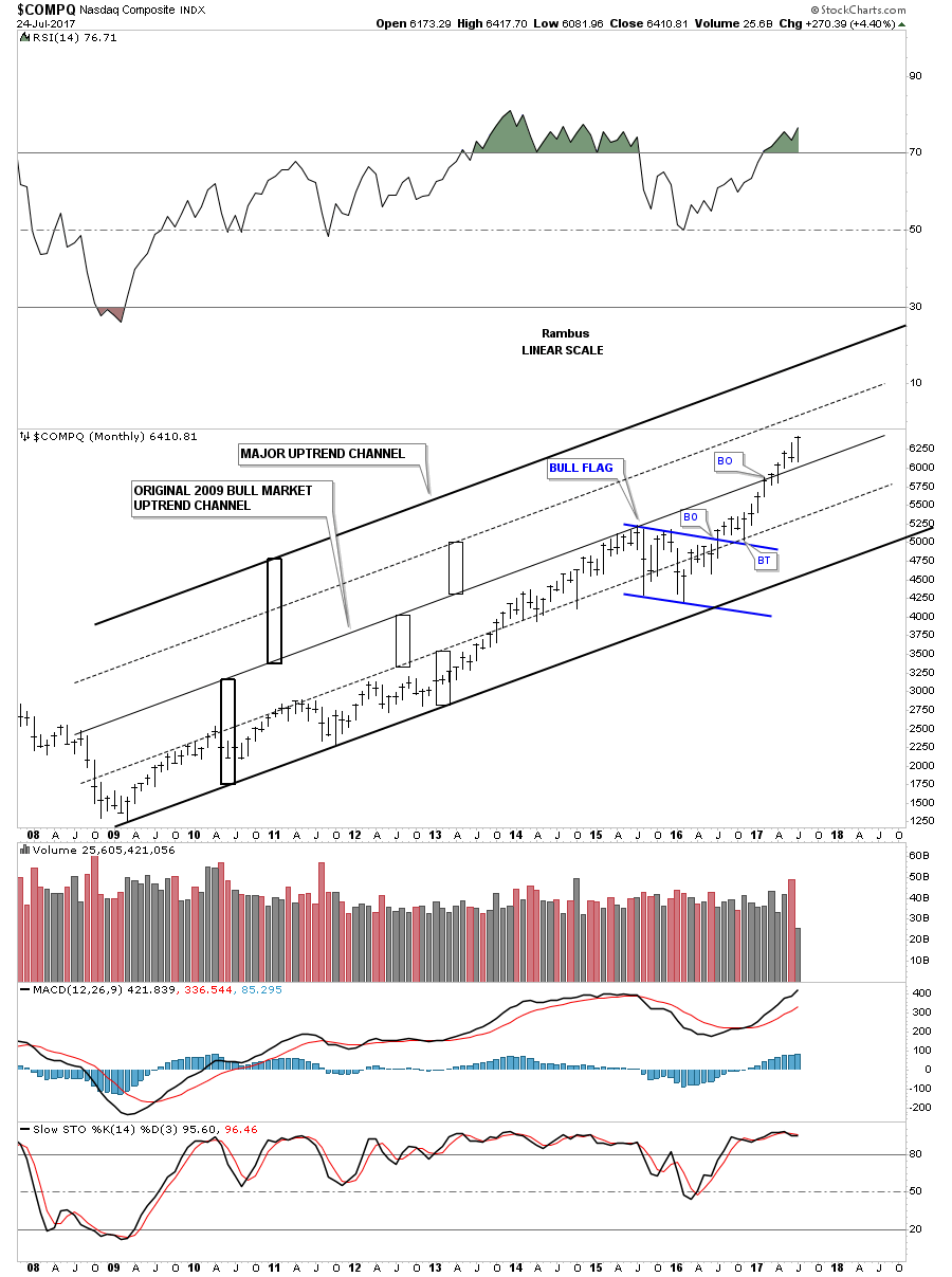
Below is a monthly chart for the $COMPQ that I haven’t shown you yet. In strong bull markets a nice tight uptrend channel can morph into a much bigger uptrend channel as the price action moves strongly upwards. The big rectangle on the bottom shows the original 2009 bull market uptrend channel, but as you can see the price action broke out above the original top rail and is now approaching a possible secondary trendline, the dashed black trendline, as shown by the smaller rectangles. Since the 2015 low you can see how the rally has been accelerating to the upside which is causing the main 2009 uptrend channel to morph into a bigger uptrend channel.
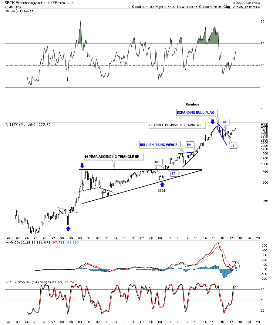
Now lets turn our attention to several sectors within the stock markets that look like they want to move higher starting with my favorite sector the $BTK, biotechnology sector. This daily chart below shows the dominate chart pattern as the H&S consolidation pattern. After the breakout above the neckline the BTK took its sweet ole time with the backtest forming a 4 month bullish rising wedge as the backtest. Last week the BTK broke out of a smaller consolidation pattern the bullish falling wedge. Today this index closed at a new high for this particular move.
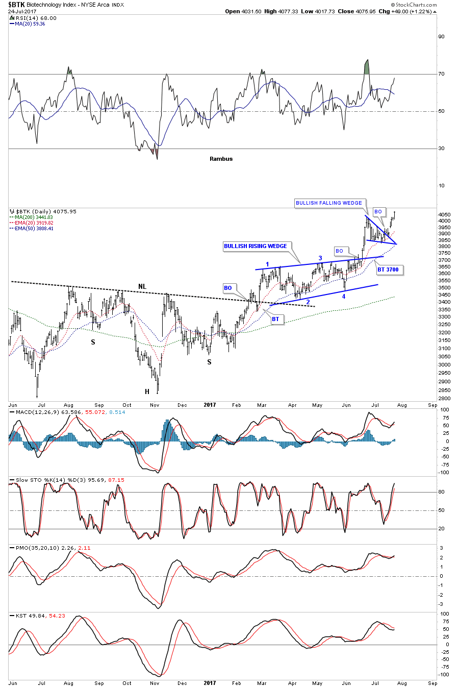
This weekly chart shows how the H&S consolidation pattern on the daily chart above formed the backtest to the much bigger black expanding falling wedge. We would have to go back about 2 years now to be at this weeks high. Sometimes you’ll hear me say, “I’m going to jump the gun on this trade,” meaning I’m going to get positioned before the breakout actually takes place. Sometimes it works out and sometimes not, but in this case it worked out great so far. I got my 2 positions in LABU just below the bottom rail of the bullish rising wedge right before the breakout. As you can see there wasn’t a backtest so if one wanted in they would have to pay up or miss the move entirely.
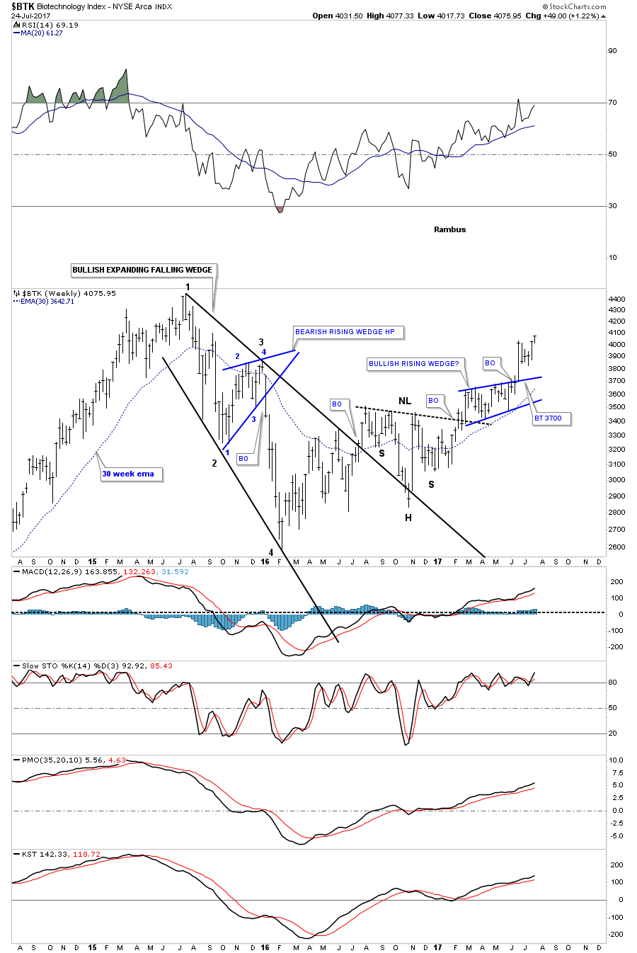
I first became aware of this index back in the late 1990’s when it went parabolic into the 2000 top. From that top made in 2000 it took the BTK 10 years to consolidate that parabolic move forming the 10 year triangle consolidation pattern. What has been so impressive about this index has been its relative strength through the years. Note how high the 2009 low was. While just about everything crashed into the 2009 low the BTK had a very mild decline and was the first sector to breakout into new all time highs.
Another area that is looking strong right now is the XLV, Health Care sector. Like the biotech’s this index had a very strong impulse move up out of its 2009 crash low where it formed a double H&S bottom. Again, similar to the BTK this index has been chopping out a triangle consolidation pattern and broke out above the top rail last month. I’ve been waiting for a backtest to the top rail, but it hasn’t materialized yet. This might be a case where if you want in you just get in before the price action moves much higher. You can then buy your second position if we do get a backtest to the top rail around the 74.50 area.

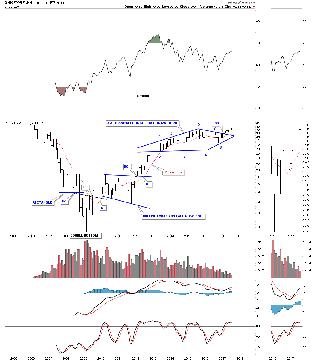
Another area that is showing some potential is the XHB, Homebuilders. I first brought this index to your attention just before the price action broke out above the top rail of the 8 point diamond consolidation pattern.
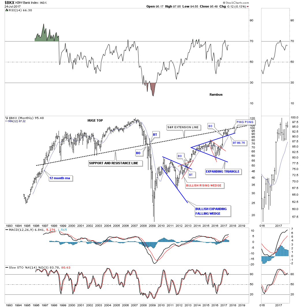
Another area that is showing some signs of life is the $BKX, Bank index. It broke out of a 3 year expanding triangle in December of last year and has been in backtest mode ever since. So far the 30 week ema has been helping with support at the top rail.
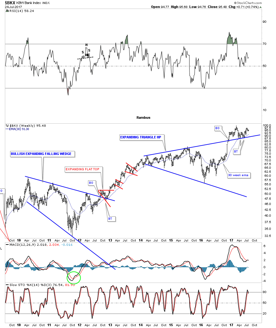
There is an old adage in charting that goes back a long time which says, an old trendline never dies it just slowly fades away. Below is a long term monthly chart for the BKX which shows the massive top that took years to buildout that led to the 2008 crash in the banking stocks. Note how the current price action is doing a ping pong move between the massive S&R line and the top rail of the blue expanding triangle. The 12 month simple moving average has now made it up to the top rail of the blue expanding triangle which should also help with support.
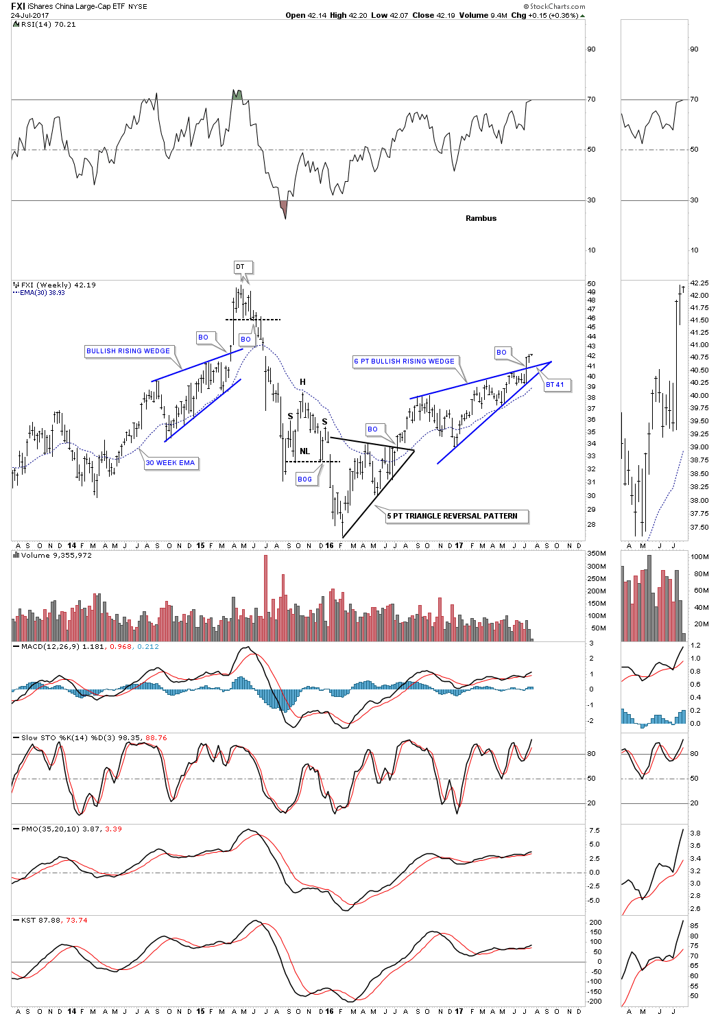
Next I would like to show you 2 foreign stock markets that are looking very strong at the moment. The first one we’ll look at is the FXI, China large cap etf. There are 2 dominate chart patterns forming on this etf with the first one being a double H&S bottom. It had a long drawn out backtest, but the neckline held its ground in the end.
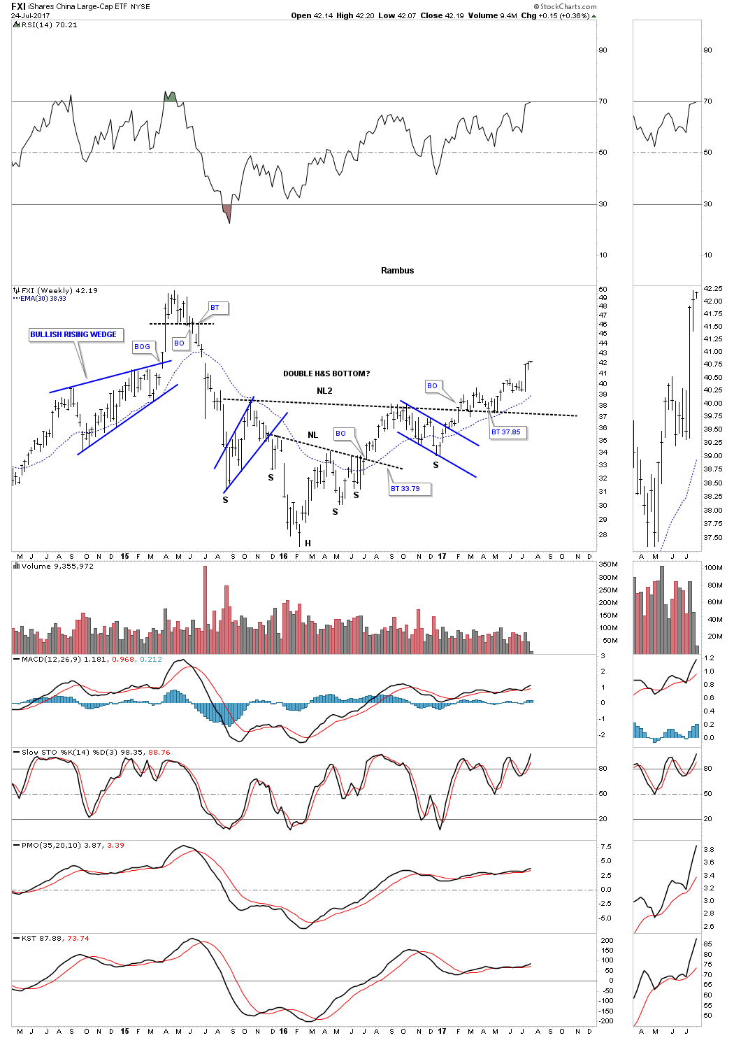
This second weekly chart for the FXI shows us a 6 point bullish rising wedge formation that broke out above the top rail a couple of weeks ago. If we get a backtest it will come in around the 41 area. Note the double top that reversed the previous uptrend and the 5 point triangle that reversed the previous downtrend.
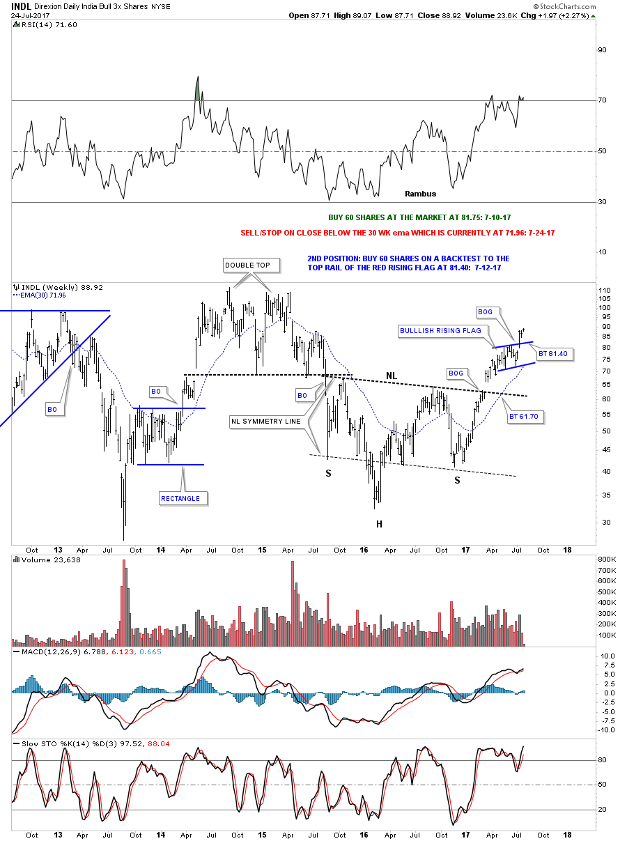
As I have to draw the line somewhere this last foreign stock market we’ll look at is the INDL, 3 X long etf for the India stock market. This daily chart below shows the price action breaking out of a bullish rising flag several weeks ago with no backtest.
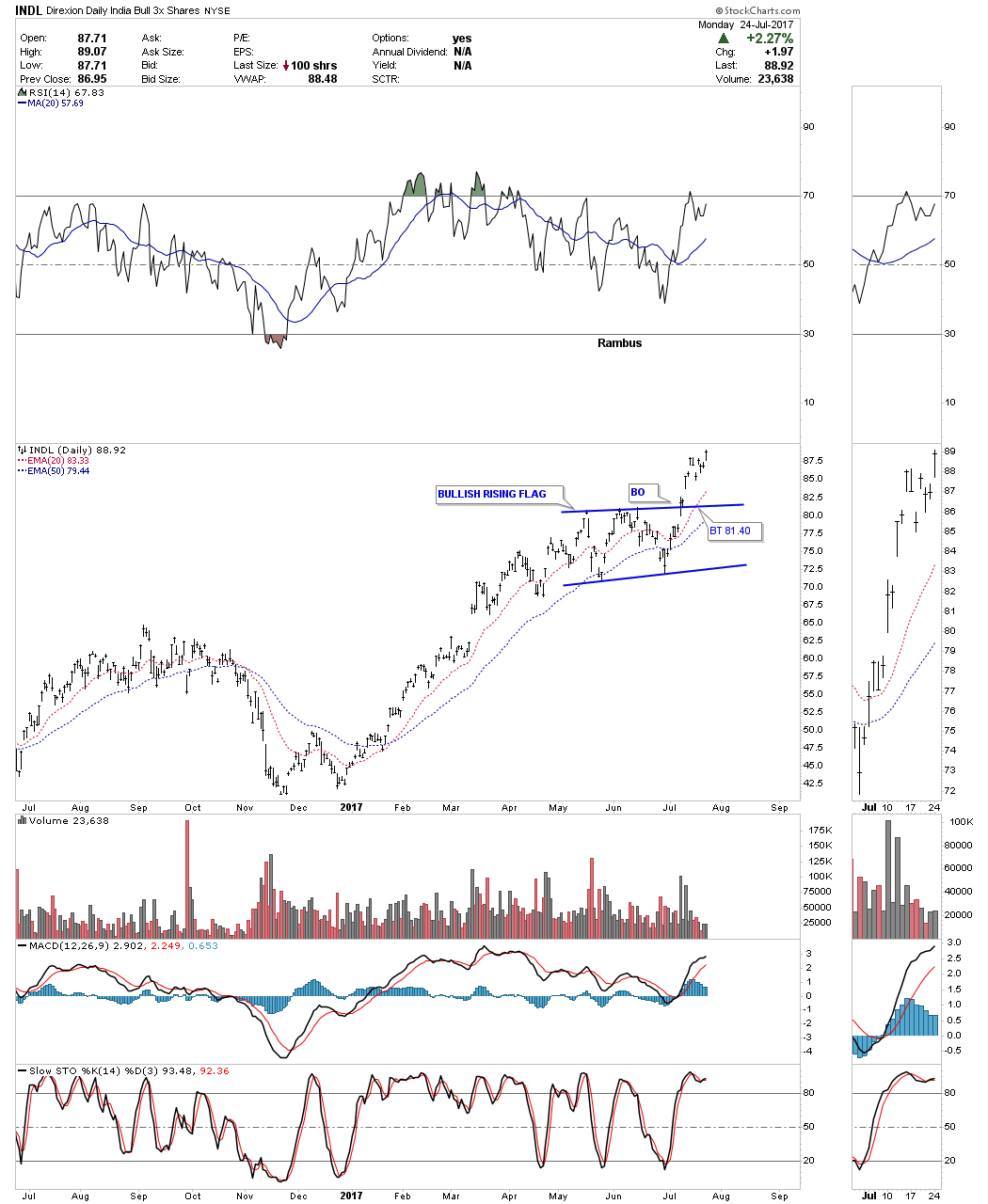
This weekly chart shows an inverse H&S bottom that had a big breakout gap. I waited for the backtest to enter a position, but it never came. The next opportunity came when the bullish rising flag developed which I was able to take advantage of.
When looking at all the charts above there are still plenty of ways to take advantage of the markets. Sometimes when our focus is so narrow we can miss out on big moves in other areas. They say there is always a bull market somewhere, we just have to look for it and trade it accordingly. All the best…Rambus
Precious Metals Part 1
Gold : Interesting Moves : Interesting Potential Targets.
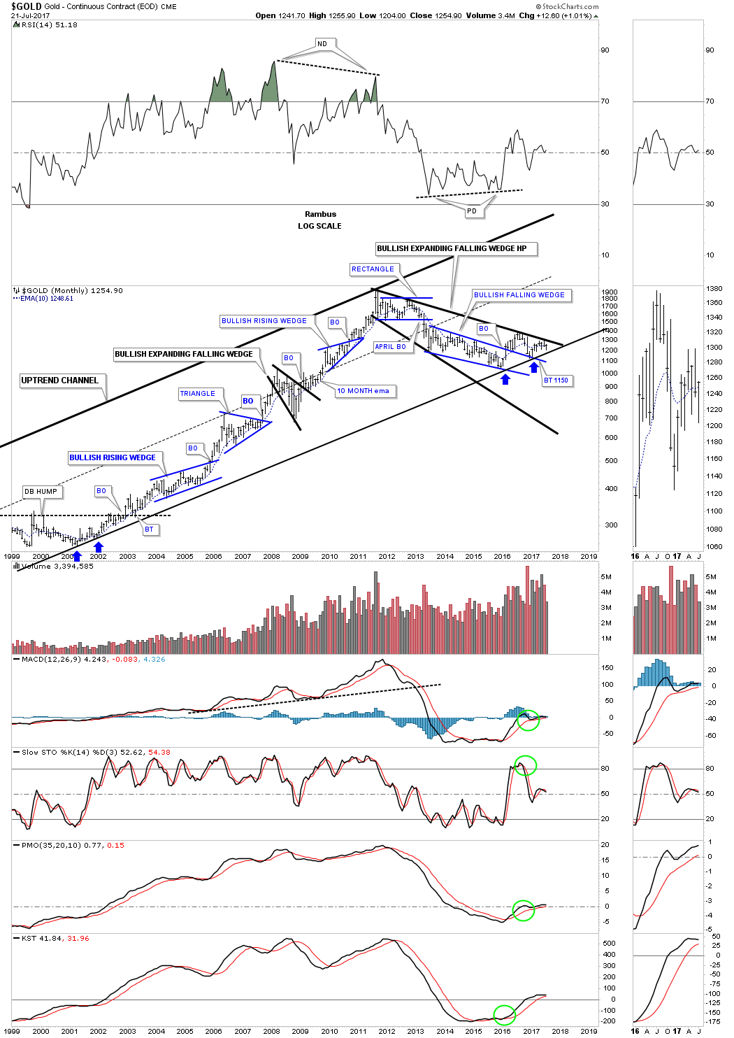
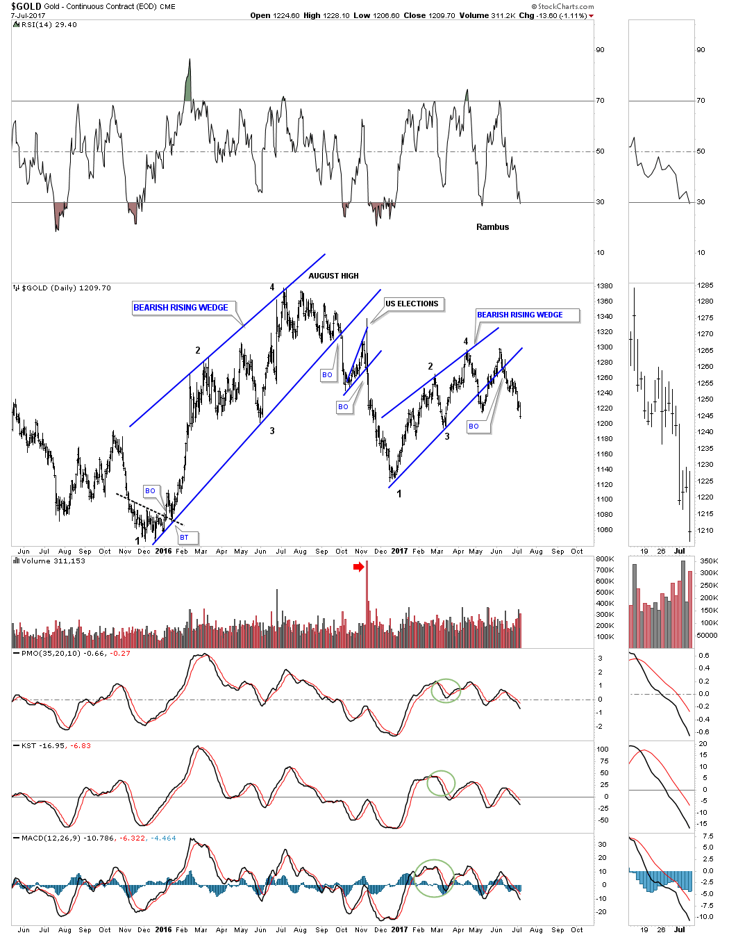
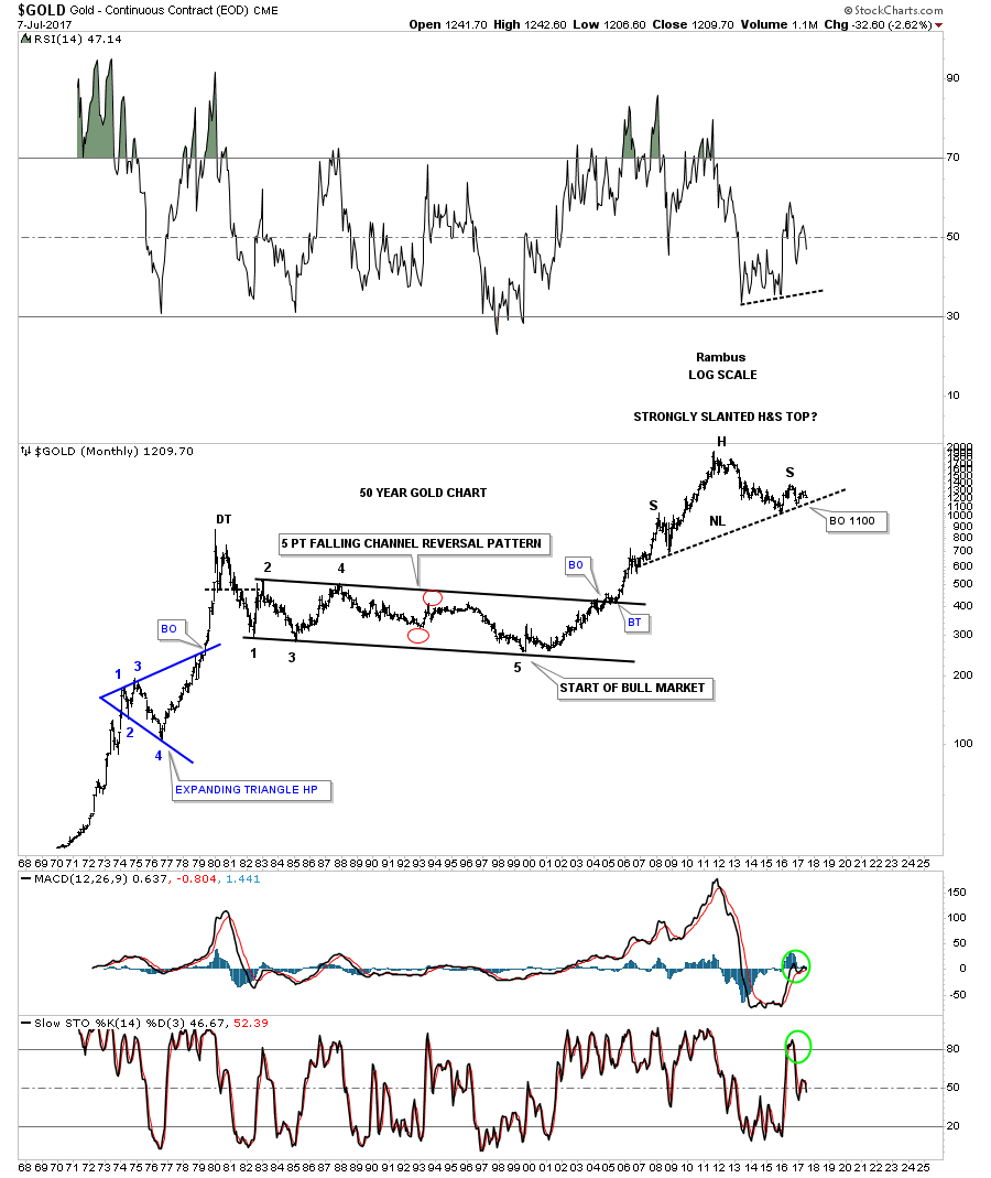
Prepared on July 9, 2017With some interesting moves in the precious metals complex last week I would like to update some charts for gold we were following late last year after the August high was put in place. There were several reversal patterns that were building out which strongly suggested that some kind of top was in place. The only question was, were they a short term top or longer term top? In this Weekend Report I’m going to do an in-depth look at gold from the daily charts to the long term charts to see if we can make some sense out of what is actually taking place with the love hate relationship that most have with gold.
This first chart for gold shows that it formed a bearish rising wedge as the rally phase, out of the late 2015 low. Note the US election spike which attempted to backtest the bottom rail of the bearish rising wedge. From that spike high gold declined in a straight line down to the late December 2016 low where it found support, and began another rally which also formed a bearish rising wedge with a sloppy breakout and backtest, which can be the case sometimes with wedges. So from the December 2015 low to the August 2016 high gold has produced a higher low and a lower high, which I’ll show you in a bit what this may mean.
Some of you may remember this next pattern that formed on gold which was also showing up on several of the PM stock indexes at the August 2016 high, especially the GDXJ. This pattern was the 7 point diamond reversal pattern. Note how the apex of that 7 point diamond reversal pattern held resistance on 2 separate occasions which created the double top. Last week gold broke down below the double bottom trendline confirming the double top.
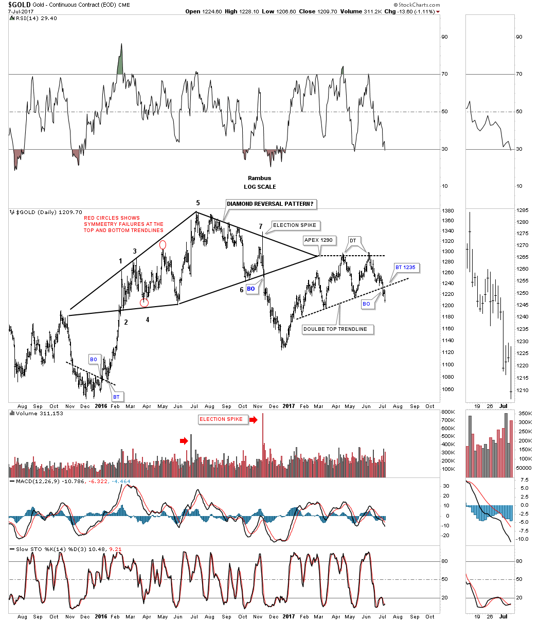
The other 2016 reversal pattern gold formed was the unbalanced H&S top which I generally show as the topping pattern on the longer term charts. Here you can see how the neckline extension line held resistance on the backtest, which again helped create the double top reversal pattern. If you recall gold was the only one out of the PM complex that came close to reaching its price objective which was at 1116.

When looking at these 3 daily charts above you can see how gold has been chopping sideways since the December 2015 low, making little progress in either direction. Some of you may be getting a picture of where I’m going with this next daily chart. The first chart I showed you tonight was the daily chart which had 2 bearish rising wedges. Not always, but a lot of the time, a triangle will be made up of several different chart patterns which makes up the internal structure of a triangle or any other consolidation pattern for that matter. As you can see the price action still hasn’t broken below the bottom rail yet, but if it does the implications will be far reaching in the big picture. Keep this potential triangle consolidation pattern in the back of you mind as we go we go back in time to look at the big picture.
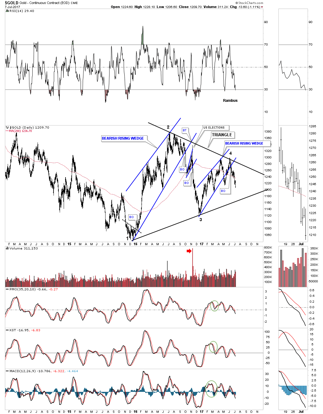
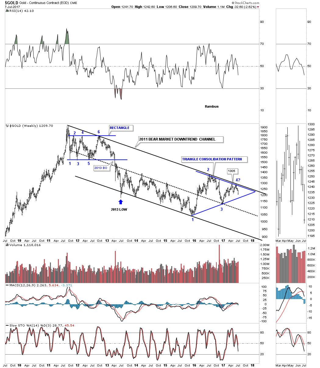
Below is a 10 year weekly chart for gold we’ve been following that you should be familiar with, which shows its 2011 bear market downtrend channel. You can see how all the daily charts patterns above come into play just below the top rail of gold’s major downtrend channel, which needed to be reversal patterns in order to keep that top rail hot.
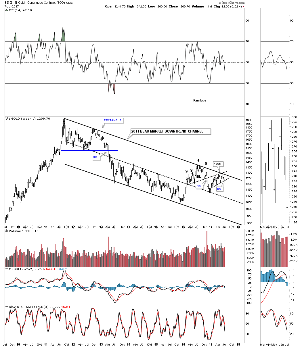
Below is the exact same chart as the one above, but this chart shows the blue triangle as a consolidation pattern. When looking at the 6 point rectangle at the top of the chart, time wise our current triangle has taken about the same amount of time to build out to this point. Again, keep the blue triangle in the back of your mind as we look at some longer term charts for gold.
This next long term monthly chart for gold I originally built out in late 2013, where I was looking for the neckline extension line / neckline symmetry rail to offer resistance once the price action broke below the bottom rail of gold’s major expanding uptrend channel. You can see the left shoulder and head formed inside the expanding rising wedge while the right shoulder formed on the backtest to the bottom rail of the expanding rising wedge.
When gold finally broke down below the neckline I thought that the price action would decline down to the H&S price objective at 750 or so. Looking back in hindsight now the blue triangle makes perfect sense, which I’ll show you in a minute. The neckline symmetry rails are all taken from the 2008 H&S consolidation pattern which was one of the most symmetrical H&S bottoms I’ve ever charted.
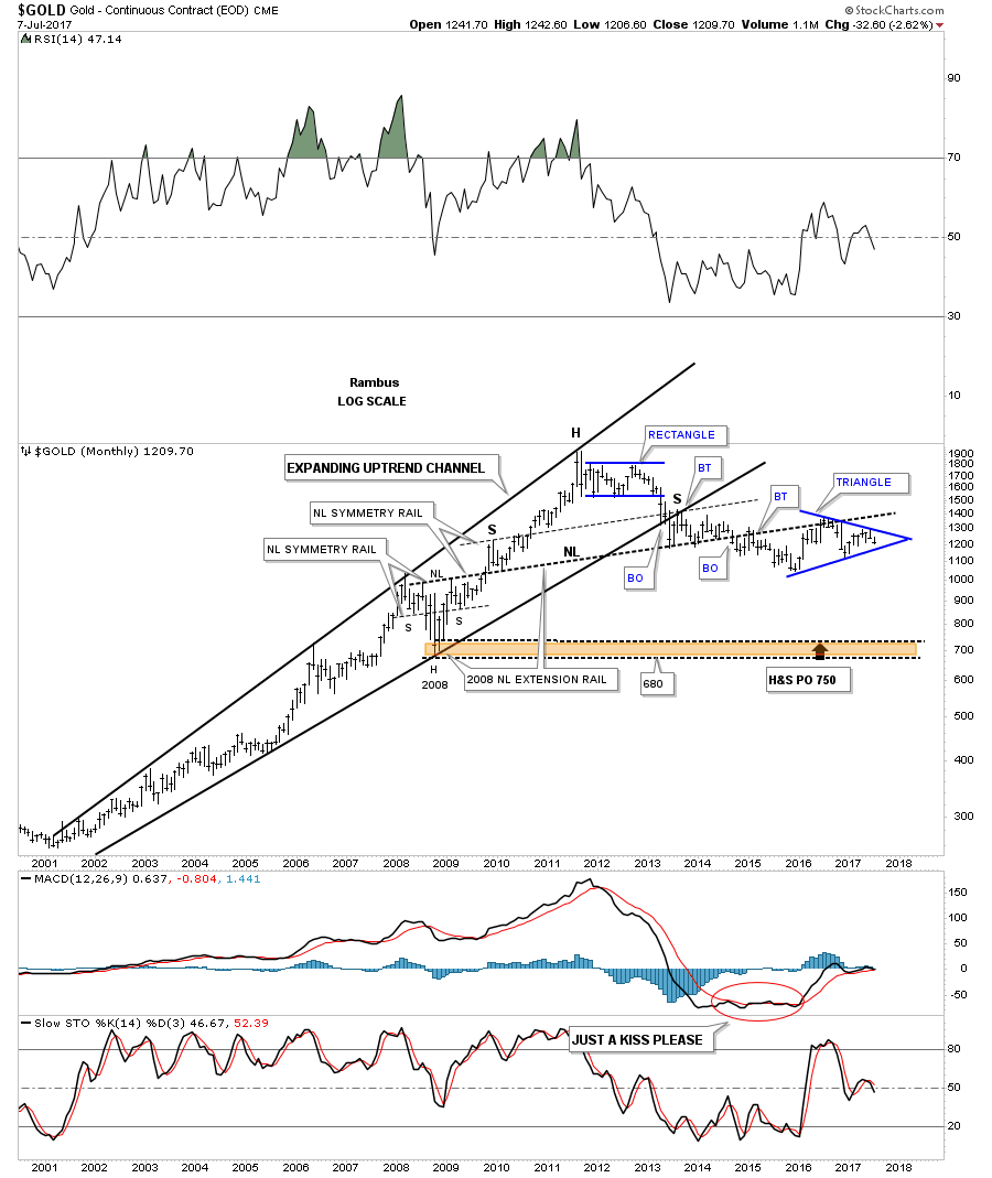
Back in November of last year, shortly after the US elections, I built out a series of long term charts for gold which I labeled, “Just for Entertainment Purposes.” that were showing some potential massive H&S tops building out. At the time the bigger bearish rising wedge we looked at on the daily chart above, I showed as the right shoulder. Now that 8 months have passed and more consolidation has taken place, the triangle is forming the possible right shoulder of the very large H&S top. Even on this log scale chart you can see gold formed a parabolic bull market before topping out in September of 2011.
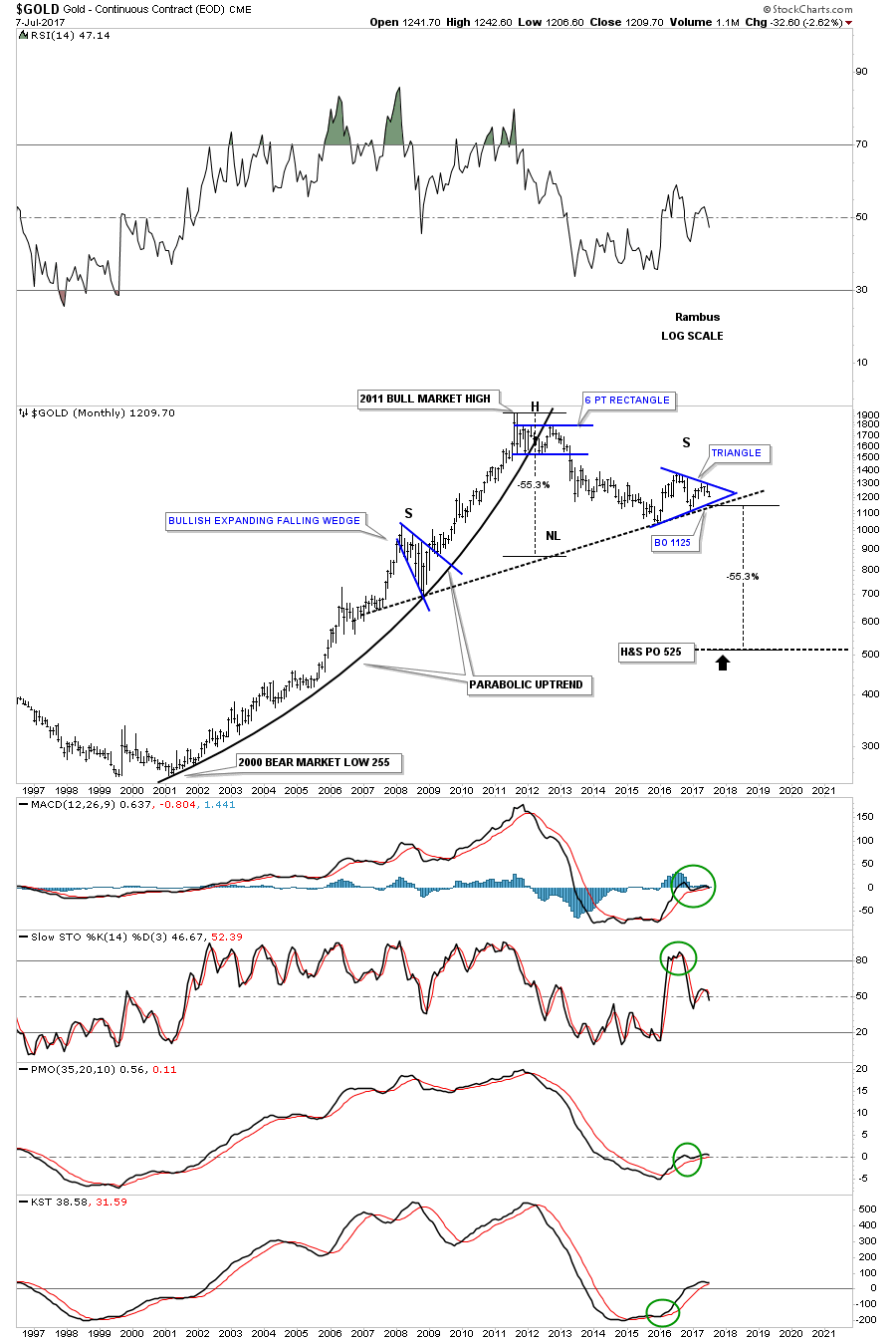
This next chart is a weekly line chart I showed back in November where I was comparing the symmetry of the left shoulder to the right shoulder before the triangle was visible. I need to tweak this chart as it’s still showing the breakout around the 1100 area which now is a tad higher as the neckline is sloping up which will also give us a slightly higher price objective.
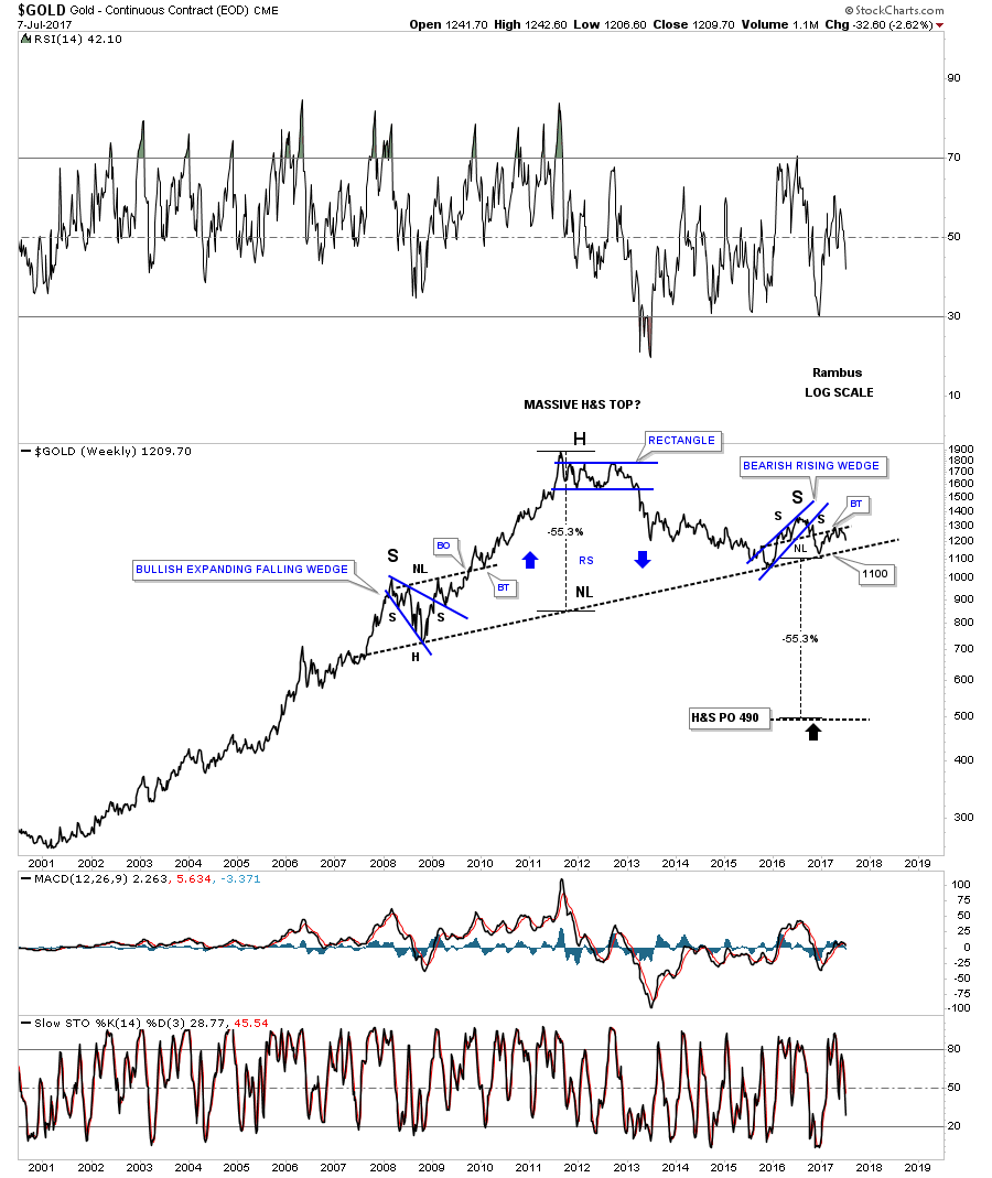
This next chart for gold is a 50 year look which puts the potential H&S top in perspective. If gold breaks below the 1100 area you will be some of the first on the planet to understand what is truly taking place with gold.
This next chart is a ratio chart which compares gold to the US dollar. As you can see this ratio just bounced off the top rail of its 2011 parallel bear market downtrend channel.

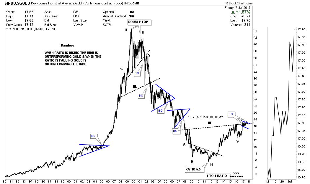
This next series of charts compares the INDU to gold which I believe is going to play out in favor of the INDU for many years to come. We’ve already looked at some very long term charts for gold which are showing a potential massive top building out. This first chart for the INDU:gold ratio is a weekly chart which shows the ratio breaking out above the top rail of the expanding falling wedge that isn’t that impressive on this short term chart.
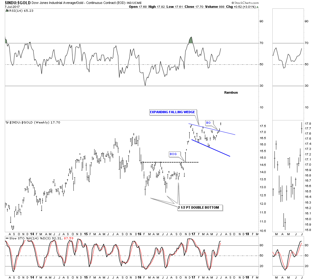
Below is a combo ratio chart which has the INDU to gold ratio chart on top and gold on the bottom. Note where that little expanding falling wedge we just looked at on the weekly chart above has built out. I may sound like a broken record, but when you see a consolidation pattern forming just below important overhead resistance that is generally a very bullish setup. If you look at the sidebar you can see there was a gap that occurred right at the neckline last week. The gold chart on the bottom shows the massive H&S top we looked at earlier.
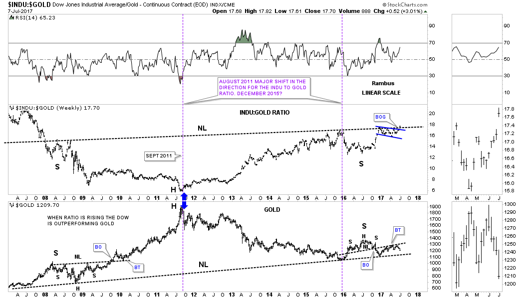
I stated on the short term weekly ratio chart that the blue expanding falling wedge didn’t look that impressive by itself. Below is a 40 year ratio chart which compares the INDU to gold. As you can see from this very long term chart there is a time to be in the precious metals complex, and a time to be in the stock market. If the massive 10 year inverse H&S bottom continues to breakout it’s strongly suggesting that the stock market is going to outperform gold for the foreseeable future regardless of all the reasons it can’t.
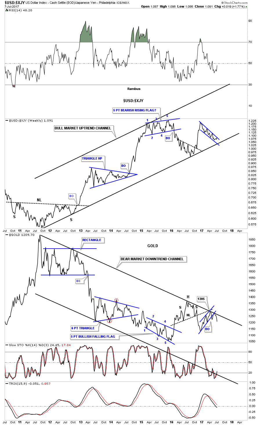
Below is another ratio combo chart which compares the US dollar to the Japanese yen on top and gold on the bottom. I know it doesn’t feel like it right now, but the US dollar vs the yen is building out a massive H&S bottom and there is that very large multi year H&S top on the gold chart below.
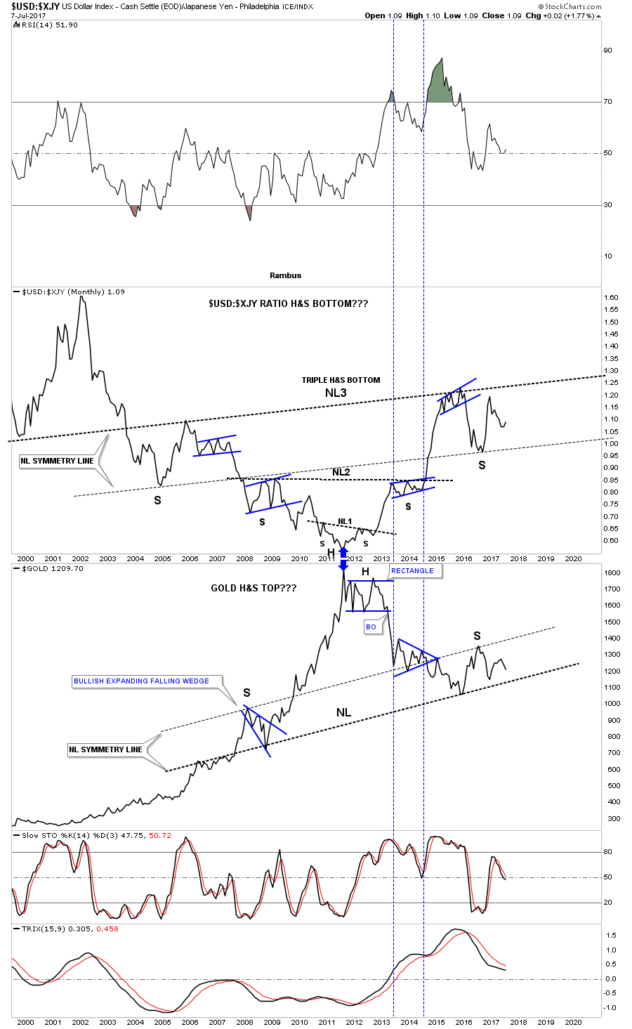
This last chart for tonight is a weekly ratio combo chart which compares the US dollar to the Yen on top and gold on the bottom. This chart does a good job of showing you the inverse correlation these two generally have. The last time we looked at this chart gold was still in rally mode just shy of the top rail of its 2011 bear market downtrend channel. As you can see gold hit the top rail and is now rolling over while the Japanese yen is getting close to breaking out of a possible bull flag which is just the opposite of what gold is doing.
So there you have it. What gold does tomorrow or the next day is not important in the big picture, but if the big picture keeps playing out like the last 8 months when I built out these long term charts, we can expect to see the PM complex bear market continue and the INDU to keep outperforming gold. Keep in mind some of these charts are very long term in nature so price change comes slowly, but as long as they keep moving in the right direction the big picture is set. All the best…Rambus
What About…Silver ?
Prepared on July 12, 2017Tonight I would like to follow up on the Weekend Report by taking a close look at silver. The PM complex tends to turn together, but sometimes one may be stronger than the others. For instance in 2011 silver topped out in April, but gold didn’t top out until September even though they reversed at the same point in time. This goes for the PM stock indexes as well.
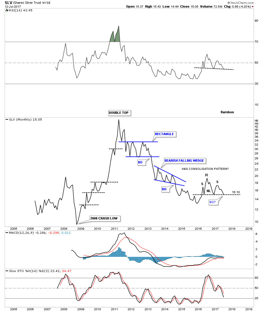
I’m going to use $SILVER and SLV as examples in this post starting with a daily chart for SLV. Since late December low of last year SLV has built out a 4 month triangle consolidation pattern. At the time I labeled the top of the flat top triangle as double top similar to what we seen on gold. SLV had a strong breakout accompanied by a strong and lengthly backtest to the bottom rail of the blue triangle consolidation pattern. Again, similar to gold we looked at earlier today, SLV built out a H&S top as the backtest to the bottom rail of the triangle with the left shoulder and head forming inside the rising wedge and the right shoulder forming on the backtest to the bottom rail. As you can see both backtests failed by a small amount to make it all the way to their trendlines.
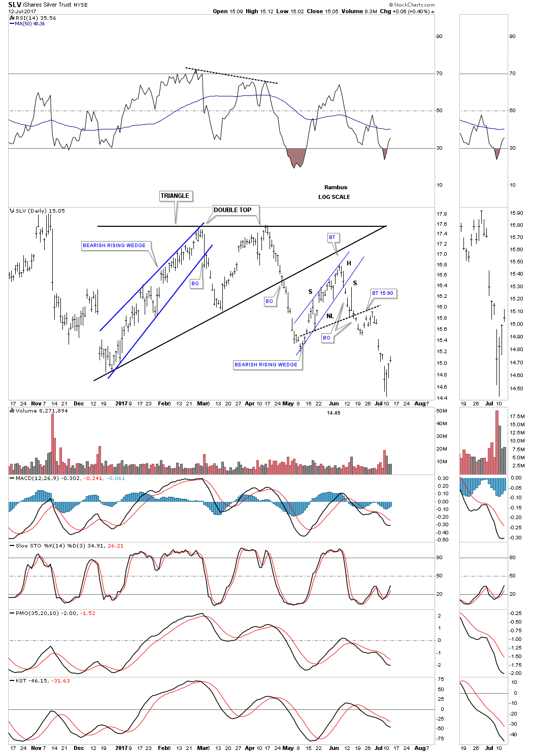
This next daily chart is a 2 year look which shows a much bigger triangle consolidation pattern that began forming at the late December 2015 low. Note the symmetry failures of the top and bottom rails of the black triangle consolidation pattern as shown by the red circles. If you add the distance of the false breakout to the failure of the price to reach the top rail they are the exactly the same size. What this means is the last reversal point in the black triangle would touch the top and bottom rails if you started the last rally at the lower trendline instead of the false breakout low.

Below is a weekly chart for Silver which shows how the bigger triangle consolidation pattern fits into the big picture. If you recall in the Weekend Report I showed you a similar triangle in gold starting at the December 2015 low, but unlike silver which has already broken down below its bottom rail, gold is still trading inside of its triangle consolidation pattern. So at this point silver is leading gold.
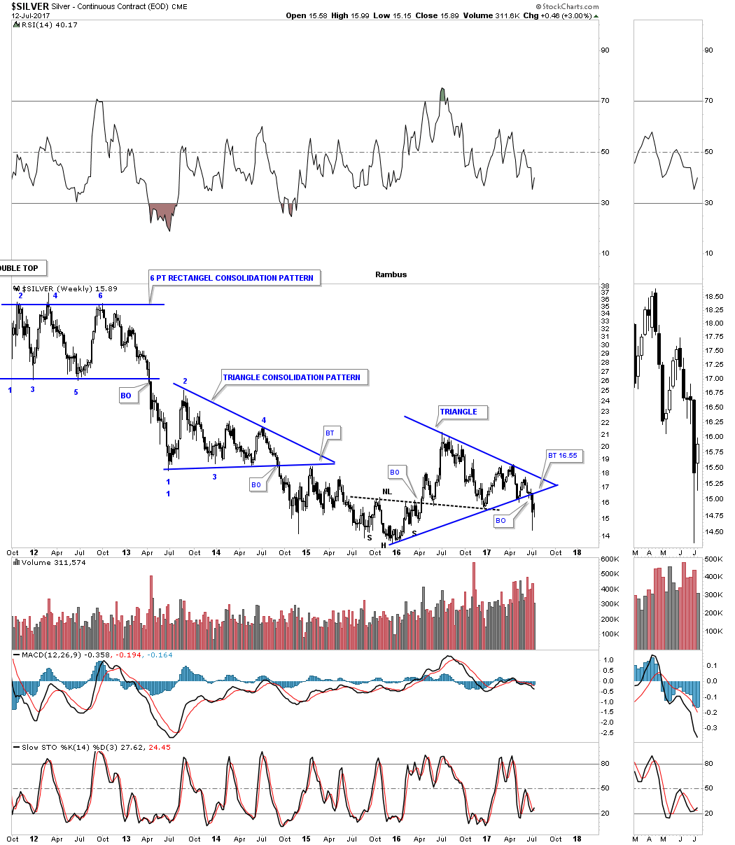
There is another pattern that both gold and silver built out which was the H&S top with the head forming at the August 2016 high. When they both broke below their respective necklines gold came much closer to reaching its measured move while silver didn’t even come close as shown on the weekly chart below. At that time silver was stronger than gold, but as the charts above show that has changed and now silver is weaker than gold.

Now I would like to focus in on the last year and a half or so and look at some of the consolidation patterns that silver has formed. Lets start with a weekly chart for silver which is showing an unbalanced H&S top with a backtest to the neckline this week at 15.90 or so.
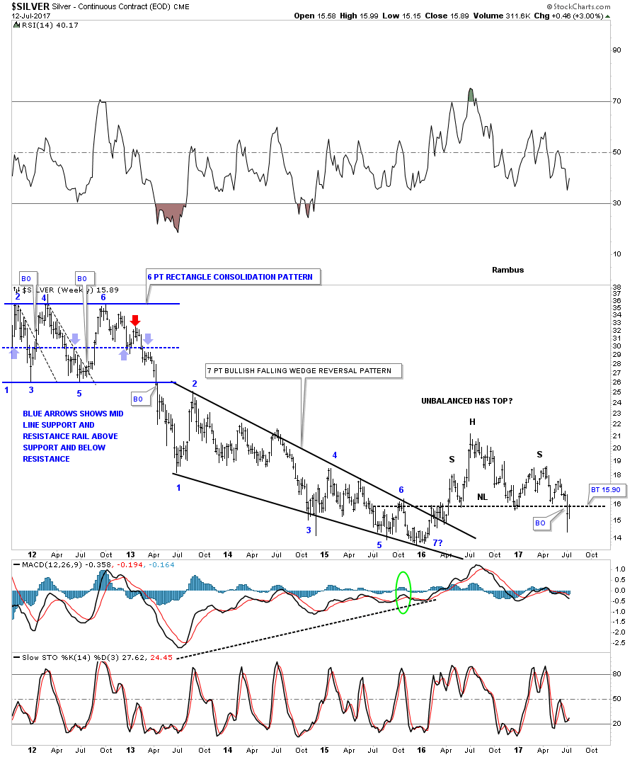
The linear scale chart for SLV shows the price action bouncing off the neckline this week so no confirmation yet on the unbalanced H&S top.

Below is another weekly chart which I can make a case that SLV has formed a double H&S top with a backtest to neckline #2 at 15.50 underway. Note the beautiful Chartology which is showing up when each trendline or neckline is broken to the downside, there is a backtest.
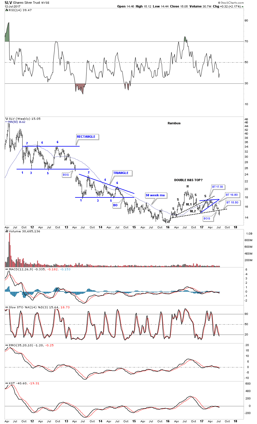
Next I would like to update the now 8 point diamond consolidation pattern we’ve been following for the better part of this year, which finally broke down below the bottom rail 4 weeks ago already. If SLV makes a completed backtest to the bottom rail of the black diamond it would come in around the 15.95 area.
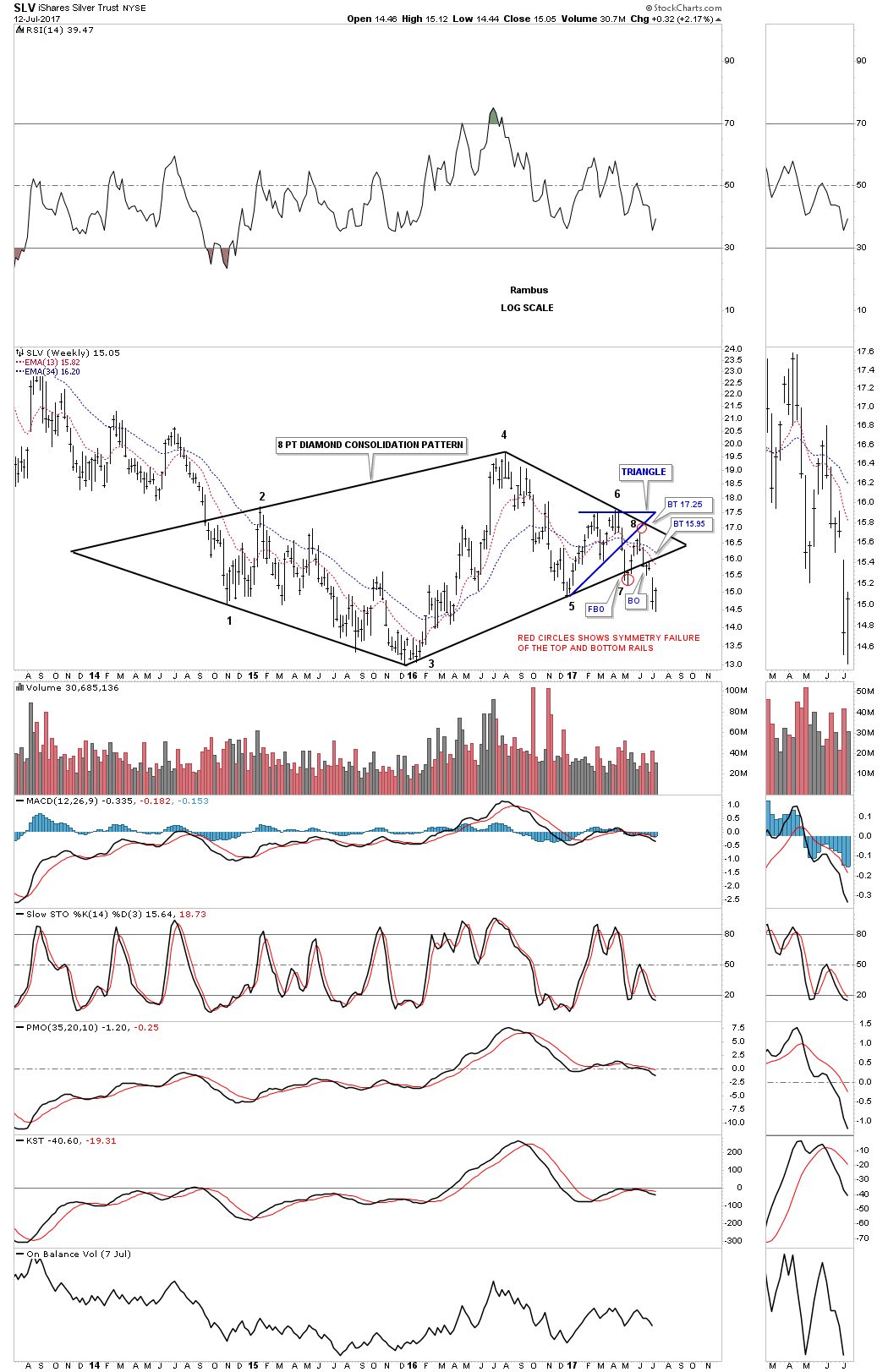
This next long term chart for SLV puts the 8 point diamond consolidation pattern in perspective within the 2011 bear market downtrend channel. As I stated at reversal points #6 and #8 all the bulls have to do is take the price action above the top rail of the 2011 bear market downtrend channel and all will be right with the world again. Instead of breaking out top side the bulls are losing ground to the downside with the breakout of the diamond consolidation pattern.
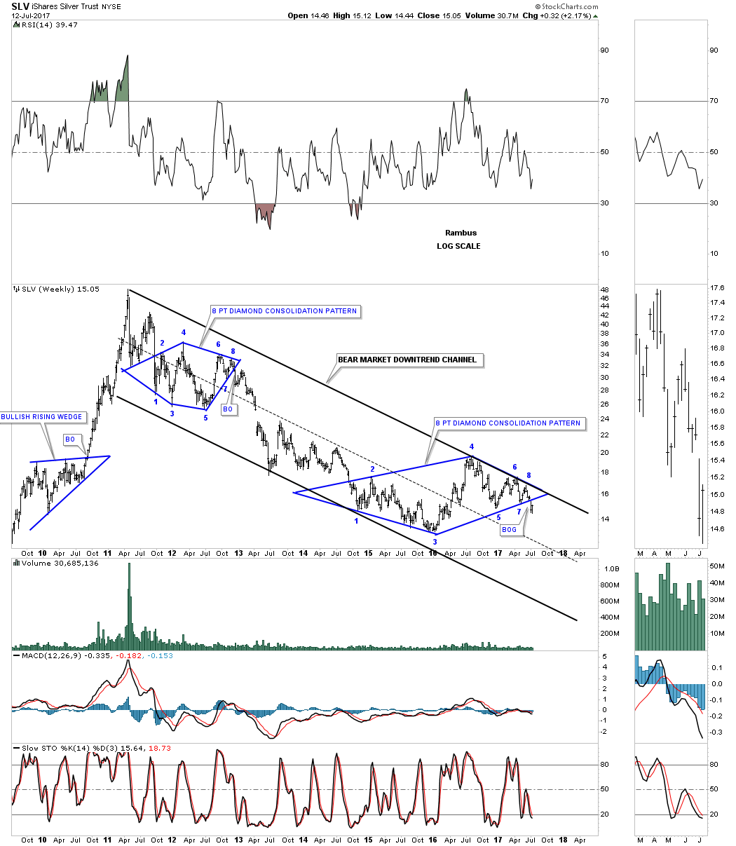
Now I would like to take silver up to the next long term level like we did for gold and see what the very big picture looks like. As with gold, silver has built out a massive H&S top we’ve been follow for several years now. Note the very symmetrical H&S top with the neckline symmetry line showing the high for the left and right shoulders. I’m showing the blue triangle as the backtest to the underside of the neckline. As you can see the triangle broke to the downside this month which is keeping my long term game plan in place. As long as the game plan keeps working there is no need to change it. If silver does an end around the apex move then I would have to change my game play, but for now it is what it is.
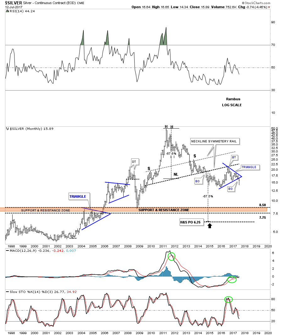
This next long term chart shows how the massive H&S top and the 2011 bear market downtrend channel fits into the big picture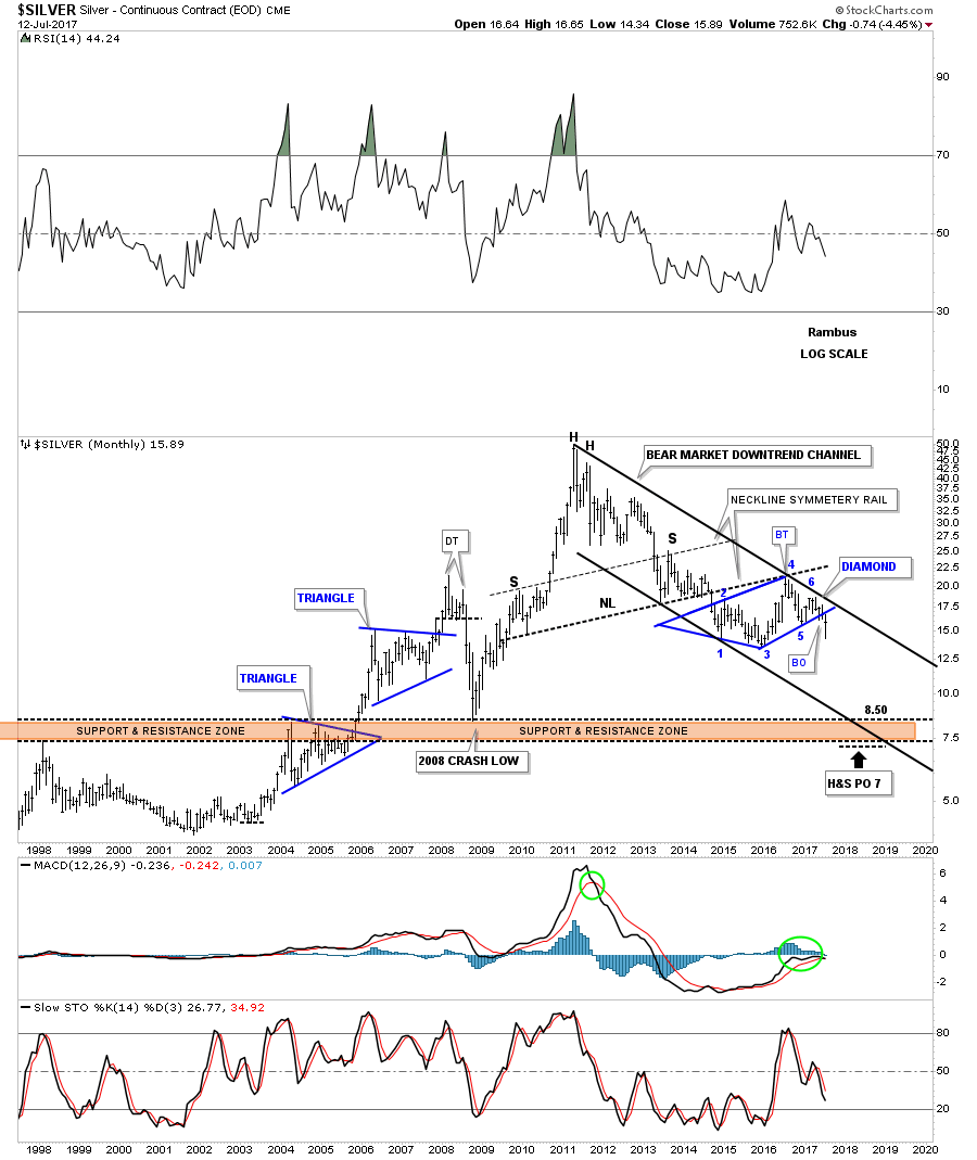
This next to last chart for silver is a 45 year look which shows its massive inverse H&S both which led to its bull market. Note how that massive 20 year neckline held support on the backtest during the 2008 crash. Will that 20 year neckline hold support at the 7.50 area again?
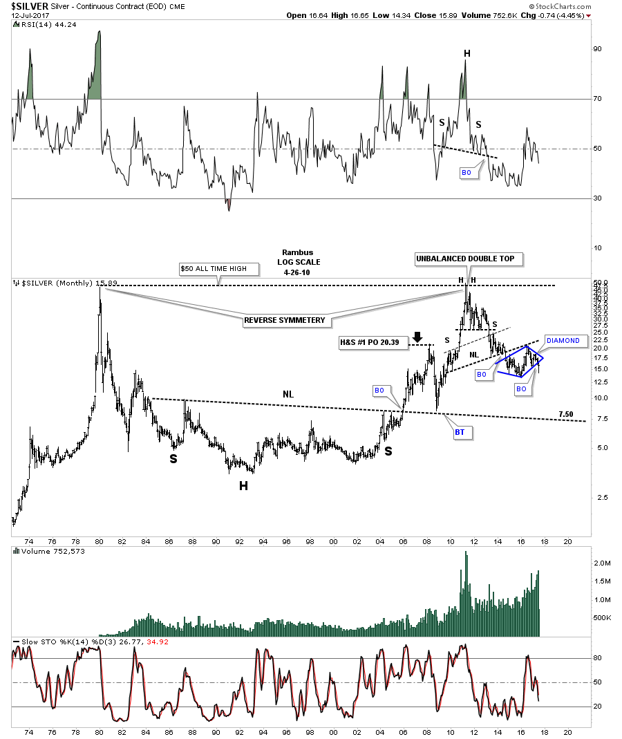
This last chart tonight for SLV is just a simple monthly line chart which is showing a possible H&S consolidation pattern building out. It will take a monthly close below the neckline at 15.10 to confirm the H&S top.
As you can see from the charts above you can look at many different time frames with multiple patterns to try and decipher what is taking place on a chart. Getting a game plan together and sticking with it until something changes is much harder to do in reality. It also takes a lot of patience to wait for long term patterns to mature. Many investors get chopped to pieces trying to trade every little wiggle on a chart. Sorry for the late post tonight, it took longer than what I was expecting. All the best…Rambus
Catherine Austin Fitts:
Rambus, I can't thank you enough. This is Blockbuster Chartology! We have a lot to study and digest. Let me remind our subscribers that they can access your ongoing efforts at: http://rambus1.com.
Related Reading:
- Blockbuster Chartology with Rambus - May, 2017
- Blockbuster Chartology with Rambus - January, 2017
- Blockbuster Chartology with Rambus - October 20, 2016
- Blockbuster Chartology with Rambus - July 21, 2016
- Blockbuster Chartology with Rambus - April 21, 2016
- Rambus: Are We in a Deflationary Spiral? - January 28, 2016
- The Dollar, Gold & the S&P 500 with Rambus - October 15, 2015
Top of Page
© Solari 2016