
Rambus: Are We In
a Deflationary Spiral?
My go to website for technical analysis of precious metals, the US dollar & the US stock market is Rambus Chartology, where Rambus (thats his handle hes the founding technical analyst) leads a discussion with extensive charts of what the markets are saying.
Last October, the Solari Report did a written interview with Rambus including an introduction here and a discussion of Rambus, his background, technical analysis as well as the word "Chartology." You can find all this information at our first interview:
- Why “Rambus?”
- How Rambus Chartology Got Started
- What Rambus Chartology Does
- About Technical Analysis
- Tracking the Markets
- What does the word “Chartology” mean?
This week, Rambus launches his quarterly Solari Report with a blockbuster chartology across the following sectors:
The Chartology of the Major Currencies
Catherine Austin Fitts:
Rambus, the response to your written interview in October was terrific. So I am delighted to welcome you back to the Solari Report as we start 2016. I am also delighted to announce that you will be joining us quarterly this year. Given the rocky nature of the financial and commodities markets, having your technical analysis and insight available is going to keep us firmly grounded in reality. We appreciate the opportunity to have you with us.
Let’s turn to the US Dollar, which has had quite a run since the summer of 2014. How has the dollar performed since your Solari Report interview in October?
Rambus:
Let’s look at some important currencies as of this last weekend to get a feel for where they are in regard to their long-term tops. As you know, currencies and commodities topped out in 2011 along with the precious metals sector. Their respective bear markets started on the slow side and began to pickup momentum to the downside in 2014 when the US dollar finally broke out of its massive base. As the US dollar rallied in 2014, currencies and commodities both declined in unison inverse to the US dollar. When the US dollar would make a small flag or wedge in its strong impulse move higher most currencies and commodities would build out an opposite looking pattern as one would expect unless things were different this time which they werent. Things can be different sometimes in the short term but in general and from the longer term perspective markets will always interact with each other as they always have.
In order to understand how commodities and currencies move we must look at the all important US dollar for clues. If we can understand what the US dollar is doing it will help us navigate our way through some difficult times in these two sectors. In general when the US dollar is falling, currencies are rising and visa versa. The same with commodities. Its not an absolute perfect correlation by any measure, but its the general inverse relationship we want to follow and that shows up on the long-term charts.
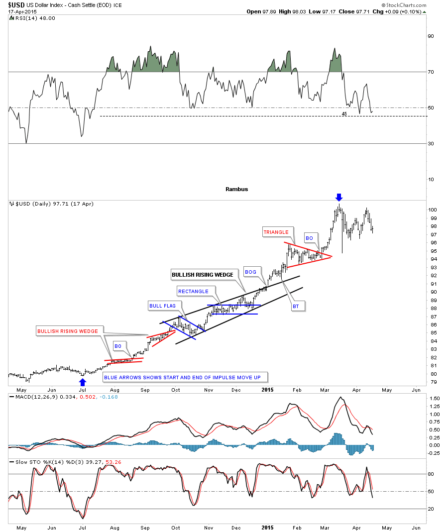
This first chart I would like to show you is a static chart which shows the US dollars last big impulse move up. It started in July of 2014 and ended in March of 2015. What this daily chart shows you is how a big impulse move is made up of small consolidation patterns one on top of the next. Sometimes in strong moving markets two smaller consolidation patterns will join forces to create a bigger consolidation pattern. You can see that with the black bullish rising wedge which is made up of a small blue bull flag and the blue rectangle. There are two points which tells us the black bullish rising wedge was indeed a bullish rising wedge. Note the small breakout gap and then the backtest to the top rail before the next leg up for the US dollar began. Take a minute and study that black bullish rising wedge as that principal will come into play as we look at some different currencies and commodities. Keep in mind that a chart pattern which slopes in the same direction as the trend tells you the move is very strong. You can think of this as running correction. The two blue arrows show the completed impulse move higher for the US dollar.
This next chart is a three year daily chart, for perspective, that shows you what an impulse move looks like which we just looked at on the chart above. You can see the big base which launched the impulse move up and after topping out in March of 2015 the current consolidation pattern that has been forming for close to ten months now which will separate hopefully two impulse moves. This is how a bull market begins. Our current black bullish falling wedge is still under construction. When we see the price action take out the previous highs at 100.70 that will tell us the next impulse move higher has begun. When you look at all the smaller consolidation patterns that formed during the first major impulse move up you can think of that move as a mini bull market. When the bull market finally ends for the US dollar well most likely see several big consolidation pattern form along the way.
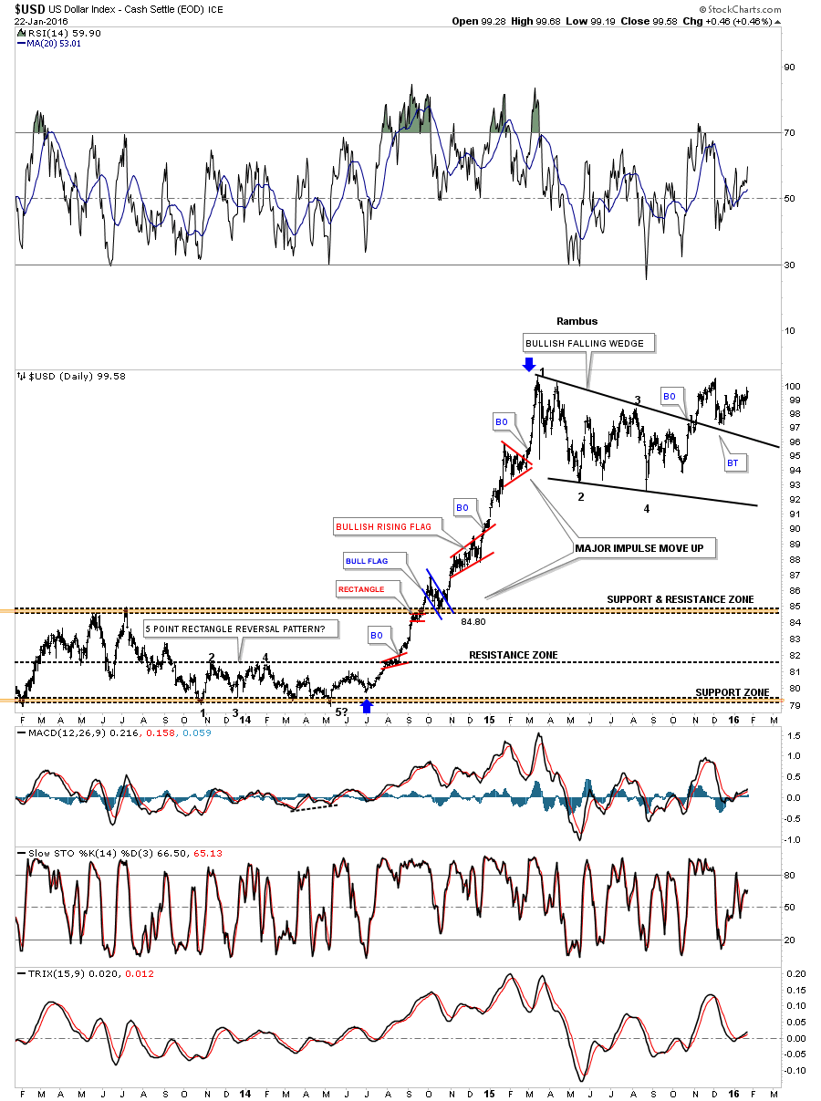
Below is a daily line chart which gives us a slightly different perspective of the impulse move up with our current consolidation pattern that may have already broken out to the topside. Many times when you see a big consolidation pattern form like this after a strong impulse move it will show you where the halfway point is for the next big move. Also note the small blue consolidation patterns that formed the first big impulse move up. Normally after you see three smaller consolidation patterns form you know youre getting close to the end of that impulse move and its time to start looking for a bigger consolidation pattern to form.

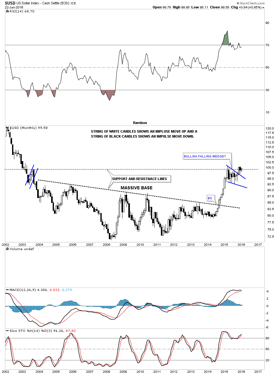
Now that weve looked at the short term daily charts for the US dollar its now time to step back and start looking at the big picture to gain some perspective on why the impulse move up took place where it did. In order to have a strong bull market there has to be a base in which to launch the new bull market. Generally speaking the bigger the base the bigger the bull market. Below is a monthly candlestick chart for the US dollar which shows its massive base. This massive base took over ten years to build out. Note the impulse move that we looked at on the charts above, and the string of nine white candlesticks that formed all in a row. This is exactly how a bull market begins. The massive breakout move strongly suggests this is going to be a strong bull market for the US dollar. Note the little blue bullish falling wedge, relative to the big base. If you look to the left side of the chart youll see a similar small blue bear flag that formed on the way down. I refer to this type of price action as reverse symmetry. Our first real big clue that the next impulse move up is underway is when we can start to see a string of white candlesticks all in a row on the monthly chart. You can see the candlesticks inside of the blue falling wedge are black and white which tells us this area is a consolidation zone. If the US dollar can close out the month of January with a white candlestick, especially above the previous highs, that will be a very good indication that the next impulse move up has begun. Its close but no cigar just yet.
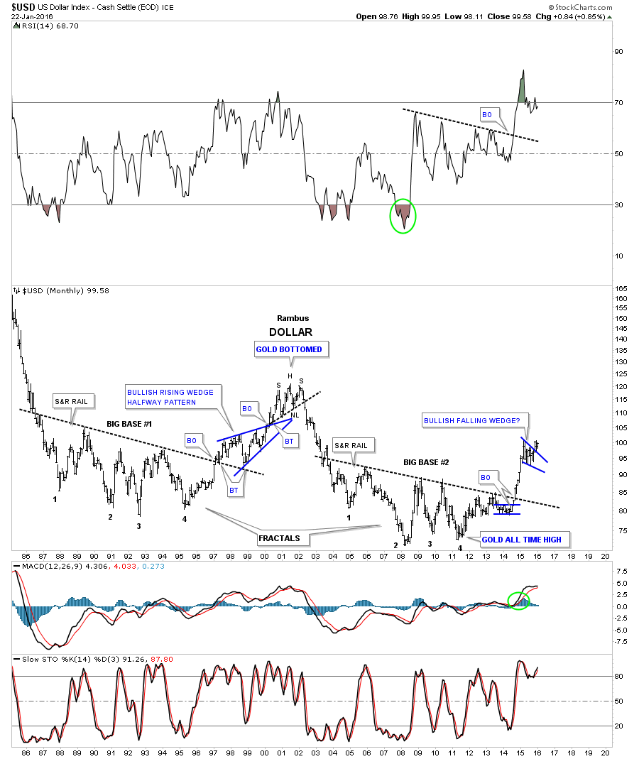
This next long-term 30-year monthly chart for the US dollar shows how our big base, we just looked at on the chart above, is a fractal to the one that formed back in the 1990s. You can see the blue bullish rising wedge which formed in the middle of that big move up to the highs at 120 or so. This chart also shows you the inverse correlation that gold and the US dollar have in the long-term. Gold bottomed when the US dollar built out that H&S top in 2000 and the bull market ended for gold when the US dollar bottomed in 2011 at point #4.
Below is a 40-year monthly chart for the US dollar which really puts everything in perspective. The US dollar made its all time high at reversal point #1 at 160 or so. From that all time high the US dollar had built out a massive 30-year falling wedge. The top black rail was broken to the upside last year which was the beginning of our current bull market. Note how the little red bullish falling wedge formed right on the top rail of the 30-year black bullish falling wedge and the neckline extension rail taken from the H&S top made in 2000. As soon as the US dollar broke above the 30-year rail of the black falling wedge , I showed you how it would reverse its role from what had been resistance to now support on any backtest to the 92.00 area. From a Chartology perspective this is as pretty as it gets.
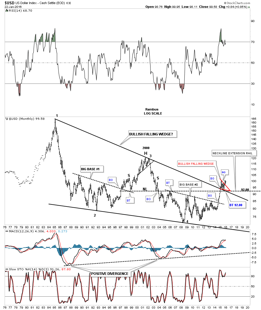
Let’s look at one last chart for the US dollar which is a 15 year monthly combo chart which has the US dollar on top and gold on the bottom. This chart shows you another perspective of the US dollars massive base which Ive labeled as a rounding bottom. The first point to grasp from this combo chart is how the US dollar formed a higher low in 2011 while gold was completing its near parabolic bull market run. This was a very big clue to understand at the time. Normally the inverse correlation would have suggested that as gold was moving in a near parabolic fashion to its bull market high in 2011 that the US dollar should have been at least making a lower low vs its 2009 low. As you can see by the red arrows the US dollar had a positive divergence to gold in 2011 by making a higher low which signaled a trend change for both.
Looking at the US dollar chart on top Ive added three blue arrows that are pointing down on the left side of the chart and three blue arrows pointing up on the right hand side of the chart. These blue arrows shows you how the US dollar is reversing symmetry backup to how it came down. By the looks of the reverse symmetry I expect to see the US dollar start acting stronger and accelerate to some degree away from the rounding bottom trendline. The 120 area would be the minimum price objective I would expect when the US dollars bull market is over. Its possible it could even go much higher but for now the 120 area is the price objective.
One last note on the combo chart below. Looking at the gold chart you can see a parabolic downtrend channel Ive added from the 2013 breakout move below 1530. If you just isolate that parabolic channel for a minute you can see the price action within that channel is just as ugly as it gets. Its been a slow painful rollover for close to three years now. As you can see the price action has made lower highs and lower lows but in one absolutely ugly manner. This price action has worn out both the bulls and bears alike. If the US dollar can breakout to new highs, above its blue bullish falling wedge, then I believe gold will move down to make a new bear market low. On the other hand if gold can breakout above its top parabolic trendline then I will have to go back to the drawing broad because I have the big picture all wrong. Ive been following that big base the US dollar has created well before it ever broke out above the S&R line. So far the Chartology has been dead on the money in regards to the US dollar chart and until something changes the bullish outlook that is the way I have to play the game.

Now that weve looked at the US dollar indepth let’s take a look at some of the other currencies that are on the other side of the US Dollar Index , starting with its biggest component the $XEU (Euro) . This year and a half chart , shows a combo blue bear flag with a H&S consolidation pattern that has been forming since the first leg down ended in March of 2015 . Same as the US dollar impulse move up. A break below the neckline will complete the combo consolidation pattern and usher in the next leg down. Please make note of that black bearish falling wedge that formed during the last impulse move down last year as there will be others to follow. These types of patterns form in fast moving markets.
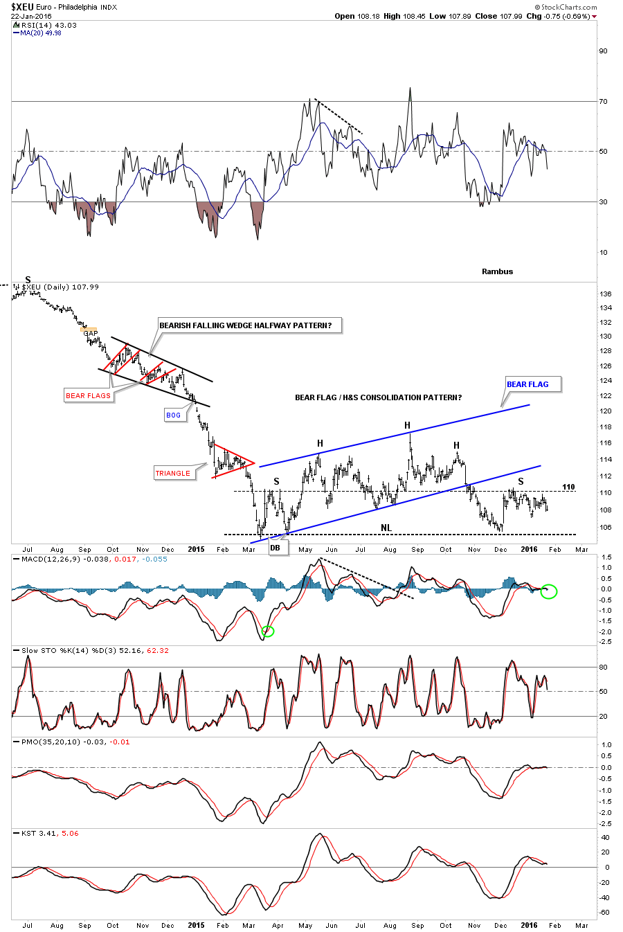
Below is a weekly chart for the $XEU which shows the H&S consolidation pattern as a stand alone pattern.
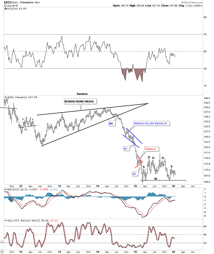
This next weekly chart is a long-term look at the $XEU which shows the combo H&S / Bear Flag consolidation pattern. Also note all the other consolidation patterns that have formed over the last six years or so. This is what a bear market looks like. A break below the current neckline will usher in the next move down.
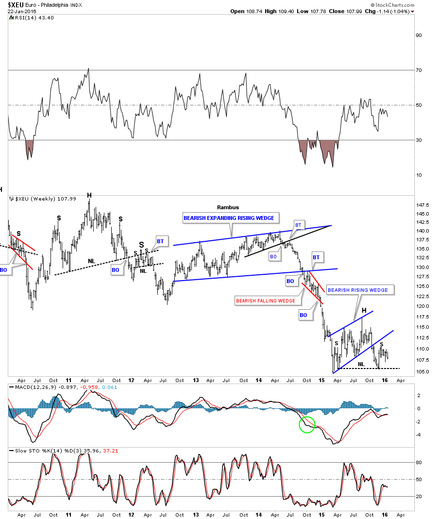
Below is a 25 year monthly chart for the $XEU which shows you a massive topping pattern in place which would look somewhat inverse to the US dollar. Note the red bear flag we looked at on the charts above . It formed between the upper neckline #1 and the lower neckline #2. Thats what I call a ping pong move. You can now see how important that little combo H&S / bear flag is now to the very big picture. The big neckline #2 is actually part of the neckline we looked at on the daily H&S consolidation pattern. Both necklines will be broken at the same time which will signal the massive top is in place and the next big impulse move down for the $XEU has begun. That massive double H&S top has a price objective all the way down to the all time lows around the 84.90 area as shown by the brown shaded S&R zone. So as you can see that neckline is a very big deal .
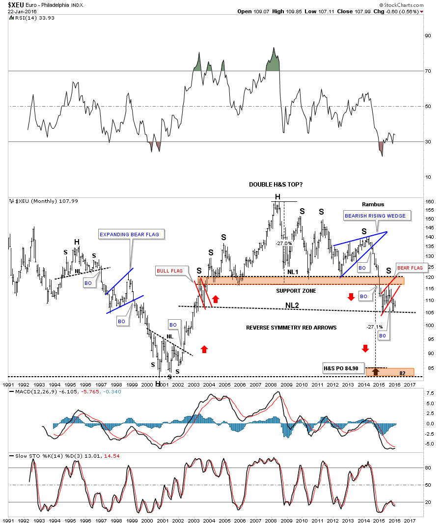
This last chart for the $XEU shows what it looks like with gold overlaid on top of it. You can see the correlation isnt perfect by any means but they do tend to move together during stronger moves. Last December the correlation really broke down as the $XEU was much stronger than gold. It will be interesting to see if they sync up again especially if the $XEU breaks down from that massive topping pattern.

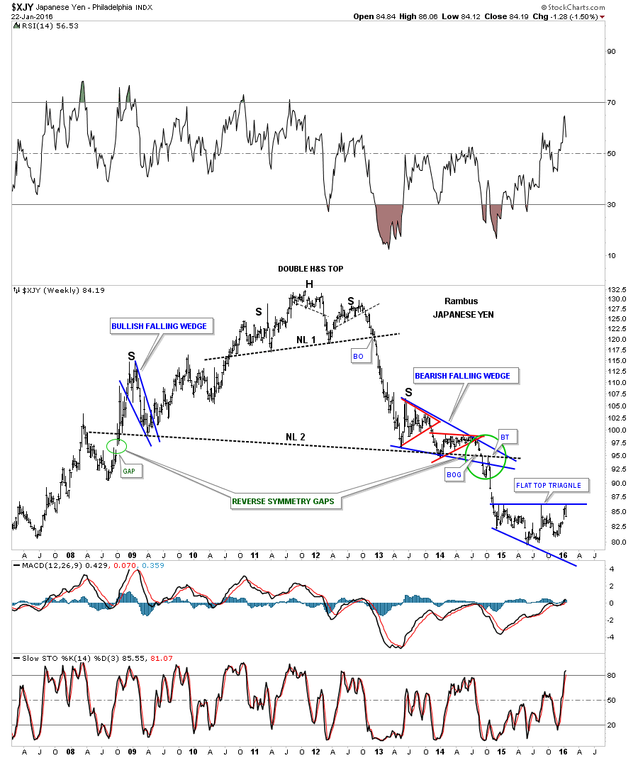
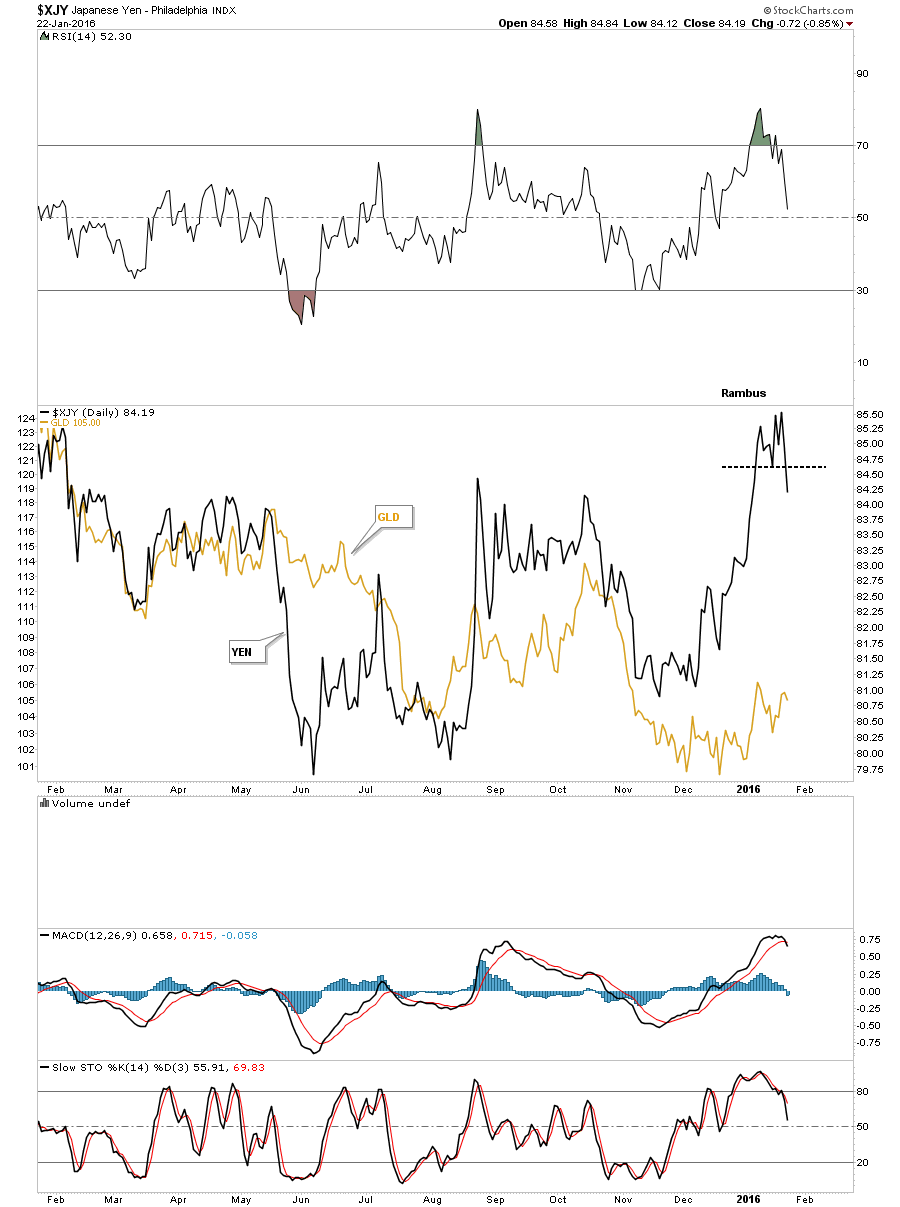
The next currency well look at is the all important $XJY, Japanese Yen. It built out a massive double H&S top which ended its bull market back in 2011. Some of the longer term members may remember when the yen was building out its right shoulder which ended up being the blue bearish falling wedge. As you can see the blue bearish falling wedge was made up of two individual chart patterns which happens alot on all time frames. Note the breakout gap below the bottom rail of the falling wedge and neckline #2 which was actually a reverse symmetry gap that was made on the way up back in 2008, green circles. The yen has been one of the stronger currencies lately. Ive labeled the latest blue consolidation pattern as an expanding flat top triangle. It has the characteristics of a H&S bottom but with the other currencies looking weak and the yen being in a bear market Im looking for the yen to break to the downside. As they say well know in the fullness of time.
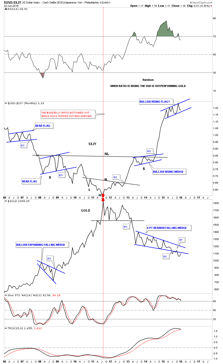
Next I would like to show you a 15 year monthly line ratio chart which compares the US dollar to the $XJY. When this ratio is rising the US dollar is outperforming the Yen. Note the beautiful inverse double H&S bottom that formed in 2011. The right shoulder for H&S #2 was a bullish rising wedge. Once the H&S neckline was broken to the upside this ratio wasted little time in rallying in a straight line to its current high. This ratio has been consolidating for the last year in a rising flag formation similar to the right shoulder. Is that one year rising flag formation a top of consolidation pattern? If one believes that the US dollar still has a ways to go to the upside yet then the one year blue rising flag will most likely breakout to the upside. It hasnt yet but if it does , well be on top of it in a big way as the next impulse move up will have begun .What does this mean for Precious Metals? When the US dollar is outperforming the Yen the PM complex usually goes down.
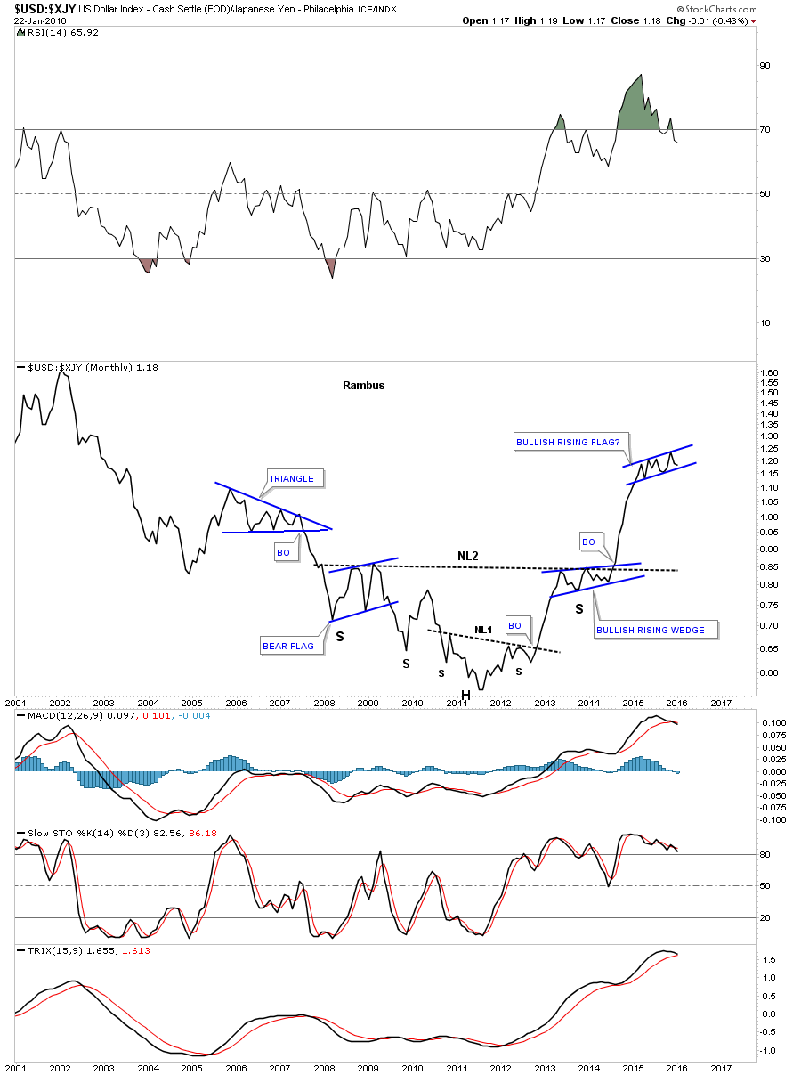
This next chart is a combo ratio chart which compares the US dollar to the yen on top and gold on the bottom. You can see in 2011 both charts came together in which the ratio chart on top bottomed while gold on the bottom topped out. This tells us when the US dollar is outperforming the yen gold generally goes down. I wish there were some absolutes in the markets but there are none of which I am aware. To show you what I mean note the yellow shaded area on the right side of the chart. You can see that the ratio chart on top broke out of the blue triangle consolidation pattern and moved straight up while gold on the bottom chart just chopped around in that never ending consolidation pattern. If Im proven correct and the US dollar is in a major bull market and the currencies are still in a massive bear market , then the ratio chart on top, which has formed a consolidation pattern with six reversal points so far, will breakout to the upside in another impulse move. Gold on the lower chart which has formed a six point falling wedge, which has already broken down, will continue to create its next impulse move lower. The clues are there but no confirmation yet.
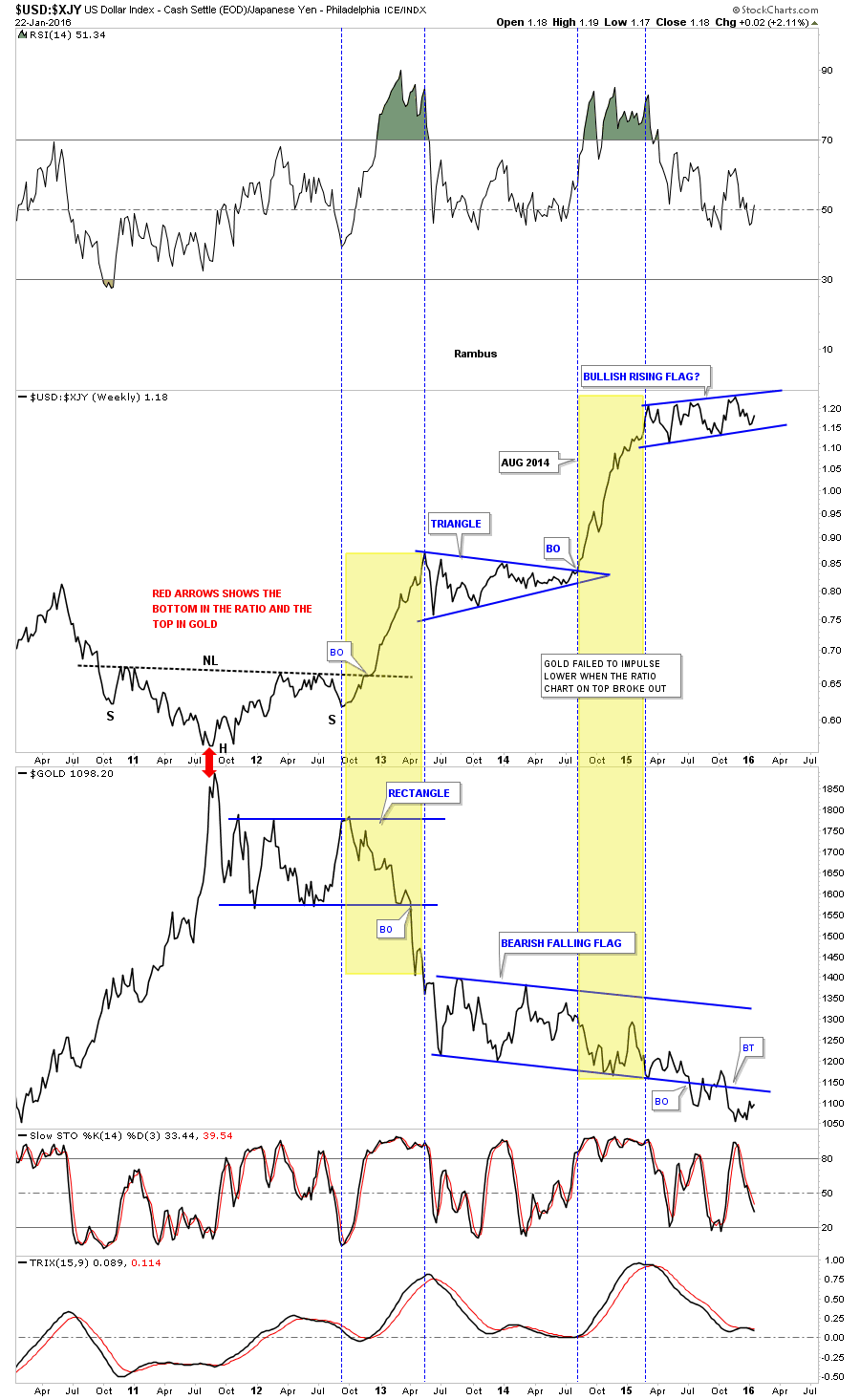
This next chart for the Yen is the same combo chart as the weekly chart above but this is a monthly line chart. It just shows you how the ratio chart fell during golds bull market and how gold went nearly parabolic to the upside. It also shows how they tend to consolidate or form inverse patterns at the same time except for the last impulse move up in the ratio when gold just went sideways.
This last chart for the yen I overlaid gold on top of it to show you how they move together in real time.
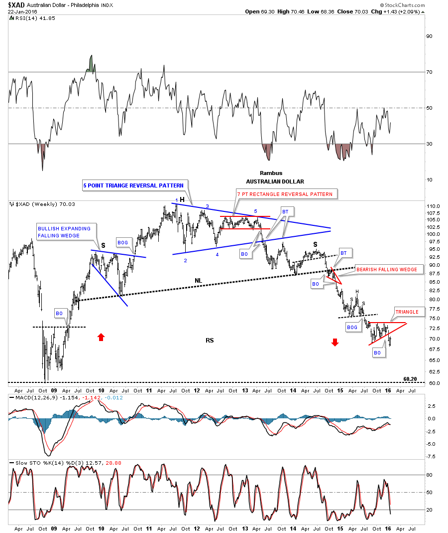
There are several more important currencies we can look at which may help give us some clues as to the direction of the US dollar. Keep in mind when you look at all these currency charts that Im not showing them for the first time. Weve been following these same chart for years now before they broke down below their massive H&S tops. As you can see on the $XAD, Australian Dollar chart, the breakout from its massive H&S top came in 2014 which is when most of the currencies and commodities, well look at later, also broke down. Pieces of the puzzle. Three weeks ago the $XAD broke out of a small red triangle and is now in the process of backtesting it from below.
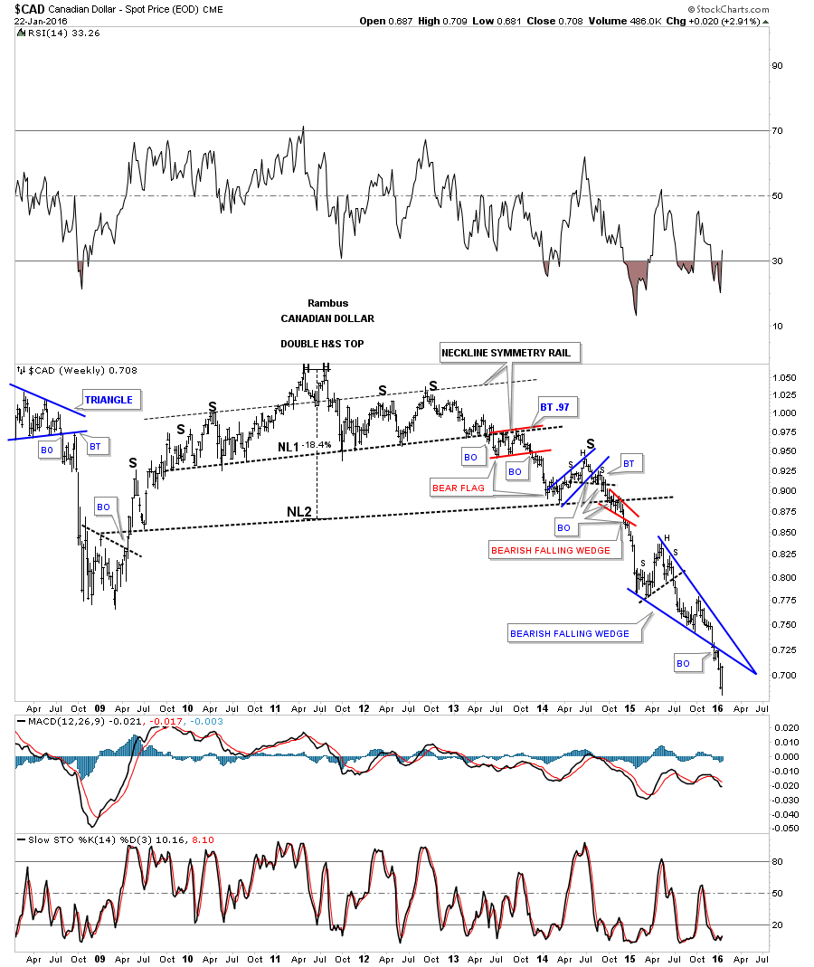
The $CAD, Canadian Dollar, is another commodities based currency which shows its massive double H&S top which also broke down in 2014. Note the bearish setup that took place at the breakout point of the big neckline where there was a small consolidation pattern that formed above the neckline and the little red bearish falling wedge that formed below the neckline. Also of special interest is the blue one year bearish falling wedge which broke to the downside about six weeks ago and now is in the process of backtesting the bottom rail from below. This is a critically important pattern in regards to the bear market continuing in the currencies and commodities.
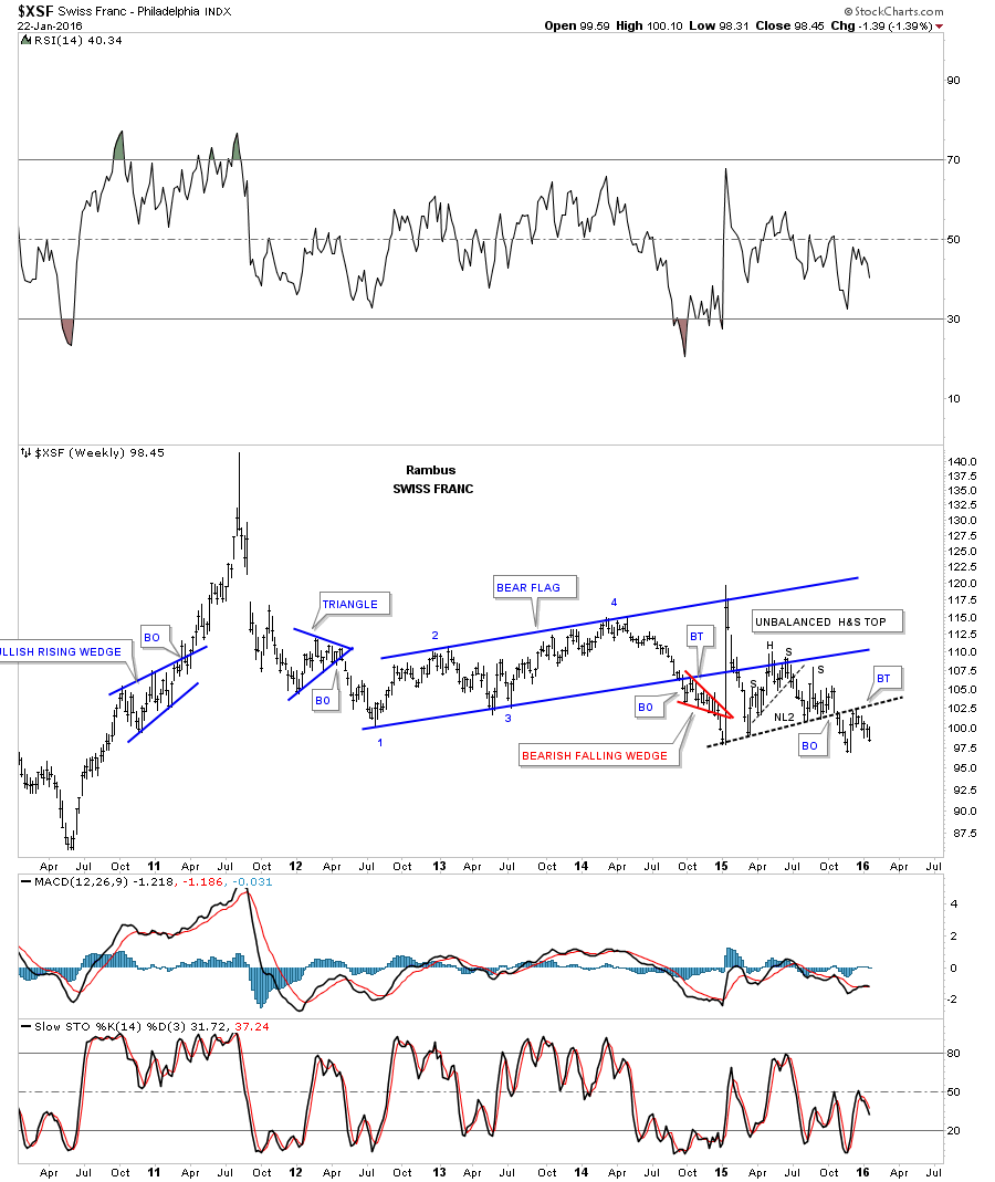
The $XSF, Swiss Franc, also topped out in 2011 but it built out a 2 1/2 year blue triangle consolidation pattern which actually broke down in 2014. It had that currency spike which was huge news at the time . The depeg from the Euro took the $XSF all the way back up to the top rail of the blue triangle consolidation pattern where it promptly reversed direction and broke back below the bottom rail telling us the big move up was false. It had one last backtest which formed the H&S consolidation pattern just below the bottom blue rail of the triangle consolidation pattern. This chart is suggesting that the next impulse move down is just beginning as it has just completed the backtest to the neckline.
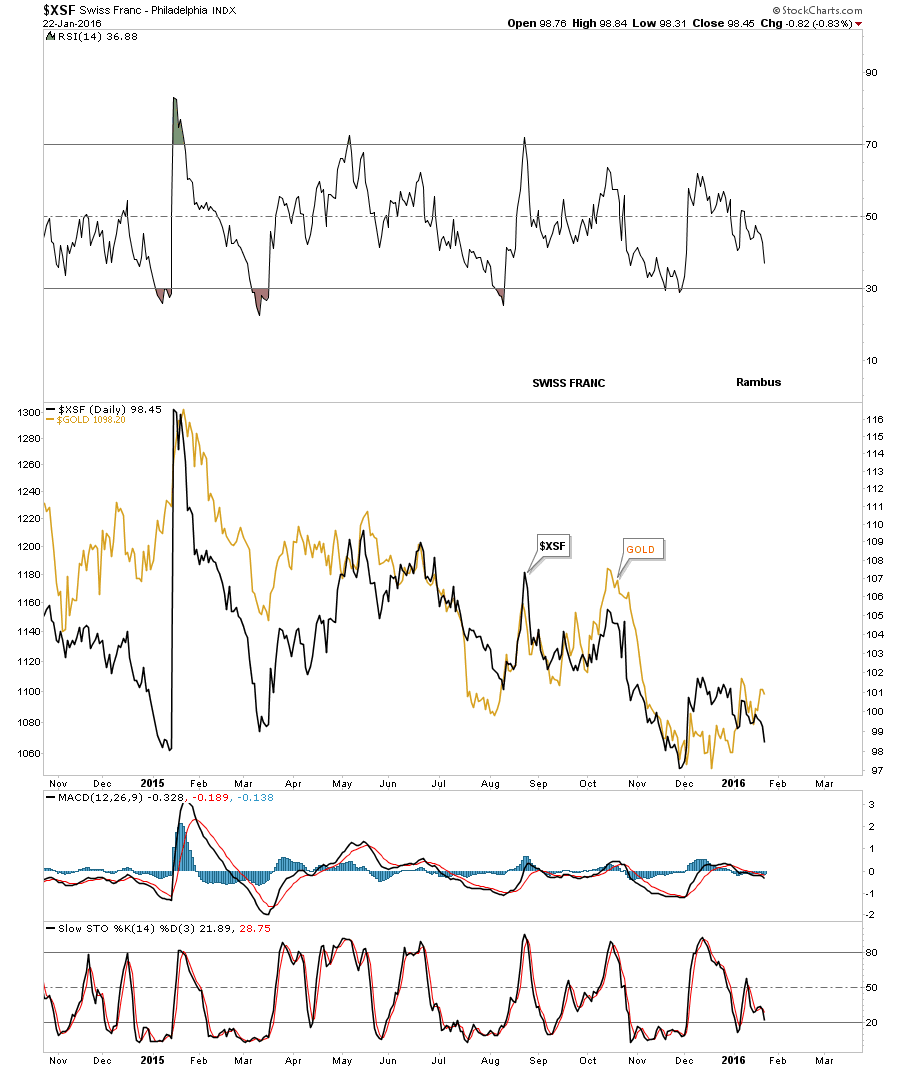
Ive overlaid gold on top of the Swiss Franc which actually shows it has a closer relationship to the movement of gold vs some of the other currencies we looked at earlier. Its still not perfect but if it starts to drop hard it looks like gold will follow suit.
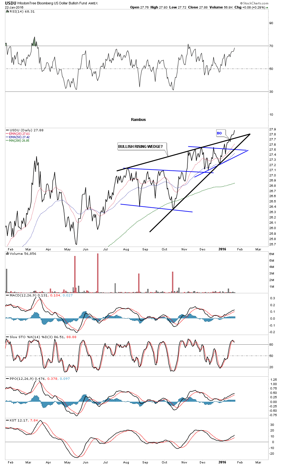
This next chart is a fairly new chart Ive been following which is the USDU. Its a chart for the US dollar but the currencies are more equally divided up to where the $XEU doesnt play such a big role in the movement of this ETF as it does in the widely followed original US Dollar Index. I think its a better representation for the how the US Dollar is faring. Below is a daily line chart which is shows USDU broke out of a bullish rising wedge last week. As you can see the black rising wedge is made up of two separate blue consolidation patterns. This chart could be giving us an early heads up that the original US dollar chart may not be too far behind in its own breakout move.
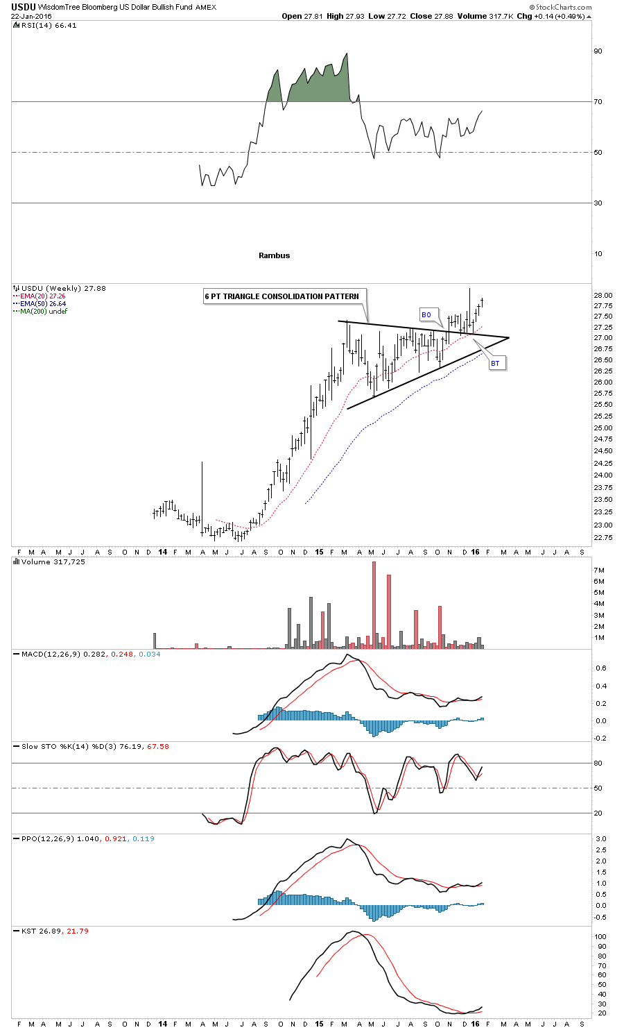
The weekly chart for the USDU shows its entire two year history. Unlike the original US dollar index chart which hasnt broken out to new bull market highs yet the USDU has. So far its showing a perfect breakout and backtest of the big black triangle consolidation pattern. This big one year triangle consolidation pattern represents to me a halfway pattern or pause between two equal impulse legs in the US Dollars bull market. If Im correct we should see a move similar in time and price to the move that began in July of 2014 to the first reversal point in the black triangle. It wont be exact but the essences of the move should be there. For those that were members back in 2014 before the impulse began for the US dollar in July you should remember we also tracked many of the different commodities indexes at the time that were showing similar setups to the currencies. As the US dollar was impulsing higher the currencies and commodities were impulsing lower. Are we getting ready to see part two of the Deflationary Spiral that maybe just beginning? All we can do is follow the price action and the charts Ive laid out for you and as long as things keep progressing as they have been since the top in 2011 we could very well be on the cusp of another important move lower.
Its taking longer than what I expected to write this – I thought I could do in two days but it looks like it might take a bit longer than I originally thought. My goal is to try and paint you a crystal clear picture of what the charts are showing me right now. Next, well look at the commodities complex and look for more clues there in regards to the big picture. As I stated above, Ill either be very right or very wrong depending on which way the inflection point breaks.
The Chartology of Commodities
Catherine Austin Fitts:
Rambus, clearly the continuing drop in commodities prices is surprising market participants, including a lot of insiders. We would appreciate any insight you can give us on the commodities sector, including oil and gas. The US dollar as global reserve currency has enjoyed an oil standard for many years. Now, the energy markets are changing and fossil fuel prices have fallen dramatically. What do the oil and natural gas charts say to you?
Rambus:
Most of the commodities indexes topped out in 2011 in a similar fashion to the currencies we looked at above. The key driver for this bear market has been the strength in the US dollar. As we discussed earlier, the correlations between different asset classes can breakdown for awhile, but when one looks at the big picture they generally hold true. As the US dollar had its big breakout move to the upside in July of 2014 the currencies and commodities started their own impulse moves to the downside inversely to the US dollar.
When looking at some of these different commodities indexes note how most topped out in 2011 followed by the development of their right shoulders in most cases. During that time the US dollar was finishing up with its big base and was getting ready to breakout to start its new bull market. Then in July of 2014 the US dollar finally broke out from that massive base and commodities and currencies broke down from their massive tops. What these important asset classes have in common is that they topped out in 2011 and really began the hard down phase of their bear markets in 2014 with 2015 being a consolidation year for the most part.
Let’s start by looking at a perfect example using the weekly $CRB index which shows a big H&S top with the head forming in 2011 and the breakout below the neckline in July of 2014 which started the hard down phase. Earlier, I remarked that the falling wedges which were being built on a lot of the currencies charts generally show up in fast moving market conditions. The US dollar began its consolidation period in March of 2015 basically trading sideways and it still hasnt totally broken out yet. Many of the commodities indexes have formed a bearish falling wedges over that same time frame which I view as a running correction to the downside. Normally these types of falling wedges that breakdown in the same direction as the trend can be a halfway pattern separating the first impulse move down from the second one. As you can see the $CRB index broke below the bottom rail of its blue falling wedge two weeks ago and is now in the process of doing a critical backtest to the bottom rail from below. This backtest is where well find out if the blue falling wedge is the real deal. If the backtest does hold then the most likely outcome will be that the blue falling wedge will show up as a halfway pattern and a similar move that took place leading into the falling wedge should take place as the price action leaves the falling wedge. Again it wont be perfect but it should give us a general guide on what to expect.
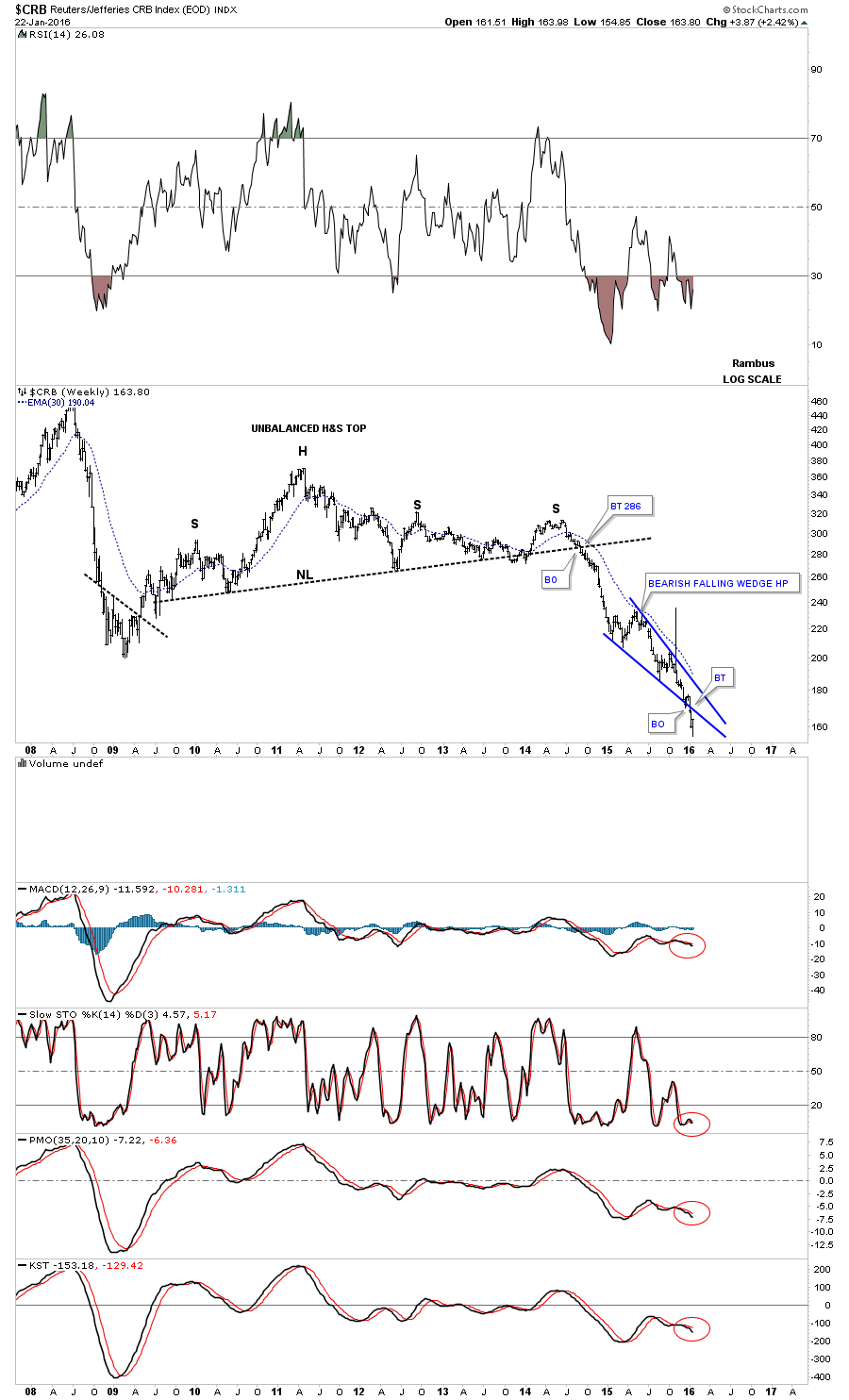
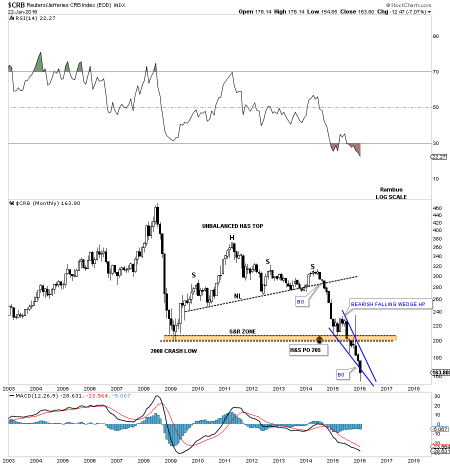
The long-term monthly candlestick chart for the CRB index puts the H&S top in perspective. The H&Ss minimum price objective was met at 205 which was the crash low in 2008, brown shaded support and resistance zone. That brown shaded S&R zone held support for about seven months before it finally gave way. Note the string of black candlesticks that formed during strong impulse moves down and a string of white candles sticks that from during a strong impulse moves up.
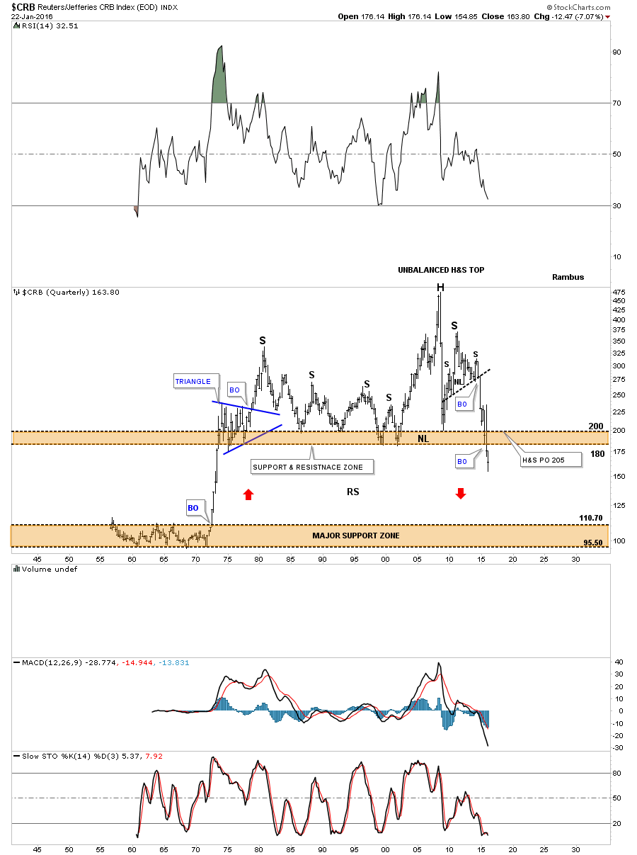
This last chart for the CRB index is a 60-year quarterly chart which goes all the way back to 1955 so there is a lifetime of history to look at. Up until the early 1970s the CRB index traded in a very narrow trading band between 110 and 95 or so. Once the price action broke above the top of the trading range it was a straight shot up to the beginning of the blue triangle. For over forty years the CRB index traded above the top brown shaded S&R zone until fairly recently. Keep in mind this is a quarterly chart which takes three months to complete a bar.
You can call the price action above the brown shaded S&R zone anything youd like, unbalanced H&S top, double top or anything else that may come to mind. Its the brown shaded S&R zone which is the most important thing to grasp about this chart. For over 40 years it held support and now its broken to the downside. This suggests it should now reverse its role to what had been support to now resistance on any backtest from below.
One last feature on this long-term quarterly chart below and that is shown by the red arrows. Back in the 1970s when the CRB index broke out above the lower brown shaded S&R zone it went vertical. Ive been showing this chart for sometime now which suggests we may see some reverse symmetry back down over the same area as the vertical rally up in the 1970s. When I first posted this chart the price action was still trading above the brown shaded S&R zone. Im still amazed when I look at this chart and see the price action trading below the brown shaded S&R zone which is at its lowest point since the 1970s. How it plays out is going to be interesting to say the least. Back to the future comes to mind .
Another commodities index I follow is the $GNX. This index has held up fairly well but it to has built out a double headed H&S top which is somewhat strongly slanted. Its pretty symmetrical as the left and right shoulders are the same height as shown by the neckline symmetry line. This commodities index also has a falling wedge in place that is made up from two smaller blue consolidation patterns one above the neckline and one below. The breakout from the falling wedge took place at the all important 2008 crash low. The 2008 crash low should now reverse its role to now resistance on any backtest.
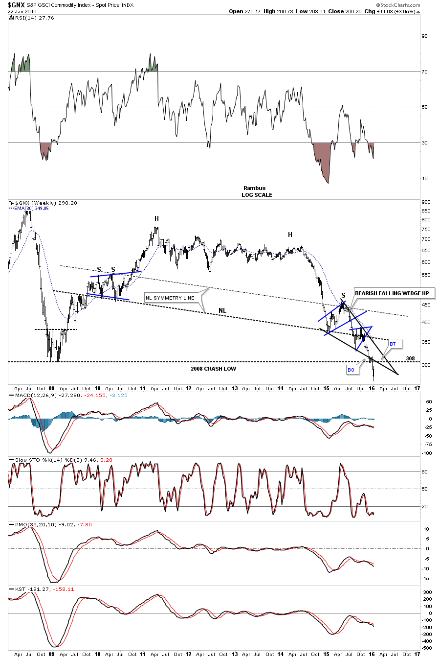
Below is the monthly candlestick chart for the $GNX.
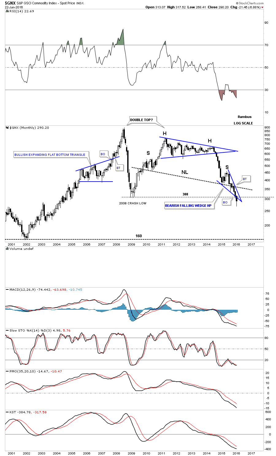
The last chart for the $GNX is a quarterly candlestick chart which shows its complete history. As you can see it still has a ways to fall to reach the H&Ss top price objective.

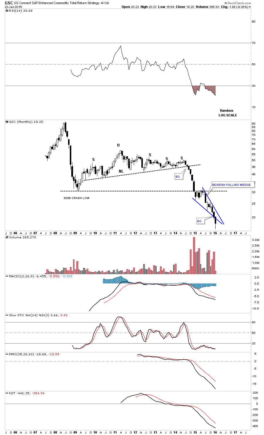
This next chart is a monthly look at the GSC which is a fairly new commodities index and trades pretty light but it still has a similar look to the other commodity indexes.
Next up is a monthly candlestick chart for the DBA which is an agricultural commodities fund which trades pretty heavily. It has a somewhat unbalanced H&S top in place. It has broken below its 2008 crash low and has been backtesting if from below for seven monthly now.

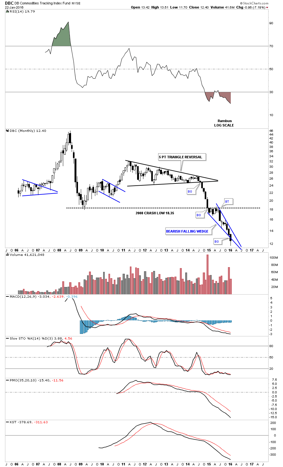
Let’s look at one last commodities index before we move on and that will be the DBC monthly chart. It doesnt show a H&S top but a five point triangle reversal pattern for its bull market top. It has been trading below its 2008 crash low for sometime now. Once the price action broke below that important low it has reversed it role to what had been support to now resistance.
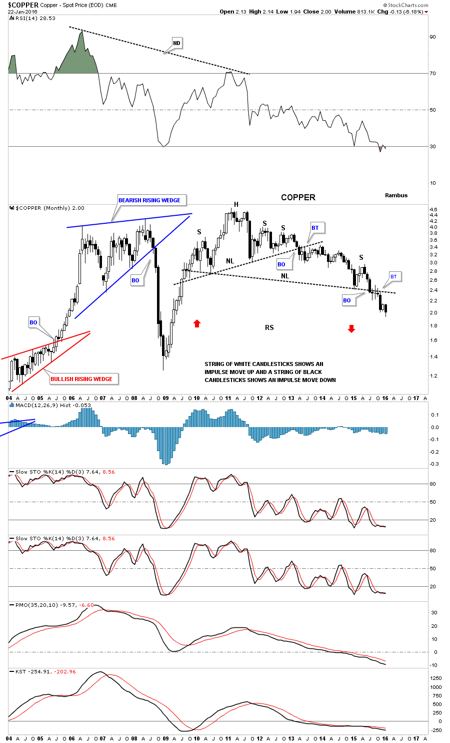
Now let’s look at some individual commodities starting with an important one , copper. A Many market analysts like to call it Dr. Copper because it generally shows the health of the economy. When its strong thats a good indication that the economy is strong and vise versa. Since 2011 copper has had some health issues .It has been building out a massive four year 7 point triangle reversal pattern. Once the blue triangle broke down in 2014 it built out a small H&S consolidation as the backtest to the bottom blue rail. That little H&S backtest matched up pretty close, symmetry wise, to the pattern on the left side of the chart that was made on the way up back in late 2009 or so. This gave me a place to add the neckline for a very large H&S top. As soon as the big neckline was broken to the down side copper formed a small red triangle as the backtest to the neckline. Three weeks ago it broke out of another small red pattern the red bearish rising wedge. Those two small red consolidation patterns may have created the bigger blue bearish falling wedge which would match up to the bullish rising wedge that formed back in last major impulse move up in 2009 which also has two small red consolidation patterns. The reverse symmetry is there. Now we just have to see if the price action can break below the bottom rail of the potential blue bearish falling wedge.
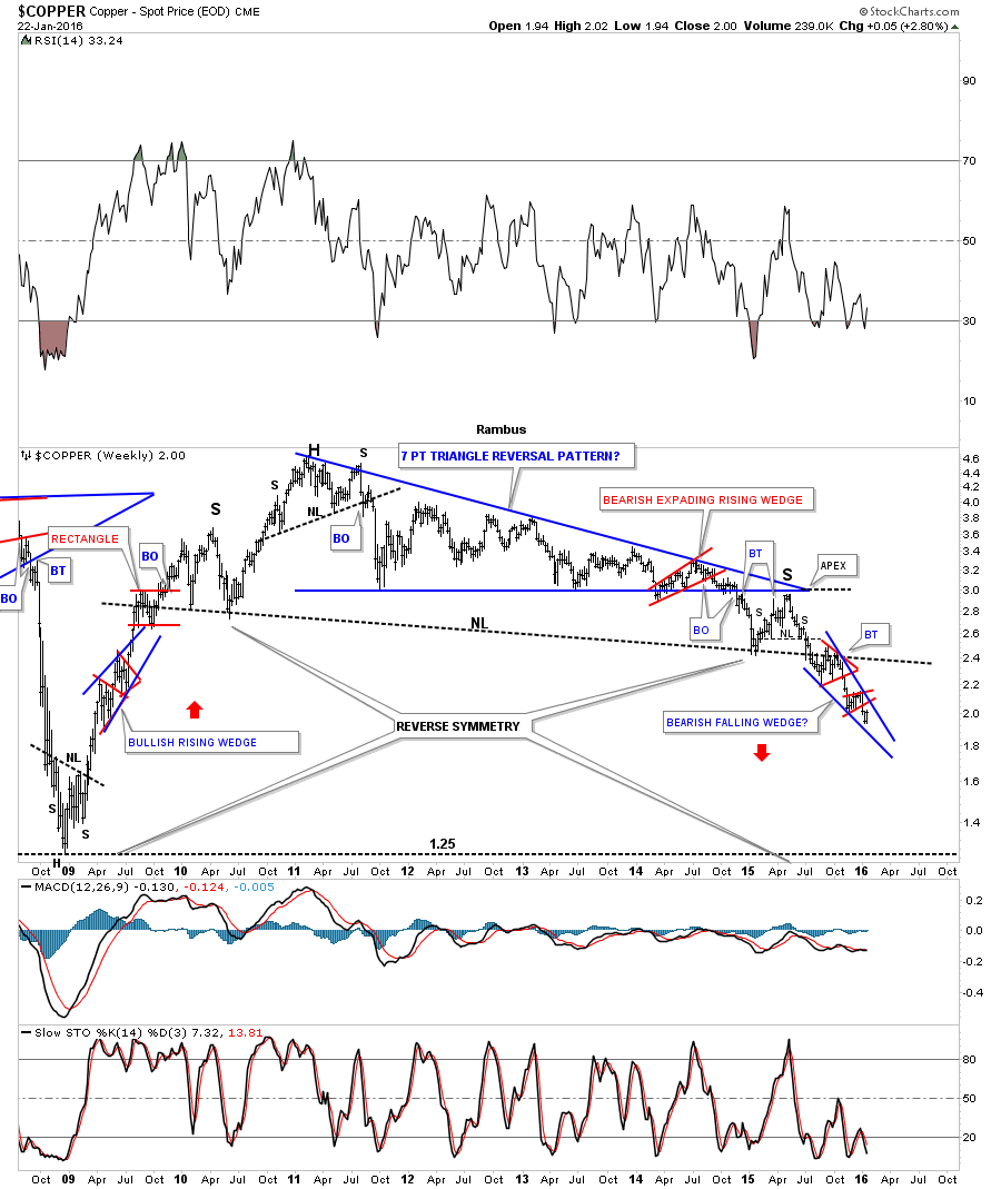
This next chart for copper is a 20-year monthly chart which during the strong bull market years built out two bullish rising wedge. The blue bullish rising wedge formed the second bottom of the four year double bottom which launched coppers bull market. Compared to most commodities and currencies weve looked copper has held up pretty well as its trading well above its 2008 crash low. However it still has an ugly looking chart if I was a long-term bull. As you can see copper is trading at a new multi year low this month.
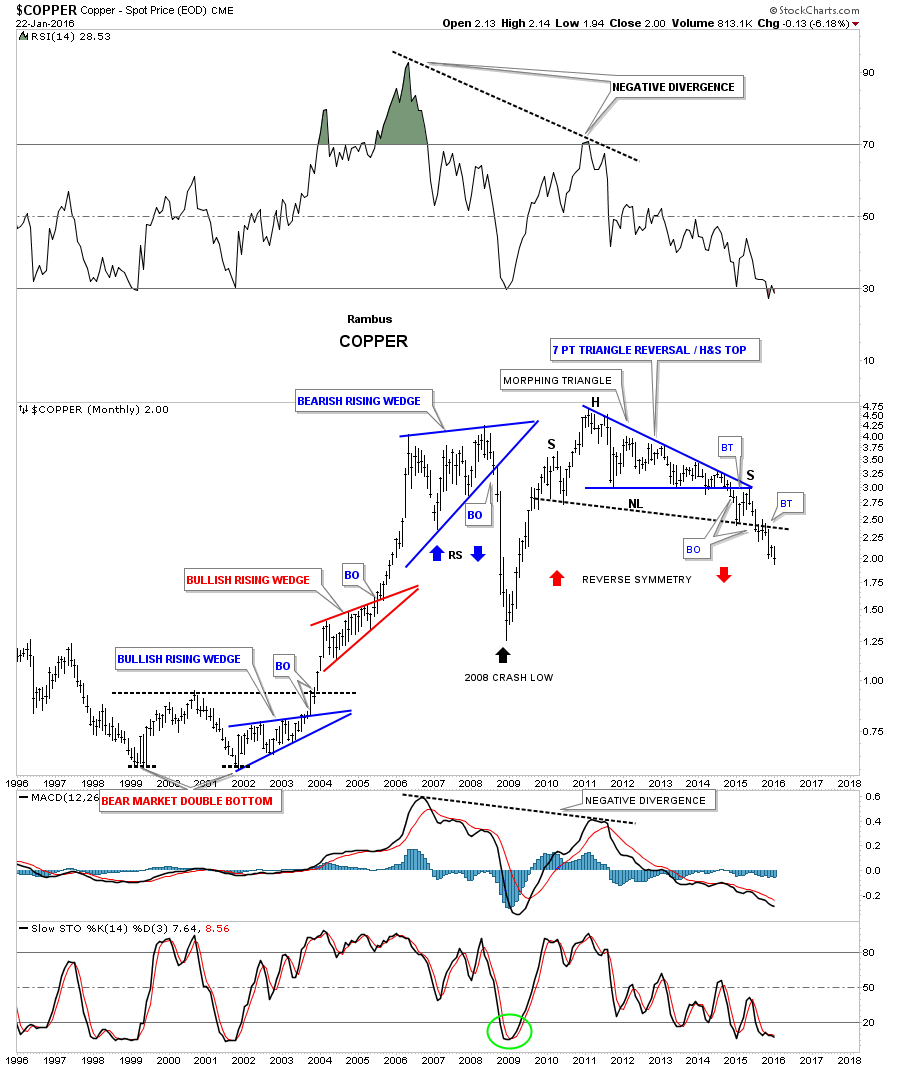
Below is the monthly candlestick chart for copper. If you are a bear it would be nice to see another black candlestick form when the month of January is finished.
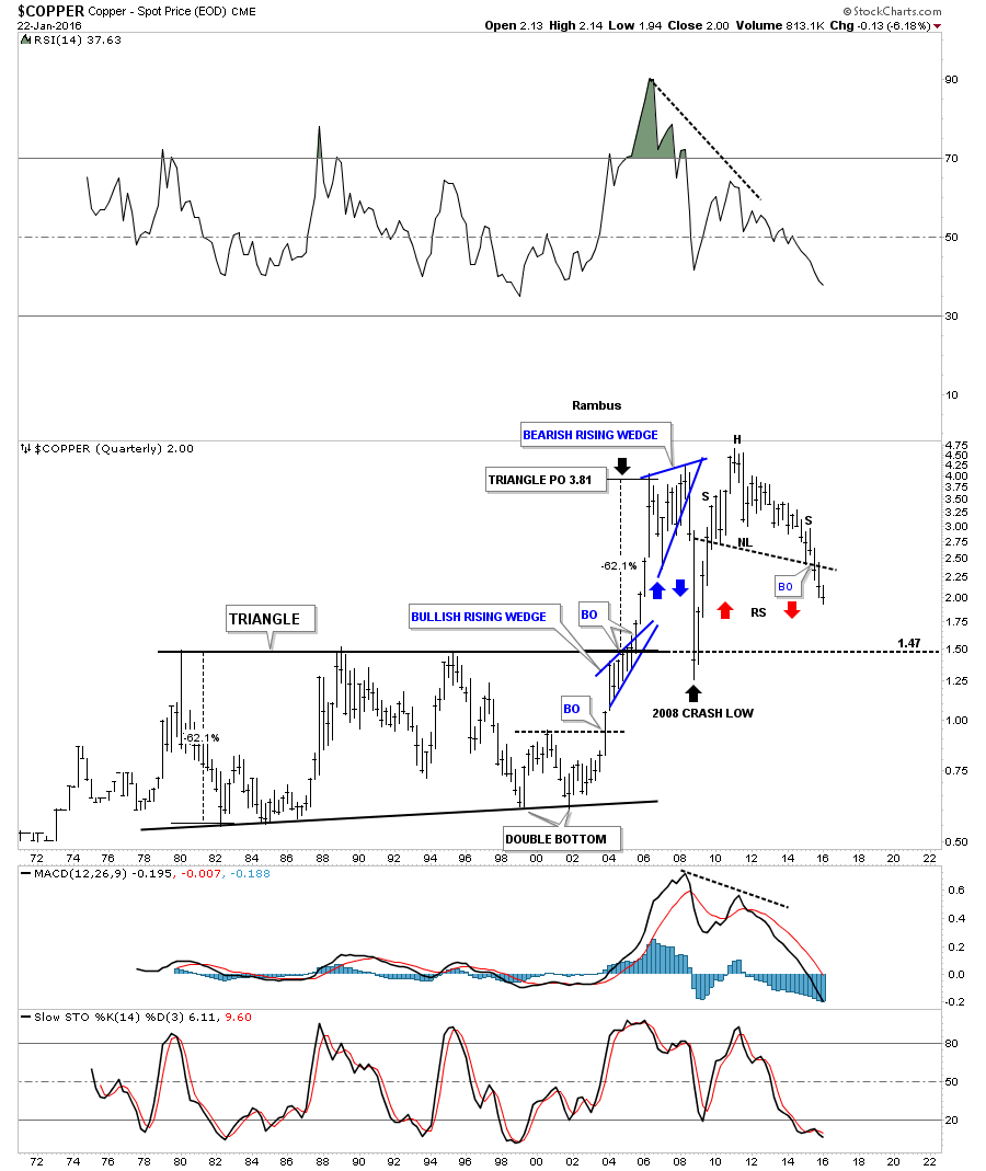
The 40-year quarterly chart for copper shows its massive H&S top. Note how the crash in 2008 found support at the old highs around the 150 area. It sure looks like copper wants to reverse symmetry down to the top of the 20-year black triangle. The blue bullish rising wedge that formed during the bull market years formed right on the top rail of that 20-year flat top triangle. It took the energy of that blue bullish rising wedge to finally break through resistance which led to the impulse move price objective up to 3.81.
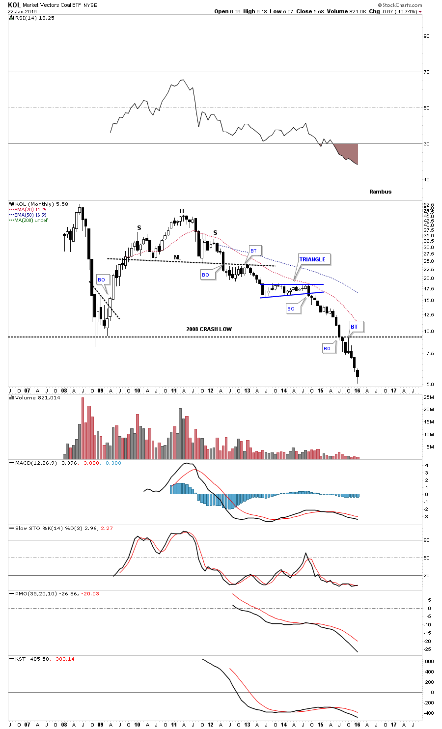
The next chart is a long-term monthly candlestick chart for KOL which is the coal etf. Note the number of black monthly candlesticks since KOL broke below the blue triangle consolidation pattern. One last note on the chart below which shows one last quick backtest to the 2008 crash low trendline before declining once again. One has to wonder how much downside can be left for this beaten down sector.
Next let’s take a look at the $GASO, unleaded gasoline chart, which had been building out a pretty tight bearish ten point falling flag formation. It broke below the bottom rails about two weeks ago and is now attempting to backtest it from below.
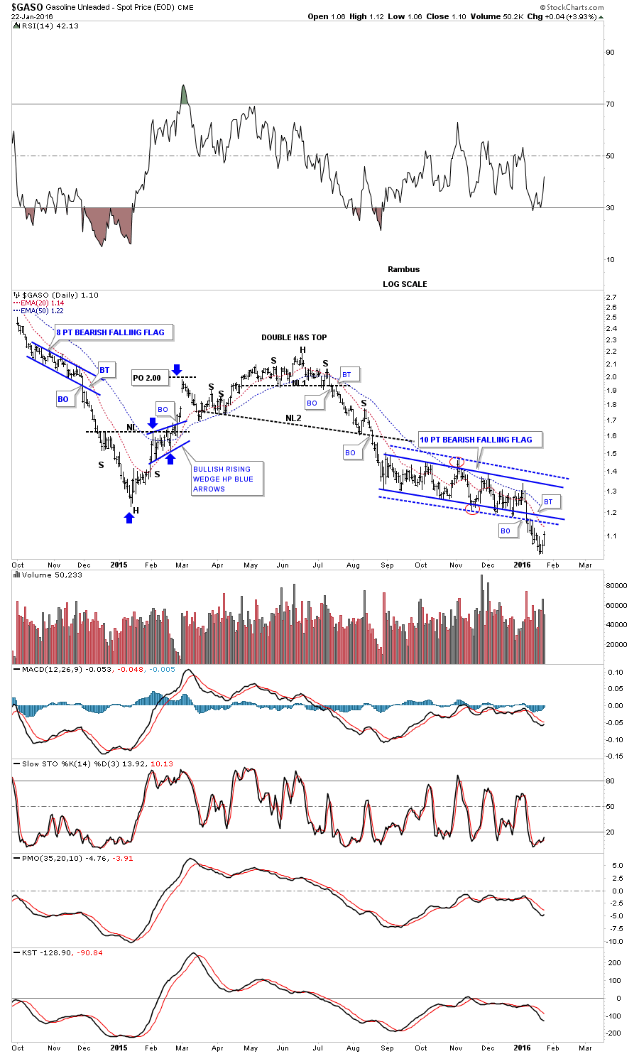
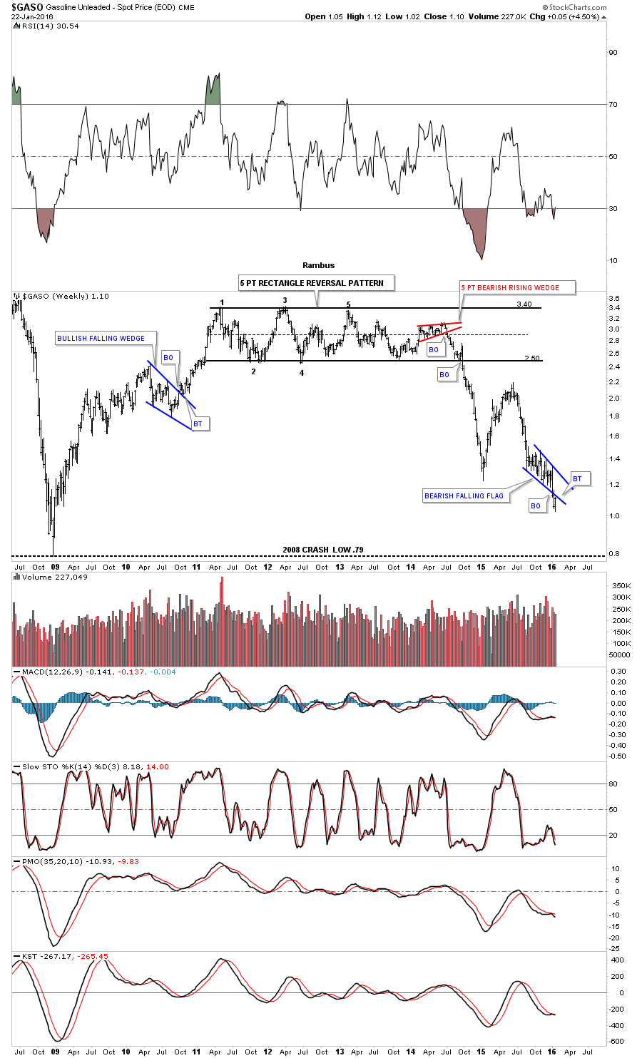
The weekly chart for GASO shows it built out a massive five point rectangle as its bull market top with the first reversal point coming in 2011. As with most of the commodities and currencies it to started to break down hard in the middle of 2014. The little red five point bearish rising wedge reversal pattern was the first good clue that the multi year rectangle was going to break to the downside. As Ive stated many times the last reversal within a rectangle can run out of gas when the mid dashed line it hit. When we see that happen it tells the bulls are worn out and cant fight the fight anymore.
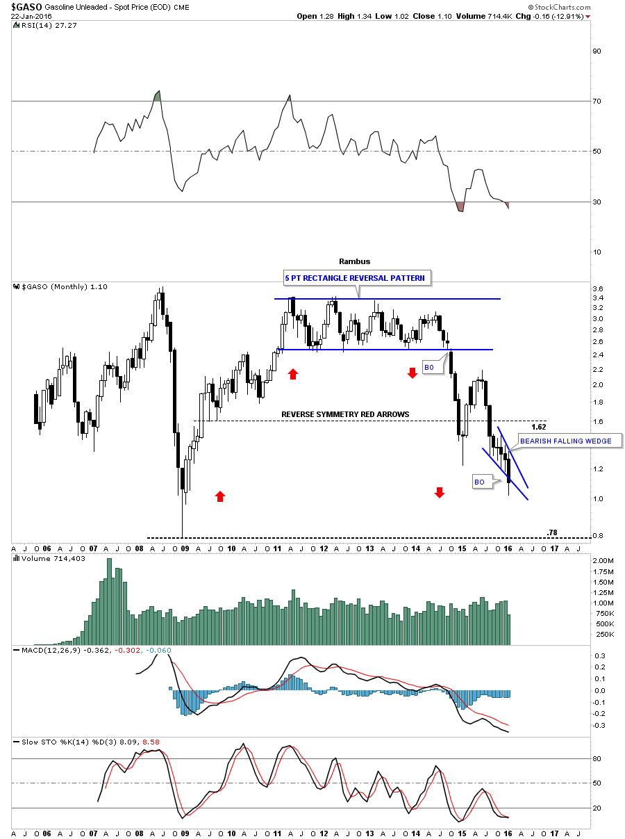
This last chart for GASO is a monthly candlestick chart which shows how the price action is reversing symmetry down to how it went up during the bull market years. If the bottom rail of the blue falling wedge holds resistance then the odds are very high that GASO will trade down to its 2008 crash low.
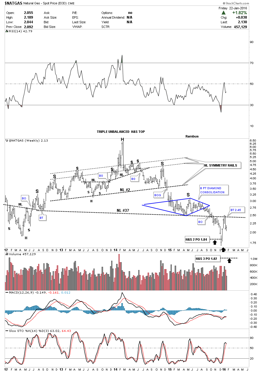
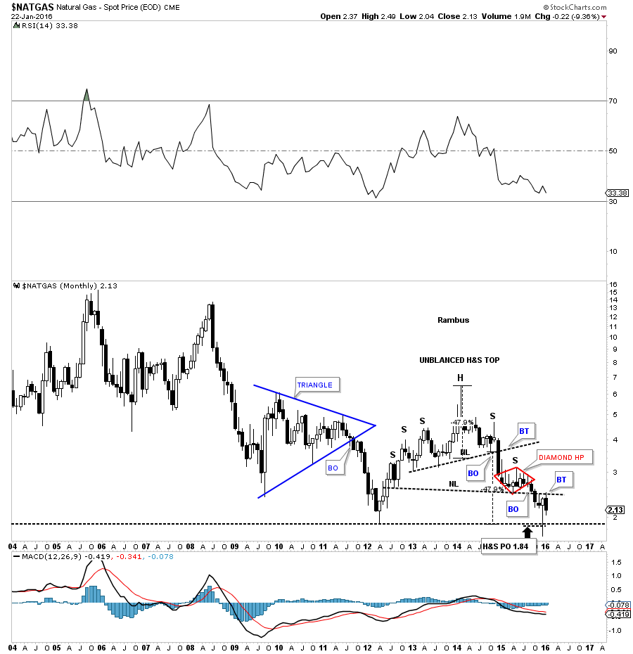
Another important energy sector is natural gas. The weekly chart for natural gas is different looking from most of the other commodities. It built out a several year three neckline H&S top. The symmetry is actually very good in regards to the two smaller H&S tops as shown by the neckline symmetry rails. After breaking down from neckline #2 natural gas found some support around the 2.50 area it built out the blue eight point Diamond consolidation pattern which ended up being the right shoulder of a much bigger H&S top. You can see at the bottom of the chart that the price objective was hit for the second H&S top at 1.84. Natural gas then did a backtest to neckline #3 where it ran into resistance and has declined for the last two weeks. So far the backtest to neckline #3 is holding resistance. We have a very clean line in the sand which is, below the neckline is bearish and above is bullish.
The monthly candlestick chart for natural gas shows its multiple H&S top which actually formed well below its all time highs. What I like about this chart is the backest that has been taking place to the lower H&S neckline as shown by this months black candlestick. As long as it can hold resistance its a fairly low risk entry point to short natural gas.
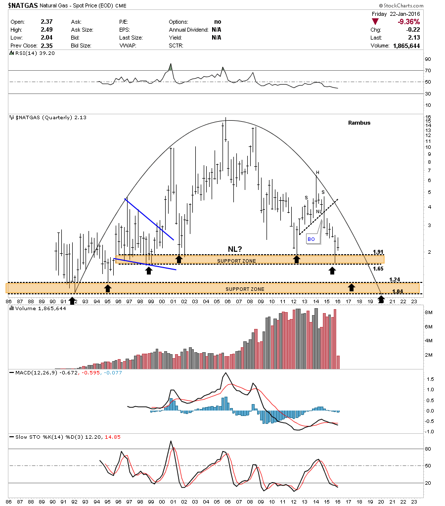
This last chart for Natural Gas is a 30-year quarterly chart which shows the entire history. It has some unbelievable symmetry as shown by the rounding top formation. There are two major support zones as shown by the brown shaded areas. Ive added three black arrows on the left side of the chart pointing up and three black arrows on the right side of the chart pointing down. In 2012 natural gas came down to the top of the upper brown shaded support zone and had a decent rally back up. Then last quarter, the end of 2015, natural gas came back down testing the lower part of the brown shaded support zone and got a bounce. Basically what its doing is eating away the support zone. I expect the next decline may very well break below the upper brown shaded support zone and decline down to the top of the lower support zone where we may see a good bounce. At any rate Natural Gas has created a very pretty long-term chart.
Regarding crude oil, let’s start by looking at this one year chart which shows the combo H&S / bearish falling wedge consolidation patterns. The H&S is a double H&S top labeled with NL1 and NL2. The bottom rail of the black falling wedge is also neckline #2. Note how many times the neckline / bottom black rail has been touched. As you can see the moment of truth has arrived as oil is getting very close to backtesting the bottom trendline around the 34.30 area. There is also the 20 day ema coming into view with the 50 day ema just overhead. A strong break above the bottom trendline will negate both patterns.
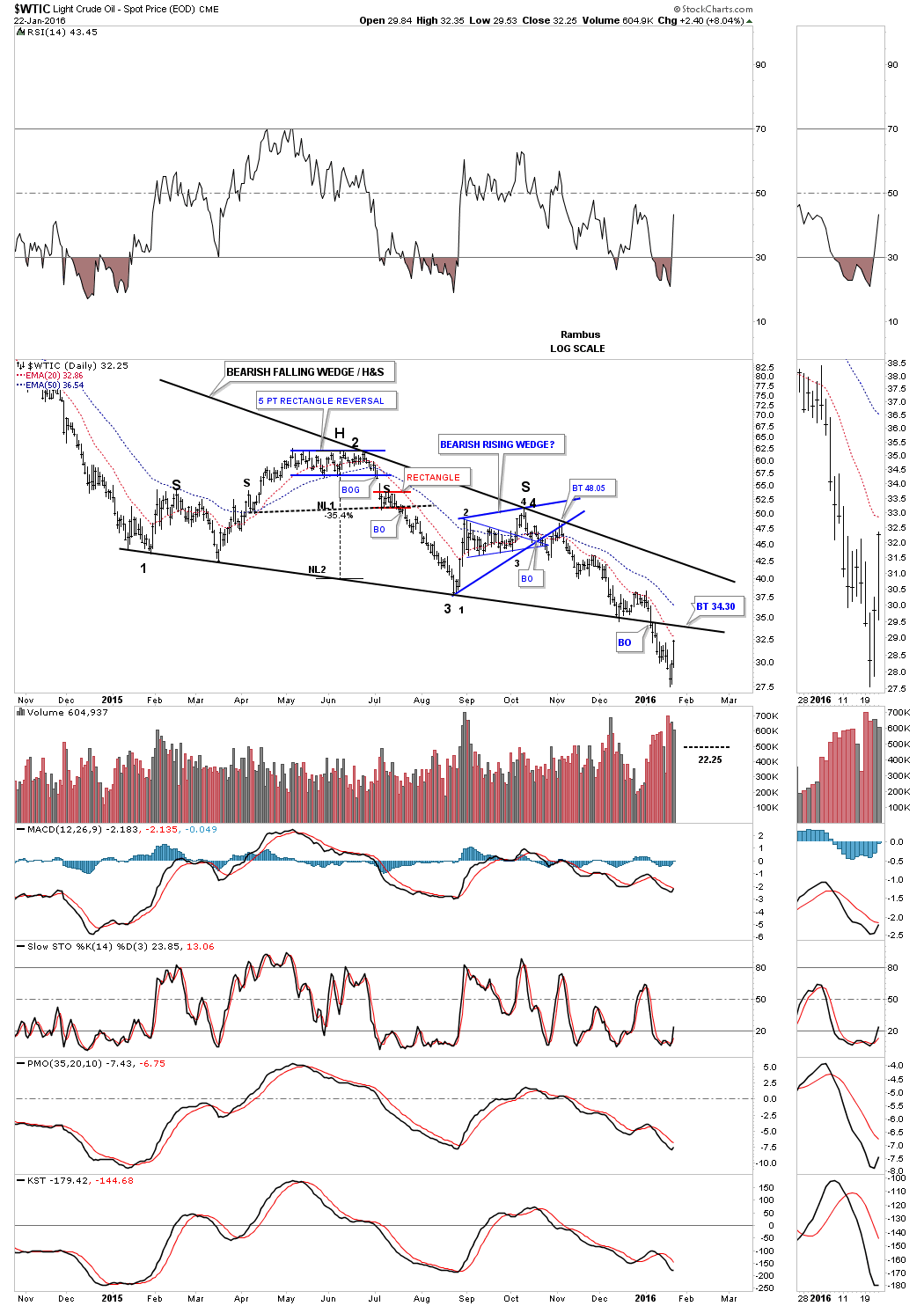
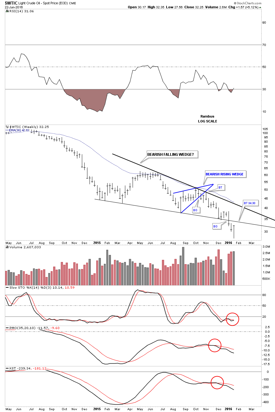
This next chart is a two year weekly look at the blue falling wedge up close and personal. You can see the smaller blue bearish rising wedge which formed last fall and had a nice clean breakout and backtest before oil dropped down to the bottom rail again and got a little bounce. That four week bounce told me the bottom rail was still hot and to be respected. Three weeks ago oil finally broke below the bottom rail just as it should have and now its in backtest mode which is what we should expect. That bottom rail is a very clean line in the sand and needs to be respected regardless of the outcome.
This next long-term daily chart shows you the massive H&S top which led to oils big move down. Once that massive neckline or S&R line gave way the bulls were nowhere to be found and the price dropped like a rock actually reversing before hitting the 2008 crash low. Ive shown you many charts where the 2008 crash low played an important role in initially letting a bounce take place before the price would eventually break below it. Also many times a smaller pattern will form right on that important support line before the price action breaks down. Oil is experiencing the exact same thing right now. When you go back and look at some of the currencies and other commodities youll see that 2015 was basically a consolidation year . Consolidating that first leg down that started in July of 2014. This blue falling wedge is the reason for this big Weekend Report. The million dollar question is : Is the second shoe getting ready to drop in the deflationary spiral that actually began in 2011 and where it picked up steam in 2014? Note the red bullish rising flag that formed in that big impulse move up back in 2007 which shows up about in the middle of the big move.

This next chart for oil is the monthly candlestick chart which shows the massive topping pattern and our blue falling wedge. Again you can see the string of black candlesticks that formed all in a row during the impulse moves down and a string of white candlestick in the impulse moves up. The crash in 2008 produce seven black candlesticks all in a row. The initial move down into the beginning of the blue falling wedge produced seven black candlesticks all in a row. If oil closes the month of January with a black candlestick then that would make three in a row.
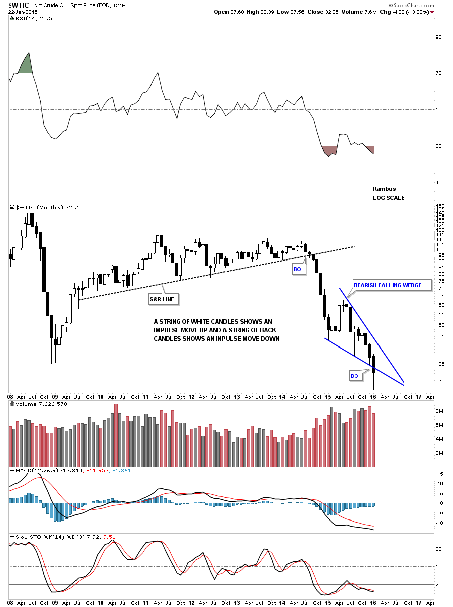
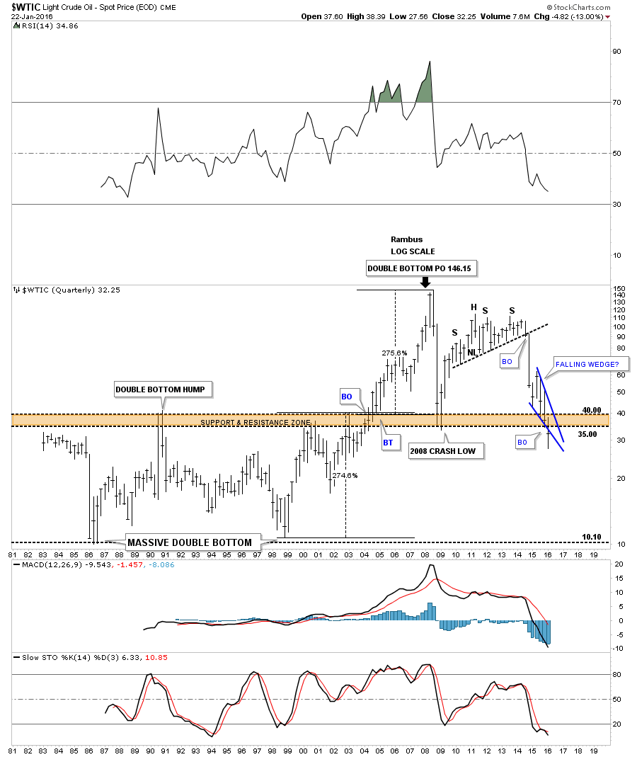
Below is a very long-term 35 year chart for oil which shows its huge trading range that lasted from the early 1980s to the early 2000s when it finally broke above that massive resistance zone between 35 and 40. Once it broke above that brown shaded S&R zone there was nothing to stop the price action from skyrocketing up to 147 where it finally ran out of gas. What is interesting about this long-term chart for oil is the trading range between 10 and 40. What that massive trading range measured out to was 146.15 on a percentage basis which was around 275%. You can see how our blue falling wedge has cracked below the upper brown shaded support and resistance zone. The pieces of the puzzle are all there we just have to see the price action do its thing now.
The Chartology of Precious Metals
Catherine Austin Fitts:
Rambus, you just finished a very comprehensive look at individual mining stocks. It was very useful to have the opportunity to go through the full selection in addition to the index, which you charted as well. What can you share with our subscribers about gold and silver and the mining stocks?
Rambus:
The precious metals sector has been in a bear market since 2011. It has been a slow grind lower especially over the last several years. Its this type of grinding action that wears out both the bulls and bears alike. Just when you think there is a bottom in place this sector will reverse course and run the opposite way. This is the job of a bear market to confuse everyone by rallying just enough to make you think this time its the real bottom.
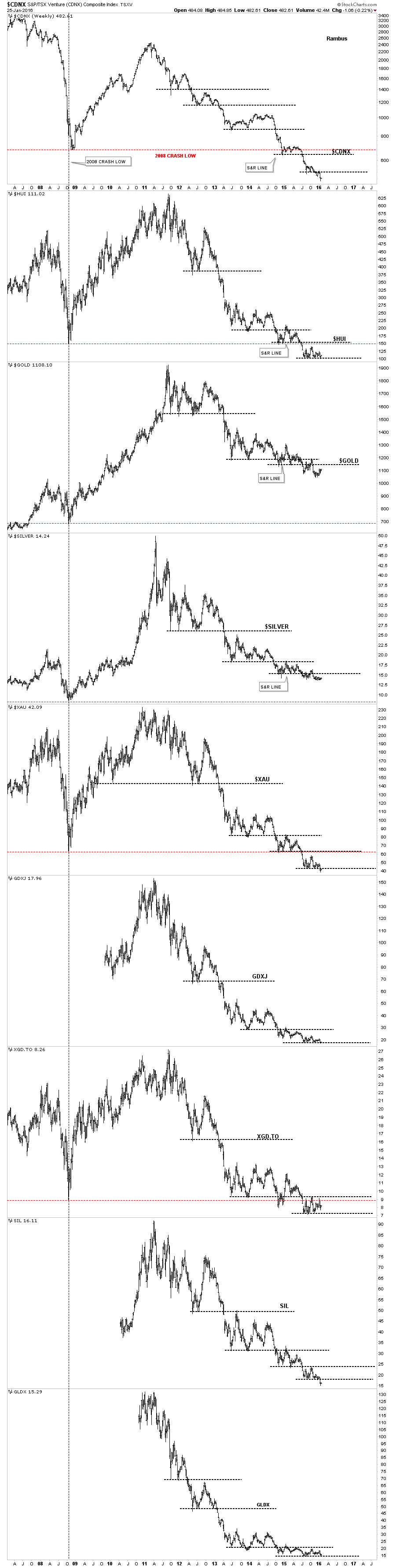
The very first thing we need to see happen to wake up the bull is for this sector to start making higher highs and higher lows which so far hasnt been the case. Below is a weekly combo chart which has gold, silver and all the important precious metals stock indexes on it. The first thing to look at is the bull market peaks which were made in 2011 for this sector and then follow the price action all the way down to the present day. For the most part youll see how this sector in general has been making lower lows and lower highs throughout its bear market. Also the 2008 crash low is an important benchmark that needs to be recognized. Youll see that gold and silver are still trading well above their 2008 crash lows while all the PM stock indexes are all trading below that important low showing relative weakness. The black dashed horizontal lines represents support and resistance. This chart clearly shows that in order to begin a new bull market this sector, will at the very least, have to trade above its lowest black dashed support and resistance line. This chart also gives you a quick reference to what shape this sector is in.
This first daily chart for gold is one I posted last week which is just a simple chart which has the black dashed support and resistance lines on it and nothing else. After breaking above the current S&R line gold did backtest it from above and has been in rally mode for the last week or so. With the steep decline leading into the low and the subsequent breakout and back test of the S&R line its possible we may see some reverse symmetry to the upside as shown by the red arrows. Gold could rally up to the previous top and stall out there if the bear market is still in force.
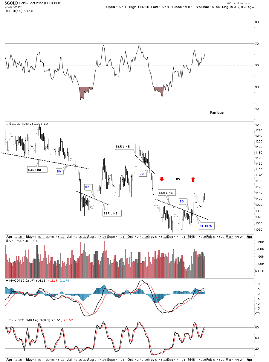
This next chart for gold is a long-term daily look which shows its most important moving averages. When theyre all properly aligned they do a good job of showing you the big trend. Just recently gold broke above its 50 day ma with the 150 day ma just above at 1114.71. If gold can ever start trading above its all important 300 day ma then it will be talking to us. One step at a time.
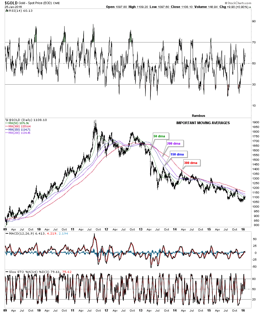
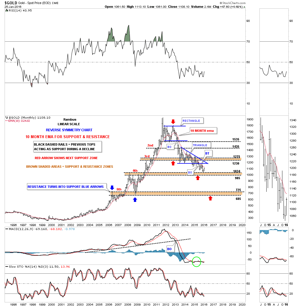
Another important moving average for gold is the 10 month ema which also does a good job of showing you the big trend that is in place. As you can see gold has just tested the top of the brown shaded support and resistance zone at 1034 and is now caught between it and the 10 month ema.
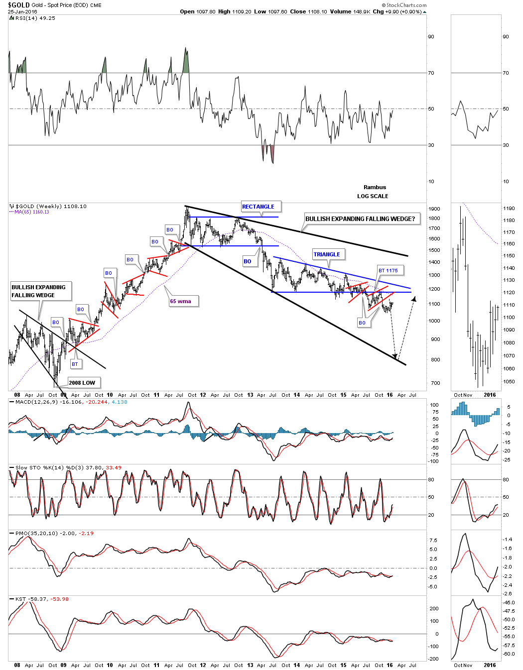
The long-term weekly chart for gold shows the 65 week ma as another important moving average that also has done a good job of showing us the big trend. This chart also shows you the bullish outcome if gold were to ever breakout above the overhead resistance. The million dollar question is will gold decline down to the bottom trendline first or will it or will it takeout overhead resistance first? Either way it will talk to us on what its intentions are.
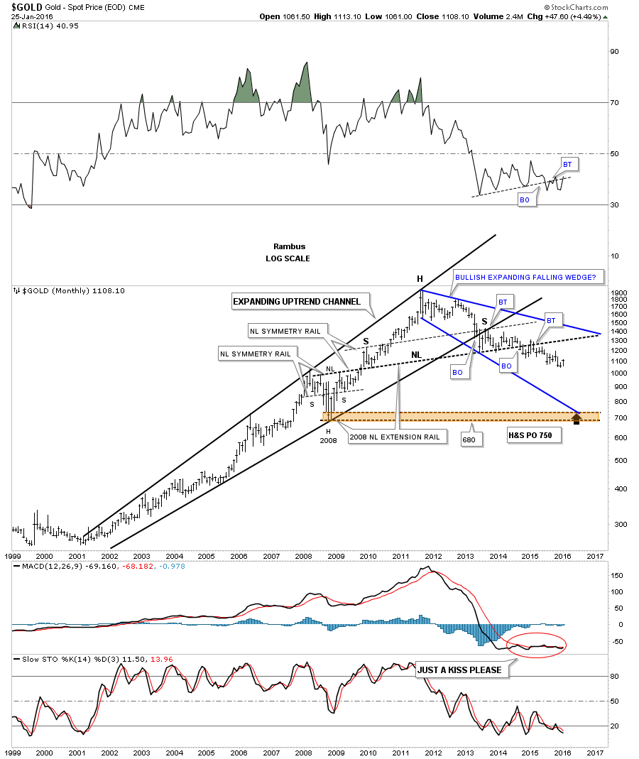
Below is the same expanding falling wedge on the 15 year monthly chart which puts it in perspective. Right now gold is trading in the middle of no mans land just up from its December low. A perfect scenario to end its bear market would be to see gold crash down to the brown shaded support and resistance zone around the 700 area. That would clean out the remaining bulls and put fear in the hearts of those that want to buy it. What we want and what we get can be two different things. We just have to watch the price for clues on what gold wants to do.
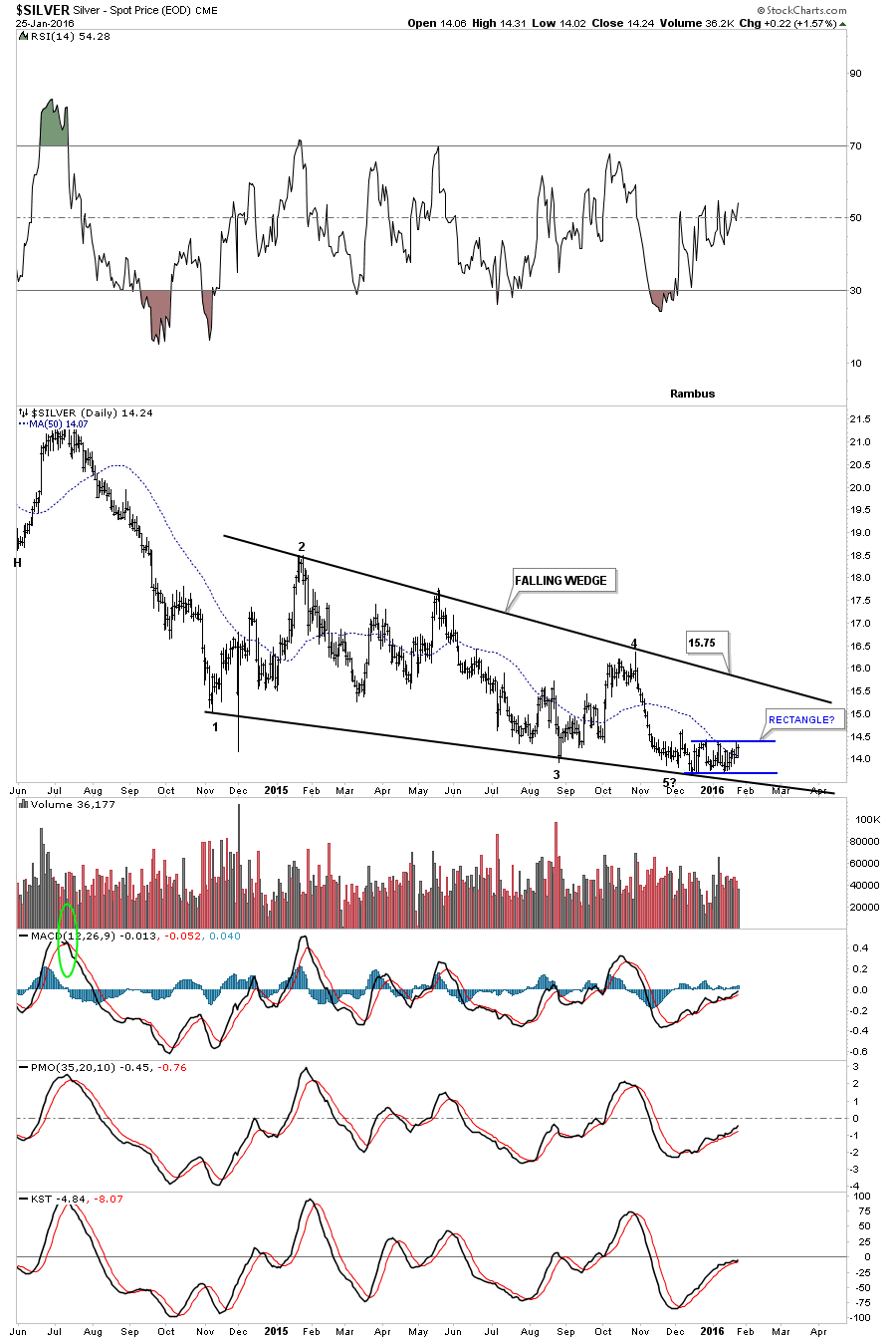
Let’s now turn our attention to silver as it has been weaker than gold. The daily chart below shows silver trading in a 15 month falling wedge pattern with a small blue horizontal trading range down at reversal point five which started to develop back in December of last year. Silver has completed four reversal points so far which puts the falling wedge into the consolidation pattern category which means it should break below the bottom rail. The bullish outcome can still be saved by the bulls if they can rally silver backup to the top rail of the falling wedge putting the wedge into the reversal category. A break above the top rail would be a very bullish development. The very first thing we need to see happen for the bullish case is to see silver start trading above the top rail of the blue rectangle pattern.
This very long-term 40-year chart for silver puts our current falling wedge in perspective. As you can see since silver put in its bull market top in 2011 it has been trading lower in a nice parallel downtrend channel. One of the reasons I thought the blue falling wedge would break to the downside is because of this chart. Note the beautiful reverse symmetry that took place during silvers bull market that really began in 2001 compared to the bear market years that started at the 1980 top. Neckline #1 and #2 were taken from the highs in 1983 and 1987 as silver was reversing back up during its recent bull market that began in 2001 and ended in 2011. Note how each neckline was broken to the upside and was backtested from above which confirmed the necklines were in fact correctly placed.
Now notice the S&R line that runs through the entire chart and how the price action interacted with it around the high in 2007 just before the 2008 crash. The 2008 crash took silver all the way back down to neckline #2 where it finally found support which launched silver on its near parabolic run to fifty. On the way back up silver hit the S&R line again and this time formed a small blue bullish rising wedge which gave silver the energy it needed to finally breakout and move to its bull market high.
Now for the important part. Notice how silver found initial support at the S&R line and built out the small blue triangle right on top of it on the way down. The S&R line had reversed its role to what had been resistance on the way up, until the price action broke above it, to now support. The bulls could have still saved the day if the S&R line held support but as you can see the price action broke below it and formed our current falling wedge, we just looked at on the chart above, which is a bearish setup. There is an old expression in technical analysis that goes something like this, an old support and resistance line never dies it just slowly fades away. Even after 35 years or so that S&R line is still in play. Its up to the bulls now to take control away from the bears who have been in charge since 2011. You know you have a good support and resistance line when the price action cuts cleanly through the chart which that 35 year S&R line does.
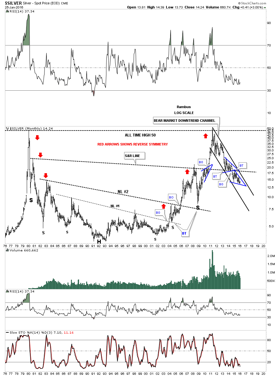
This last long-term chart for silver shows all the patterns it made during the bull market years. This chart also shows you a very large bearish H&S top in place. Note the blue bullish rising wedge that we looked at on the chart above that formed on the way up and the blue triangle that formed on the way down in the same area. The bullish rising wedge on the left side of the head is the left shoulder and the blue triangle that formed on the way down is the right shoulder of a massive H&S top. Again like the massive 35 year support and resistance line we looked at on the chart above, that cuts right through the price action, you can see how the neckline is doing the exact same thing with one small consolidation pattern above it and one below. Silver can rally up to the top of the blue falling wedge and not change the bearish setup that is currently in place. One of the characteristics silver had during its bull market years was that it would form a small red bullish rising wedge as a halfway pattern between the consolidation patterns.

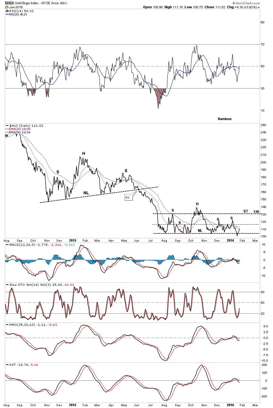
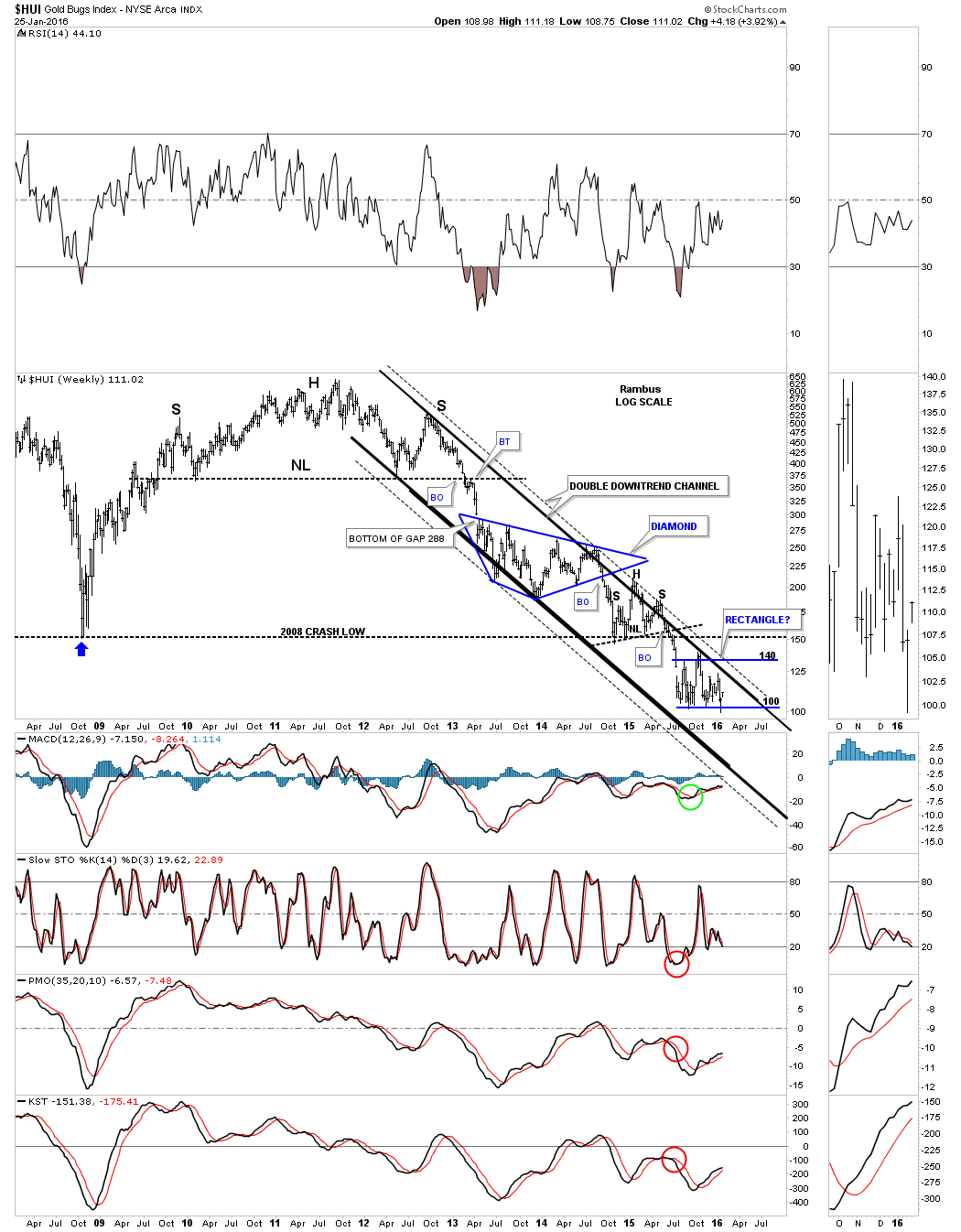
Let’s now take a look at the HUI which has shown a little strength the last several days bouncing off the support zone that began to setup last August. It looked like last week it was going to finally break through that strong area of support and begin its next impulse move lower. As it has done about eight time prior the support zone held and the HUI is getting a bounce and has to be respected.
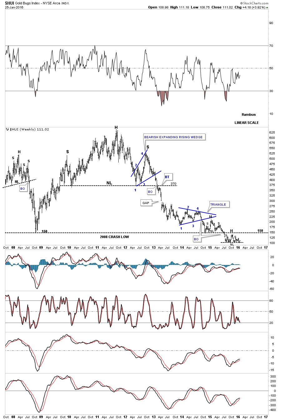
Below is a long-term weekly chart for the HUI which shows its 2008 H&S top and the massive multi year H&S top which ended the bull market for the HUI. Focusing in on the 2008 crash low trendline at 150 you can see that the HUI built out a small H&S consolidation pattern just above it and is currently building out some type of pattern just below. This is a similar setup that we looked at on the long-term silver chart which had one consolidation pattern above that 40-year support and resistance line and one below it. The same principal applies here as well. If the HUI can trade back above the 2008 crash low S&R line, that would be the first step in the right direction for the bulls.
Below is the long-term monthly chart for the HUI which shows its entire history. You can see the massive base that the HUI built out in the late 1990s which launched its ten year bull market. Big base or top = big move. During its bull market the HUI built out one blue consolidation pattern on top of the next just as you would expect from a bull market. Note the massive H&S top that few recognized at the time which was needed to reverse the 10-year bull market. Since the HUI doesnt want to break below the support area we looked at on the daily chart Im going to call the seven month price action a trading range. This means the trading range can be either a consolidation pattern or a reversal pattern depending on which way the trading ranges breaks. As the trading range has formed in the downtrend the odds are higher that the breakout when it comes will be to the downside.

This last chart for the HUI shows its bear market double downtrend channel. The outside trendlines are dashed because the price action broke the solid trendlines briefly and then moved back into the main channel. For the time being Im going to label our current trading range as a rectangle with the bottom at 100 and the top at 140 or so. The trading range still could be the H&S consolidation pattern I originally thought was building out but I need more confirmation now that the bottom has held yet again. The bottom line is that the PM complex is showing a little life in here but will it be enough to turn the bear market around ? Stay Tuned .
The Chartology of the Stock Markets
Catherine Austin Fitts:
I expected the equity markets to be soft in January. However, they have taken quite a dive. The question on many investors minds is whether this is a 5-15% correction or a deeper correction, say 15-25%, or are we turning into a bear market? What do the charts say about the equity markets?
In addition, you have been looking at some of the sectors that have been the market leaders, such as Biotech and the tech stocks. Have you looked at the FANG stocks (Facebook, Amazon, Netflix and Google)? We would welcome any thoughts you have on the market leaders and what the charts say about the overall market.
Rambus:
I would like to show you some longer term charts for some of the different stock markets which can give you a clearer picture of what is actually taking place within a bull or bear market. These long term charts wont give you a precise top or bottom but they are good at letting you know when a major trend is changing. Its always much easier to trade with the major trend than against it as youll have the wind at you back if you make a mistake and buy to high during a bull market. Eventually the main trend will catch up with you and save your trade. When you trade against the main trend just the opposite happens. If you make a mistake on your buy point in a bear market it will be unforgiving as the main trend will keep falling away from where you entered the trade originally and it only gets worse until you finally had enough and exit your trade.
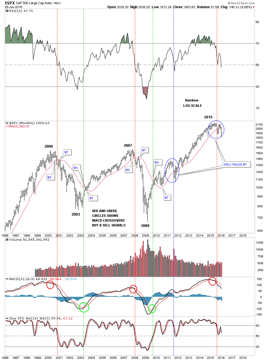
Below is a very simple but effect method of knowing what side of the major trend to be trading. Sometimes the simplest approach to trading is the easiest to understand. This weekly chart for the SPX goes back seventeen years to the bubble top in 2000. I just use a 30 week moving average and an 88 week moving average looking for a crossover. It doesnt get any simpler than that. There has only been five signals generated when the 30 week and 88 week ma crossed over each other.
The first sell signal, red circle, came at the 2000 bull market top. The next buy signal came at the 2003 bear market low, green circle. The next sell signal came at the 2007 bull market top with the next buy signal come after the 2009 crash low.
From that last buy signal that was made back at the end of 2009 these two moving averages never crossed again until the beginning of this year just several weeks ago. You can see our most recent crossover, sell signal, if you look at the sidebar. Will this buy signal stick? There are no guarantees when it comes to the markets but the odds favor the sell signal will stick until we see the 30 cross back above the 88 week moving average. Note how the 2015 H&S top looks compared to the 2007 H&S top.
This most recent crossover sell signal was a game changer for me. I had been bullish for a long time even when the H&S top was building out. I just needed a simple crossover to get me on the other side. The Strategy is now to play the stock market from the short side which I expect will be the major trend for awhile. How long the SPX will go down is anyones guess but the new game plan is to trade the downside.

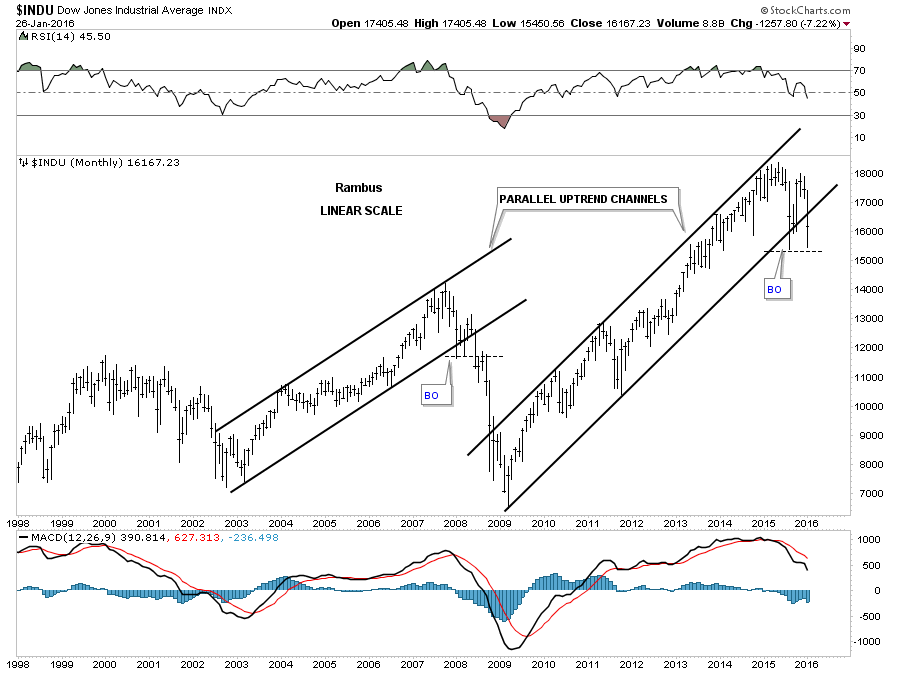
Below is a 20 year monthly chart for the SPX which has just the simple 21 month moving average on it in red. The 21 month ma can be used on other stock market indexes but its the cleanest on the SPX. Here we just look for the price action to either cross above or below the 21 month moving average for a buy or sell signal. Again its not going to get you in at the exact bottom or out at the exact top but it shows you which side of the market to be trading. This moving average works like a support and resistance line. When the price action is above the 21 moving average things are bullish and when the price action trades below it the main trend is down.
Starting at the 2000 bull market high you can see the price action stayed above the 21 month ma until it fell below and create the first lower low. What the 21 month moving average does is reverses its role to what had been support to resistance once its broke to the downside. You can see the SPX spent the next four months backtesting the 21 month ma from below before the bear market really took off to the downside. Just the opposite happened in 2003 when the SPX broke above the 21 month ma and backtested it from above before the bull market took off to the upside. You can see the interaction of the price action to the 21 month moving average was the same at the 2000 top and the 2007 top. Once broken to the downside it reversed its role and acted as resistance stopping any rally attempt.
The buy signal came much higher at the 2009 crash low but the 21 month ma did its job and held support when the SPX broke above it. For close to a year the 21 month ma held support before one of the most hated bull markets in history took off. The year 2011 marked the first failure for the 21 month ma, lower blue circle, when it closed the month below it, but the very next month the SPX was able to close back above the 21 month ma and it has held support until just recently.
When you compare the price action of the 2015 top to the 2007 top you can see how they both interacted with the 21 month ma. In 2007 the SPX quickly traded back above the 21 month ma when it failed to hold support and the exact same thing happened at the 2015 H&S top except for one big difference. Unless we get a monster rally in the next three days the 21 month ma is going to close decisively below the moving average unlike 2011. For now the 21 month ma which is at 2021 is major overhead resistance until the SPX can trade back above it. Until that happens the bear market is alive.
If the current price action in the SPX confirms that it has indeed started a bear market this next long term weekly chart shows where we should see some important support show up. This flat top expand triangle has been around for many years. The 2000 and 2007 bull market highs both reached up to the 1500 area before their bear markets began. That heavy overhead resistance zone was over come about three years or so ago. If we see a declining SPX, the top of the old resistance zone around the 1500 area, will be the very first area that will offer some good support. At that point well have to look for more clues that the Chartology may give us.
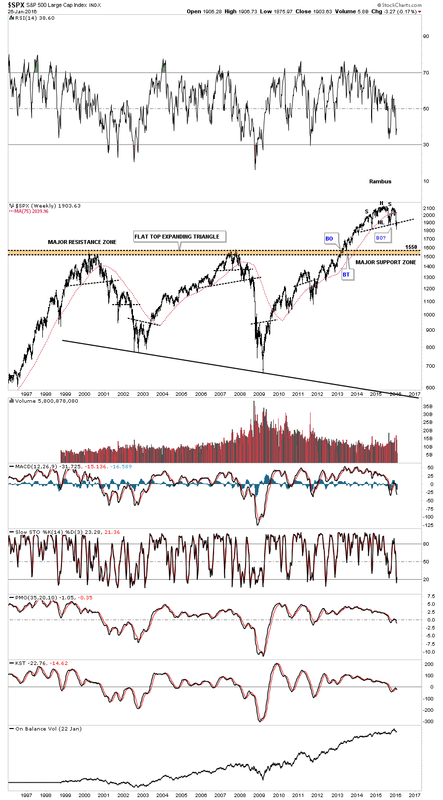
This next chart for the SPX shows it 2009 bull market uptrend channel. So far the bottom rail hasnt been broken to the downside. The possible neckline has been cracked but not broken. A monthly close below the neckline and the bottom rail of the 2009 uptrend channel will give us a couple of more clues the bear market is upon us.
Lets look at a couple of the different sectors that have been leading the way lower. The $RUT has been by far the weakest of all the US markets as it has already broken below its two year H&S neckline. A backtest to the neckline, if we get one, would come in around the 1090 area.

The Transportation Average had one of the strongest bull market runs out of the 2009 crash low. It was also the first index to break below its big H&S top. Whenever you see rising wedges that breakout in the same direction of the main trend you know youre in a strong move. You can see two blue bullish rising wedges that were formed during the last major move up which led to the H&S top.
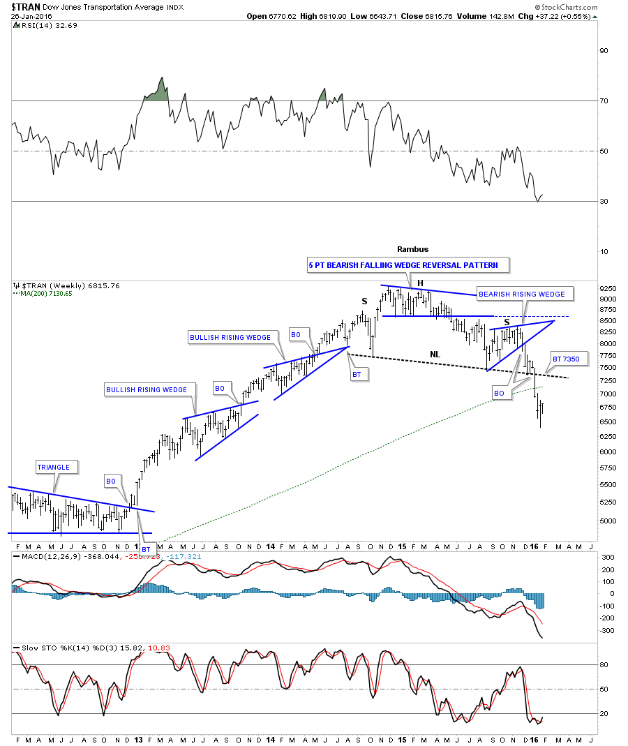
The 20 year monthly chart for the Transportation Average shows you a beautiful H&S consolidation pattern which led to its bull market. The first real area of support should come in at the neckline extension rail at 5520.
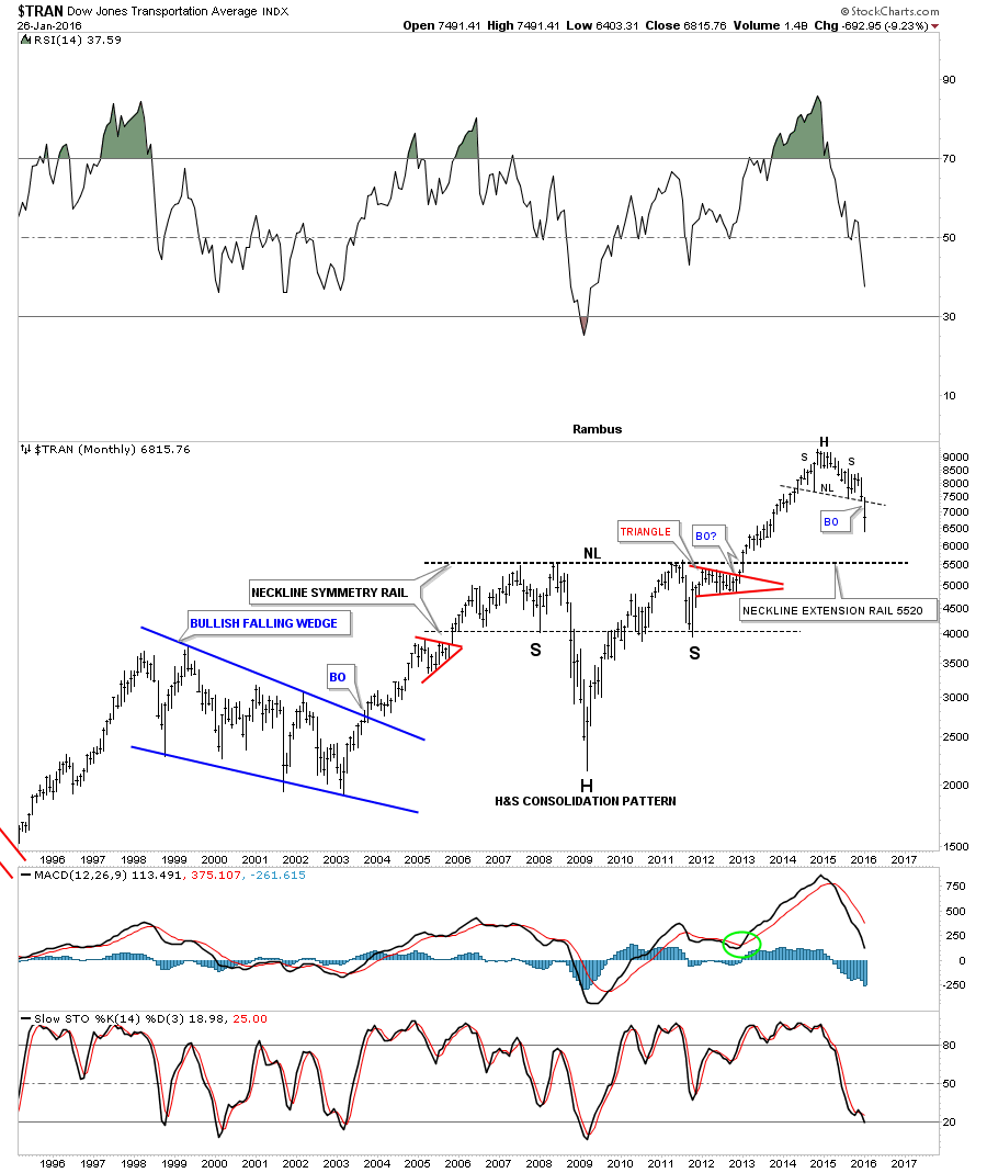
Below is a 100 year chart for the Transportation Average which shows you all the big chart patterns it has formed over the many years. Even on this 100 year chart you can see how pretty that H&S consolidation pattern is on the chart we just looked at above. Investors psychology never changes.

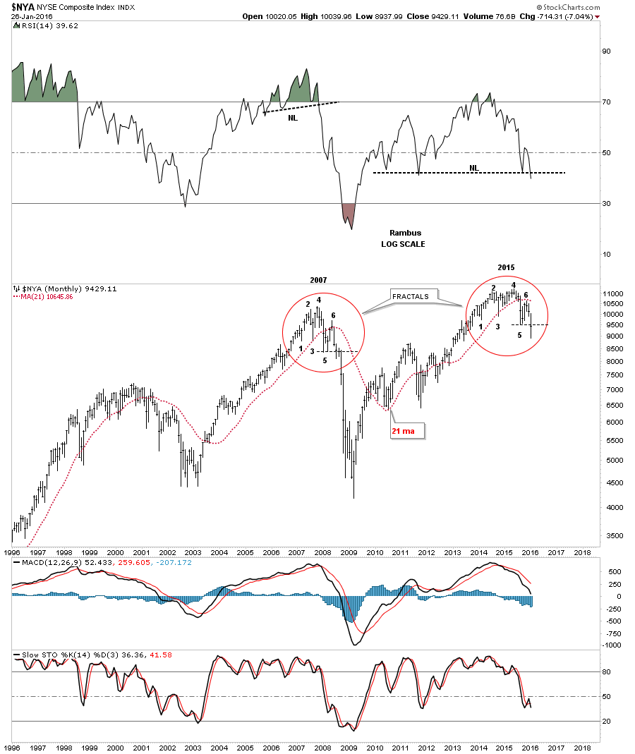
This next chart is a 20 year monthly look at the $NYA which is a pretty broad index with alot of stocks in it. Sometimes when you look at a chart like this things can jump out at you. Here you can see the 2007 and 2015 tops with a red circle around each one. This chart is comparing the turning points in each top which are fractals, meaning they look the same. When you look at the 2007 top compare number 1 to the number 1 in the 2015 top. Then go through each number on the 2007 top and compare it to each number in the 2015 top and youll see they match up perfectly. The thin black dashed horizontal lines, just above point number 5 shows you where we are at presently in 2015. Also note how the price action interacts with the red 21 month ma. So far so good.
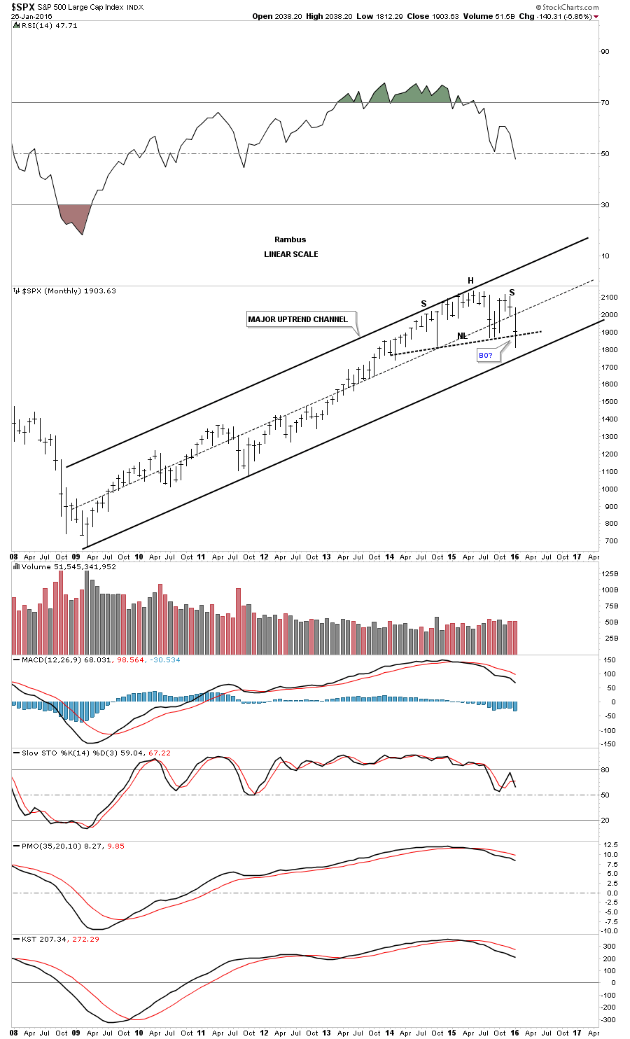
This next chart is just a very simple look at the 2003 bull market and the 2009 bull market. Each bull market created a beautiful parallel uptrend channel which had an ugly breakout and strong backtest to the bottom trendline.
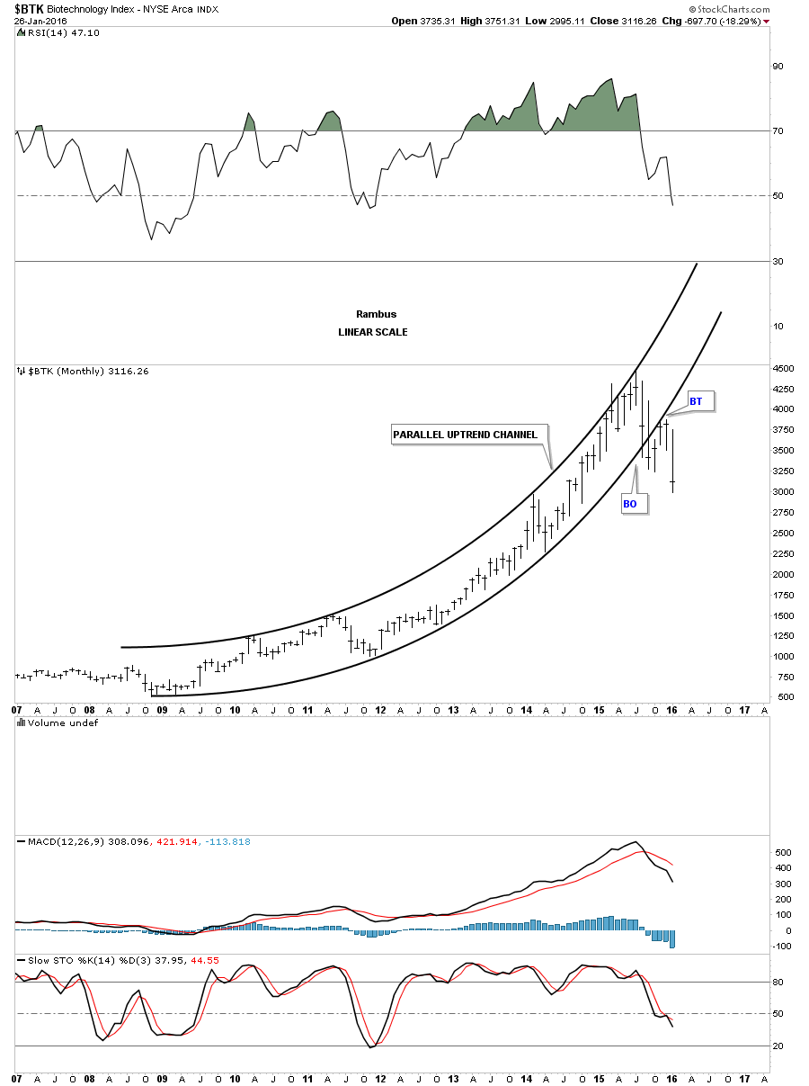
If youve been follow the bull market for any length of time you know the Biotechs were the strongest sector since the bull market began in 2009. Below is a monthly chart that shows you the $BTK, biotechnology index, and how its bull market looked. It was a thing of beauty until it finally broke below the bottom rail of its parabolic uptrend channel. After it completed the backtest to the underside of the bottom trendline its now one of the weaker sectors in the markets.
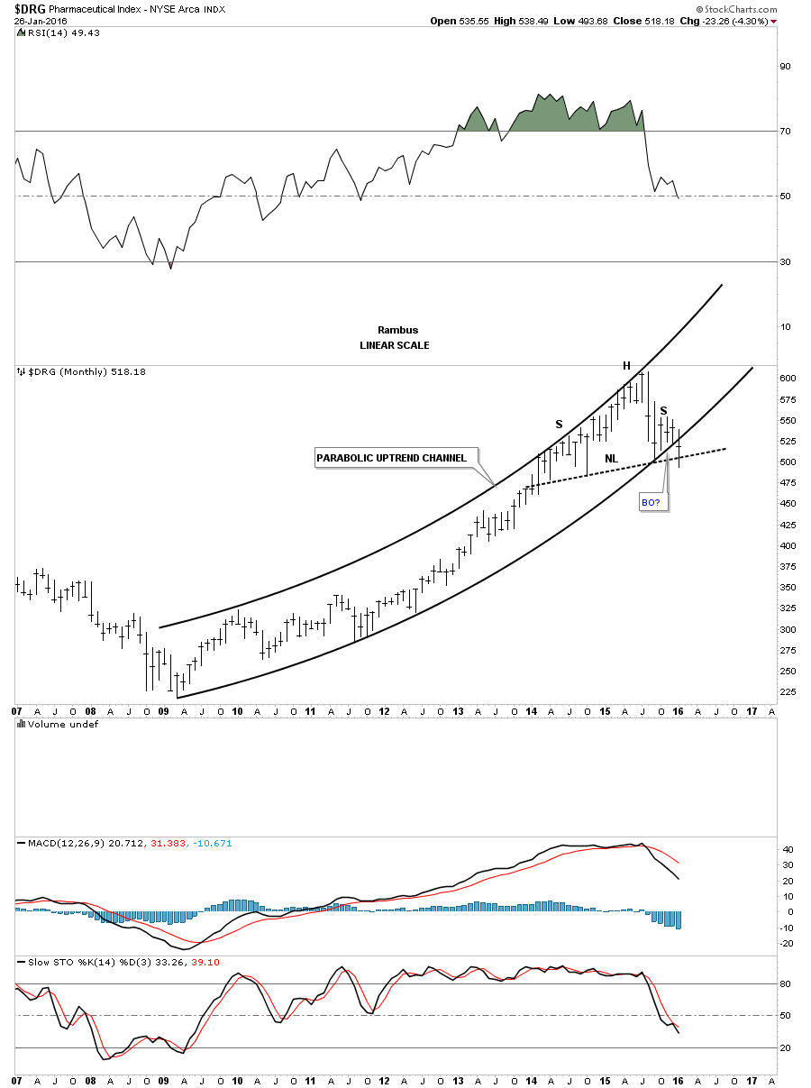
The $DRG, pharmaceuticals index, has also enjoyed a strong bull market. The price action is sitting at a very interesting place right now. As you can see it has built out a possible H&S top right at the top of its parabolic uptrend channel. The price action has broken down below the bottom rail of the parallel uptrend channel but not the neckline yet. A good clue that the bear market has started for this sector is when we see the neckline broken to the downside.
The $RLX, retail index, has also had a good bull market and is still trading inside of its parabolic uptrend channel. It has tested the bottom rail this month but so far it has held support.

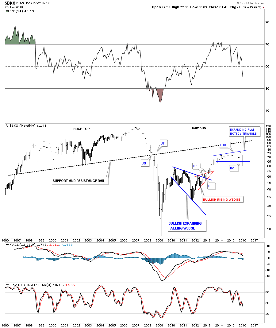
For awhile I thought the $BKX, bank index, was going to reach the massive support and resistance line which held support for this index until it finally gave way in 2008 during the housing crisis. The current chart pattern is a flat bottom expanding triangle that had a false breakout of the top rail only to fall right back inside of the pattern. Many times when you see a false breakout like that youll get a big move in the opposite direction which is happening right now.
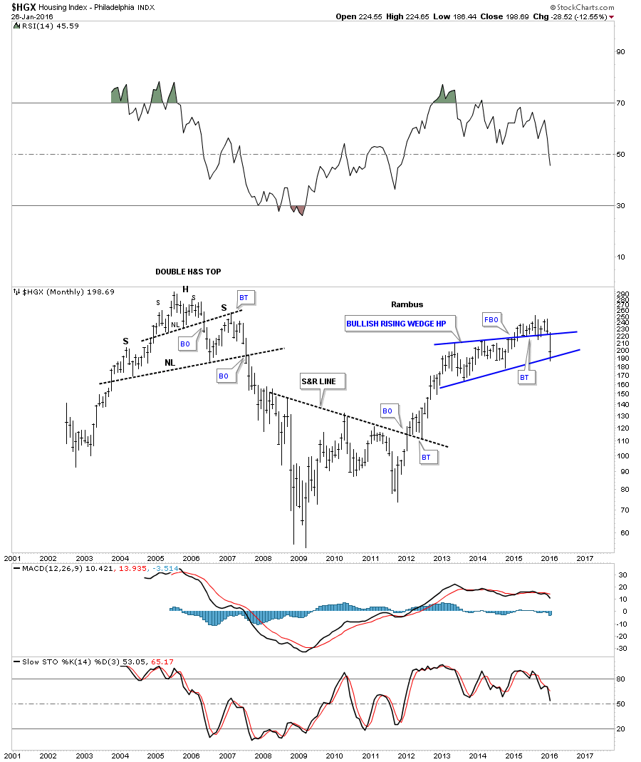
Until this month it looked line the $HGX, housing index, was going to find support on the top rail of the blue rising wedge that I thought had a chance to play out to the upside. As you can see from the last bar on the right hand side of the chart the top rail gave way and its now finding some support at the old bottom rail of the rising wedge. Its possible we could see a ping pong move now between the bottom and top trendlines before we see a breakout.
Since China has been in the news lately lets finish up this report by looking at the $SSEC, Shanghai stock index, which built out an unbalanced double H&S top. You can see the small H&S top that formed in the summer last year that is actually the head of a much bigger H&S top labeled NL2. This was one of those frustrating trades when everything looked good and was good from a Chartology perspective, but the backtest to the underside of neckline #2 took five months to complete.You can see a big breakout gap that occurred when neckline #2 was broken to the downside. That confirmed the H&S top was in place. Note how the backtest to the underside of NL2 ended up being H&S pattern. This index is trading at a new low today.

This last chart is a very long term daily chart which shows you the parabolic rally the $SSEC back in 2007 and the parabolic crash that followed. You can also see our current H&S top we just looked at on the chart above and how it fits into the big picture.

From a Chartology perspective all four parts of this report show what the many different markets look like today. Tomorrow is another day. Keep in mind most of the charts are of the longer term time frame which gives one a sense of where youre at so you can know where you want to go. Things change slowly on the longer term charts vs the minute charts when everything speeds up and changes happen very quickly.
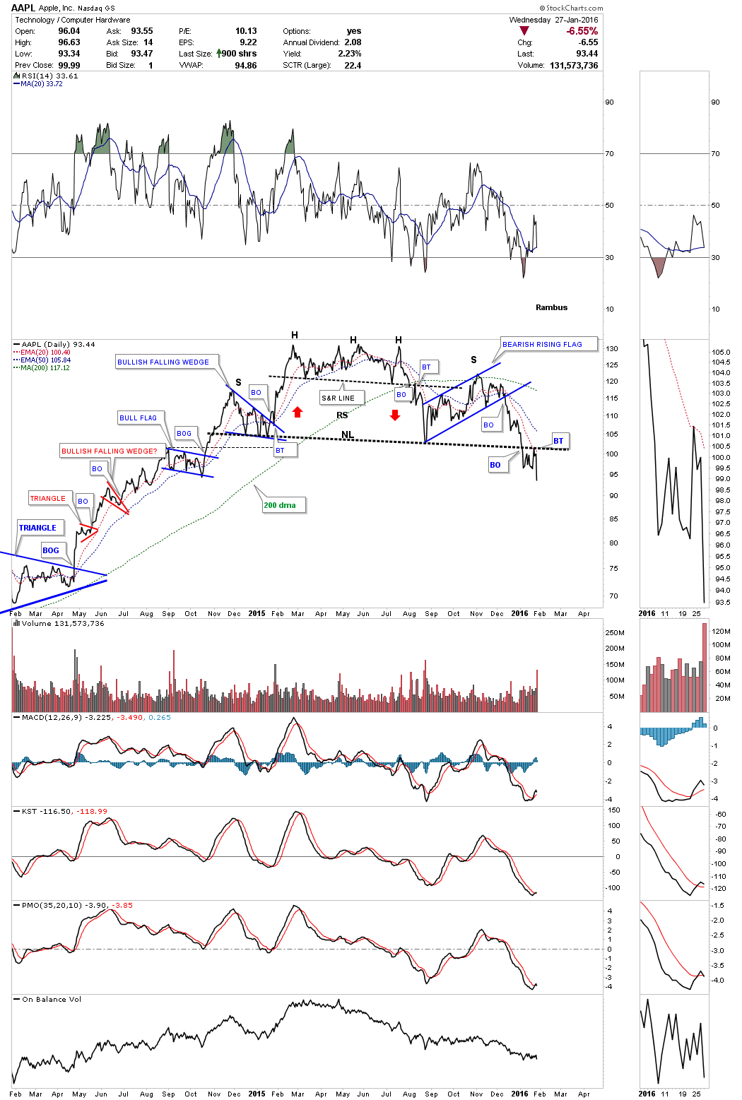
Also, I published a chart of Apple yesterday. A two year daily line chart for AAPL which shows it has just broken down from its H&S top and backtested the neckline this week. This stock is in a lot of stock market indexes.
Is another leg coming in the deflationary spiral that began in 2011 and started to gain momentum in the summer of 2014? Only time will tell but with the charts in hand we can follow the price action and when it changes, we change. So, until the charts start to change this is the picture I see from a Chartology perspective, right or wrong.
Catherine Austin Fitts:
Rambus, I can't thank you enough. This is Blockbuster Chartology! We have a lot to study and digest. Let me remind our subscribers that they can access your ongoing efforts at: http://rambus1.com.
In closing, would you like to summarize?
Rambus:
Yes, Catherine. As you know, weve been following the deflationary spiral since most of the commodities topped out in 2011, including the precious metals sector. In July of 2014, the real hard down phase began in the commodities sector when the US dollar began its big impulse move up which ran from roughly 80 to 100 before it began to consolidate that massive advance. For almost a year now the US dollar has been trading in a sideways trading range digesting those big gains. Once the consolidation phase runs its course for the US dollar and it breaks out of its sideways trading range, I believe we should see at least one more leg down in the commodities complex which could very well mark the capitulation phase.
Some of the different commodities have already had huge declines so we are closer to the end than the beginning of their respective bear markets. The big question is, will get the big final capitulation spike down, to clean out the last of the bull investor holdouts, that will clear the way for some base building? A lot of damage has been done to the commodities sector that will need some time to repair itself. I will be keeping a close eye on the US dollar which will show us the way during the turbulent times that lie ahead.
All the best, Catherine!
Related Reading:
- The Dollar, Gold & the S&P 500 with Rambus
- Thanks, Rambus!
- Precious Metals: Its ALL about the Big Picture After All
- GoldMoney Stock Down on Continued Losses
Top of Page
© Solari 2016