
October 26, 2017
Rambus: Blockbuster Chartology - 2017 3rd Quarter Review
By Catherine Austin Fitts
My "go to" website for technical analysis of precious metals, the US dollar & the US stock market is Rambus Chartology, where Rambus (that's his handle - he's the founding technical analyst) leads a discussion with extensive charts of what the markets are saying.
Our series with Rambus began in October 2015 when the Solari Report did a written interview with Rambus including an introduction here and a discussion of Rambus, his background, technical analysis as well as the word "Chartology." You can find all this information at our first interview:
- Why "Rambus?"
- How Rambus Chartology Got Started
- What Rambus Chartology Does
- About Technical Analysis
- Tracking the Markets
- What does the word "Chartology" mean?
- Rambus: Blockbuster Chartology
In January 2016, Rambus launched his quarterly Solari Report with a Blockbuster Chartology across the four market sectors: Currencies, Commodities, Precious Metals and Stock Markets. You can find it here: Rambus: Are We in a Deflationary Spiral? Then, Rambus returned with his Blockbuster Chartology across the market sectors in April, July and October. With 2016 behind us, Rambus returned with his Blockbuster Chartology for our Annual Wrap Up and then in May and July to take an in depth look at currencies, US and world stock markets and precious metals.
One of the reasons that Rambus is so good at his craft is that he focuses on "staying on the right side of the major trend." The challenge of doing so at this time is that it is tempting to look for bottoms or to assume that the trend upwards in the US dollar or stock market may be over. However, Rambus consistently brings us back to the discipline of the Chartology. What does price tell us? As he describes so aptly, we are dealing with psychological warfare.
Sitting back once each quarter to get this perspective offers invaluable insight. So, here we go for the 3rd Quarter 2017 Blockbuster Chartology!!
Blockbuster Chartology By Rambus
Currencies
The Dollar Post
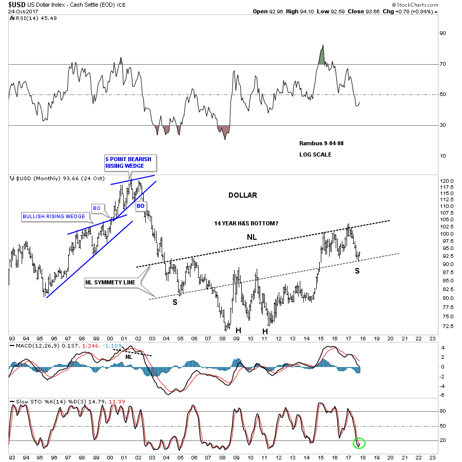
Prepared on October 26, 2017I haven’t posted much on the US dollar lately as I’ve been waiting for the dust to settle, as the price action completed another reversal point in its nearly 2 1/2 year trading range.
Tonight I would like to update some of the charts we’ve been following to see if we can gain any insight into what the US dollar is currently telling us about which way it wants to go. We’ll also look at some other currencies that may shed some light on the direction for the US dollar.
This first daily chart for the US dollar starts at the 2017 top and down to the bottom of the 2 1/2 year trading range.
I’ve been showing you this technique with some of the stock market indexes that are doubling the size of their 2009 uptrend channel. With the US dollar it’s just the opposite, where I used the black rectangles that are exactly the same height, to look for a place to add the bottom rail of the downtrend channel. As you can see there were no touches on the bottom rail until the very bottom of the downtrend channel was hit.
All it really tells us at this point is that we have a parallel downtrend channel in place. What we need now is to see some type of reversal pattern building out to reverse the downtrend that has been in place for almost a year. We have a potential inverse H&S bottom building out, but we need to see the neckline broken to the upside before we have confirmation that the downtrend may be over. It’s close, but not quite there yet.
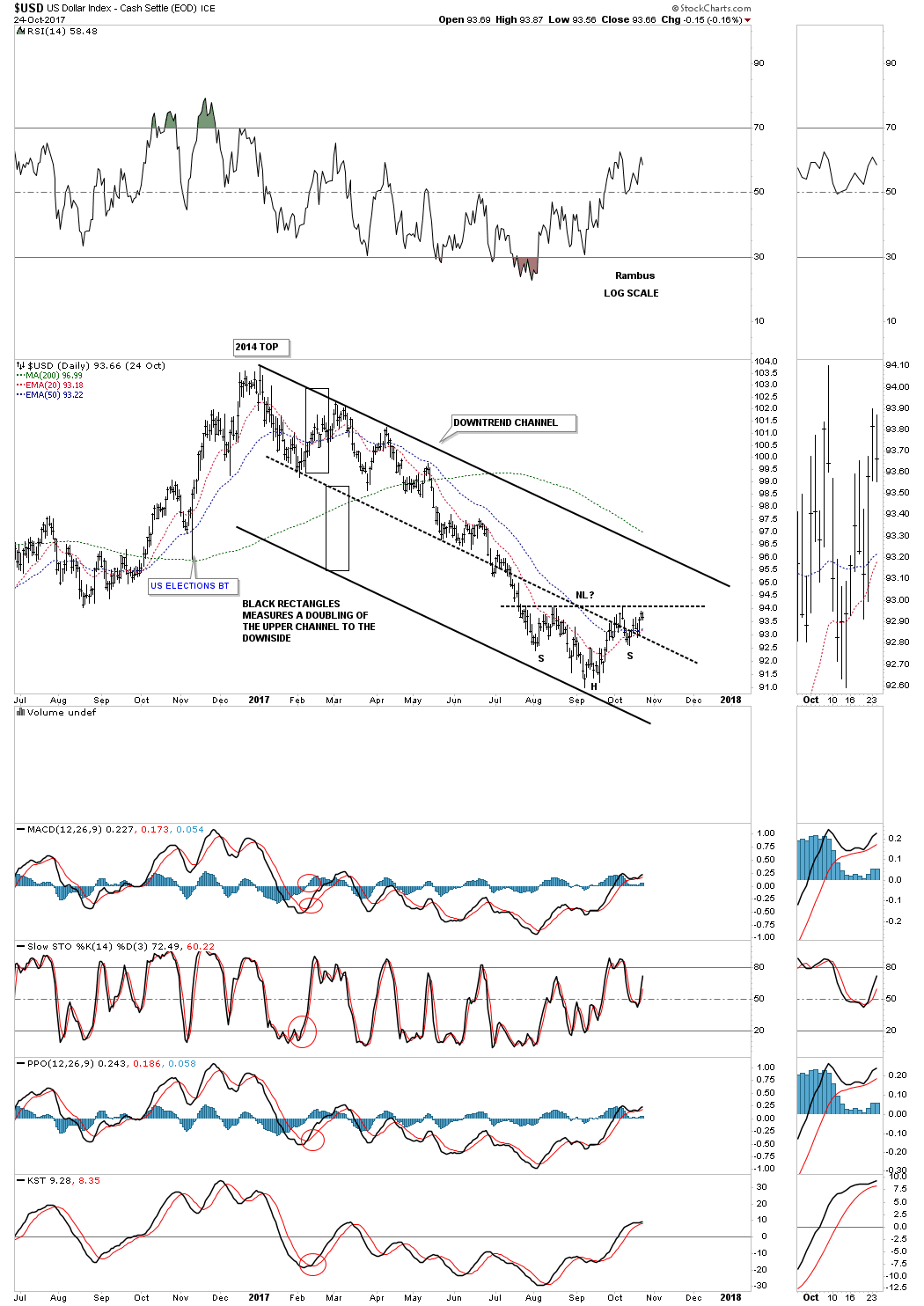
Now I would like to add the downtrend channel from the daily chart above to the big 2 1/2 year trading range so you can see how it fits into the big picture. You can see why for a dollar bull case we need to see a reversal pattern build out right here and now. What this chart is also telling us is that we had a false breakout above the top rail of the 2 1/2 year trading range and one below. I have shown you many charts in the past on how these false breakouts are what I call false symmetry breakouts. What this generally means is that the original 2 1/2 year trading range is still valid and to be respected. It’s important at this point in time to see the price action continue to trade above the bottom rail of the 2 1/2 trading range, above the 93.00 area.
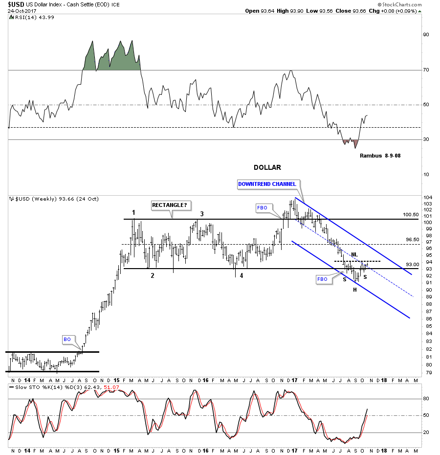
Below is a long term weekly chart which shows the massive 10 year base that launched the previous impulse move up and how our current 2 1/2 year trading range fits into the big picture. Again, you can see how important a reversal pattern is for the life of this 2 1/2 year blue trading range. That big massive 10 year base is strongly suggesting to me that our 2 1/2 year trading range should be a halfway pattern to the upside, vs a top that many are willing to see . Time will tell.

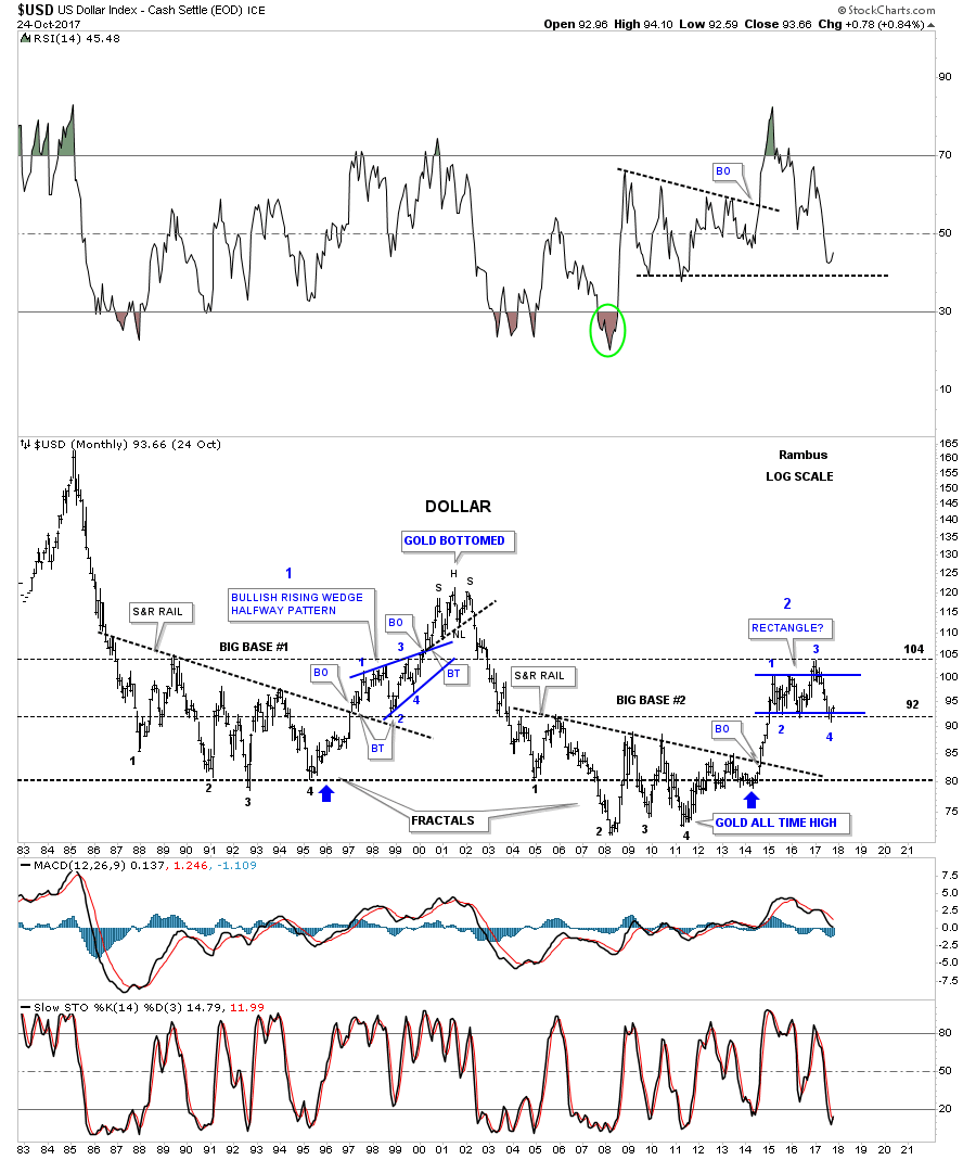
This next long term chart for the US dollar is a long term 35 year monthly look which shows the two massive fractals labeled, big base #1 and big base #2. Long term members should remember this chart as it seemed like it took forever for the big base #2 S&R line to be broken to the upside. It was a case of discovering this big pattern well before the breakout, so a lot of time went by before we got confirmation that big base #2 was indeed valid. Once the breakout occurred the US dollar wasted little time and rallied in an almost vertical move before our current trading range began to buildout.
There is also another piece of fractal information on this chart which is shown by the two thin black dashed horizontal lines at 92 and 104. What those two lines represent is the size of the 1998 – 1999 bullish rising wedge halfway pattern. If big base #1 was big enough to launch that bull market up to the 120 area you would think our big base fractal #2 should also be big enough to launch a similar rally. If that is the case then our 2 1/2 year trading range should be a halfway pattern to the upside.
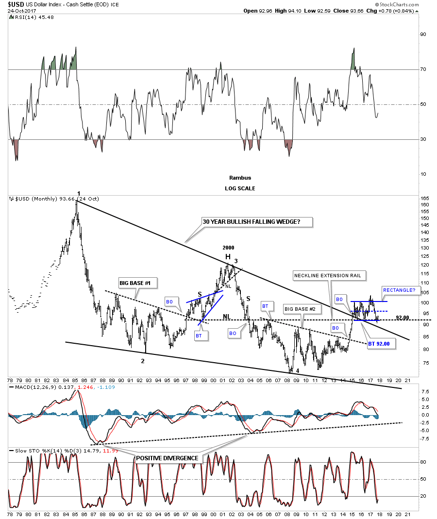
We’ve been following this next very long term chart for the US dollar that shows its 30 year falling wedge with reversal points #2 and #4 being our two big fractal bases. Reversal point #3 was the H&S top at the 2000 high. It took a lot of energy for the US dollar to breakout above the top rail of that 30 year falling wedge, which was needed to consolidate that move by forming our current 2 1/2 year trading range right on the top rail of that 30 year falling wedge. There is another line of support that comes into play at the 92.00 area, which is the neckline extension rail taken from the bigger H&S top, which formed at the 2000 high. So far it has held support on three separate occasions.
Before we move on there is one more long term chart for the US dollar that I’ve only posted several times in the past. I’ve been keeping a close eye on the neckline symmetry line to see if it would hold support as a possible low for the right shoulder. Keep in mind this possible massive H&S bottom is going to take time before it’s confirmed one way or the other. This is one of those cases that if I’m right, we aren’t going to know for many months if it’s valid or not, but we will be able to follow the price action in real time and monitor it going forward. As they say, stay tuned .
Also for this bullish scenario ,we need to see some type of reversal pattern buildout right here to reverse the price action off the neckline symmetry line. The H&S bottom we looked at on the daily chart is our best option at this time. That potential small H&S bottom is so critical to so many different areas we looked at on these US dollar charts above.
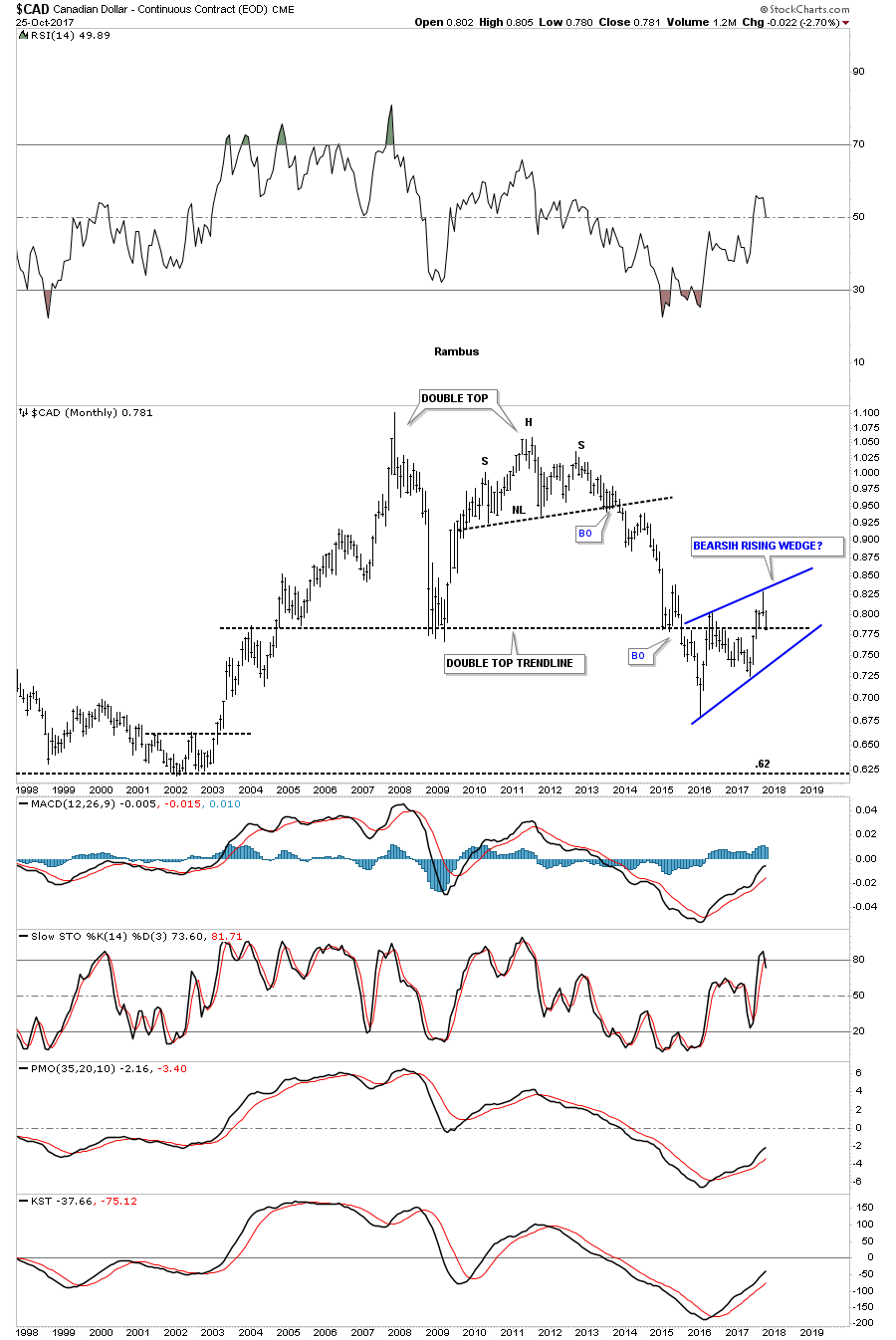
Lets look at some other currencies to see if they can give us any clues on what the US dollar might do. Below is a 20 year monthly chart for the Canadian Dollar that is showing a very large double top with a strong backtest to the double bottom hump which is forming a possible bearish rising wedge.
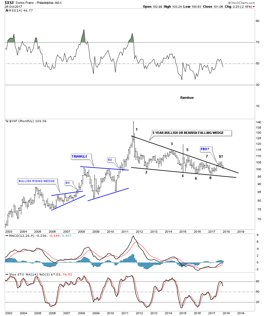
This long term monthly chart for the Swiss Franc is showing us a 6 year falling wedge which may have had a false breakout above the top rail. If the price action trades back into the falling wedge it will negate the breakout for now.
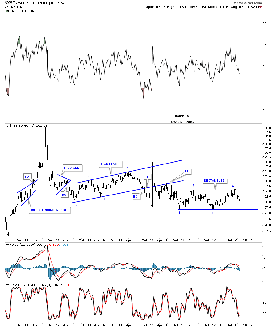
This weekly chart for the $XSF is showing a possible rectangle consolidation pattern building out within the downtrend.
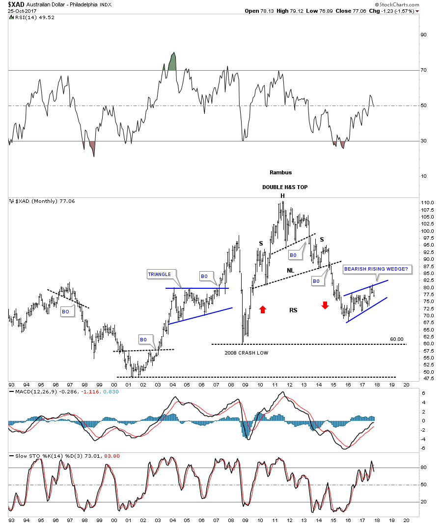
Next up is the Australian Dollar which may be in the process of building out a bearish rising wedge halfway pattern to the downside if the bottom rail is broken.
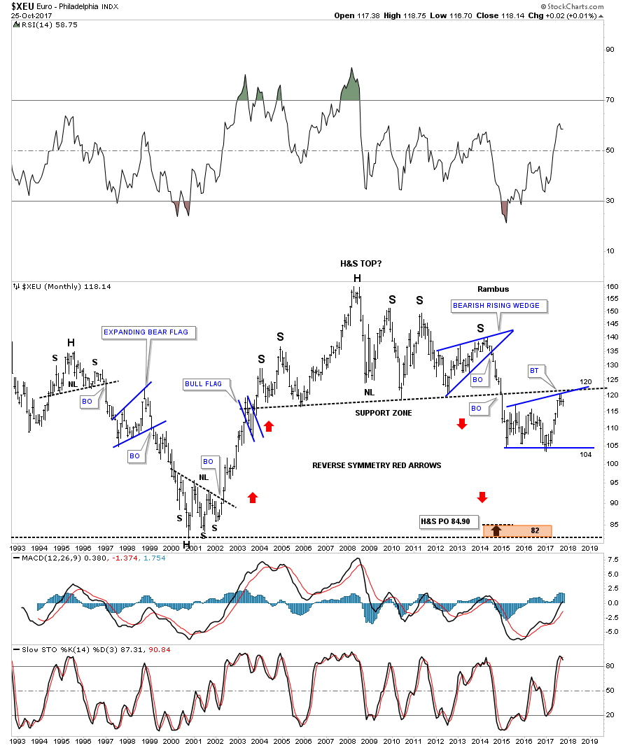
With the US dollar testing critical support then there is a good chance that the $XEU should also be testing resistance somewhere. When the $XEU broke below the neckline I was initially looking for a quick backtest to the underside of the neckline, but little did I know it would take almost three years before we would see a complete backtest at the 120 area. At any rate we now have a complete backtest in place. Now we’ll see if the neckline has reversed its role to what had been support to now resistance.
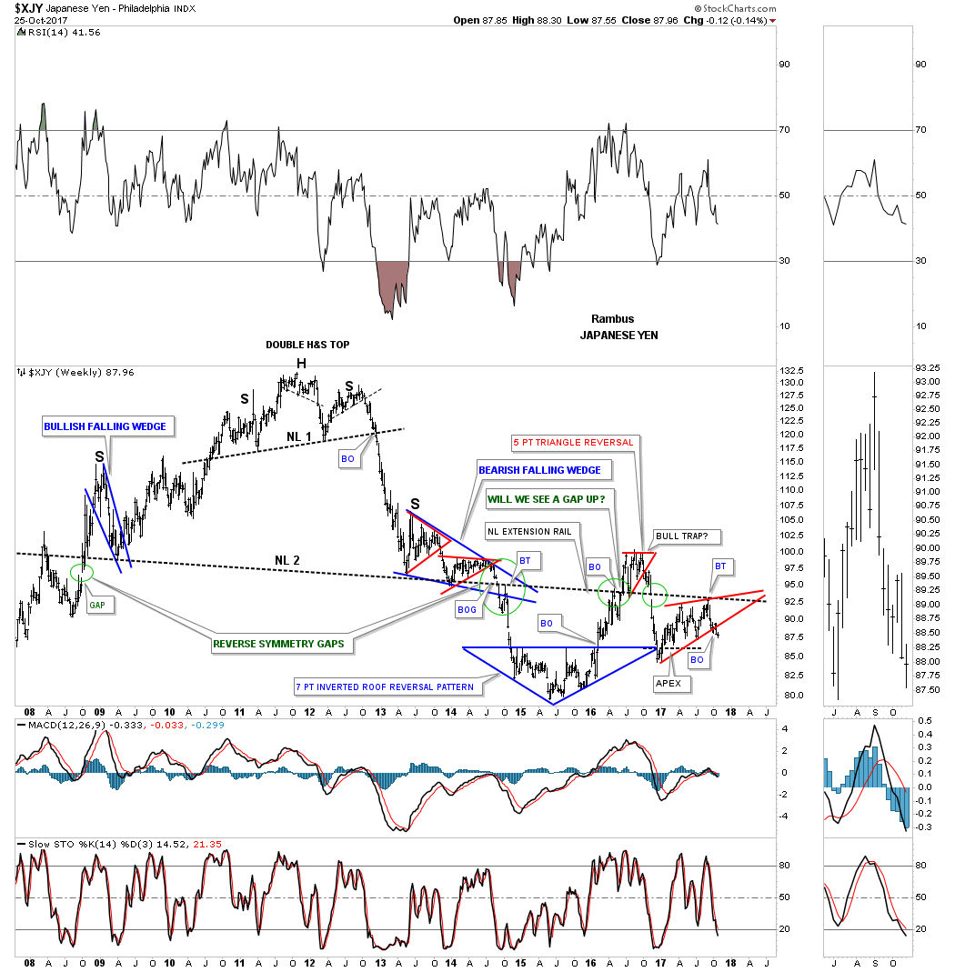
Below is a weekly look at the $XJY which is showing it breaking down from a morphing rising wedge formation as shown by the red circles. If we get a backtest it would come in around the 89.15 area.

Below is another longer term weekly chart for the $XJY that we’ve been following for many years which is getting quite busy now. First, notice how the price action interacts with big Neckline #2. There was an initial gap made on the left hand side of the chart when the $XJY gapped up to start forming the left shoulder of that massive 6 year H&S top #2. There was a breakout gap when the price acton broke below the neckline 6 years later confirming the double H&S top labeled reverse symmetry gap.
After the initial decline the $XJY built out the 7 point inverted roof reversal pattern which led to a countertrend rally back up to the neckline. When we got back up to the neckline I thought the backtest was complete when the price action declined for about 3 weeks or so, but then it decided to rally once again, this time breaking above the neckline which looked like the neckline had failed to hold resistance. After trading above the neckline for several months and backtesting it from above, the XJY built out the red 5 point triangle reversal pattern, which led to the move back below the neckline I then called that trading range above the neckline a bull trap. Note the green circle on the far right hand side of the chart which shows the XYJ gapping below the neckline once again, telling us the neckline was properly placed.
About 6 weeks ago the price action backtested the neckline from below once again, forming the red bearish rising wedge which is the same rising wedge we looked at on at the weekly chart above.
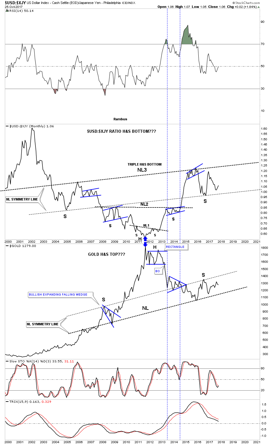
This next chart is a long term chart which compares the $USD to the $XJY. For the last several years the neckline symmetry line has been holding support for the right shoulder low. It’s possible that this ratio may be building out 13 a year triple H&S bottom. We won’t have a definite answer until neckline #3 is broken to the upside, but we can follow the price action for more clues as time marches forward.
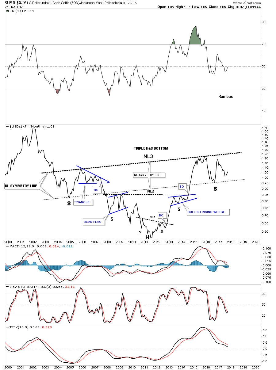
Below is a combo chart which has the $USD:$XJY ratio on top and gold on the bottom. The neckline symmetry line on both charts have done a beautiful job of showing us where the low for the right shoulder on the ratio chart is, and the high for the right shoulder on the gold chart is located. Again, we won’t have confirmation that the possible H&S patterns are complete until we see the necklines broken. At any rate this combo chart may have some profound implications if these two H&S patterns play out. Have a great weekend and all the best…Rambus
U.S. & World Stock Markets
The Psychology Behind the Stock Market Charts
Prepared on October 4, 2017Tonight I would like to update some old charts I first posted several years ago which showed the 2009 bull market uptrend channel in many different areas of the stock markets, along with many overseas markets.. It’s hard to believe, but this bull market is going on nine years and counting. There was no way to know back at the 2009 crash low that a bull market of this magnitude would develop into one of the greatest bull markets of all time. If the markets have taught me one thing, it’s to have an open mind and be receptive to any eventuality that may come our way.
Lets start with the long term monthly chart for the SPX which shows its parallel bull market uptrend channel that began forming in the spring go 2009. In 2015 the SPX needed a break to consolidate that massive move out of the 2009 crash low building out the blue bullish expanding falling wedge consolidation pattern. As you can see the last bar on this chart is forming right at the top rail of the 2009 bull market uptrend channel.
Most investors would look at this chart and come to the conclusion that the SPX has to correct right here and now because the bull market has been so strong for nine years, that it just has to correct. Maybe that will be the case, but we’ve been following the daily chart for the SPX, which shows it’s breaking out of a bullish rising wedge formation. That being the case, then it’s strongly suggesting that the top rail of the 2009 bull market uptrend channel will give way to the upside.
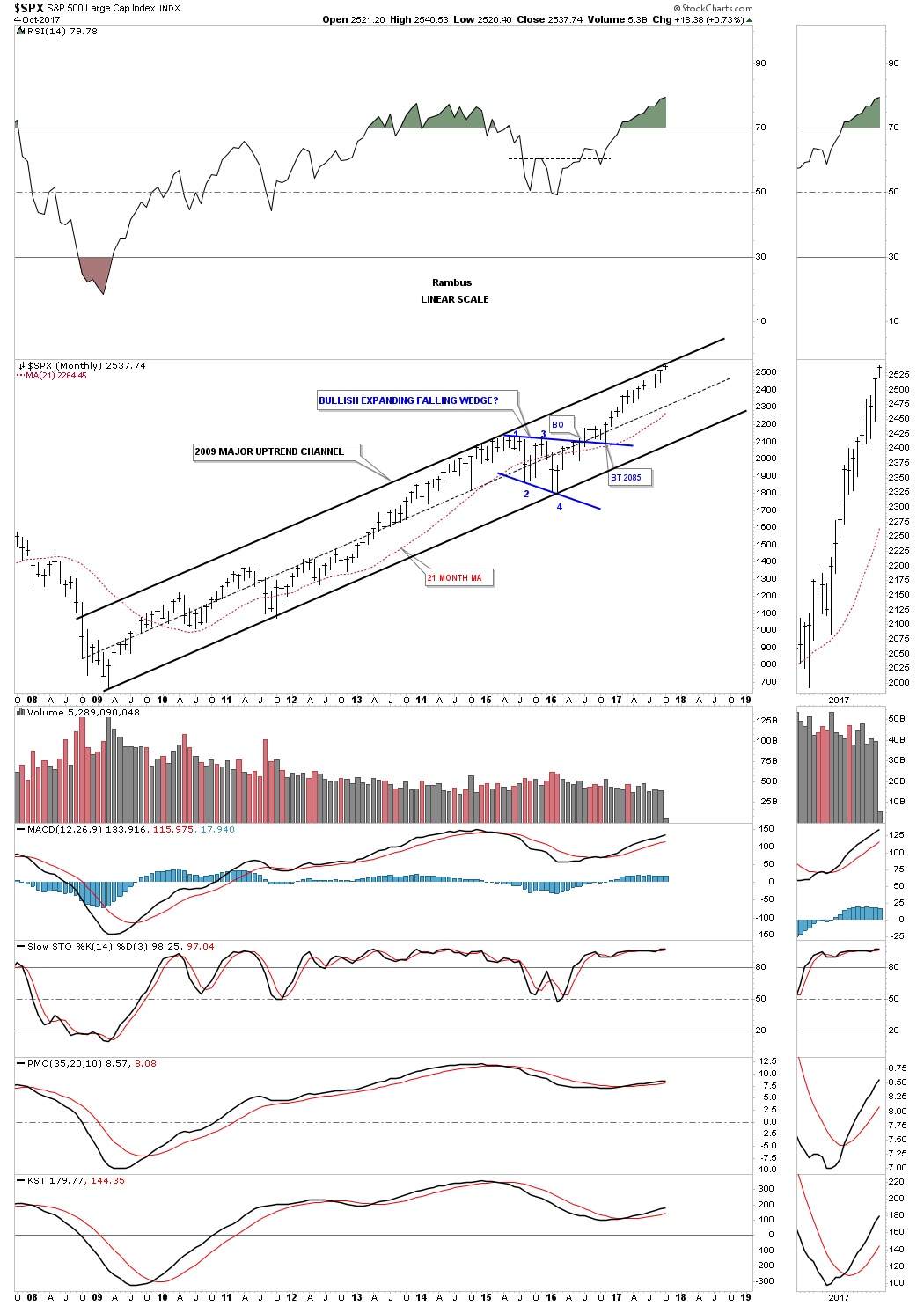
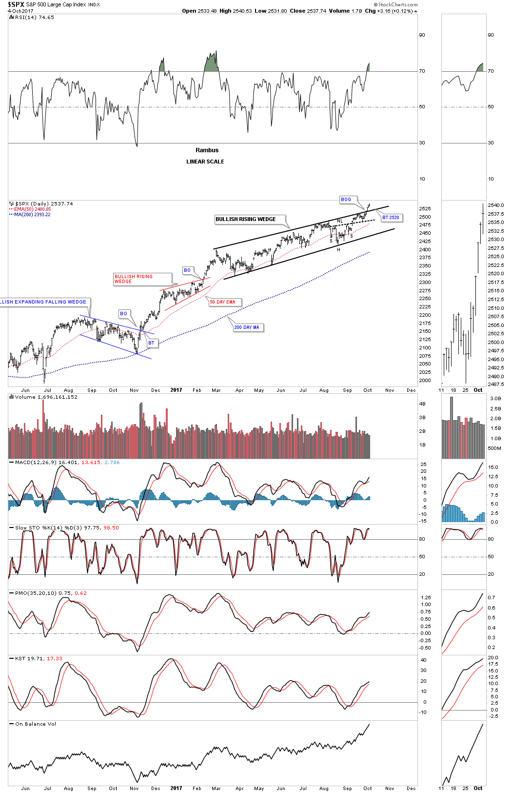
Before we move on lets take a look at the daily chart for the SPX which is showing the bullish rising wedge that has broken out topside. We’ve looked at many instances over the years in which I showed you how a small consolidation may form just below an important resistance line, that gives the stock the energy it needs to finally take out that overhead resistance line. This bullish rising wedge is situated just below the top rail of the 2009 bull market uptrend channel and is strongly suggesting that the top rail is going to give way. If that happens then it will setup another possible scenario that we’ll look at on this next chart.
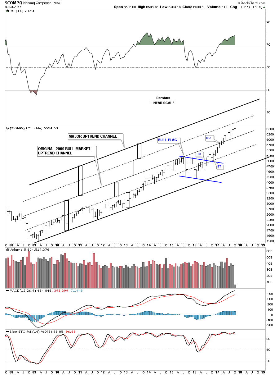
Up until just recently the COMPQ has been one of the strongest sectors, making new all time highs one after the other. This chart also shows you what can happen during very strong bull markets. The center thin solid line was the top rail of the original 2009 bull market uptrend channel until it was broken to the upside about 8 months ago. When this happens the chances are very good that the original 2009 uptrend channel will likely double in size, as shown by the heavy black rectangles. The smaller rectangles show each half of the uptrend channels. Just like the monthly chart for the SPX we looked at above, the COMPQ formed the blue flag as its 2015 consolidation pattern. What is becoming pretty obvious is that this recent leg of the bull market is starting to accelerate to the upside vs the rally out of the 2009 low to the 2015 high.
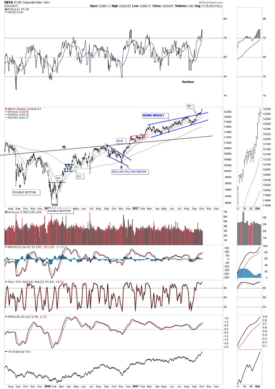
This next long term monthly chart is for the $NYA, which is a good proxy for the overall health of the general stock markets. It formed the blue bullish expanding falling wedge as its 2015 consolidation pattern. Note the H&S consolidation pattern that is suggesting that the NYA has much further to run before its price objective is reached.

Below is a daily chart for the NYA which shows it breaking out of a bullish rising wedge formation just above its neckline.
This next monthly chart is one of my favorite areas to invest in right now, which is the $RUT 2000 small cap index. As you can see it’s currently breaking out above the top rail of its 2009 bull market uptrend channel. It formed the blue bullish expanding falling wedge as its 2015 consolidation pattern.
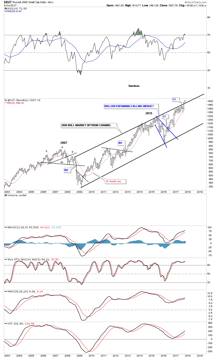
Unlike most of the other stock market indexes that built out bullish rising wedges the RUT built out a nearly 10 month expanding flat bottom triangle consolidation pattern. If you look at the monthly chart above you can see how the expanding flat bottom triangle formed just below the top rail of its 2009 bull market uptrend channel. The breakout above the top rail of the 2009 bull market uptrend channel shows the same breakout above the top rail of the 10 month expanding flat bottom triangle. Is it just a coincidence that both trendlines are being broken at the same time? Not from a Chartology perspective.

Next up is the 2009 bull market uptrend channel for the INDU which is just starting to breakout above the top rail of its original 2009 bull market uptrend channel. The top rail of the original 2009 bull market uptrend channel should now reverse its role to what had been resistance, to now support on any backtest. Again, you can see how the rally out of the 2016 low is starting to accelerate vs the rally out of the 2009 crash low.
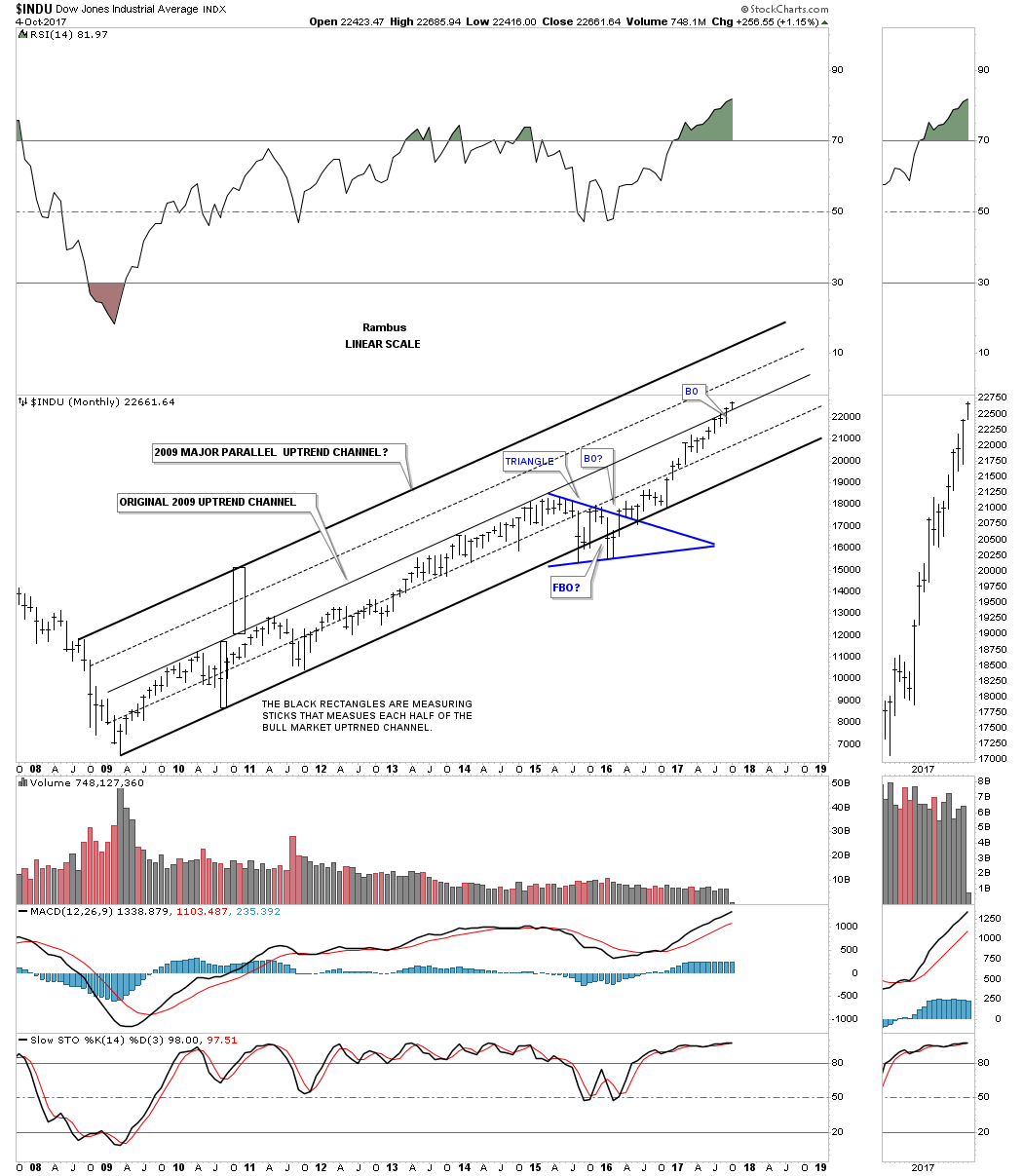
This daily chart for the INDU shows just the 2016 uptrend channel and why this bull market is so enduring. Instead of going vertical the price action has been self correcting, forming one small consolidation pattern on top of the next. This is exactly what you want to see take place for a lasting bull run. At some point down the road we may see the price action starting to go vertical, which will be a sign that the impulse move may be coming to an end, but for the time being this is classic bull market action. The blue bullish rising wedge has formed just below the top rail of the original 2009 bull market uptrend channel on the monthly chart above.

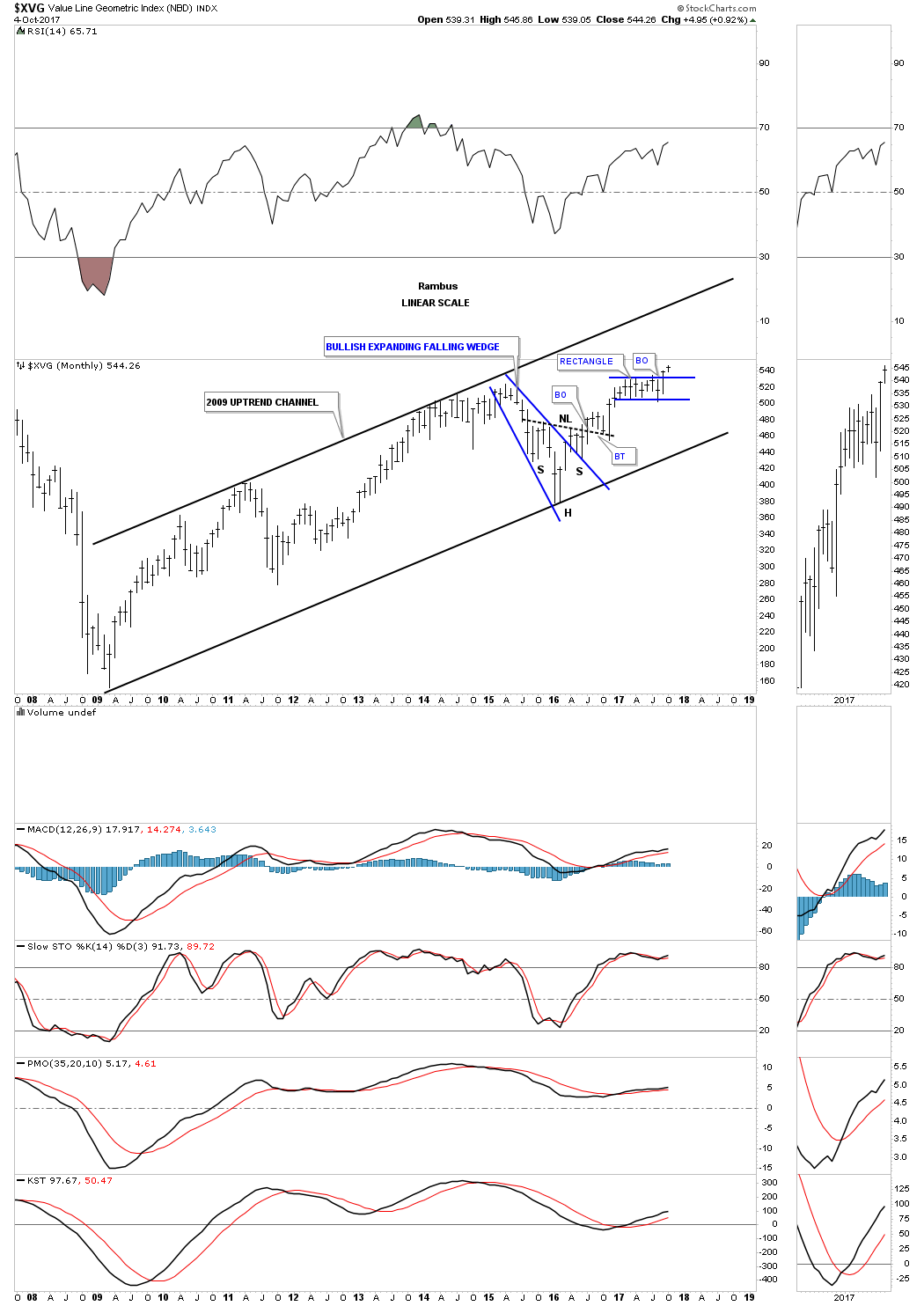
Below is a long term monthly chart for the $XVG, value line index, which is a good proxy for the overall health of the stock market. It’s 2015 correction formed a classic H&S bottom with the left shoulder and head forming inside the bullish expanding falling wedge and the right shoulder low forming on the backtest to the top rail . As you can see the price action is now just starting to breakout from the one year rectangle consolidation pattern.
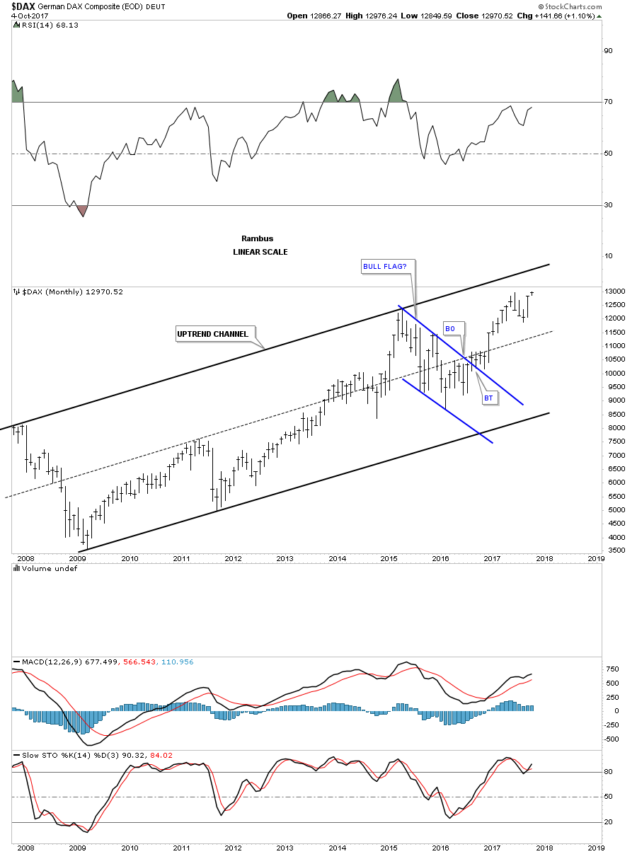
Below is a long term monthly chart for the $DAX, German stock market, which shows its 2009 bull market uptrend channel.
This next chart is a long term monthly look at the $FTSE, London Financial Times, which is showing its 2009 bull market uptrend channel which isn’t as pretty as some of the others, but it’s an uptrend channel just the same.

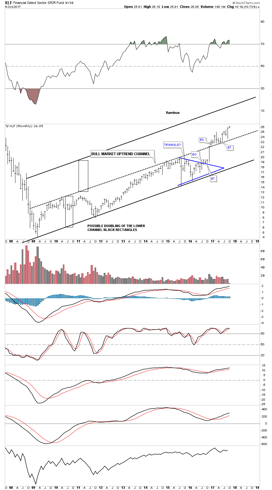
Below is a monthly chart for the XLF, financial sector, which is showing a beautiful expanding 2009 bull market uptrend channel. It’s always nice to see the banking stocks along with the small cap stocks leading the way higher in a bull market.
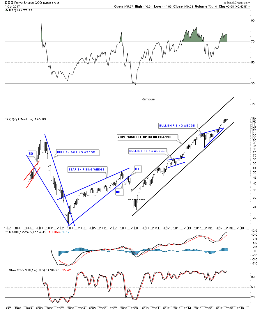
This last chart for tonight shows one of the strongest sectors since the 2009 crash low. The QQQ represents the 100 biggest cap tech stocks on the planet. It’s hard to make a bearish case for this index no matter how hard one tries. Shorting this index since the 2009 crash has been hazardous to ones financial health.
Putting all the pieces of the puzzle together, using the shorter term daily charts and adding them to the 2009 bull market uptrend channel, paints a very clear picture that the bull market is still in full swing with no signs of a major top in place. If anything, the uptrend is starting to accelerate, which is confounding most investors to no end. At some point we’re going to get a decent correction, but for now the trend is your friend. All the best…Rambus
PS: My wife and I have been planning a road trip up to Canada to see my old buddy Fullgoldcrown. We are going to leave Friday morning and will probably be gone roughly 2 weeks or so. I will have my trusty Apple MacBook so I’ll be able to follow the markets. I will do most of my updating in the evenings after the markets are closed.
You may have noticed I’ve been showing a lot of combo charts lately. This makes it easier to keep track of all the different areas at one glance. I’ve updated all the trades this past weekend on the sidebar with their sell/stops so you should be able to keep track of the trades you may have taken.
Big Patterns Lead to Blow Your Mind Targets.
Prepared on October 24, 2017Before we look at some long term charts tonight I would like to explain what these charts represent to me. I’ve mentioned on numerous occasions that big chart patterns equals big moves which is a relative thing. If one is looking at a daily chart and sees a consolidation pattern building out the impulse move will be relative to what the daily chart is showing. On the other hand, if one is looking at a multi year monthly chart then one can expect the impulse move to be very large on a relative basis in both time and price.
This is an important point to grasp because if you see a big consolidation pattern forming on a very long term multi year monthly chart, the move will be in proportion to the chart pattern. The same would hold true for a consolidation pattern on a daily chart. It’s a relative thing.
I’ve been showing some very large consolidation patterns for many years now that are over ten years in the making. These massive consolidation patterns tell us to expect a very large multi year move that is relative to the consolidation pattern. When I first started posting some of these large consolidation patterns most thought there is no way such a big consolidation pattern can predict a move on the scale I was showing. The thing is, most investors never seen a 10 year consolidation pattern because their focus is mostly on the shorter term daily and weekly charts.
One thing I find interesting at this stage of the bull market is how few investors really understand what is taking place right now. In one camp there are the bears that keep talking about an imminent top and a crash to follow. In another camp there are some bears that have given up on shorting the stock markets, but are now recognizing this impulse move is much stronger than they anticipated, and are looking for a blow off top to end the bull market that began in the spring of 2009.
And then there is my view which I’ve been showing for several years now which is strongly suggesting that we are in the early stages of a new secular bull market that began at the 2009 crash low. I know this perspective blows peoples minds, but that’s what the long term monthly charts are telling me. Remember it’s a relative thing, big patterns lead to big moves.
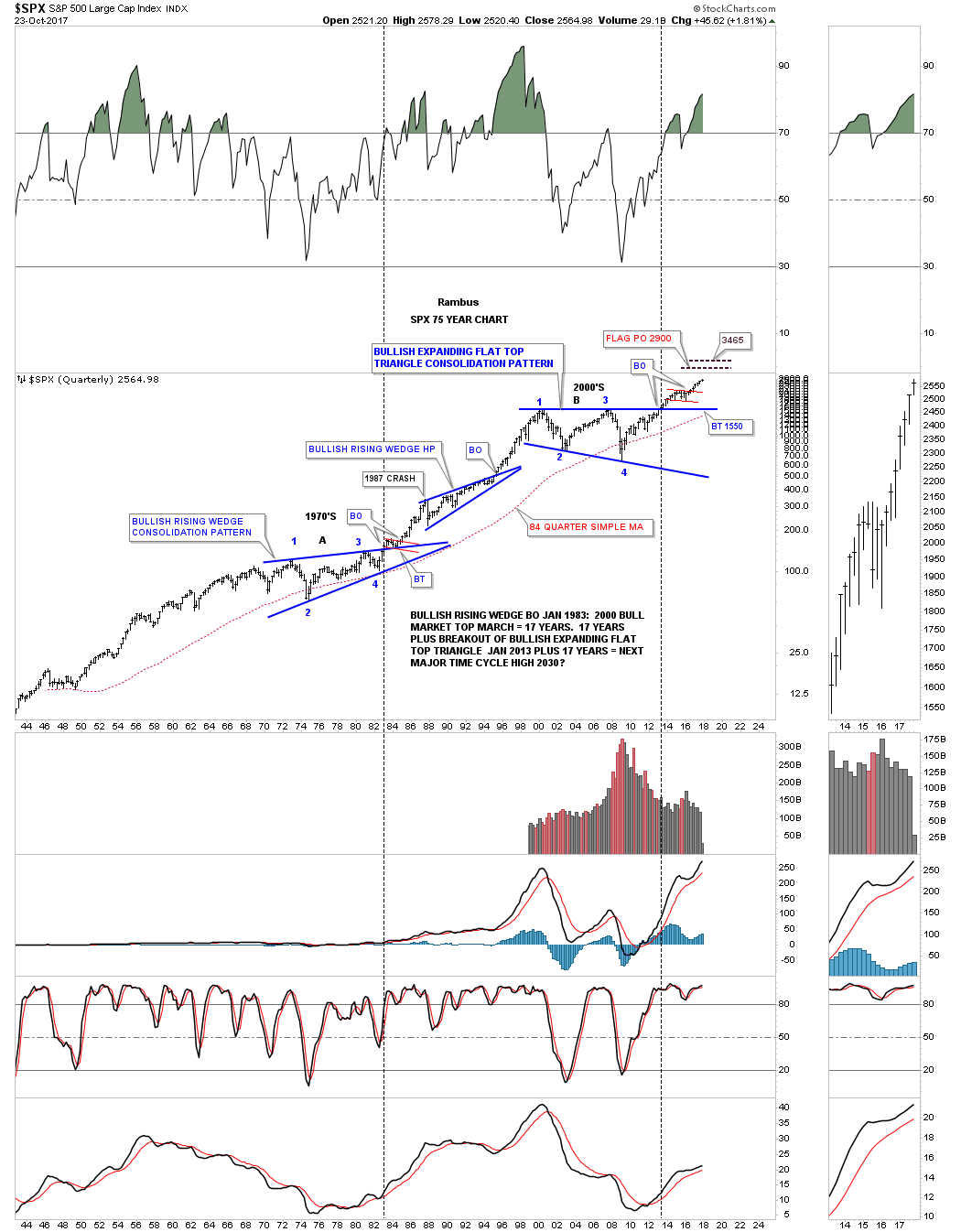
Just so you know that I’ve not completely lost my mind lets look at some long term charts and see how some of the very large multi year consolidation patterns are playing out, starting with a 20 year look at the SPX. The first reversal point occurred at the 2000 top that ended one of the biggest bull markets of all time. Reversal point #2 came in 2002 which was the first bear market. The SPX then rallied back up to the 2000 high in 2007 but could go no further and collapsed in the great crash that ended in March of 2009, which began our new secular bull market. Note the blue bullish rising wedge which formed just below the top rail of the 13 year flat top expanding triangle. Whenever you have a strong resistance line on a chart, many times you will see a small consolidation pattern form just below that important trendline, that gives the stock the energy it needs to finally overcome that line of resistance that was 13 years old.
The breakout of the blue bullish rising wedge and the top rail of the 13 year flat top triangle consolidation pattern occurred almost simultaneously in 2013. If you look real close at the breakout area you will see there was one quick backtest a month later that confirmed the 13 year flat top expanding triangle was indeed authentic, and the initial impulse move out of that very large consolidation pattern began in earnest.
That impulse move lasted until 2015 when it was time for a rest, and the SPX built out its first consolidation pattern above the top rail of 13 year expanding flat top triangle. It took roughly 15 months to consolidate that first impulse move up, with the SPX building out the blue bullish expanding falling wedge consolidation pattern. Five months after the initial breakout and backtest to the top rail the SPX began its second impulse leg up which we find ourselves currently in. On the shorter term daily chart I’ve been showing the red bullish rising wedge as a consolidation pattern after the top rail was broken to the upside. Consolidation patterns that slope in the same direction of the major trend tells you the move is very strong. Some call these types of patterns running corrections and usually have a negative divergence on the shorter term daily chart. This allows the RSI to correct, while the rising flag or wedge continues to trade sideways with an upward sloping bias.
There is a measured move we can make which is what I call the breakout to breakout method. We can take the distance from the breakout point of the 13 year flat top expanding triangle to the first reversal point in the blue expanding falling wedge. We then take that distance and add it to the breakout point of the blue expanding falling wedge to get a price objective up around the 2900 area. That would be a place to see another consolidation pattern start to build out to consolidate this latest impulse move.
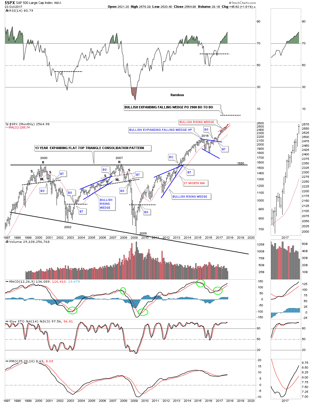
As we’ve discussed earlier in this post chart patterns are relative to the size of the chart you’re looking at. Below is a 75 year chart for the SPX which puts the 13 year flat top expanding triangle, on the chart above, in perspective. If I didn’t tell you which time frame you were looking at you wouldn’t know if the chart below is a 2 hour chart, daily chart or a weekly chart, it’s all relative. Since I told you it was a 75 year chart you can see how nicely the 13 year flat top expanding triangle fits into the very big 75 year picture.
In the 1970’s the SPX built out a roughly 11 year bullish rising wedge which was needed to consolidate the previous secular bull market. When the SPX broke out above the top rail of the 1970’s bullish rising wedge that initial impulse move lasted almost 4 years before we saw a decent correction which we got with the 1987 crash which is still the biggest one day percentage decline in history. If felt like the end of the world if you were trading that day, but as you can see it was only the first reversal point in the blue bullish rising wedge which ended up being a halfway pattern to the 2000 top.
I don’t know if it will happen, but if our current impulse move out of the flat top expanding triangle is the same as the impulse move out of the 1970’s impulse move, the SPX could run to the 3450 area before we see a possible several year consolidation pattern start to build out. When you compare the rally out of the 4th reversal point in the 1970’s bull market, and compare it to the our current bull market that started in 2009, you can see that in both rallies the SPX never made a lower low for the most part on this quarterly chart, which is a sign of a strong bull market.
Now that I’ve shown you the basic relative principles of big chart patterns I won’t go into much detail on some of these next long term charts to follow. Just keep an open mind when you look at these charts. Relativity works in the universe and Chartology.
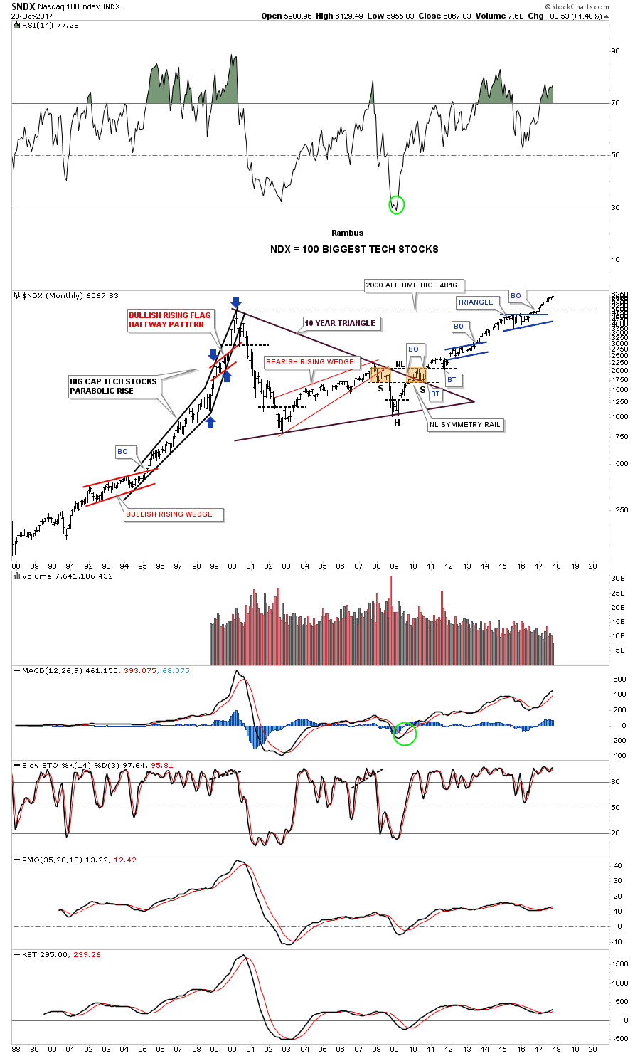
Below is a 30 year monthly chart for the NDX which shows you a 10 year symmetrical triangle consolidation pattern. Note how the NDX built out the blue triangle just below its all time highs which gave the NDX the energy it needed to finally breakout to new all time highs. Also note the beautiful and symmetrical H&S bottom in 2009 which was the reversal pattern that launched our current secular bull market. I said I wasn’t going to say much about the charts to follow, but notice the red bullish rising flag that formed in the middle of the last major impulse move up into the 2000 top. Patterns that slope in the same direction of the major trend tells you the trend is very strong. The blue arrows measures the red rising flag as a halfway pattern.
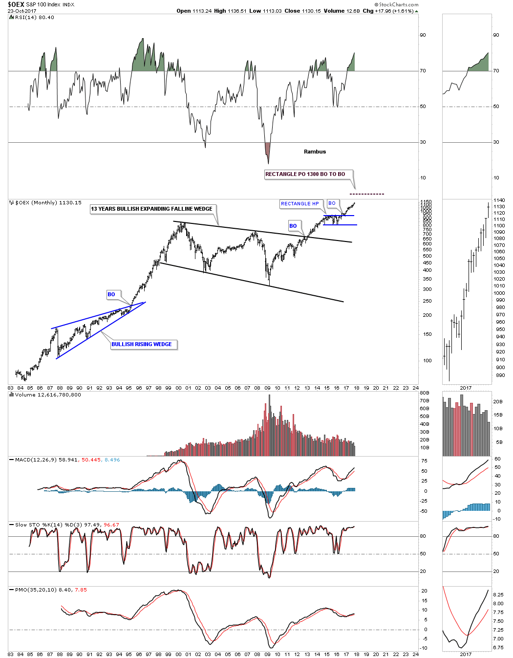
This next chart is a 35 year look at the OEX 100 which built out a 13 year bullish expanding falling wedge with the breakout in early 2013. It built out the blue rectangle consolidation pattern as its first consolidation pattern after the breakout.
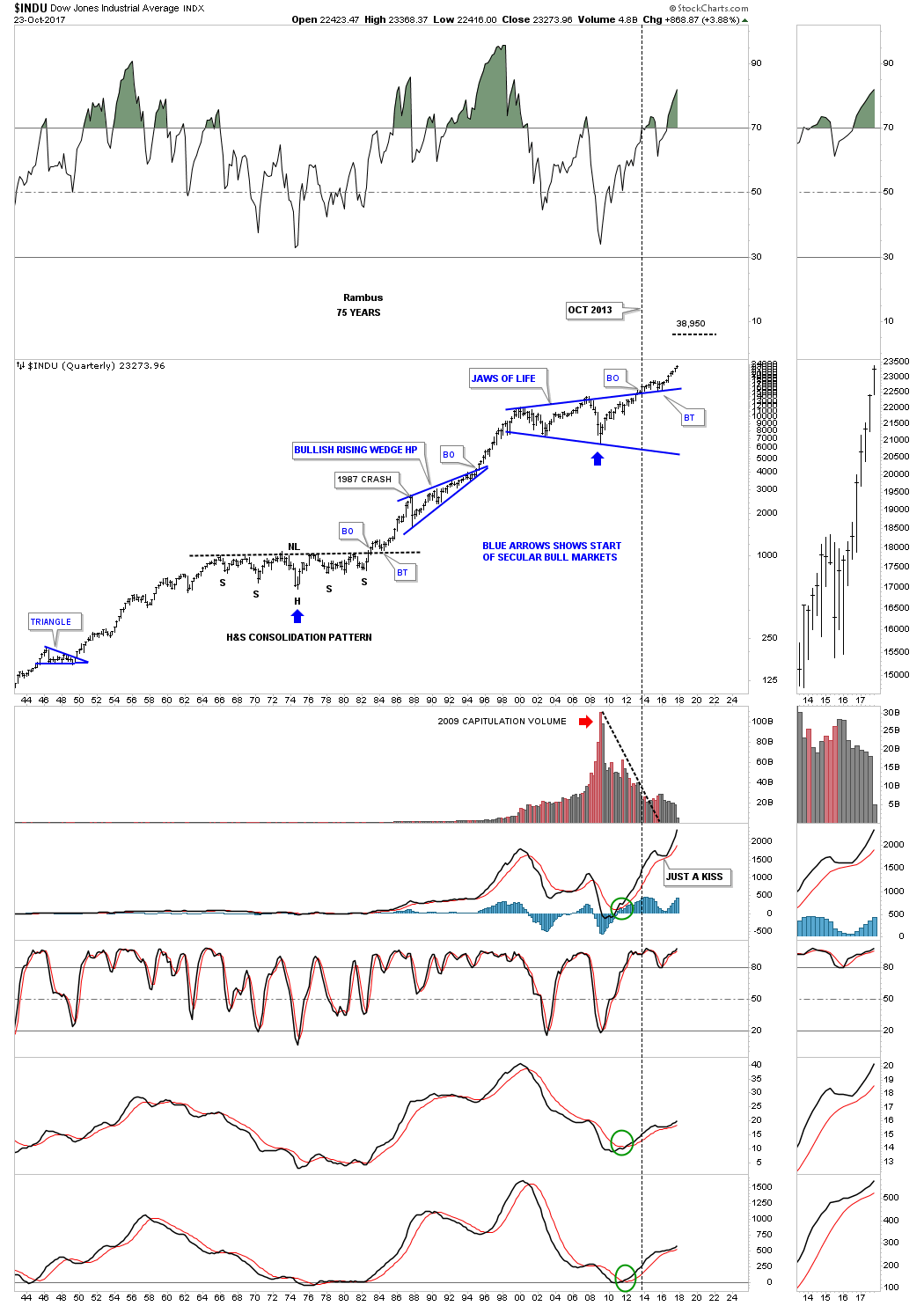
This next chart is a 20 year look at the INDU which I call the Jaws of Life because so many analysts were calling it the Jaws of Death. From a Chartology perspective nothing could be further from the truth. The breaking out and backtesting process was pretty laborious, but when all the work was done the initial impulse move higher began, which we are currently in. Big patterns equal big moves.
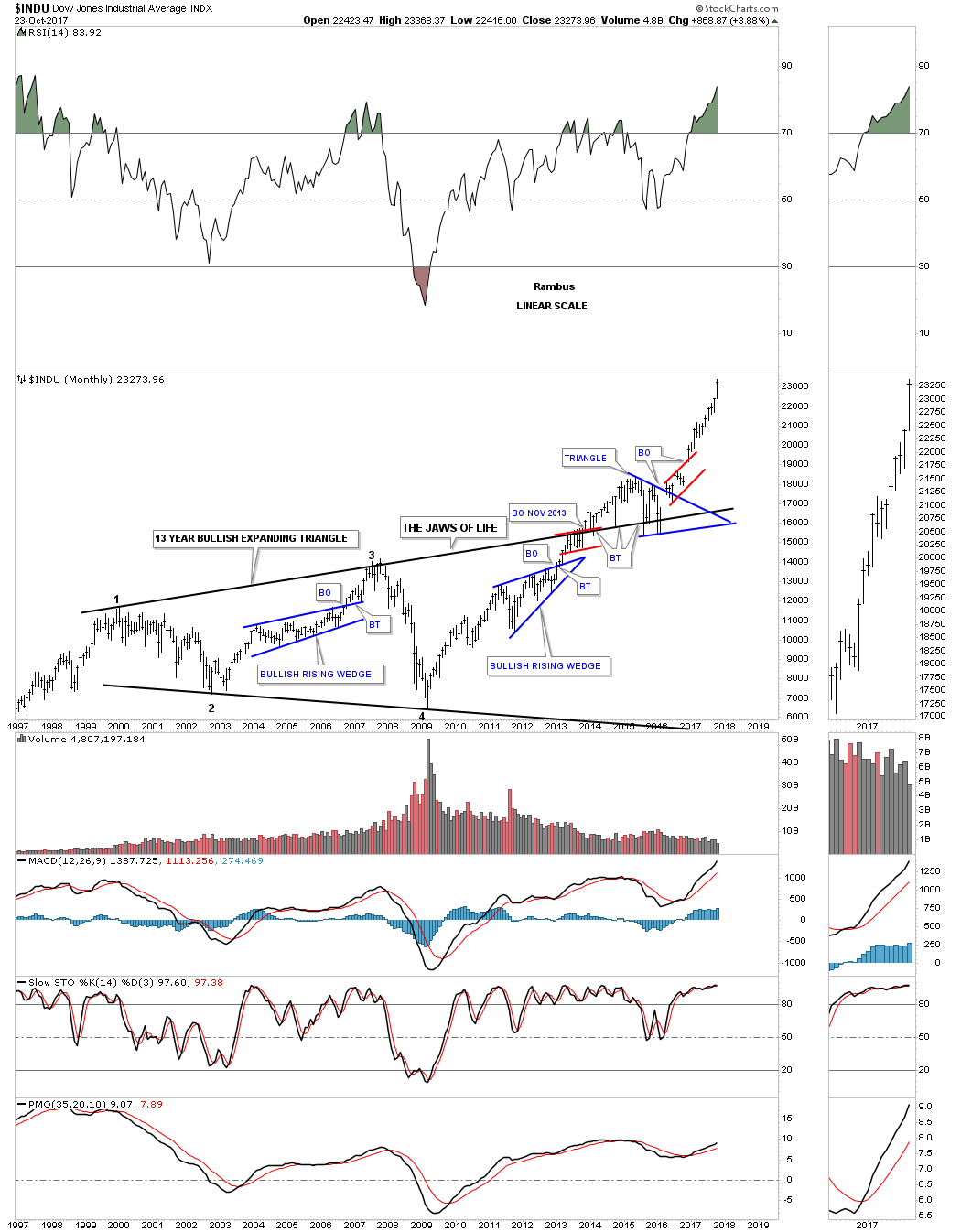
This monthly line chart for the INDU is a thing of beauty which shows the Jaws of Life and the 3 backtests to the top rail which was perfect. If you’ve ever wondered what a true impulse move looks like our current one shows you a perfect example.

This last chart for the INDU is a 75 year look which puts the Jaws of Life in perspective. Back in the mid 1960’s to the end of the 1970’s the INDU built out a perfect H&S consolidation pattern which launched the Dow on one of its best bull markets in history. Just like the SPX the first real correction didn’t start to form until the 1987 crash which ended up being the first reversal point in the blue bullish rising wedge. Note the similarities between the breaking out and the backtesting process of the massive H&S consolidation pattern and our Jaws of Life expanding triangle. Again, I don’t know 100% for sure if our current impulse move we are in will match the initial impulse move above the neckline to the 1987 top, but if it does the INDU could run to the 38,950 area before we see a multi year correction.
If we are truly in a new secular bull market that is going to last for many years to come the Transportation Average is going to have to play a key role in the development of the secular bull market. Below is a 20 year monthly chart which shows a very large 7 year H&S consolidation pattern that broke out in early 2013. That impulse move lasted about 2 years before it needed to consolidate. The consolidation pattern that formed was another H&S consolidation pattern which was much smaller. As you can see there is a red rising wedge that has just recently broken out above the top rail with a backtest in progress after hitting new all time highs. The price objective for that massive 7 year H&S consolidation pattern is up to the 14,250 area.
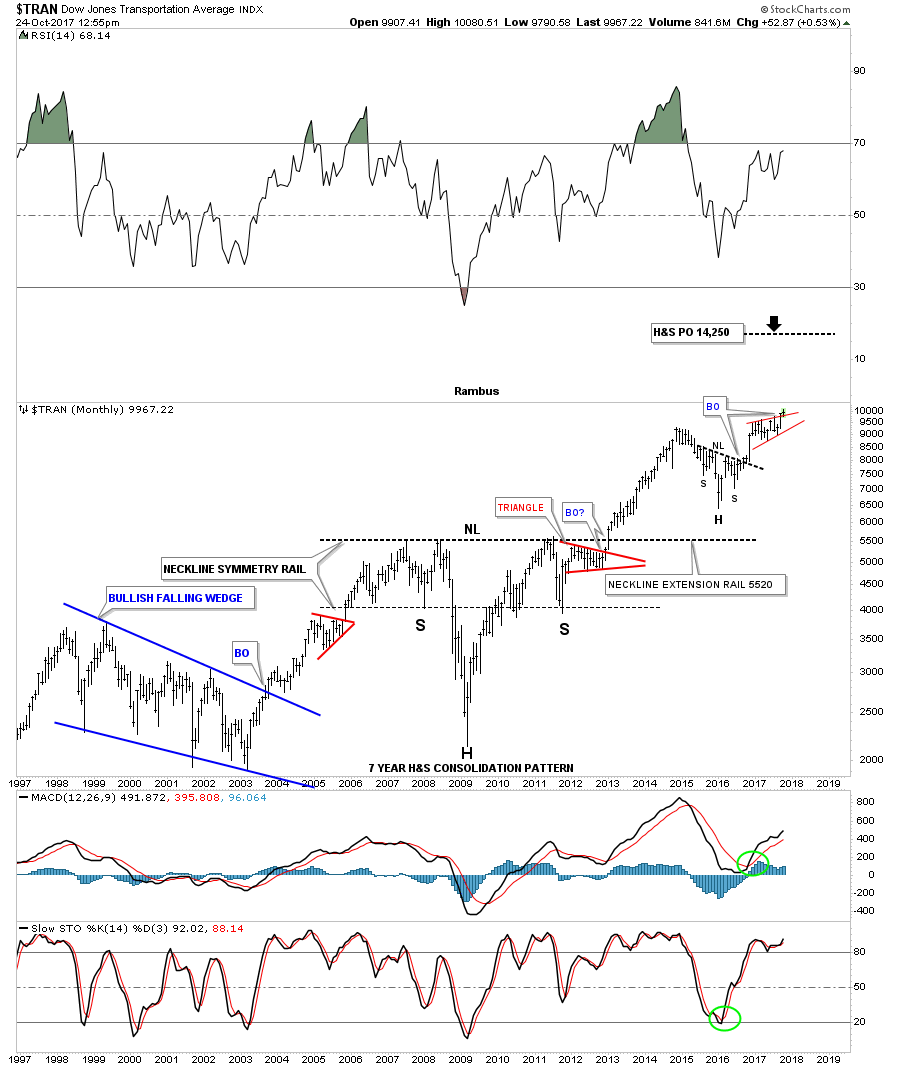
Below is a 100 year quarterly chart for the Transportation Average which puts the 7 year H&S consolidation pattern in perspective.
![]()
I’m going to change it up a bit and start with a daily chart for the RUT and work our way out to the long term charts so you can see how we get there. If you’ve been following the RUT, small caps index, you know it is setup a little differently than the other US stock market indexes. The daily chart below shows it has been building out a nearly 10 month flat bottom expanding triangle which finally broke out at the end of September. A backtest to the top rail would come in around the 1470 area.
If you recall I showed you many small H&S bottoms that formed on most of the US stock market indexes toward the end of summer. This one on the RUT is responsible for the breakout above the top rail of the flat bottom expanding triangle.
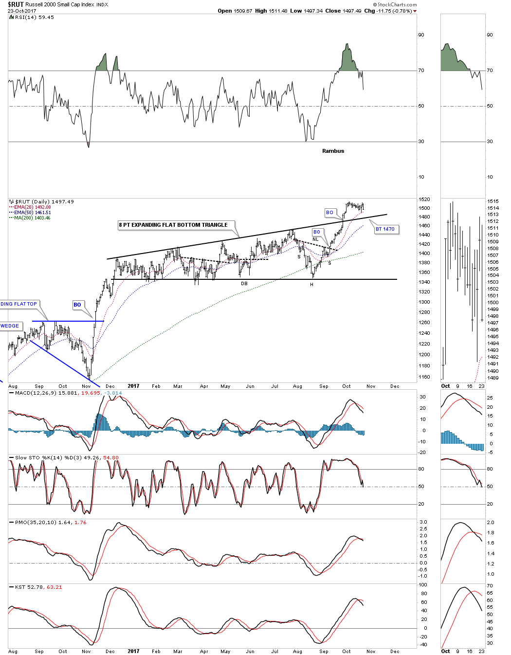
Now, when we look at the 2 1/2 year daily chart for the RUT, you can see that the 8 point flat bottom expanding triangle formed just above the neckline extension line. It then reversed its role to what had been resistance when the H&S bottom was building out to support where the head is located on the small H&S bottom on the 8 point expanding flat bottom triangle. Hopefully you can begin to see how important each pattern is in the formation of much bigger patterns.

Now lets step back a little further in time and look at a 5 year weekly chart which shows the H&S bottom with the 8 point expanding flat bottom triangle. The H&S bottom on this weekly chart strongly suggested that the top rail of the blue expanding flat bottom triangle was going to give as the price objective was up to the 1560 area.
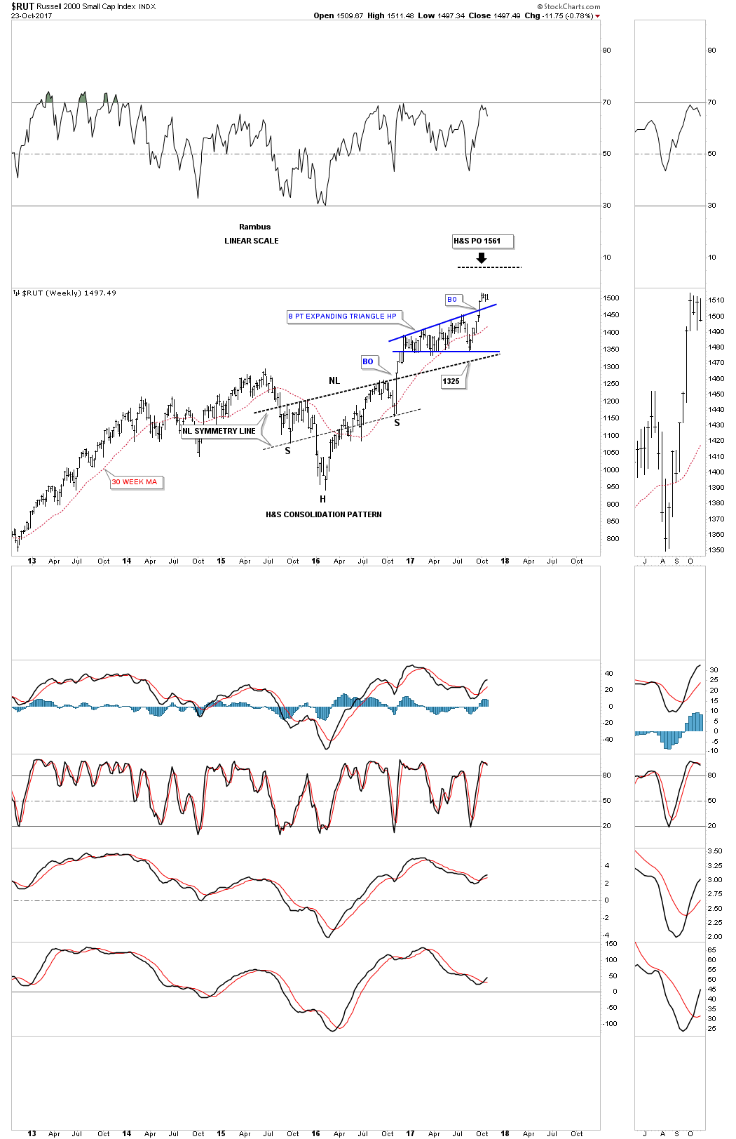
Below is another weekly chart that goes back to 2011 which shows us another consolidation pattern that has built out, which is the nearly 4 year black expanding triangle. Note how all the patterns we’ve looked at are coming into play in building out the black expanding triangle. Now you can see how the smaller blue 8 point expanding flat bottom triangle has formed just below the bottom rail of the much bigger black expanding triangle.
As we’ve seen previously on a few of the long term charts above, it’s a bullish development when we see a small consolidation form just below an important resistance line. We now have two lines of support on our current backtest, the top rail of the small blue flat bottom expanding triangle, and the top rail of the multi year black expanding triangle which will come into play around the 1470 area.
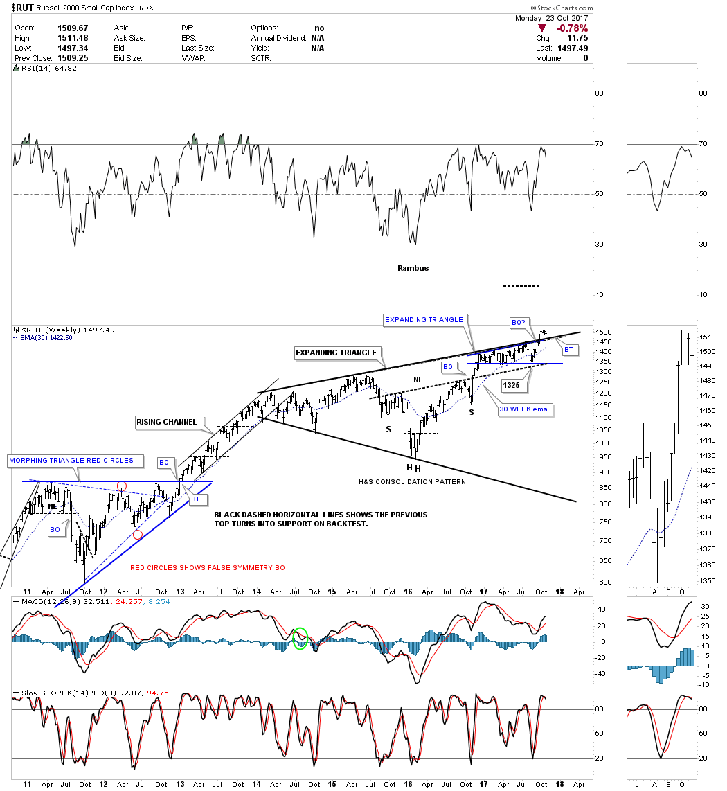
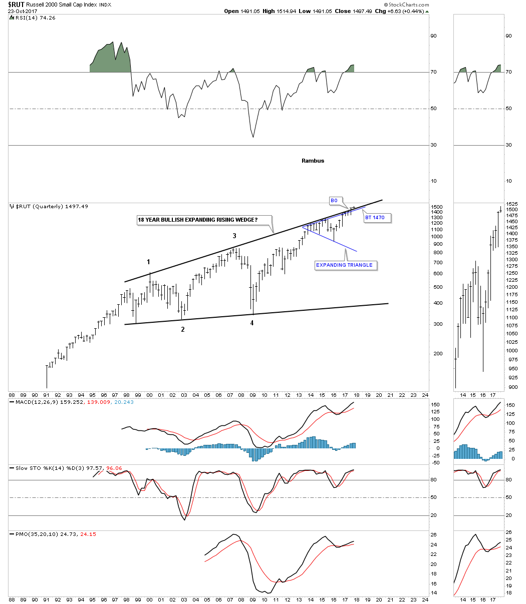
This last chart for the RUT shows what we get when we put all the pieces of the puzzle together. What we get is an 18 year expanding rising wedge consolidation pattern which is in the process of breaking out. We can now add a third line of support at the 1470 area for the backtest.
In part two we’ll look at some more massive consolidation patterns in many different areas of the markets so you can see how these big patterns play such a key role in understanding where you’re at in the big picture so you can trade accordingly. All the best…Rambus
Precious Metals (and More on Stocks)
Gold Breakout or Fakeout ?
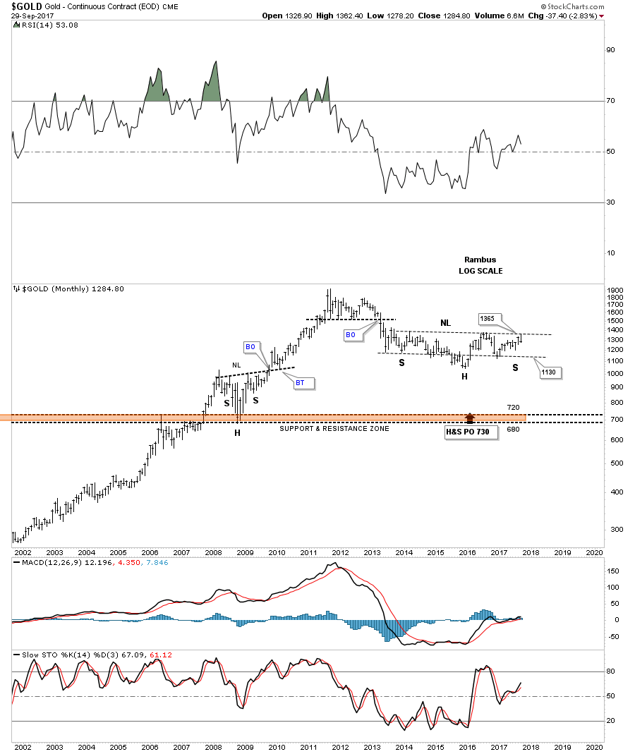
Prepared on October 01, 2017Since we’ve been spending a lot of time on the stock markets lately tonight I would like to update some of the charts we’ve been following on gold. About 8 weeks ago gold broke out above the top rail of its 2011 bear market downtrend channel and is now in the process of backtesting that top rail which would come in around the 1260 area. The bulls really need to see the top rail hold support. If gold breaks back below the top rail of the 2011 downtrend channel that would negate the breakout. Note how the H&S top’s neckline has held resistance, as shown by the NL extension line.
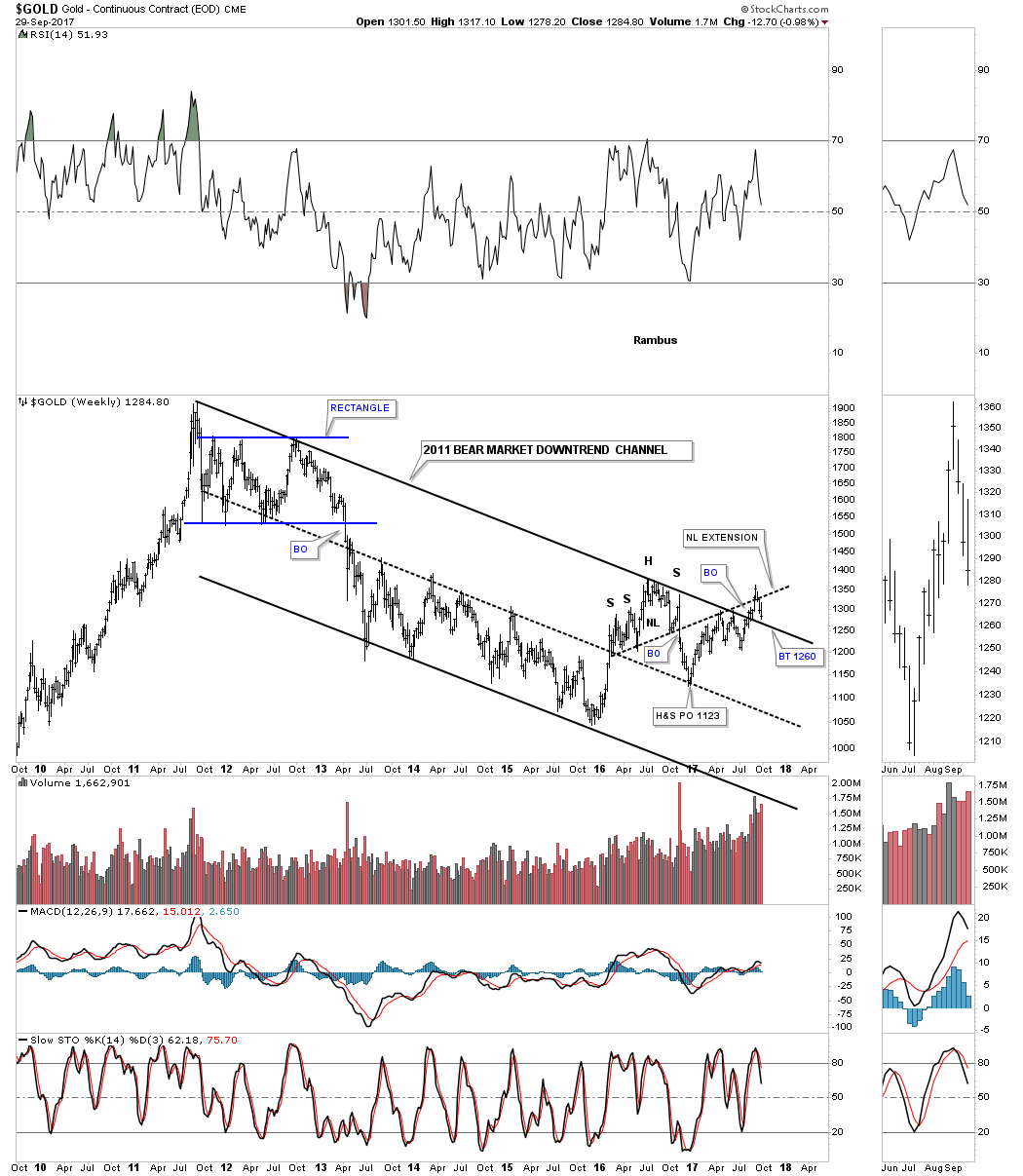
This next chart is a weekly line chart that gives us a slightly different perspective, which shows the 2011 bear market downtrend channel is still in play with no breakout above the top rail. The 2 black rectangles are measuring sticks that are the exact same height and measures each half of the downtrend channel, which is perfectly parallel. Since the price action has run from the bottom rail all the way up to the top rail I connected the last 4 reversal points which could be setting up a triangle formation. Keep in mind we still have no idea if the blue triangle will be a consolidation pattern to the downside, or a reversal pattern. If the bottom rail is hit that will be the next pivot point.

The last time we looked at this long term monthly chart for gold I suggested we could see a ping pong move between the top rail of the blue expanding falling wedge and the top rail of the 2011 bear market downtrend channel. That is currently taking place right now. The bulls will want to see the top rail of the black expanding falling wedge hold support right here and then a breakout above the top rail of the blue expanding falling wedge, which will give gold a higher high. The 20 month ema is also offering some support in this general area.

This next chart for gold is basically the same setup as the chart above, but this chart shows the black parallel downtrend channel instead of the expanding falling wedge.
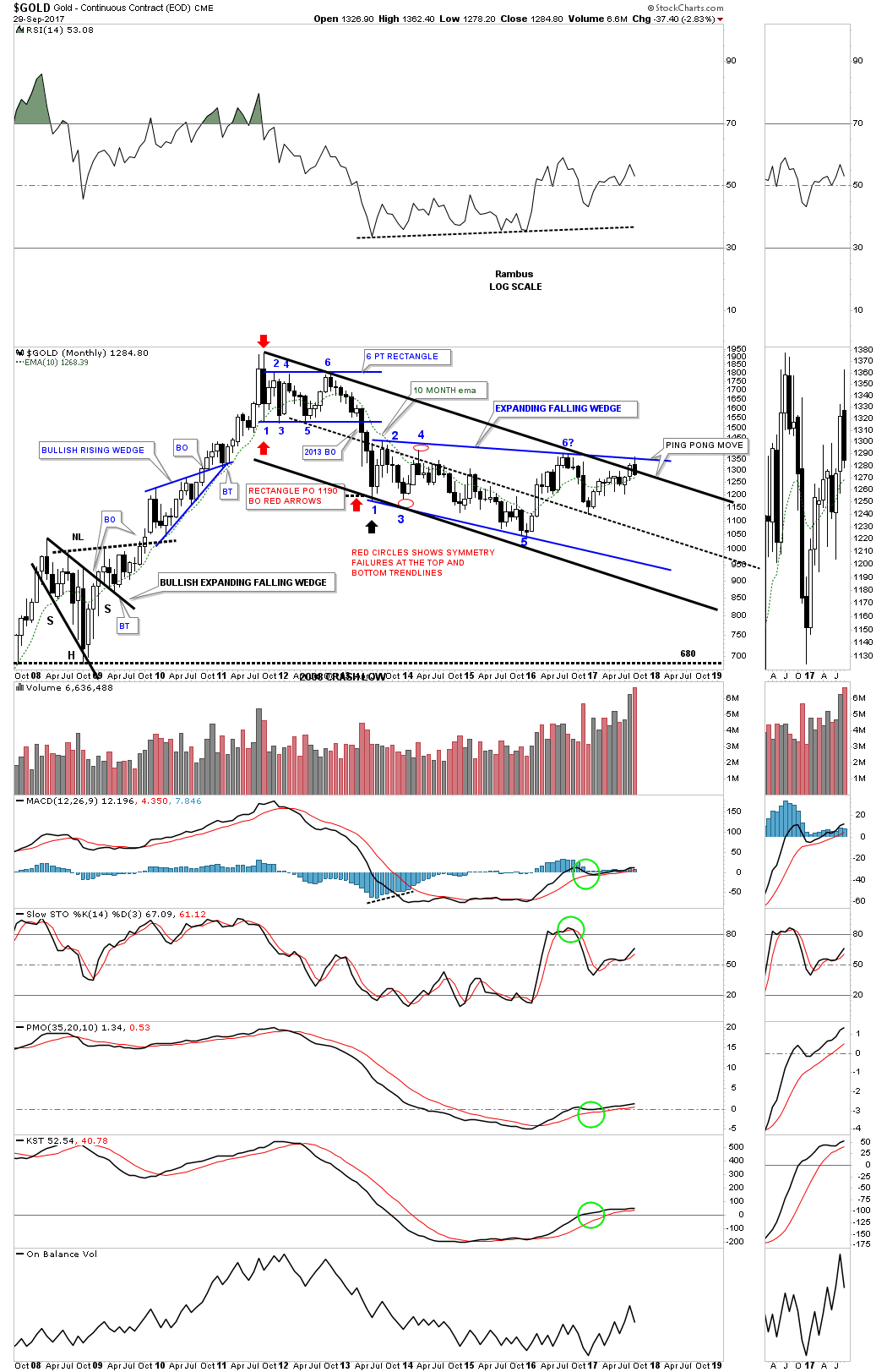
Below is another long term monthly chart for gold which shows a slightly different setup. Instead of the blue expanding falling wedge gold built out a 7 point point falling wedge reversal pattern. It had 7 reversal points so it’s a reversal pattern. As you can see, gold has been doing all the right things in regards to the breaking out and backtesting process. The top rail of the blue 7 point falling wedge has held on two backtests along with the top rail of the black expanding falling wedge, which is currently in progress. To say gold is at a critical area on this chart is an understatement.
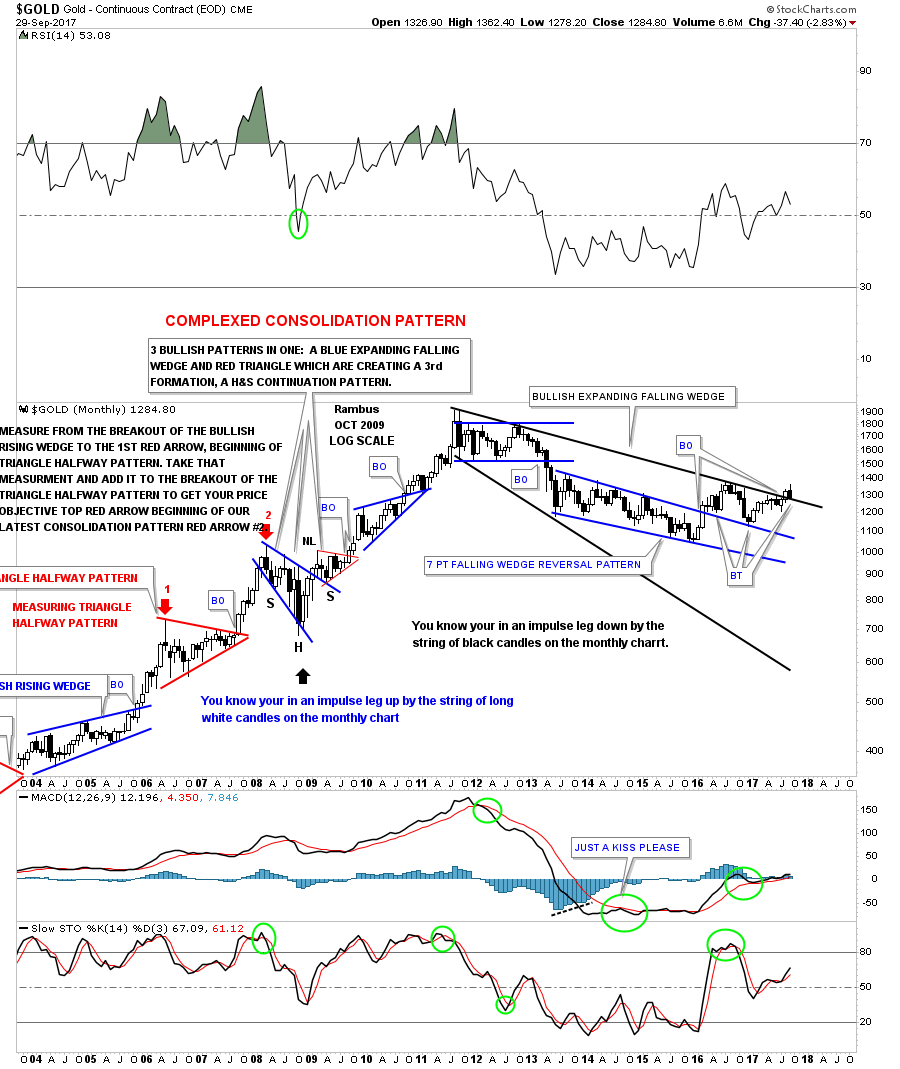
This next monthly chart is just to keep it real for the time being. Until gold can take out the top rail of the blue expanding falling wedge the possible bull market can’t go forward. It’s as simple as that.
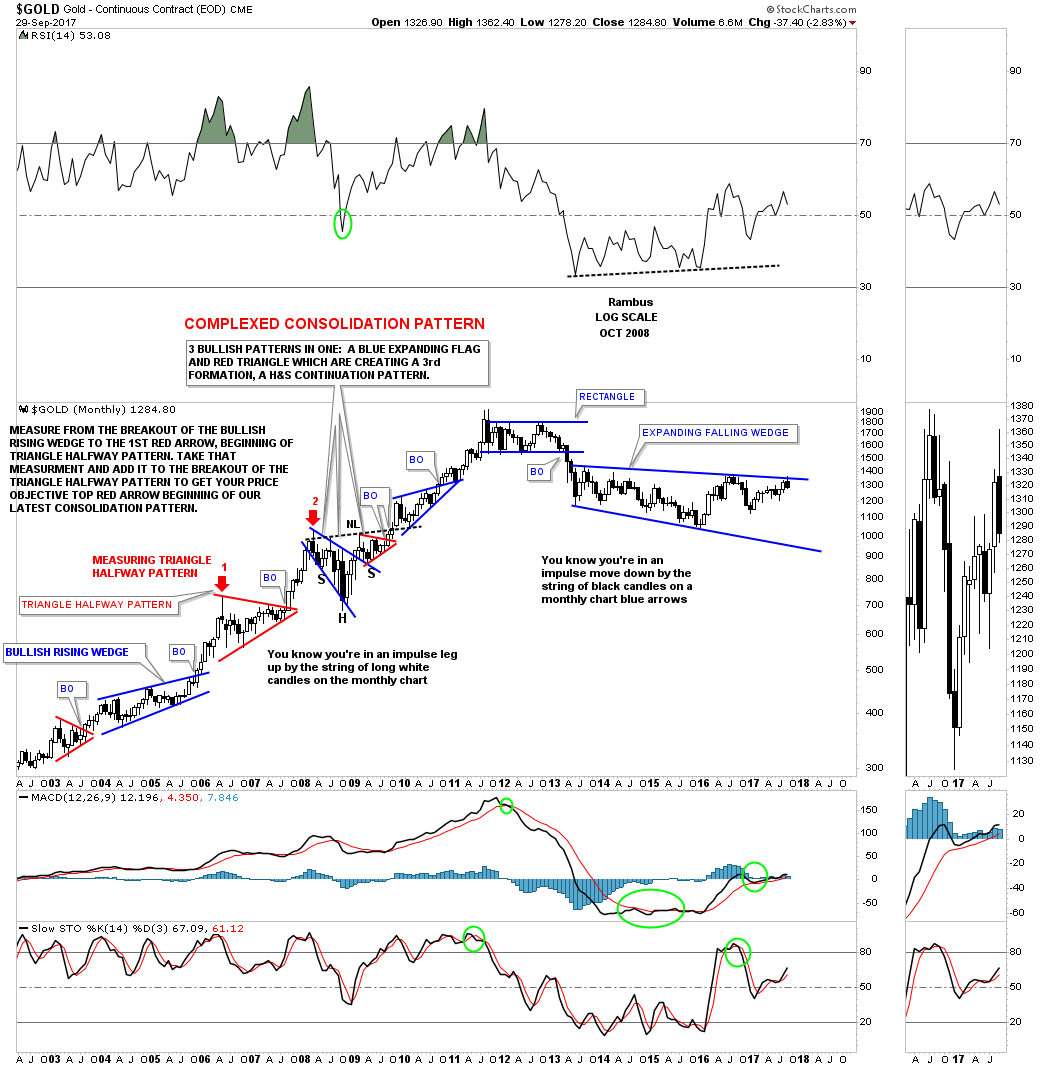
I used this next 20 year chart for gold during the bull market years as the 10 month ema did and excellent job of holding support, but just a fair job during the bear market years. As you can see the price action is now just trading slightly above the 10 month ema which also comes in close to the top rail of the blue expanding falling wedge. Note how the last monthly bar hit the top rail and then sold off to close the month of September toward the low. It’s not the end of the world yet for the bulls, as many times the price action will test an important trendline only to sell off a bit and then test it again and eventually breakout. Again, the bulls need to take out that top blue rail to get the bullish momentum going.
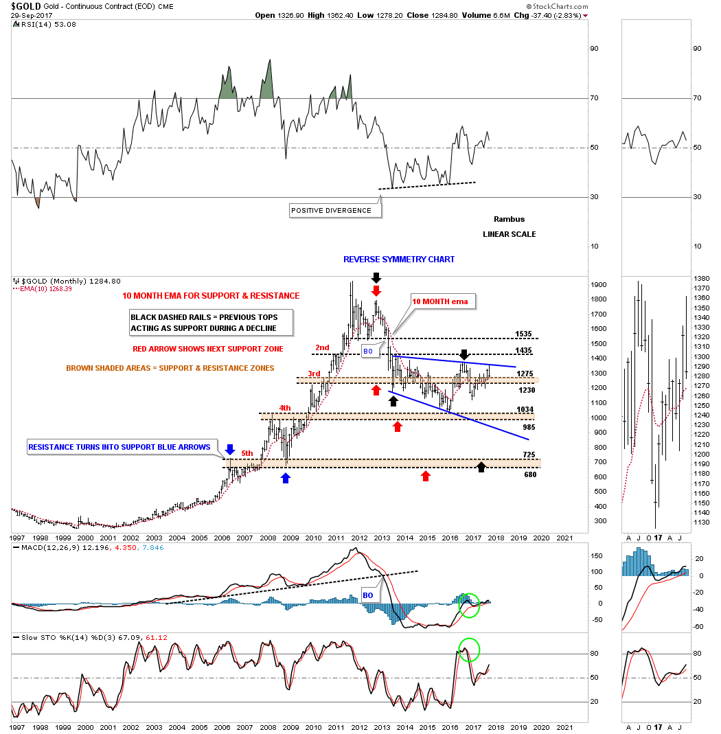
This next long term chart for gold shows its bull market uptrend channel that is still intact. Initial contact came in at the December 2015 low, and second contact was made a year later at the December 2016 low, as shown by the two blue arrows. The 2008 crash doesn’t look all that impressive on this long term chart, but that correction built out a bullish expanding falling wedge which is similar to our current one that began to buildout at the 2011 high. I can’t state strongly enough how that top rail of the current black expanding falling wedge needs to hold support to keep the original bull market alive.
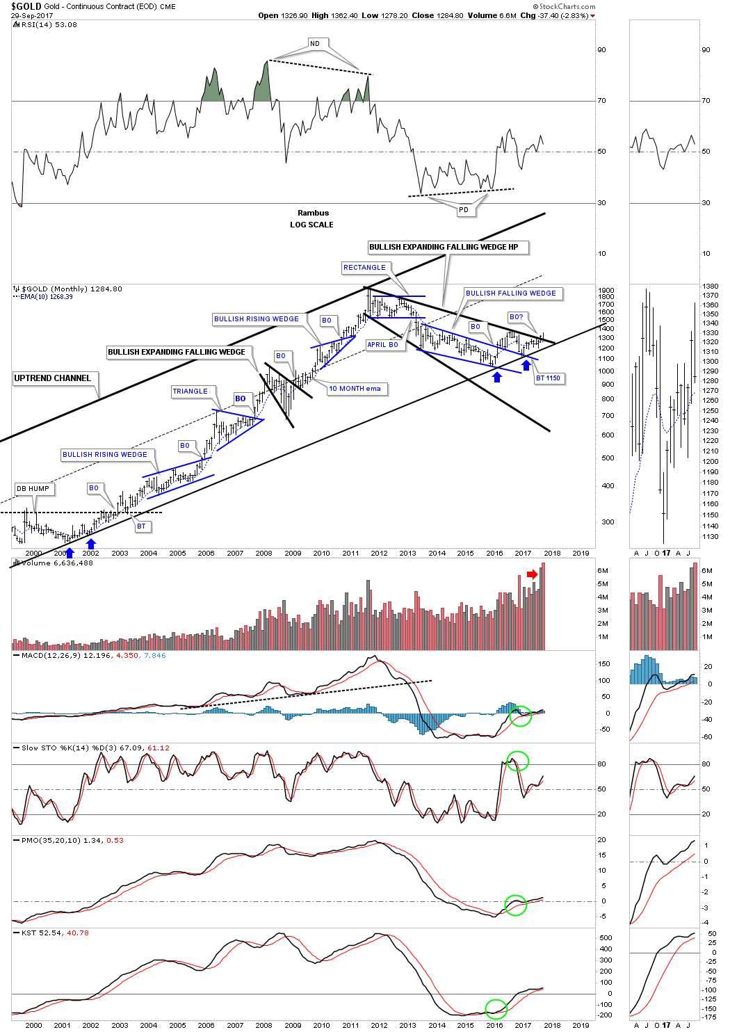
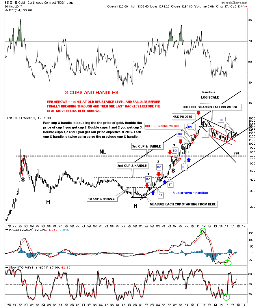
This next chart for gold is the old 40 year H&S bottom chart along with the 3 cups and handles. Note the massive H&S bottom that built out between 1980 and 2007 which launched the bull market. That massive H&S bottom had a price objective up to the 2035 area which was slightly higher than the actual top that came in at 1920. The 2008 crash doesn’t look like much on this chart, but look where gold found support which was right on the neckline at 720 as the backtest. Whenever I post this chart I always say it’s a good study in how support and resistance works, as shown by the red and blue arrows. What had been resistance turns into support once broken to the upside. At this point the bull market uptrend channel is still in play.
These next 2 charts I’m watching for clues that may give me an early heads up on the next direction for gold. This first chart is a fan line chart. Fan lines are taken from an important low, in this case the bear market low in 2000, and connect to the lows once a top is in place. Normally a fan line will hold initial support, but then the fan line will fail. After the fan line breaks you will generally get a backtest to the underside and then the decline takes hold again. The rule of thumb is when the 3rd fan line gives way the move down will begin in earnest as in our current case with gold. As you can see the price action has been climbing the 3rd fan line for close to a year now. The bulls don’t want to see the 3rd fan line broken to the downside.
The other gold chart I’m keeping a close eye on is the another long term monthly chart which is showing a possible H&S consolidation pattern building out. The neckline symmetry line held support initially for the right shoulder at the 1130 area. Symmetry suggests we could see another test of the neckline symmetry line to complete the right shoulder. If we do get one more test of the neckline symmetry line, and it holds, gold will have built out a very beautiful and symmetrical H&S consolidation pattern which will be big enough to launch a multi year bull market.
What most of the charts above are showing is that gold is at an important inflection point where it can go either way. A little more time is needed to see how some of the patterns play out, especially some of the backtests. One thing I do know is that when gold finally starts its next impulse move Chartology will capture most of it. All we need is just a little more confirmation to get on the train as it leaves the station. All the best…Rambus
Market Melt-Up While Opportunity Knocks in the PM sector
Prepared on October 22, 2017This week I introduce two new market indicators, the PM stock buy-signal indicator and The YC Market exit-signal indicator. We will look at just how extended the general stock market is and discuss gold stock market dynamics in a post bubble contraction (PBC). Also I review strategies going forward in Novo Resources.
General Stock Market
Rambus’ charts have chronicled the market indexes relentlessly powering higher. It’s a runaway freight train… unstoppable. One prominent newsletter writer from a contrarian newsletter group has even published a guide on how to play what he calls the melt-up market. I often hear people wonder “what can possibly stop this market?” It acts impervious to any threat or bad news. Let’s take a look at some measures of vertical extension which the markets have now reached.
Frank Barbara recently published a few market duration statistics that are simply mind boggling. The DJIA has been around for 121 years and we have accurate statistics over that time frame. We are now in the longest interval without a 5% correction in history… by a long shot. We have gone 306 days since a 5% correction. This is off the charts, since the second longest interval in the last 121 years comes in at 265 days back in 1964. The #3 and #4 longest were 229 and 220. The S&P 500 has similar statistics, however it has not been tracked as long as the DOW.
Similarly, the DOW’s 100 day MA has been in an upward configuration for 333 days. There have been only 2 other times in history where it has even exceeded 250. It typically takes 18 trading days to turn the MA down so as a minimum 350 seems in the bag. Today’s extreme vertical run is simply extraordinary. Since world markets are driven by a sea of liquidity due to QE programs it has characteristics of an engineered outcome. It reminds me of what happens when the US Forest service does not allow any fires to burn. It prevents them for extended periods, but ultimately results in a conflagration later on.
After the Dot-Comm bubble burst FED emergency measures resulted in the housing bubble and after the 2008 financial crisis, emergency money printing (QE) has led us to where we are today…the everything bubble. This is not a rant against FED policies, I am simply chronicling the reality of markets today in an attempt to develop a strategy going forward. The two previous bubbles, although large, were essentially side-show bubbles, however today’s bubble is a money bubble which goes to the heart of money and credit. Once it deflates the FED may not be able to reflate it since they will not be able to increase non-productive credit. It is with this knowledge that we will review the dynamics of a post bubble contraction (PBC) and develop a strategy going forward.
Russell 2000-20 year extreme in momentum
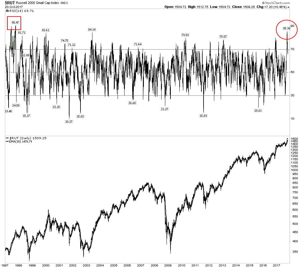
Below is a chart of the Russell 2000, note how the RSI has reached an extreme unequaled since Oct 1997, 20 years ago. When an RSI gets to this level it limits the move of the index higher. It’s not a top call, but an indication of being extremely overbought.
GSR Review- Credit Crunch coming but not here yet
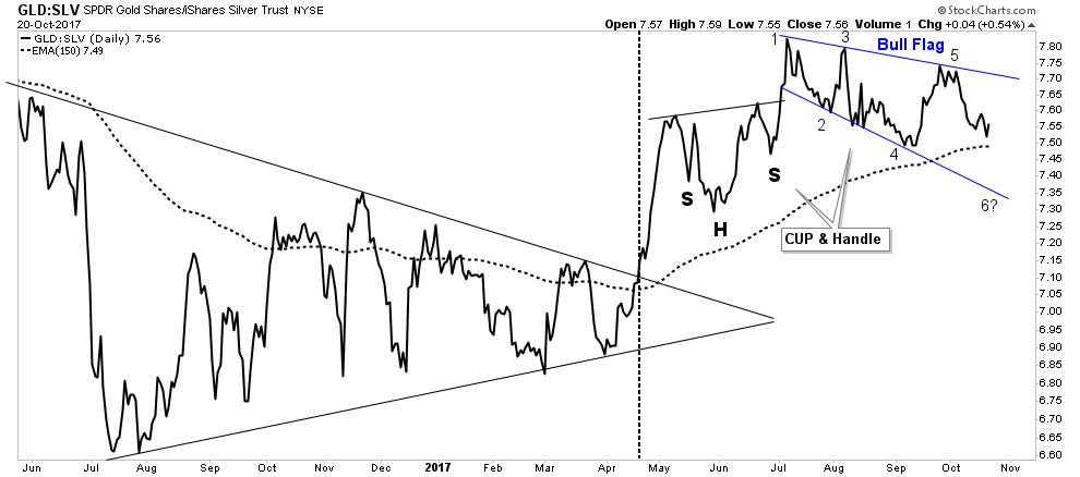
I continue to monitor the GSR because it is the prime indicator to the arrival of the PBC. The reason this is so important is because that is when the gold stock bull market will resume its advance which I will explain in the gold section further below. The chart below shows the GSR at the last bubble top. The GSR forecast a credit contraction when it broke out of its consolidation in Jul 2007, 3 months before the market top. It entered into its second consolidation at the time of the actual market top. It confirmed the credit tightening forecast by breaking out of the second consolidation in December 2007, 2 months after the market top. It took another year before the market crashed in the fall of 2008.
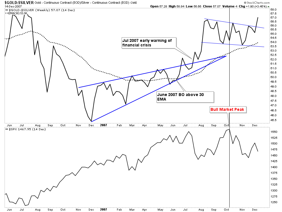
Today’s GSR chart shows the same set-up, with the second consolidation well advanced. It has not yet broken out to the upside which would confirm the forecast of an active PBC, but it has completed most of its technical work prior to a break out. It actually looks about the same stage as the 2007 pattern at the time of the general market top. The current chart configuration mirrors the process of 2007 and is in the process of forecasting a market top and credit contraction, but we are not there yet.
The YC Market Exit-Signal Indicator
Introducing the yield curve market exit-signal indicator. Over the past 20 years this indicator has accurately signaled the start of the last 2 bear markets. It hasn’t provided a reentry signal, just an exit signal. When the spread between the 2 yr and 20 yr Treasury Yield violates its topping pattern to the downside it signals to get out right now! In the two previous bear markets the spread has undergone a divergent lower high top, while the SPX puts in a higher high. When this occurs one should exit when the spread index violates its previous low. Typically the divergence develops over an 8-18 month period. The dashed vertical lines are where the exit signal occurred the in the prior two bear markets.
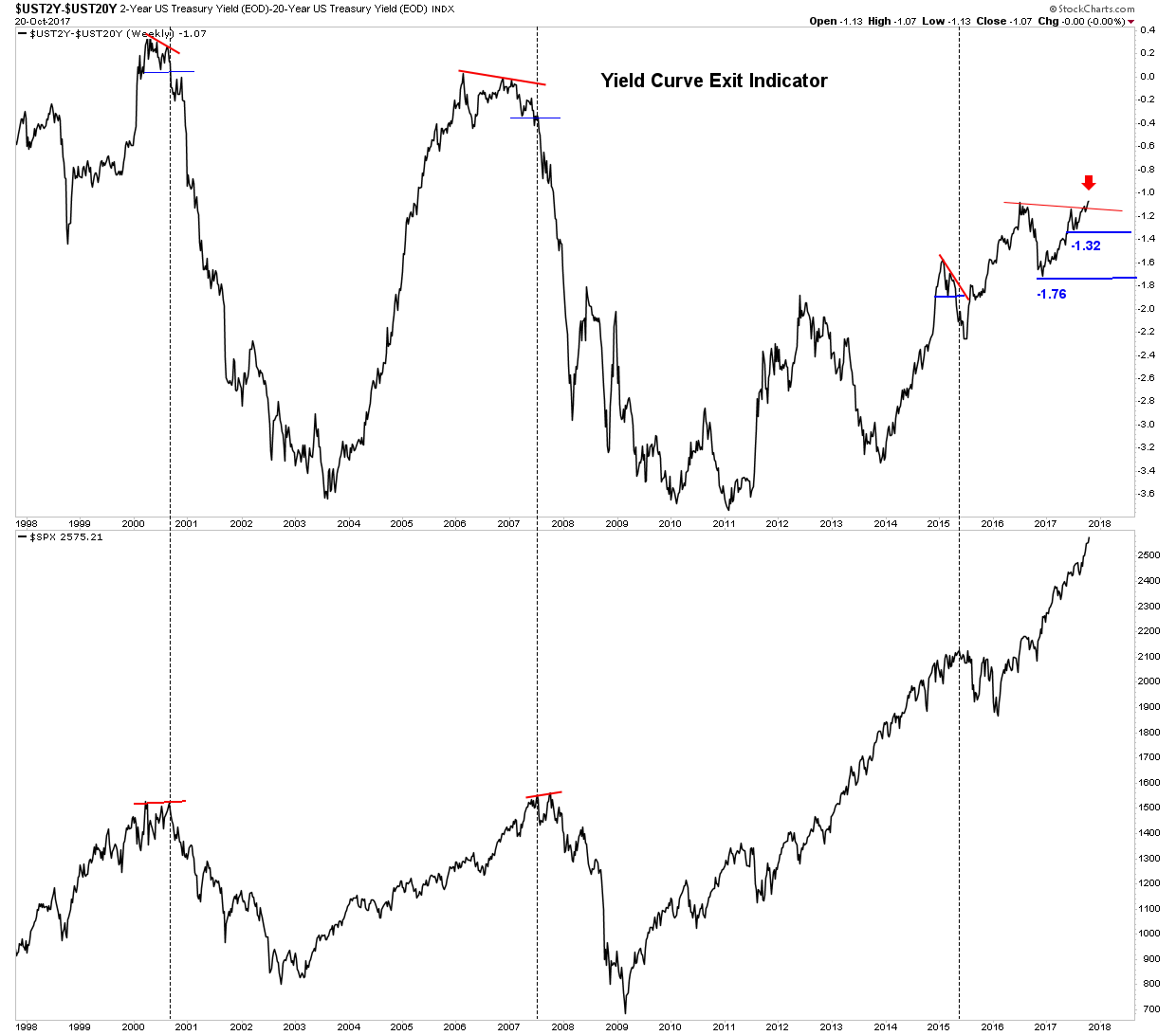
This week’s close is signaling that the market has now entered full scale melt-up. Until this week the YC indicator had been working on a 16 month divergence and appeared setting up for an exit signal. But a funny thing happened on the way to going over Niagara Falls, it blew through the last two previous highs reconfirming the up-trend. A decline through the 1.32 level would have signaled an exit from the market. This indicator is therefore signaling that the melt-up has further to go to the up-side. A parabola is developing and we know how parabolas resolve, but for now markets should continue higher.
History Repeats- The Liquidity Preference of Money Zooms the Market
In 1928 the FED became spooked by the rise in the stock market and the associated speculation. As is occurring today the FEDs bubble machine stoked the market throughout the 1920’s. This was simply another case of the FED being both arsonist and fireman. So in the fall of 1928 the FED began raising rates in an attempt to reign in the market, however quite the opposite occurred. The market went into overdrive for the next year blowing out in September 1929. The reason the market resisted the FEDs efforts to restrain it is due to the liquidity preference of money. Keynes described this dynamic this way: investors hold more cash as rates remain low. Once rates begin to rise they deploy their cash due to the opportunity cost incurred by holding that cash. This is likely what is behind the surge in the present market. Since the FED has made it clear they are raising rates, people are throwing their last remaining funds into the market. The melt-up has arrived.
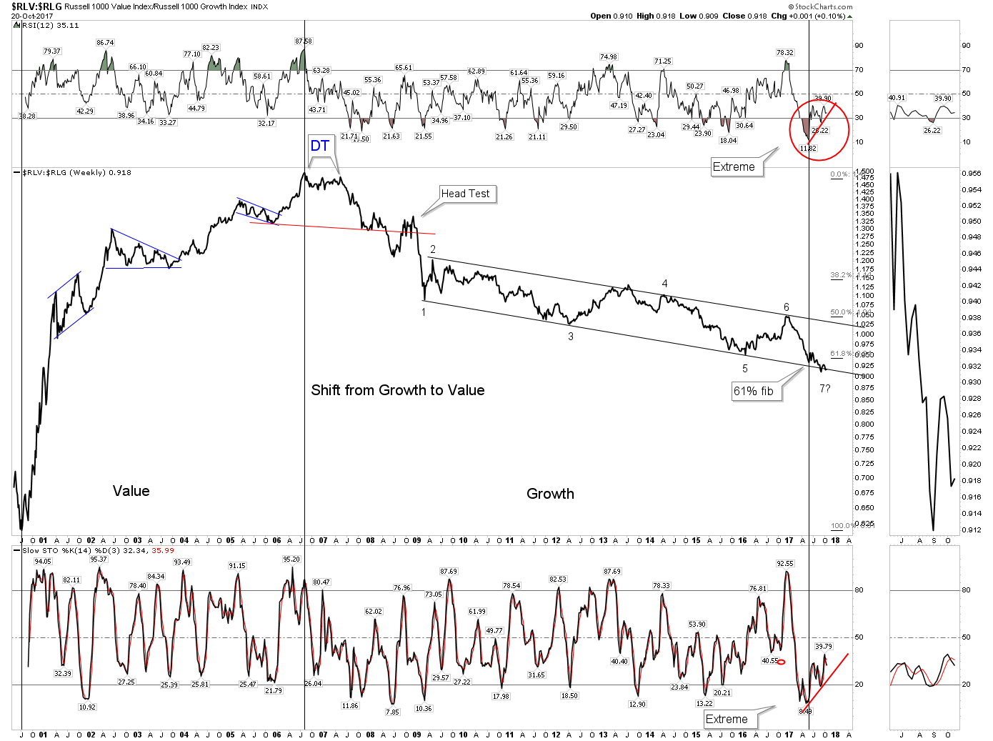
Growth to Value Transition
The melt-up is likely the final leg up in this 9 year bull market. Once the top is in the market is likely to transition to an era where it favors growth over value. We are tracking this process with the chart below. It appears ready to make a turn. The current position at point #7 shows the extreme preference for growth with RSI far exceeding any past reading over the past 20+ years. Stochastics are stretched to the limit as well. Both RSI and Stochastics have now put in glaring divergences indicating it’s time for the ratio to turn upward now. A break above the upper channel line would be the confirmation of a new value cycle.
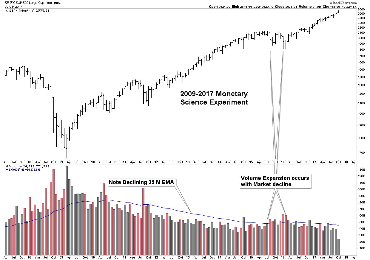
Monetary Science Experiment
You have seen this chart before, but notice how volume is flaming out despite the move to higher highs. The overwhelming message that this chart delivers to me is how this entire bull market is some freak of nature. Bull markets develop and progress on increasing volume, however this bull market has been the polar opposite. The subtle message of this chart is that once the inevitable 10% drawdown comes, there may be a massive air pocket underneath. The entire gain of this bull market may prove to be non-durable since it is driven by QE vs. organic growth.
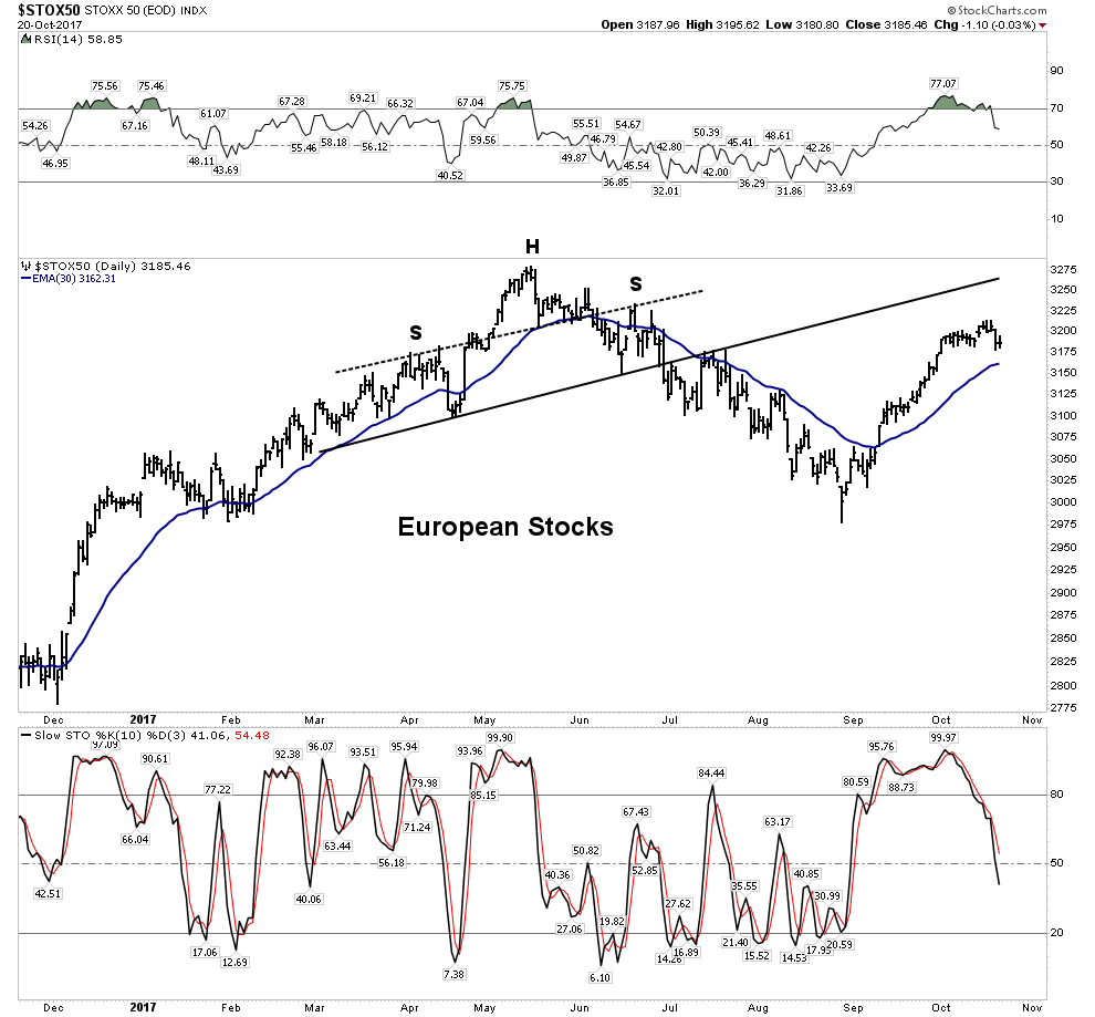
European stocks have rallied nicely for the past 6 weeks. It appears this may be a classic 6 week BMR. Stochastics and RSI may indicate a decline is resuming.
FAANG Stocks- Are they losing their leadership?
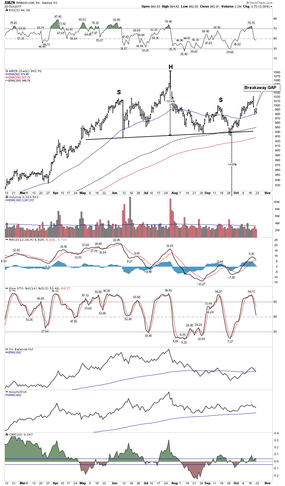
AMZN– Clearly showing pronounced distribution. Thursday’s breakaway gap is a significant red-flag. It comes following Wednesday’s outside downside reversal off of highs. Plus it comes at the end of a two week rally that can be classified as a head-test following a potential H&S pattern buildout. This chart is screaming avoid!
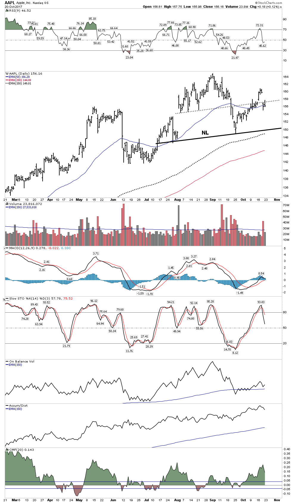
AAPL– This market darling is also showing signs of distribution. Thursday’s action was also a breakaway gap down below an S&R line. Not in serious trouble like AMZN, but if the 150 level gets broken, which is only 3% away, watch out!
The other FAANG members have not yet shown up on the distribution radar.
Bottom Line for the Stock Market
The market is in melt-up mode. It is likely the last leg up in a 9 year bull market. All fear has left the market and It has higher to go, don’t even think about shorting this thing. Follow Rambus’ charts for upside targets, however late December through January offers a target window for an ultimate top.
Precious Metals
In this section I would like to briefly look at the charts then explain why the dynamic of a post bubble contraction is so important to the PM stocks. Rambus’ PM charts are so authoritative I can’t improve on them, however I can provide some alternative insights. I have mentioned before that I view the PM sector through both clear analytical glasses and rose colored glasses. That’s because the weak USD has distorted the US indexes. I regard the SPTGD as the best index to track.
The weekly SPTGD makes it evident that things are coming to a head soon. By the end of this year or by January 2018 price will have reached the tip of the APEX. Sometime between now and then it’s going to break out, either up or down. It is my view it will be to the upside.
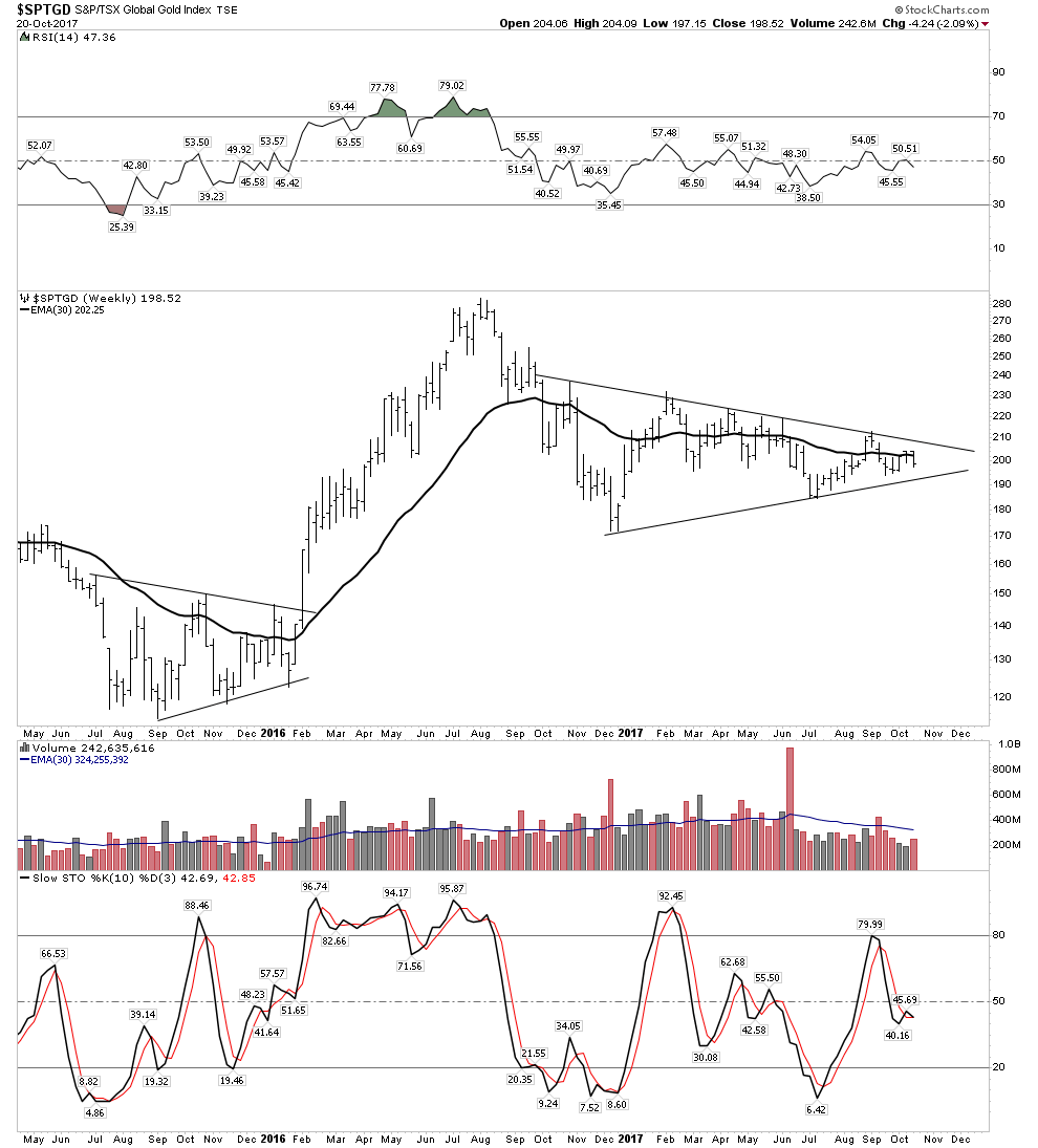
The weak handed investors that got drawn into the market going into the August 2016 high will likely do some tax loss selling over the next 6 weeks. They may then deploy that freed up cash into the general stock market as it most likely continues higher. This could put some more downside pressure on the PM stocks. It could even result in a false break through the lower boundary of the triangle in the SPTGD. However, the next FED rate hike or an exogenous event could put an end to the markets blow-off top. Early next year the PM stocks could finally resume their bull market with a second leg up.
That second leg up in its bull market is known as the mark-up phase or awareness phase. It is the longest leg in a bull market. It is the time where the public and institutions over time begin to recognize the forces behind the bull market and begin entering themselves. It will take years to fully develop, but we will have already accumulated our fortress positions.
The key to successful investing is to be there before the crowd and to have the crowd come to you. In the next phase investors should own things that can’t be printed. December 2015 was the beginning of the first phase, the accumulation phase, where informed investors staked out their positions unbeknownst to the public or the institutions. It is the quiet phase.

The daily chart above shows the index struggling. It has been challenged to get through the cluster of moving averages and the upper channel boundary, note also volume is fading. Internal technicals, as shown, are not supporting a move higher at this time, however I am not willing to totally write it off, therefore I am holding 70% of my PM positions because it could always turn on a dime and I see a breakout coming early next year. I would prefer to ride it down a bit rather than risk missing an upside breakout move.
Weekly GDX
Now we put on our USD rose colored glasses and see the GDX looking pretty good here. It has held above the triangle breakout and the 100 EMA. The three red arrows show ARMS readings which equate to full-on fear, depicting wash out bottoms providing good psychological support.
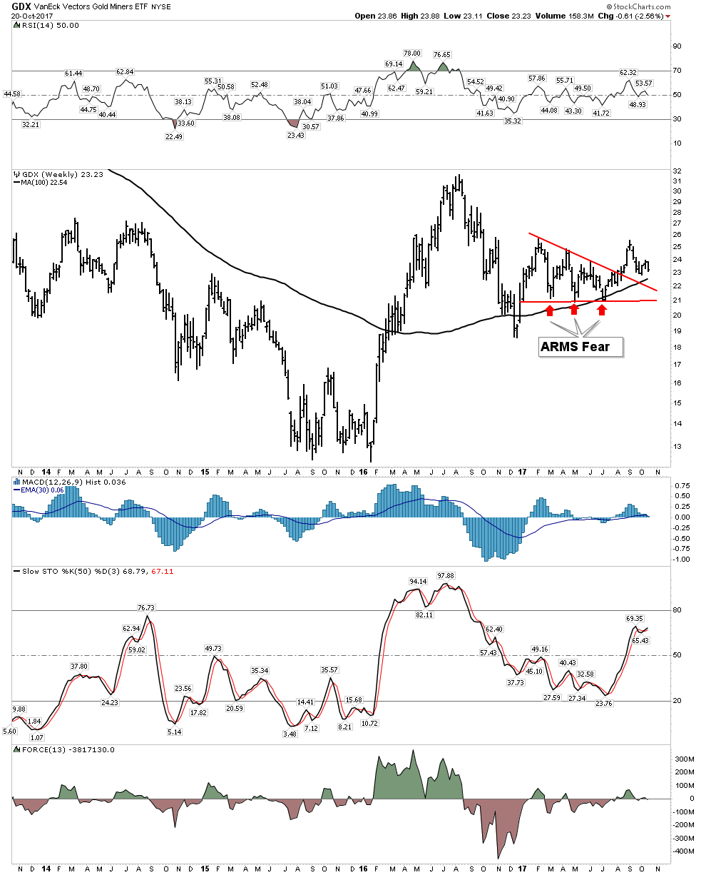
Below the daily GDX shows it holding above the moving averages and triangle, however note that volume is trailing off.

Gold (in USD)
If gold can remain above the upper channel boundary it would indicate an early resolution of a BT and would be very bullish.
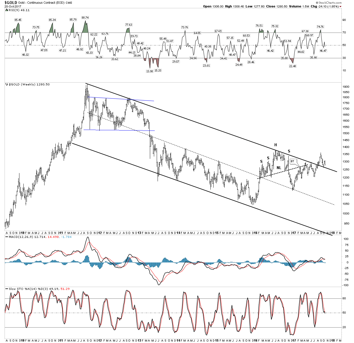
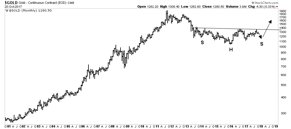
If gold did break down into the channel it would not be catastrophic as the gold chart below shows it just needs to do some more basing work before the big move which is a break above 1360. Remember: big bases sustain big moves
The HUI also shows it is finishing up the saucer shaped consolidation that it needs in order to sustain a big advance. This is all very exciting as it points to 2018 as a big year ahead for the PM stocks. The time to load up is before 2017 ends.

PM Stock Buy-Signal Indicator
The second new indicator I am introducing I call the precious metals stock buy-signal indicator. It has a tremendous track record of signaling when to enter the gold/silver market. It combines a dual requirement of monthly RSI below 38 occurring simultaneously with the CCI below -125. In the chart below the vertical dashed lines show occurrences when this dual requirement has occurred in the past. There were no false signals in this 15 year sample.
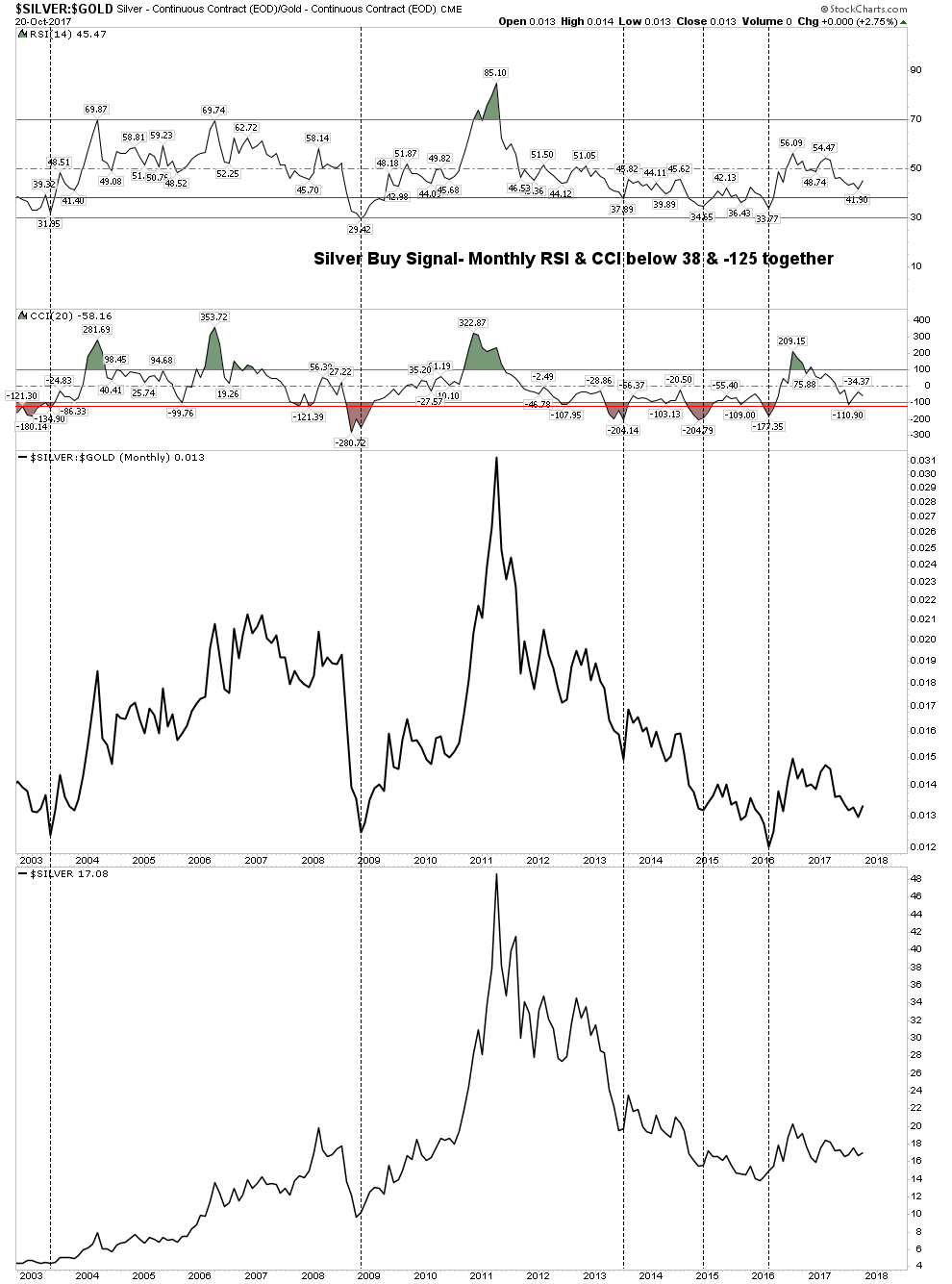
What this is telling us now is we are not there yet. Possibly by the end of the year we can get the RSI and CCI below the red line which would signal a buy. Keep some powder dry knights.
Bottom Line-PM market.
The general stock market is the shiny object right now. It has further to run and is acting as a decoy to divert ones attention away from the PM stocks which are shaping up for a generational sized bull market. Keep your eye on the ball. Not saying don’t play the final melt-up in the SM, but the major opportunity over the next 3 months will be in identifying and scooping up the abandoned value plays in the gold and silver market. We are right now in one of the greatest opportunities in a lifetime. To understand why keep reading.
Gold Bug thinking- Purge Thyself
Those are the technicals and now I would like to discuss why the gold stocks are getting ready to embark into phase II of its bull market likely in early of next year. I constantly harp on the PBC theme because this is the driver of this trend. As the general market tops credit will begin to contract and the gold shares will begin their run.
I have mentioned before that I am a reformed gold bug. When I was in college in the mid 1970’s I started playing around in the PM’s. Of course I had no idea what I was doing, but it was easy to “understand” the gold bug narrative. You know… evil FED prints money, gold bugs buy gold, inflation blossoms , gold bugs get rich and as a side benefit gold bugs watch the public suffer and we can say “I told you so”.
Sounds easy… so as pure luck would have it, I hit some home runs early on and I was hooked. The GB narrative now became lodged in my brain. I am ashamed to admit it, but it took 30 years for me to get rid of it. Sure, I did plenty of other investing in the great bull market from 1982-2000, but the GB narrative dominated my thinking. What I didn’t understand was gold’s true role as a counter weight to the world’s financial system and there isn’t necessarily an immediate direct link between FED money printing and a higher gold price as the process is a bit convoluted. Of course, it’s always wise to hold gold bullion as a core position at all times for security and liquidity, but one should only own gold stocks during a PBC. This central truth eluded me until about 7 years ago. The cost of this ignorance was the opportunity cost of not fully participating in one of the biggest bull markets in history from 1982-2000. I shouldn’t feel too bad however because probably not one in 10,000 understands these concepts.
Principle: Only own gold stocks during a Post Bubble Contraction
Post Bubble Contraction
Credit bubbles are formed when banks monetize government debt. Gold underperforms during a credit bubble since gold is anti-correlated to the credit cycle. Once the bubble bursts however, gold rises sharply with no advanced warning. Gold mining margins are always driven by the spread between industrial commodities and gold. In a contraction credit collapses and commodities plunge against gold on a real basis. The world is now in the final stages of the largest credit bubble in history, (the everything bubble-The Economist magazine) As the boom turns to bust the FED must print money at an accelerating rate to maintain the illusion of savings. But the boom cannot be sustained because the mal-investments created during the boom years cannot survive in a higher interest rate environment. As the scramble for cash progresses interest rates spike and commodities collapse against gold. More money printing only worsens the situation.

A collapsed credit bubble has little effect on gold because gold has no cash flow which turns out to be a good thing. Gold then becomes a counter balance to the financial system. During the bubble the spread between industrial commodities and gold narrows, however once the credit contraction begins this spread expands leading to improved gold mining margins thus profits. An entire credit expansion lasts around 50 years however a PBC lasts around 15-20 years. It is during this relatively narrow window that one should be in the gold stocks.
Huge booms in gold stocks historically occur at about 40 year intervals. California 1850’s, Klondike late 1890’s-1900’s, USA depression 1930’s, USA inflation 1970’s. Now we are approaching the next 40 year interval with a historic credit bubble teetering on the brink. Logic would suggest this set-up to be the biggest gold bull market in history.
The Dollar and an ultimate gold price
The USD is a unit of liability of the FED’s balance sheet, (it says NOTE on top of a dollar bill). A USD currency note is actually a token mostly backed by treasury bonds, which are of course simply contracts. It is popular to call it pure fiat, however historical reality does not bear this out. The liability of the USD is actually balanced with collateral on the FED’s balance sheet. This collateral is made up chiefly of credit instruments (bonds etc). However at $1250 gold the FED backs the USD with a 7% gold backing. (The FED however, still values gold officially at $42.22-crazy) As interest rates rise the value of its bonds backing the USD declines, therefore the market demands something else to make up for the reduced collateral. Historically this has been gold.
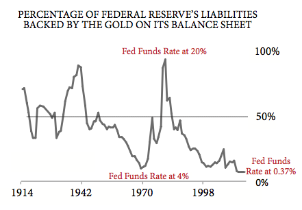
In the early 1980’s when interest rates completed the run from 4% to 20% it destroyed the value of the FED’s bonds. As a result, gold rose to $875/oz providing complete backing of the FED’s liabilities. This also occurred in the late 1930’s during the depression. Looking ahead as rates rise again in the PBC, gold should also rise to make up for the loss of value in the FED’s bond portfolio. The lesson here is that it is NOT the quantity of dollars that determines their value, but the value of the assets backing them that determines it.
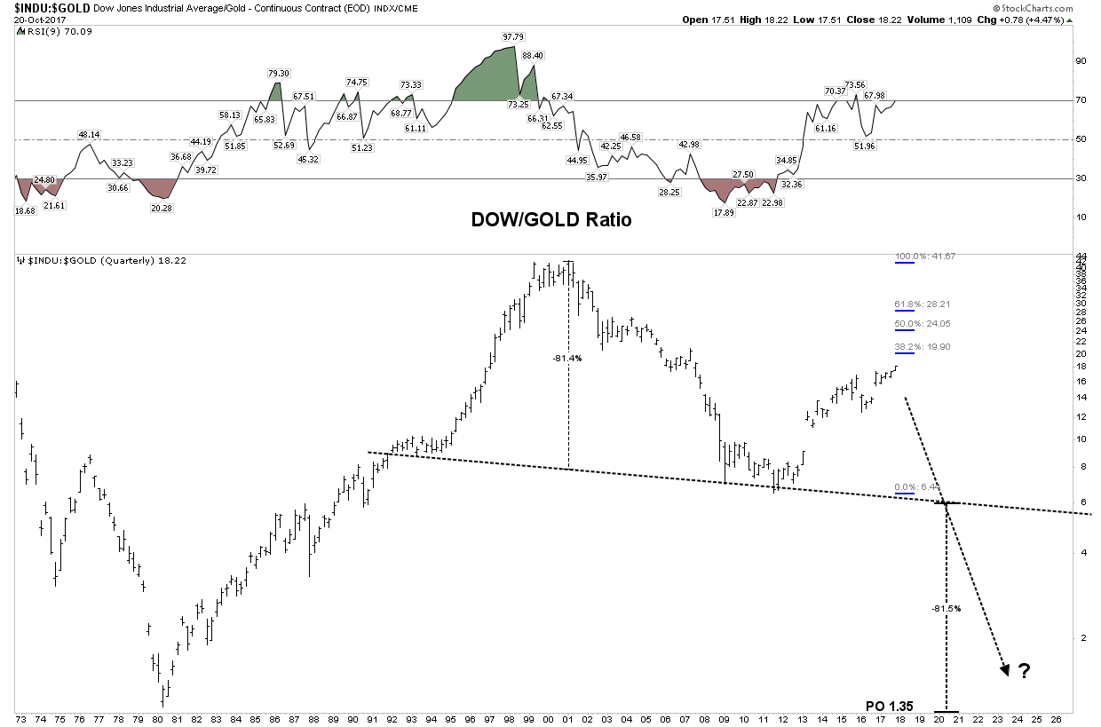
DOW:Gold ratio
At the end of PBCs the DOW:Gold ratio typically bottoms around 1:1. Typically the bigger the bubble the lower the ultimate ratio. We see this occurring in the below historical chart.
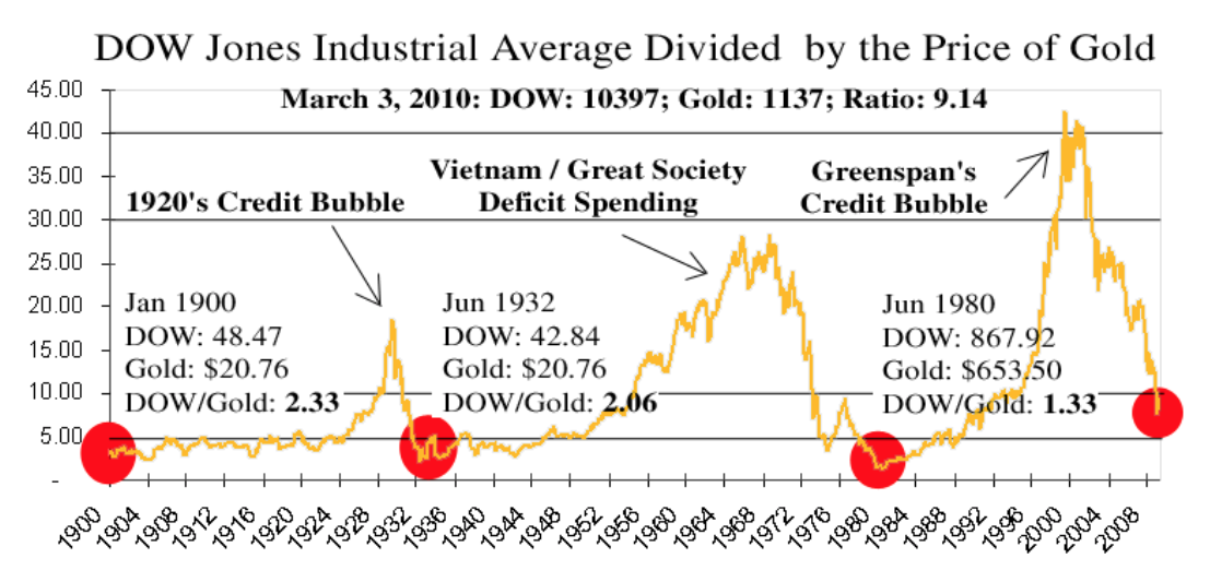
Today the DOW:Gold ratio sits at 18:1. The chart below depicts a measured move to 1.35 right at the historical resolution point. A move to this degree would be wildly bullish for the gold sector.
Ultimate outcomes
If interest rates were to rise to early 1980 levels it would require gold to be priced at $24,000 to fully balance the FED’s balance sheet. That of course is not a forecast, but simply is a marker of what has happened in the past to collateralize the currency at 100%. It’s anyones guess what actually happens, however once one understands the mechanics of balancing the currency liability on the FED’s balance sheet a $10,000 gold price doesn’t seem that insane after all. Get ready for the biggest bull market in your lifetime!
Novo Resources- A strategy session.
It has been over 10 years since a serious gold discovery hit the market. Fruita del Norte and Eleonore were the last that I can recall. Therefore many members may never have seen one of these progress. It may be helpful to examine how Novo could play out into the future. Let’s look at both extremes which could happen and try to prepare ourselves mentally for either possibility.

Could the chartology be seeing a $23 price target?

The disaster case: Novo now sports a billion dollar market cap based on a grab sample and a theory. When the first drill samples come in they could miss…It happens. This stock is so elevated that it could suffer a vertical crash. Arizona Silver Exploration comes to mind, an 86% crash from its pre-drill results level. Not saying it will happen, but one must be mentally prepared and adjust your position size accordingly.

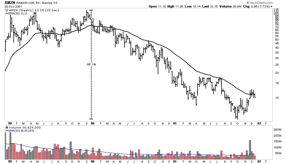
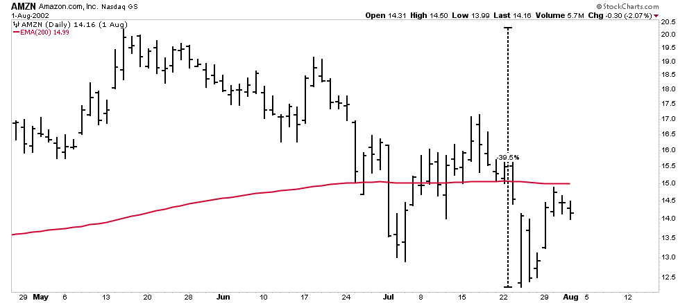
The discovery case: If everything works out and we indeed have the largest discovery in 100 years the stock could go to triple digits. But even if it went there don’t think it will be a straight line, it will be a roller coaster. Something like AMZN over the past 20 years. There will be drawdowns and they will be gut wrenching. So let’s do a mental exercise and look at some of Amazon’s draw downs on its way from $1.30 to 1080. First one must realize that the only way anyone could have captured all of the AMZN gain would have been to buy and hold. Ride the deep cycle roller coaster.
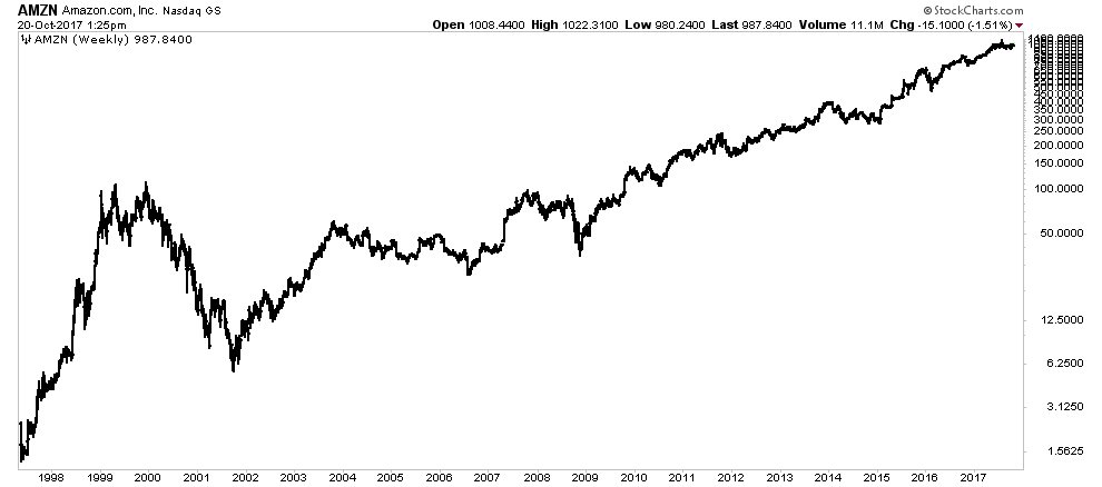
With the exception of the 2000 bear market the AMZN advance looks like a pretty straight-up line. The real time reality is quite different however. The charts below show the major draw downs that AMZN underwent from a present day perspective on its way to 1080. Here are the percentages:
-95%, -40%, -59%, -66%, -30%, -32%, -30%, -32%, plus there were also smaller ones in between. This serves as a great lesson in investing as it shows that to get those gains one must have a strong enough conviction to survive these gut wrenching drawdowns,
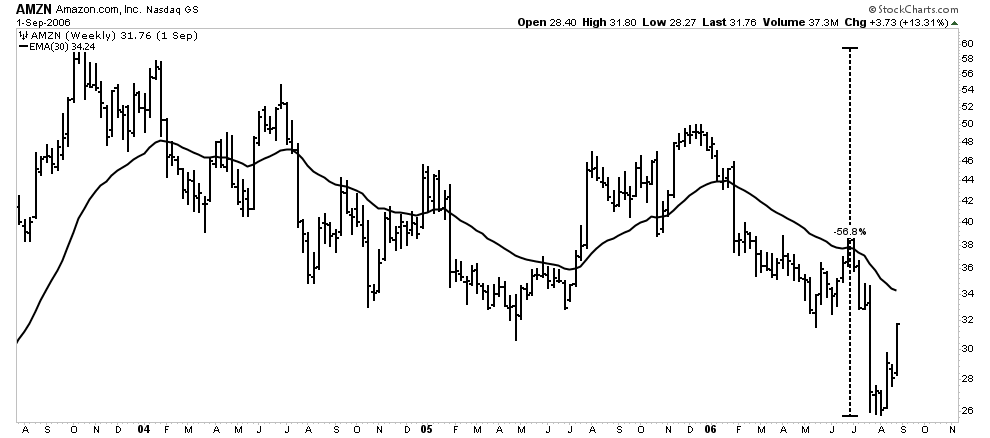
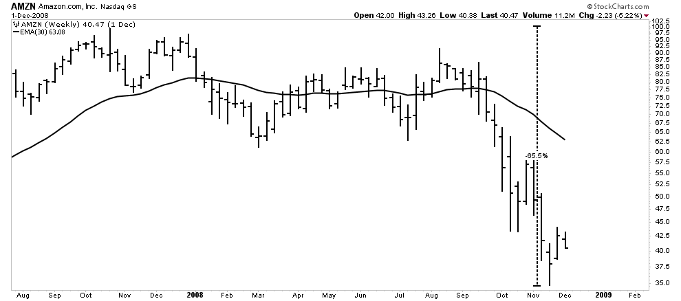

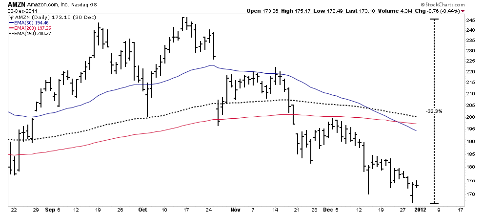
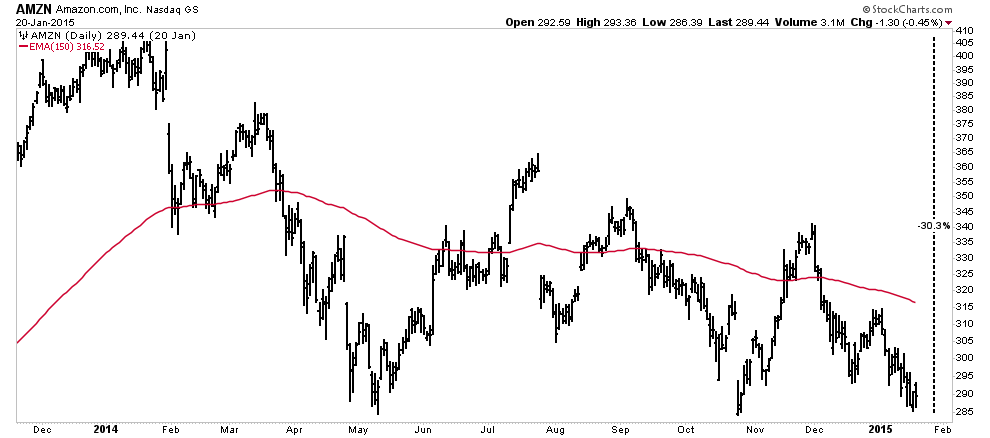

The point is that even if Novo turns out to be a total success, I am sure there will be 50% drawdowns along the way if not larger. You have been warned.
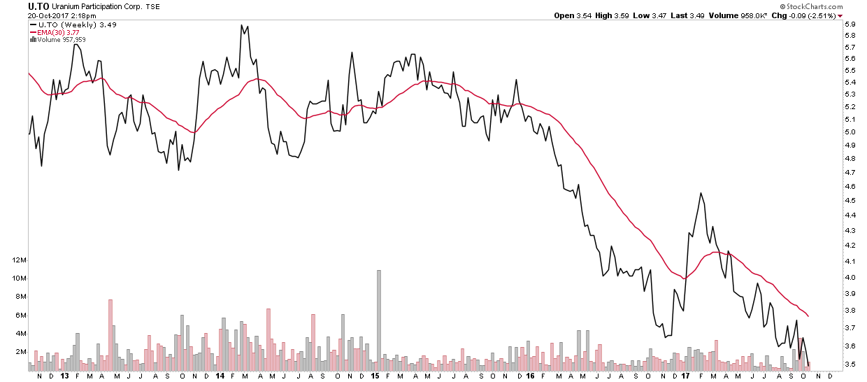
Uranium Market- Will there ever be a bottom?
This week a member asked to take a closer look at the uranium sector to try to determine if we may actually be bottoming here. One of the main conclusions of the uranium study posted on the side bar is that Uranium is an essential element of the upcoming second electrical revolution. Recent news reports of the Clinton uranium rip-off selling 20% of the USA’s uranium to Putin tends to confirm this conclusion. Contrary to news reports Putin doesn’t need USA uranium to build nuclear weapons, as he has plenty enough for that high priority use, but instead he desires to corner the market because he sees the energy needs ahead. Those are the fundamentals, however as technology marches on solar and wind become increasingly more efficient and cheaper, while the capital development cost of nuclear power plants just keeps rising. In a rising interest rate environment this will continue to exacerbate the problem for nuclear. So I am not totally convinced that nuclear will flourish outside of China. It seems that’s the message of the bottom bouncing of the uranium market.
So it is with this fundamental understanding we examine the bottoming action of the uranium sector. We are going to principally apply the Weinstein method to our analysis. This mean, of course, that we are going to miss the absolute bottom as we need confirmation before we jump in. So we won’t be able to make grandstanding posts claiming we “called” the bottom. (after several attempts).
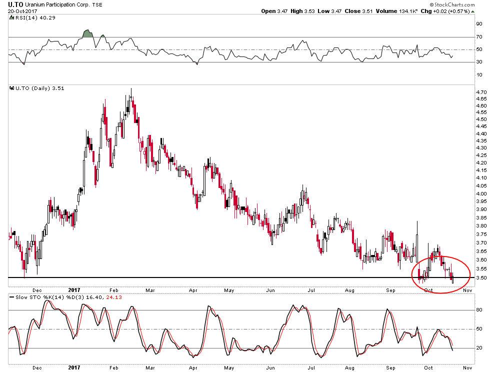
Uranium ETF price (U.to)
It is possible that this is putting in a broad double bottom, but it sure looks shaky. Both the RSI and the Slow Stochastics are NOT showing any kind of divergence. My best guess is it continues to go lower.
 .
.
U.to & URA overlaid.
When we overlay the URA as a proxy for the uranium stocks it begins to show some faint signs of promise. We see the stocks attempting to put in a higher low while the uranium price attempts its double bottom. It’s too early to tell, but what we should look for is for the URA to exceed its previous high at 14.00. If that were to occur we should sit up and start getting interested. URA stochastics and RSI (not shown) are displaying very slight divergences indicating a turn is possible, but certainly not assured. With tax loss season fast approaching I would not count on a turn until mid-December.

Weinstein 30 EMA Bottoming Process
Alterra offers a text book example of the bottoming process. We focus on the interplay with the 30 W EMA. Before we call a bottom we want to see a break above the 30 EMA with volume and a successful retest. Once we have that under our belt we can make the call. Typically the first move above the 30 EMA cannot be sustained and it falls back. It often takes three attempts before it can sustain the move. I call these price probes dutiful soldiers as they perform their duty by taking a bullet for their fellow soldiers who are to follow behind them.
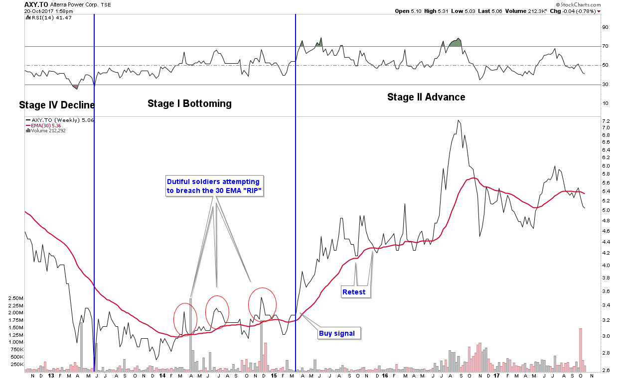
An authentic move through the 30 EMA should occur on 2X volume. The more volume the better. Recently Altius blasted through its 30 EMA with 4X volume lending confidence to the move. So with Alterra the bottoming process took 2 years.
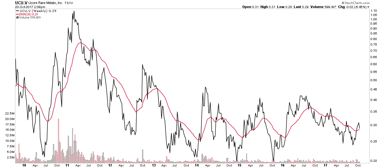
Another large sized position I hold is in UCORE. It has been testing my patience for 5 years locked in its bottoming process. So we see sometimes this can take years to unfold:
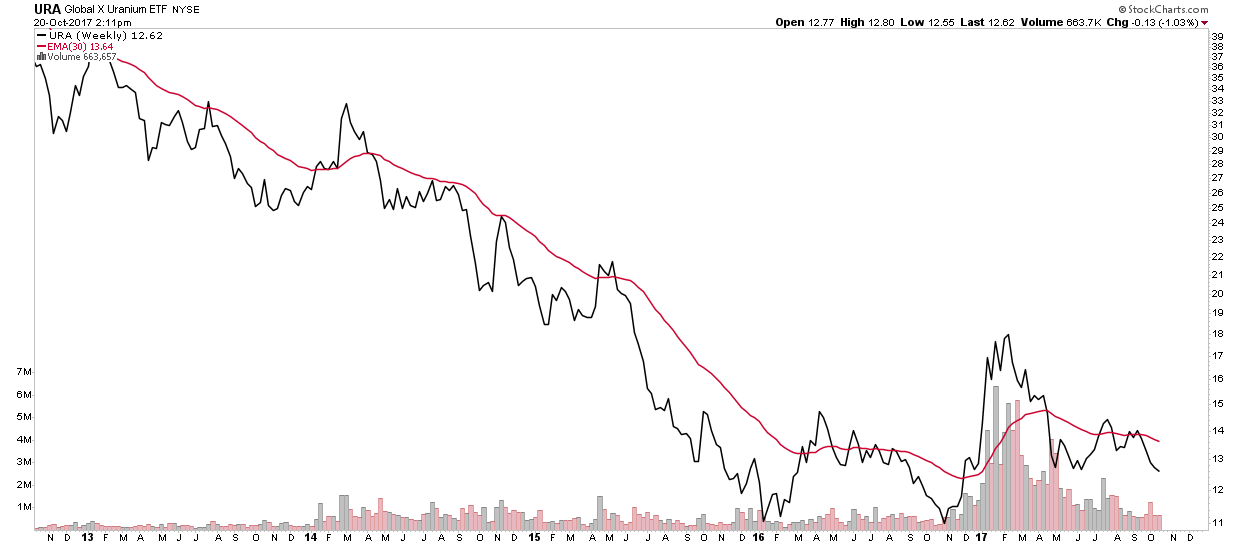
URA- It keeps going and going and going.
So with that as perspective let’s look at URA. We can see it’s two years into its bottoming process. It’s got 2 or possibly 4 dead soldiers lying alongside the bottom in their attempt to penetrate the maginot line, the 30 EMA. It got all lathered up about one year ago with volume and it had a powerful penetration, but ultimately it gave it up. The two most recent attempts were pretty weak.
Now let’s put U.to into the truth machine… it’s pretty pathetic:
Here is the rest of the group:

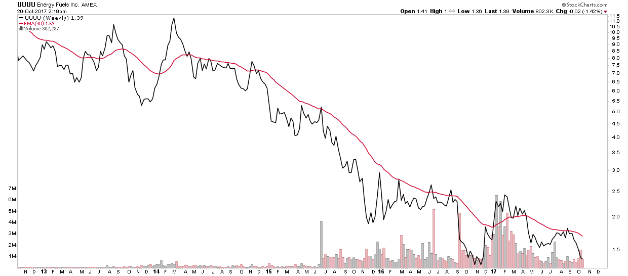
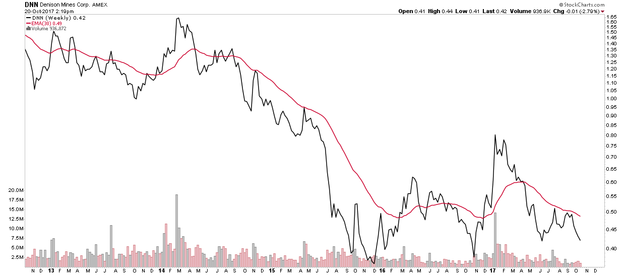


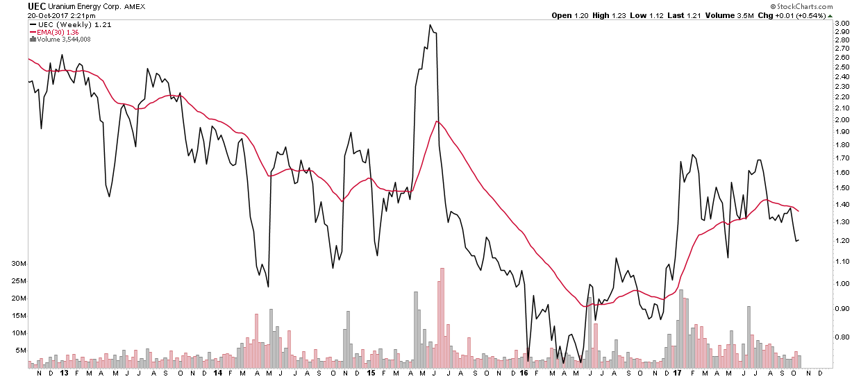
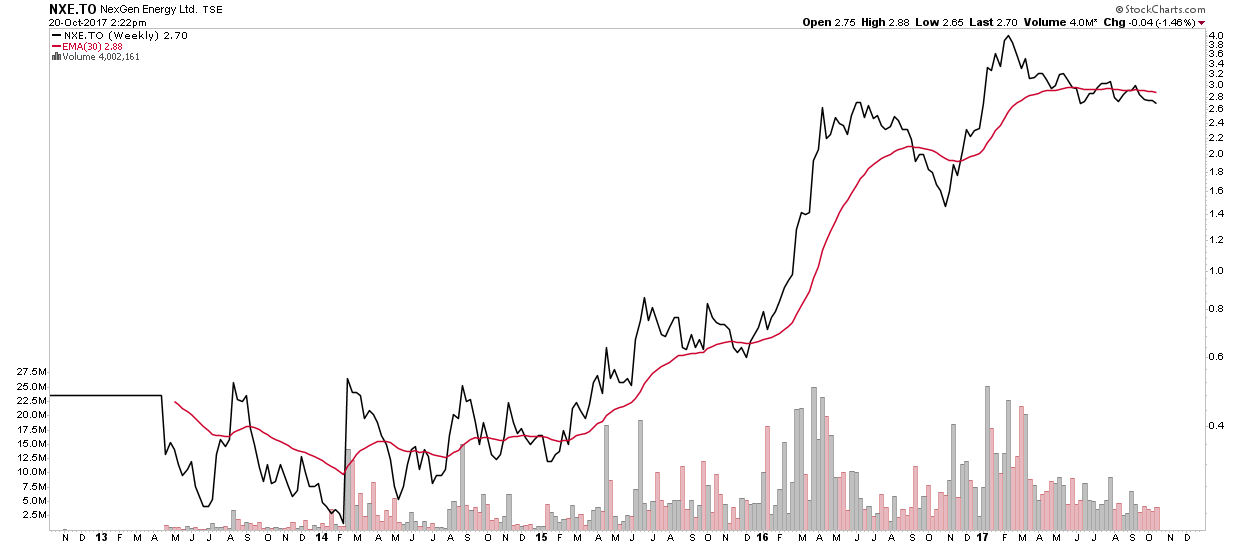
They all look pretty anemic with the exception of Next Gen. I am dying to own some uranium stocks, but quite honestly the chart action seems to be saying…patience my son.
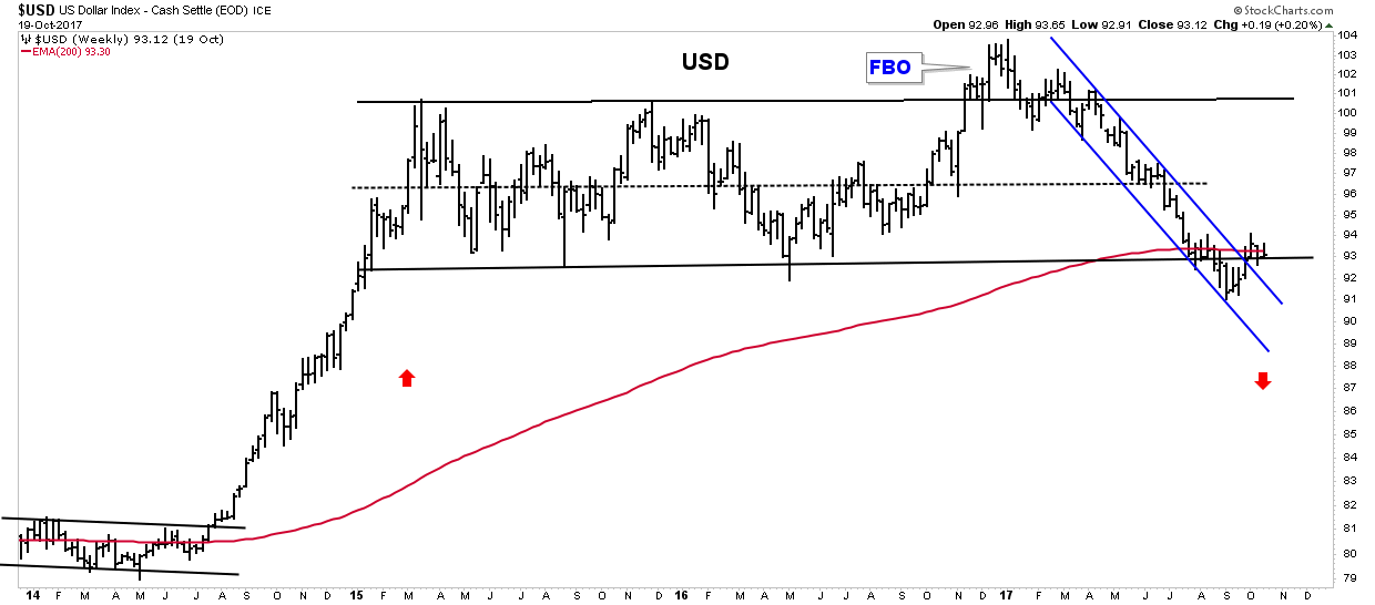
The USD
The USD continues to rally. Its immediate objective is 97 on the dollar index. This could exert some downward pressure on commodities and gold.
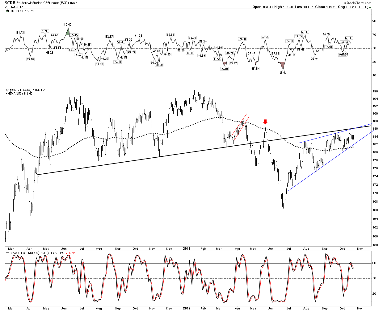
CRB
So far the preferred analysis for the CRB is it is finishing up a backtest to its NL. It is showing some promise however, as it has remained above the 150 EMA for 6 weeks now. If the NL is broken to the upside we need to start considering the inflationary outcome.
The CRB with the USD effects stripped out shows a very negative picture.

Conclusion
In a PBC commodity prices decline relative to gold. This does not require commodities to decline on a nominal basis, only on a real basis. An example of this is the hyper-inflation in Weimar Germany in 1923. That was a credit contraction, combined with a failure of the currency. Commodities may have zoomed to the moon, but they declined relative to gold. I presume that eventually commodity prices will rise in the coming PBC on a n, but at first the charts seem to indicate that they will decline. A rise in the CRB will be associated with a decline in the currency, the USD.
The Purpose of the FED
The FED was created in 1913 for the prime purpose of insuring private bank solvency. A secondary role was for it to facilitate the financing of the government. Safeguarding the purchasing power of the currency is way down their list of priorities. In the next recession or financial crisis the currency safeguard function will be thrown out the window in order to save the banks and fund the government. One must position oneself now to protect for this eventuality.
In the meantime markets have entered full on melt-up. It will likely last the rest of the year which provides a great opportunity to position oneself in the sector which will provide the protection going forward.
Catherine Austin Fitts:
Rambus, I can't thank you enough. This is Blockbuster Chartology! We have a lot to study and digest. Let me remind our subscribers that they can access your ongoing efforts at: http://rambus1.com.
Related Reading:
- 3rd Quarter Wrap Up - Control 101 - October, 2017
- 3rd Quarter Wrap Up - Control 101 - Financial Markets - October, 2017
- Blockbuster Chartology with Rambus - July, 2017
- Blockbuster Chartology with Rambus - May, 2017
- Blockbuster Chartology with Rambus - January, 2017
- Blockbuster Chartology with Rambus - October 20, 2016
- Blockbuster Chartology with Rambus - July 21, 2016
- Blockbuster Chartology with Rambus - April 21, 2016
- Rambus: Are We in a Deflationary Spiral? - January 28, 2016
- The Dollar, Gold & the S&P 500 with Rambus - October 15, 2015
Top of Page
© Solari 2016